
Things to remember when creating a color scheme for your product

Color is one of the most powerful tools for attracting a user’s attention within a UI. Vibrant hues naturally draw the human eye toward interface elements. Color can also influence user perception of weight and size within an interface — warmer hues tend to seem heavier and more prominent.

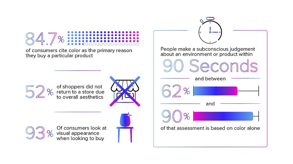
Users make subconscious judgments about a product within 90 seconds, and up to 90% of that assessment is based on colors alone.

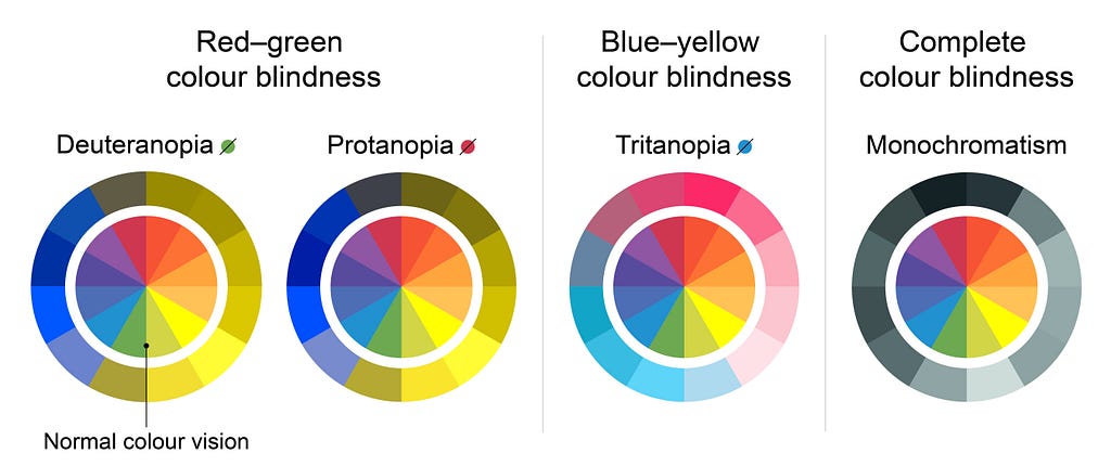
Approximately 8% of men and 0.5% of women are color deficient (~ 1 in 12 men and 1 in 200 women), making sufficient color contrast crucial consideration.

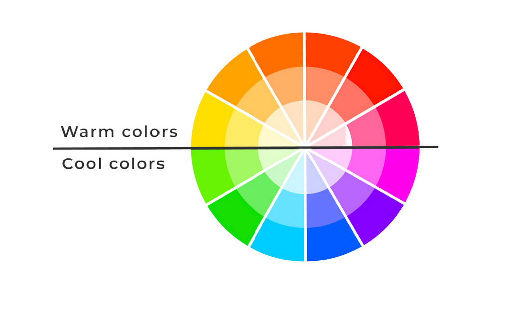
Warm colors like red and orange are more easily noticed by users in peripheral vision compared to cool tones.


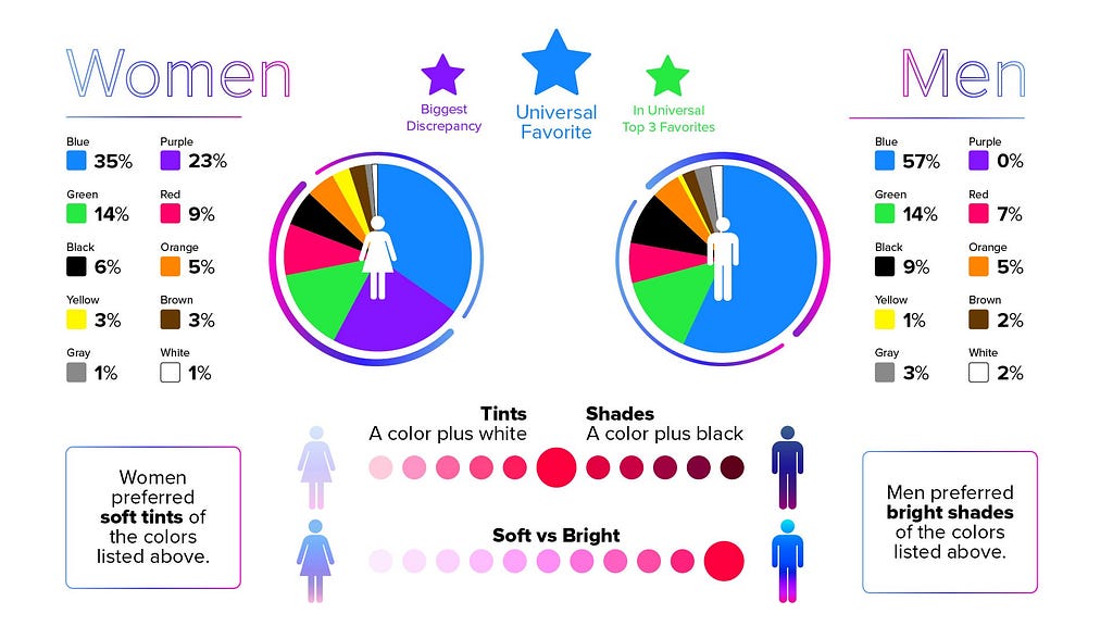
Blue is one of the most popular preferred colors across cultures, genders, and age groups for web interfaces and software. On average, users tend to view objects and websites with a blue-based color scheme as more trustworthy and secure.


Color can impact a user’s ability to quickly comprehend information, with warm colors promoting better understanding of written content.
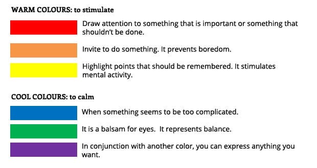

Vibrant accent colors help guide a user’s eye toward desired actions within an interface more effectively than muted colors. Vibrant, saturated colors like red and orange can increase feelings of urgency in users, potentially encouraging faster actions or purchases.
Desaturated, muted colors are less stimulating for users, promoting a calmer viewing experience well-suited for reading or focused work.


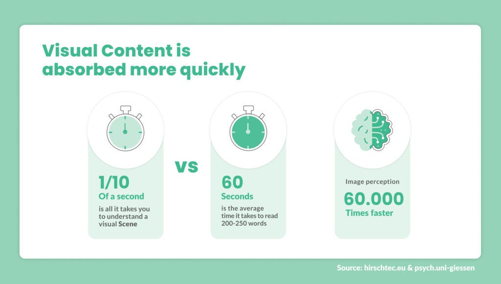
People process visuals before reading text content, making strategic color choices essential for instant comprehension.

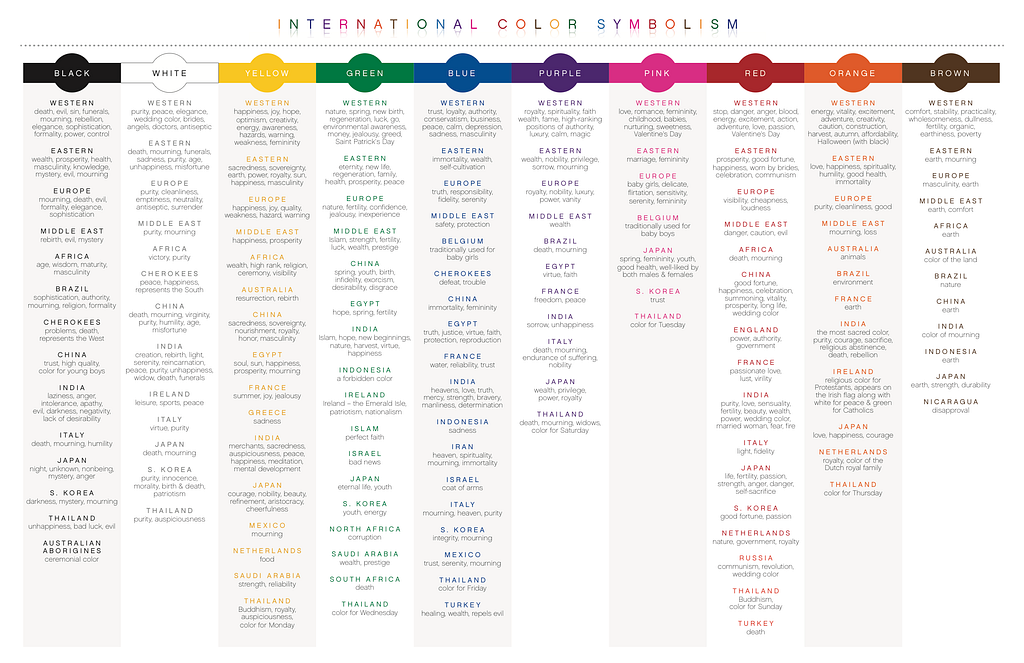
The meaning of colors can differ across cultures, so localized color associations must be accounted for in global product design.

While trends influence color preferences, users respond best to simple and consistent UI color schemes:
- Too many bright, vivid accent colors competing for attention in a UI can create confusion, stress, and reduced comprehension for users.
- Consistently used color cues help train users’ memories for functional elements like calls-to-action over repeated application usage.
Want To Master Product Design?
Try Interaction Design Foundation. It offers online design courses that cover the entire spectrum of product design, from foundational to advanced level.
This post contains affiliate link(s)
10 Facts About Color in Design was originally published in UX Planet on Medium, where people are continuing the conversation by highlighting and responding to this story.