2023 was quite a busy branding year. I am sharing my view on the most and least valuable from a design perspective. I guess the world’s most shocking rebrand (if you want to call it rebrand) was the Twitter catastrophe… However, as I don’t consider that a rebrand it is out of my list.
The Good
It is a difficult one as I think that there have been very successful brand designs this year, starting from Bolt’s rebranding at the beginning of the year to great work like Barbie’s makeover revitalising the brand and making it into the cultural zeitgeist.
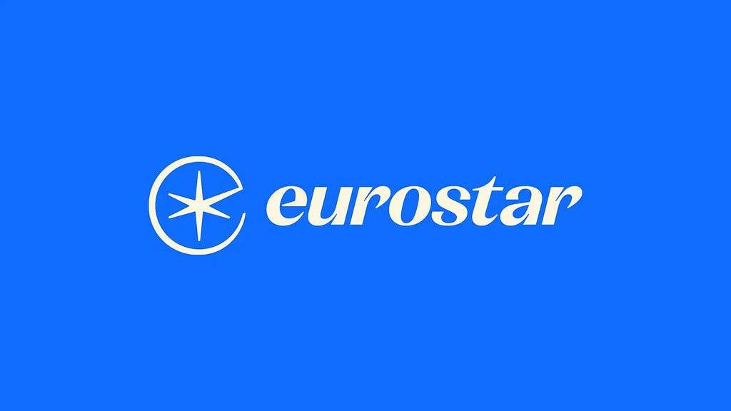
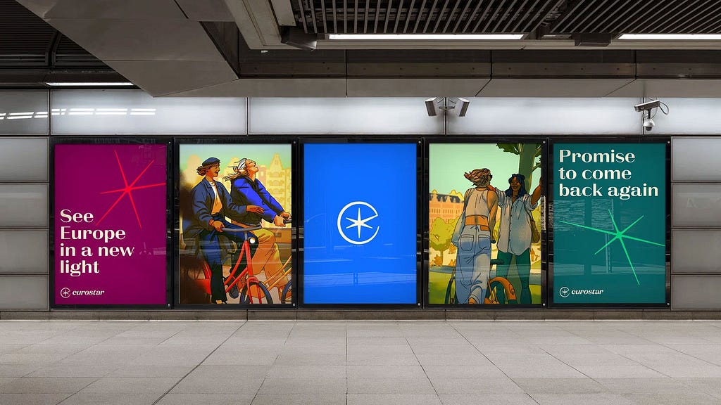
But if it’s me, I wish I had worked on the Eurostar’s rebrand. They have captured Europe, travel, style, railway… a really 90s look, which warmed my heart. The new Spark logo is not just memorable, it moves, connects revitalises any composition. Those lines are limitless. The whole visual system is crafted and seems never-ending, full of possibilities. It is very brave, distinct and definitely will
Designed to “respect the heritage of both brands, while modernising for the future”, the refresh returns to an earlier iteration of Eurostar, the very first in fact, in 1994. Great job from DesignStudio!
“The typeface feels really unusual for a brand. And Eurostar, it’s such a great service, but it’s felt so tired and dusty for so long. It’s just so nice to kind of see it get a new lease of life.” — Sean Thomas, ECD at global agency Jones Knowles Ritchie


The Bad
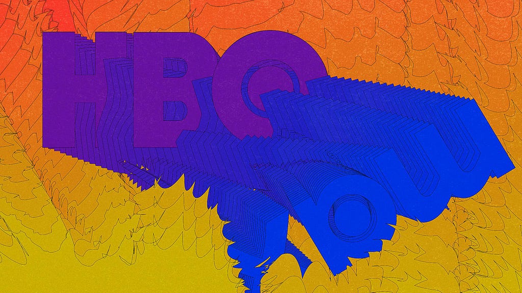
Very close to Johnson & Johnson’s unfortunate debranding, in my opinion, and potentially because I have much more attachment to it rather than J&J’s brand. The bad rebrand of the year will go to HBO.
I could see how HBO would have benefited from a refreshed look, and even from a repositioning exercise to signal a broader programming and make a more family-friendly look for some categories if you wish. But losing the great reputation and equity built through years of amazing content seems a bit of a shooting oneself in the foot. Especially, when you think of ‘Max’ as a name, which is not memorable or sticky, it is often used to differentiate between product lines… Bad change, bad colour change, bad naming and very bad tagline: “The one to watch”. Nooo!

The Ugly
Ok here… I have had discussions in the studio about this… one of those rebrands that I was excited about… Nokia. Such a disappointing result, legibility is poor, colour change that doesn’t add much, and missing parts in the font almost resembling a new trend like the KIA rebrand (which didn’t have a great reception). To me feels like a lost opportunity, but hey.
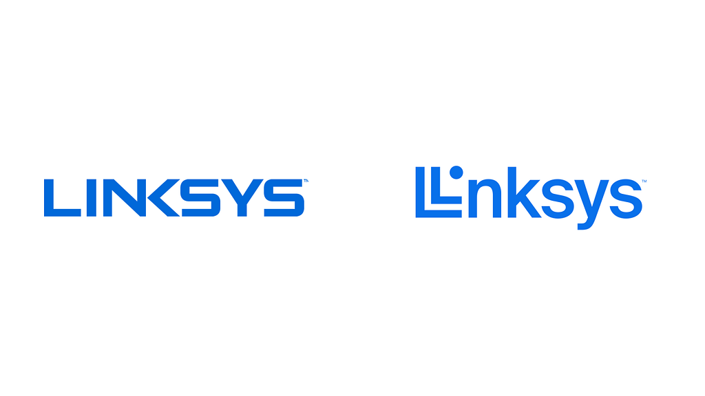
In favour of some of my friends and colleagues, I have decided that the real real ugly one was Linksys rebrand.

Seems one of those rebrands for the sake of it. They most likely aimed to get a symbol, well, they got a new symbol they lost everything else, even in a simple rule as legibility as now you read ‘Llnksys’. The monogram and icon system and utility I think it works well… all the rest for me is just a miss with no hit.
Even worse when you present it like this: “This change is more than a new logo or identity. It’s a reflection of our commitment to you, our customer, to build the world’s most reliable, innovative, and future-ready wireless technologies.” this is how they shared the news on Reddit.
2023 rebrands: The good, the bad and the ugly was originally published in UX Planet on Medium, where people are continuing the conversation by highlighting and responding to this story.