With the advancement of digital technology and the growing need for user-friendly user interfaces, design systems and UI kits have become integral to the development process. I keep an eye on new design systems. Some of them are worth sharing with you.
Blade Design System
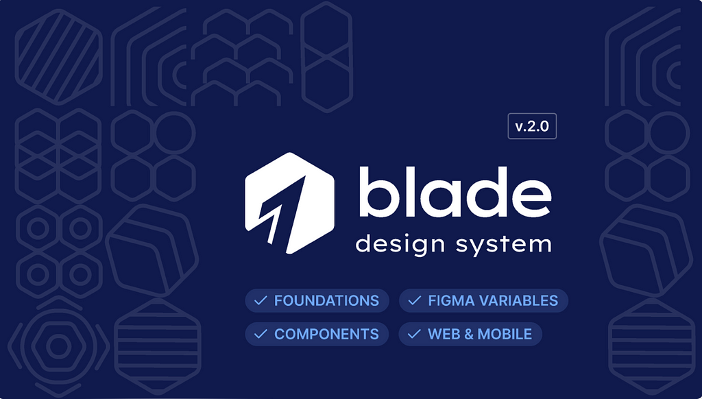
Blade Design System is Razorpay’s official design system. It is a comprehensive set of tools and components for creating interfaces and websites.
All carefully created tokens and standard components with documentation are available at the link, from tried-and-true to current.
It is also convenient that the entire design system is hosted on GitHub. Hence, you can install the whole design on your website.
Atomised Design System
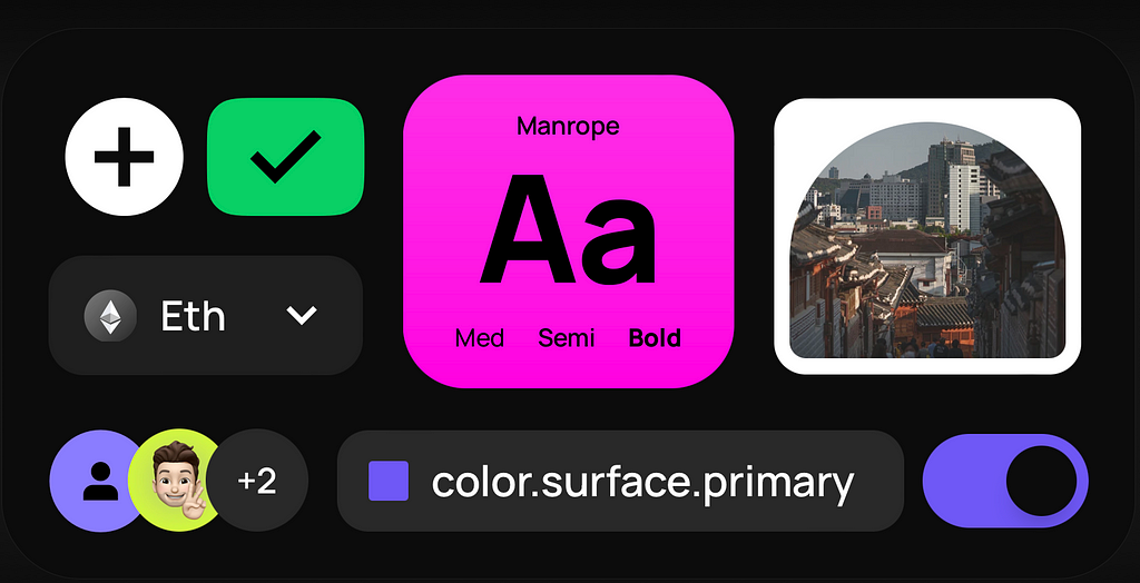
Atomized Design System allows you to create modern, stylish and visually appealing user interfaces and websites without routine tasks.
What’s inside the design system?
- 200+ styles: typography, effects, colour schemes,
- 700+ components: buttons, lists, Web3 and more,
- 200+ variables,
- sample screens for inspiration and finding suitable solutions.
The whole system is very conveniently organised and well thought out. The free package is a good way to get acquainted with it in detail.
Design System by Jordan Hughes
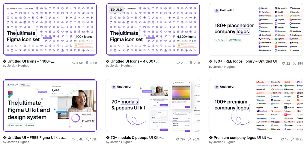
Design System by Jordan Hughes is a large set of various components for your projects. These are company logos, icon sets, UI Kit, modals & popups, avatars, colour palette systems etc.
Everything is conveniently organised, so you can quickly find your needs for a particular task or project.
Wanted Design Library
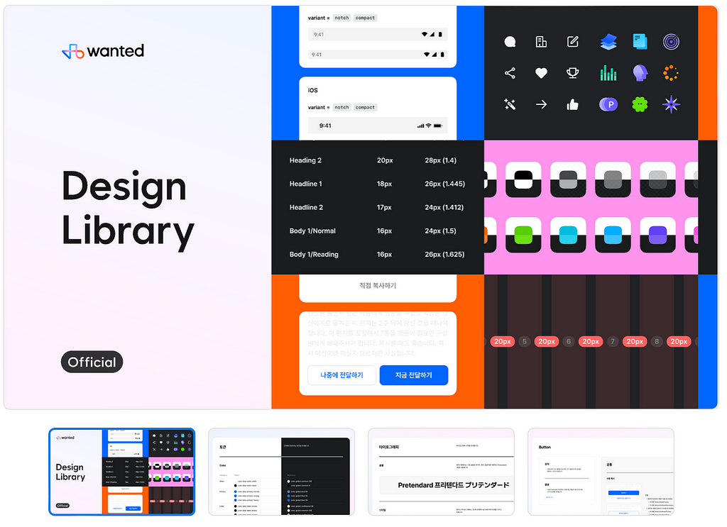
Wanted Design Library is an original and thoughtful design library that even beginners can quickly adapt and use in their projects.
The library includes structured elements broken down into basic themes: colour, typography, grid, and icons. This library is perfect for projects where it’s important to stand out and offer users something new and different.
I love that the Wanted team has shown how they use their design system in projects. And honestly, it all looks perfect and presentable.
Design To Code UI Kit (Free)

Design To Code UI Kit is an innovative tool that simplifies the process of going from design to code. The kit includes ready-made components that can be easily adapted and integrated into a project’s codebase. It is an essential toolkit for designers and developers, where everything is maximised with the latest Figma features:
- Each Figma component has a React component linked to Storybook.
- Props in Figma are 100% identical to the props in React.
- Fonts, sizes, shapes and spaces are saved in CSS variables that correspond to variables in Figma.
- The structure & design of the interface completely match the structure in the code.
- Quality components in both Figma and React.
- Design & UX best practices + Coding & Styling best practices.
Design System Strategy
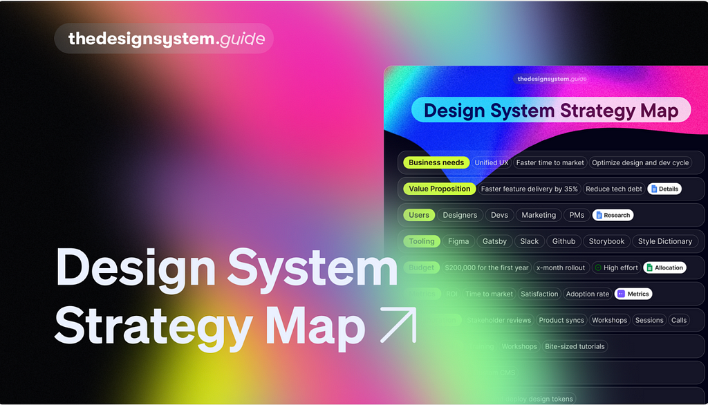
If you want to create your own design system, you need a strategy.
Design System Strategy will help you do that.
Design System Strategy Map is a one-page document summarising your design system’s main activities, goals, and users. You can share this map with all your stakeholders to get feedback and develop a strategy that works.
Conclusion
In 2024, new design systems and UI kits will offer advanced features and tools for creating user interfaces. Whether you work for a large team or a small startup, these design systems can help you realise new projects.
Subscribe and stay in touch. Let me know what you’d like to learn in future posts!
Twitter | Instagram | Dribbble
6 New Design Systems & UI Kits 2024 was originally published in UX Planet on Medium, where people are continuing the conversation by highlighting and responding to this story.