
Every year, there are new eCommerce design trends on the block as online brands look for new ways to outshine their competitors. The average eCommerce shopper spends a lot of time online. These buyers expect eCommerce brands to offer new and innovative user experiences. They’re not satisfied with plain old websites that look like they belong in 2013.
To attract these consumers, online retailers and their web design teams experiment with new design features and design trends. Most of these experiments fail and trends fade away. But, there are a few select eCommerce design trends that end up setting new benchmarks in terms of what’s possible in terms of user experience, site functionality, and visual appeal.
More importantly, these design trends help brands create more sales-friendly eCommerce platforms. In this article, we’ll discuss the top eCommerce design trends of 2023 that are not going to fade away anytime soon.
The Trends That Are Making a Difference
Here’s our definitive list of the top 9 eCommerce design trends of 2023.
1. Animated Product Reveals

Animated product reveals are computer-generated videos that display products in motion. Why are these videos so popular in eCommerce design? Well, animation can bring any visual to life. So, instead of displaying their products via static visuals, several eCommerce brands are using animation to add life to their product listings.
New-age online shoppers love eCommerce brands that go the extra mile to deliver memorable user experiences. Hence, the use of animation in product reveals or displays has taken center stage in eCommerce web design in 2023. eCommerce web designers team up with 3D artists to replace static product images with compelling 3D visuals.
These 3D animations help online shoppers visualize the products they’re purchasing in real time. Animations can also be used to:
- Highlight micro-interactions
- Reveal hidden menus
- Animate text (e.g., product descriptions) in product galleries
Animated content engages shoppers, and makes eCommerce platforms livelier and more memorable. Animations can also be used to share “Easter eggs” with shoppers. For example, when buyers earn rewards for buying specific products, their prizes can be presented in memorable 3D animations.
2. Multidirectional Layouts

Multidirectional layouts in eCommerce design are website layouts that can easily accommodate different directions. This kind of layout allows shoppers to scroll diagonally, left-to-right, right-to-left, and in other directions, not just up and down. It’s easier for shoppers to compare products side-by-side when operating on such layouts.
eCommerce platforms with multidirectional layouts can also be optimized for multiple languages. For example, most eCommerce website designs are specifically optimized for left-to-right languages like English or Spanish. An eCommerce platform with a multidirectional layout can be optimized for right-to-left languages like Hebrew/Arabic as well.
Here are some other key features of eCommerce websites with multidirectional layouts:
- Off-center images
- Irregular grids
- Design elements that flow in all directions (instead of a single direction)
- Product galleries that can be explored by scrolling right-to-left, diagonally, and in other directions (not just top-down)
- Flashy typography
- Seamless transitions between different page sections
Multidirectional layout is a strong e-commerce design trend in 2023 because it allows e-commerce brands to be different from their competitors and present their products more innovatively and engagingly. Aware is a good example of an eCommerce brand that has proficiently implemented multidirectional layouts in its web design.
3. Neubrutalism

Neubrutalism is a web design trend that was developed in the early 2020s as a retort to minimalism and flat design. Minimalism and flat designs have dominated the world of web design since 2010. These design styles prioritized the use of simple and plain design elements over visually striking design elements. Neubrutalism was the exact opposite of these two.
Neubrutalism rejected the use of beige color palettes, simplistic content alignment, and classic typography. Instead, it embraced the use of unusual background color themes, asymmetrical layouts, and bold, futuristic typography. These design elements give websites a sense of rawness and unorthodoxy. That’s exactly what eCommerce brands need to stand out.
Hence, many eCommerce brands have replaced their flat and minimalistic designs with neo-brutal design elements. Here’s an example of neubrutalism being used by the eCommerce brand Gumroad. This design features bold colors, unique geometric shapes, an asymmetrical layout, and eye-catching typography:

Neubrutalism still follows some basic traditional design rules like making the CTA buttons ‘pop out’ from the background. But, as you can see from the image above, the neubrutalist aesthetic is nothing like traditional flat design or minimalism. Here are some other key features of neubrutalism in eCommerce web design:
- Unusual background color themes that typically feature high-contrast colors that clash with each other to create a visually striking design.
- No use of gradients as designers prefer bold and solid colors instead.
- Bold and futuristic typography.
- Unconventional use of space (e.g., the use of random and inconsistent layouts and large negative spaces)
- Use of negative space: These designs often use negative space to create a sense of balance and visual interest.
- Animated elements with shadows to create a sense of movement, dynamism, realism, and depth.
Neubrutalist designs may not follow traditional design principles, but they’re still 100% functional in the sense that the user experience on neubrutalist websites and interfaces is not drastically different from what you would expect from a standard eCommerce website.
However, it must be said that brands that use neubrutalist designs typically evoke a sense of awe and surprise from users. That’s because neubrutalism is meant to be unique, unexpected, and the total opposite of what you can see on basic eCommerce sites with flat and minimalistic design styles.
These inherent features of neubrutalism make it unsuitable for many eCommerce brands. For example, if your eCommerce brand sells health and wellness products, the presence of neubrutalist design elements (e.g., striking colors and bold typography) on your site may overwhelm your target shoppers. Neubrutalism is more suitable for eCommerce brands that are known for being unique, whacky, and different.
4. Creative Page Transitions

Online shoppers hate waiting. According to some industry experts, the main reason why people have embraced eCommerce is that it eliminates much of the waiting that comes with shopping in traditional stores. That’s why, since the early 2010s, most major eCommerce brands have focused on making their sites fast-loading.
But, in the 2020s, having a fast-loading eCommerce platform is not enough to satisfy online shoppers. In 2023, not only do eCommerce websites need to load fast, but the transitions within their buying/sales procedures also need to be super-fast. That means processes like adding items to a cart, billing, and final check-outs all need to be super-fast.
On top of being fast, these processes need to be engaging as well. That’s where clever page transitions can be of immense help. For example, animated page transitions can add extra layers of interactivity to an eCommerce platform. Such features can liven up the eCommerce site and make it more fun to navigate.
Here are some other page transition techniques that can be used in e-commerce web design:
- Smooth Scrolling: Smooth scrolling can be integrated into the product listing pages to create seamless transitions between two or more product categories. Users can scroll through the product pages smoothly and feel engaged while doing it.
- Flash Animated Transitions: The use of flash animated transitions in between different product pages on an eCommerce website can help brands deliver more engaging user experiences.
- Diagonal Shape CSS Transitions: Diagonal shape CSS transitions can be used to provide users with smooth transitions between different product visuals. These transitions can also make eCommerce platforms appear unique and visually appealing.
- Page Loading Transition: Instead of using a simple ‘loading’ animation whenever a new page is loading, designers can provide users with specific percentages that denote the progress of the page loading process. This simple transition trick can make users feel more engaged with the site.
- Fade Transition: In this subtle transition technique, the current page fades out whenever users switch to a new page. For example, when the buying process is complete, the checkout page can ‘fade away’ and get replaced by the ‘Thank You for Shopping with Us’ page.
- Slide Transition: In this transition technique, the current page slides out, and the new page that the user has selected slides in. For example, the product details page can slide away and the shopping cart page can slide in whenever the user decides to add a product to the cart.
eCommerce websites can use these creative page transitions to create a sense of flow and momentum on their platforms. Such efforts make the shopping experience more fun and less frustrating because shoppers don’t get the feeling that they’re waiting: they get the feeling that they’re being entertained by the creative page transitions.
5. Gothic Visuals

Do you think ‘goth’ died off somewhere around the time you passed out of college? Think again because ‘goth’ is alive and well, thanks to Gen-Z. That’s right, Gen-Z has embraced many subcultures that used to be famous back in the late 90s and early 2000s and goth is one of them. Don’t believe us? Just look up #goth or #whimsigoth on TikTok.
You’ll notice many teens recreating the witchy and ghostly ’90s aesthetics that were popularized by Black Metal bands back in the day. These teens are looking for ways to express themselves freely and rebel against the status quo. By adding gothic visuals to your eCommerce web designs, you can validate their expressions and make them browse longer on your website.
This is especially true for brands that specifically cater to Gen-Z. We’re talking about online fashion retailers, online bookstores, and other online platforms that sell Gen-Z-oriented products. Here are some gothic-themed web design elements that eCommerce web designers should consider adding to their platforms:
- High contrast color pallets featuring dark colors like black, ruby, and deep purple. Such color palettes create a sense of drama, intensity, and goth!
- Spiritual symbols that allude to mysticism such as bats, skulls, cobwebs, zodiac signs, etc.
- Geometric shapes, such as the pentagram and Romanesque arches.
- Renaissance motifs, such as visuals of angels and gargoyles add a touch of spookiness to the design.
- Gothic typography such as Blackletter, Fraktur, Textura, Rotunda, Medusa Gothic, and Brut.
If your target audience is interested in goth and loves dark aesthetics, adding gothic elements to your eCommerce web design is a no-brainer in 2023!
6. Vaporwave Aesthetics
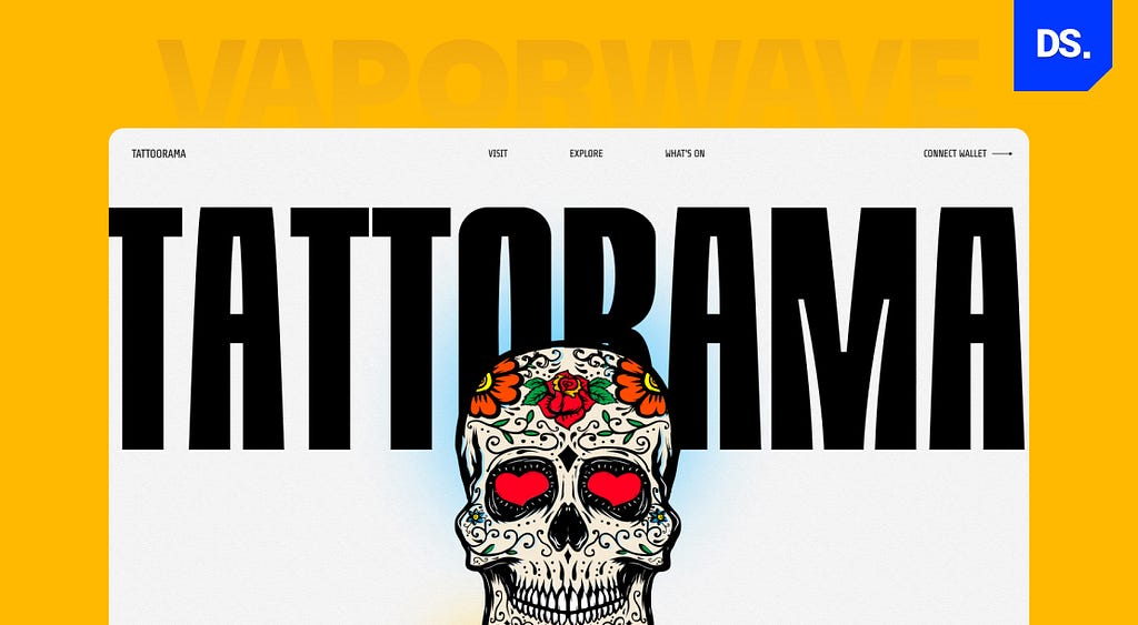
Ever since the game Cyberpunk 2077 was released in late 2020, the ‘Cyberpunk’ subculture has gone mainstream. Cyberpunk is a subgenre of science fiction that describes an Orwellian future where technology has merged with every aspect of human life. Sound familiar? That’s right: many people claim that the world we currently live in is already quite Cyberpunk.
So, why not add Cyberpunk-themed aesthetics to our e-commerce websites? That’s the type of thinking that has triggered the rise of vaporwave aesthetics in eCommerce web design.
This design trend draws inspiration from the Cyberpunk culture. Vaporwave aesthetics in eCommerce web design is characterized by the use of design elements like:
- Vibrant colors like light pink, navy blue, and neon green. These colors create a sense of melancholy and escapism.
- Retro-futuristic imagery that evokes a sense of nostalgia for the 1980s (the decade when the Cyberpunk culture was born) such as cassette tapes, neon lights, palm trees, and cassette tapes.
- Glitch art created by intentionally corrupting multiple digital images. This glitchy art is meant to evoke a sense of unreality and hyper-reality.
- 3D typography that features three-dimensional shapes. 3D typography creates a sense of depth and hyper-realism.
- Surrealist imagery that looks illogical or dreamlike.
- Eclectic design where multiple design styles and elements are combined to create a sense of surprise.
- Asymmetrical layouts and grids.
- Psychedelic fonts like Magritte, Moonshine, Los Monstruoz, Art-Nuvo, Lucid Dream, and Psychedelic Love.
- Creative and eye-catching Call-to-Action buttons.
Many e-commerce sites like Cyberdog, HypeBeast, and Vapor95 have built their brands around Cyberpunk and vaporwave-inspired designs. After seeing the popularity of this design trend, especially among the youth, several mainstream eCommerce sites like Mister Porter, SSENSE, Bodega, and Urban Outfitters have also incorporated cyberpunk and vaporwave aesthetics into their web designs.
7. Scrollytelling

Scrollytelling is a web design technique that uses scrolling to activate dynamic multimedia elements on a webpage. As you scroll down a webpage animations, videos, images, and other multimedia elements load automatically to narrate a story. Instead of presenting a lot of text-based information on one webpage, Scrollytelling uses long, scrollable pages to narrate a story more engagingly.
This design technique creates a sense of immersion and compels users to keep scrolling. The more they scroll, the more time they spend on the eCommerce site. Their chances of buying something also increase the more they scroll. The website for the Apple Watch Series 7 is a good example of simple but effective Scrollytelling. With every scroll, users are exposed to dazzling images and bold headlines.
8. Designing Micro-Interactions
Micro-interactions are small, subtle interactions that shoppers encounter on eCommerce websites or apps. They are often overlooked by web designers. But they can have a significant impact on the eCommerce platform’s user experience. For example, the progress bar that pops up on the screen whenever users download files is a micro-interaction that can be designed to be engaging. The same goes for other micro-interactions like:
- Providing feedback when users enter wrong information in submission forms. This feedback can be designed with eye-catching graphics.
- When users hover their cursors over product visuals, it can trigger a micro-interaction that zooms in on the visuals to provide a closer look at the product. This zoom in effect can be designed to be more eye-catching and engaging.
- When users click on product filters, it can trigger a micro-interaction that displays an animation to confirm that their desired filters have been applied.
Carefully designed micro-interactions add a touch of personality and fun to eCommerce websites. More importantly, they increase on-site engagement and encourage user interaction.
9. Mobile-First Design

Mobile-first design in web design is the practice of designing for the smallest device first and then gradually enhancing the design to suit larger devices. Since mobile users are the primary targets of eCommerce brands in the 2020s, mobile-first design is the most important eCommerce design trend of this year.
Here are some mobile-first design principles that eCommerce websites must adhere to:
- Use flexible layouts and visuals that can resize/reposition themselves automatically to fit the screen size/s of the device being used.
- Use simple and uncluttered layouts to create a clean user interface.
- Use an intuitive navigation menu with clear labels for all links/buttons.
- Use clear fonts and large font sizes to ensure that the text on the screen is easy to understand for mobile users.
- Use pop-ups sparingly. Make sure the pop-ups are easy to close. Or else, they may disrupt the shopping experience for mobile users.
- Test the design on mobile devices to ensure the design meets the needs of mobile users.
By adhering to these basic design principles, eCommerce website designers can create easy-to-use mobile-first websites.
Which of These E-commerce Design Trends is Right for Your Website?
These 9 eCommerce design trends have made our eyes pop this year. But, which of these are suitable for your website? To answer this question, we recommend you analyze your audience and determine which trends they’ll like and find easy to use. Also, before you incorporate any of these trends into your eCommerce website’s design, test them. Test the designs on different devices/browsers to ensure they work properly.
If you’re still struggling to incorporate these design trends into your eCommerce website design plans, Design Studio’s web & UX/UI design experts are here to help. Reach out to us and we’ll help you leverage these design trends most effectively!
Originally posted on design-studio.io.
9 Stand-Out eCommerce Web Design Trends of 2023 was originally published in UX Planet on Medium, where people are continuing the conversation by highlighting and responding to this story.