In mobile interfaces
Onboarding in mobile applications refers to the first few slides that appear at launch and introduce the user to the application before authorization or usage.
These slides are called introductory or introductory onboarding.
Introductory onboarding
The main purposes of such slides are two:
- To motivate to log in, sign up, and use the application in every way possible;
- to help you understand the interface.
The second case is interesting because even before the user sees the application interface, they are told how to use it.
This works pretty well when the functionality of the app is small and easily described in these slides:
- take a picture of a tree,
- add a caption,
- share on social networks.
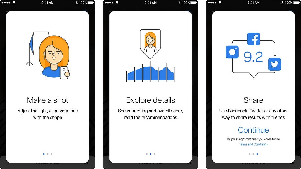
In this case, the user immediately after familiarization easily performs the described actions.
But this method is bad if the application goes far beyond three steps. For example, the first slide told the user how to use statistics. The second told where to set up phone calls. In the third, something else. But the user, as it turns out, at the moment only wants to change the avatar in the profile of one of the invited friends in his account. And after a while he will have a need for all the available functionality. But onboarding has already passed and all the knowledge has been forgotten long ago.
Such situations can be avoided in several ways:
- giving the opportunity to review the onboarding slides again,
- situational onboarding.
Situational onboarding
Teaching how to use the interface in three slides at the first launch of the application is a poor idea.
It is better to spend these slides on making the user understand in general what the application is and what to expect from it. For example, I wouldn’t want to sign up for a service that I don’t really need. It’s better to teach the interface as you go along.
The simplest (and quite widespread) way is to show over the interface where buttons are located and what they are responsible for.
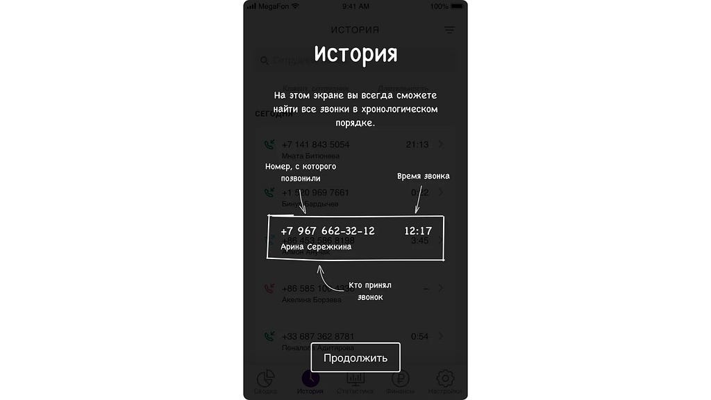
Let’s say you opened the Dashboard, and immediately arrows and inscriptions appeared on top of it, showing what and how it works. And if the user goes further, for example, to the call history, similar explanations on how to use this part of the interface appear on top of the interface.
The advantage of this approach is that knowledge is given to the user only as it is needed. If you open one part, you get explanations on it. You didn’t open another part — they didn’t tell you anything about it.
In web interfaces
Although it is believed that with the reduction of the screen size decreases and the time of interaction with the device, there is one thing: the time to decide whether to use the interface on the web is much shorter than in mobile applications. This is due to the huge number of alternative sites that offer the same thing, perhaps even easier and clearer. On the web, it is quite easy to try all these alternatives: click here, click there, click here, don’t like it — close and return to another tab.
In mobile applications, however, it is not like that yet. In smartphones and tablets people spend time searching for an application, installing it (can you imagine if websites had to be installed on the first visit?), then they watch introductory slides, try to use the application… Not many people want to look for a new suitable application every time they spend so much time.
Let’s be honest: if you have a lot of tutorials on the interface in your application, it can’t be called simple.
The product landing page is the introductory onboarding. And situational onboarding for websites should be used if the interface is not the most usual. Or when icons with not the most common metaphors. Or the specialization is rather specific (let’s say, bond market analysis).
About the terminology
Sometimes Onboarding is called tutorials. There are Tips, Tricks. Whatever you call it, it does not affect the result. But approving the terminology at the initial stage of product development will help everyone to simplify life in the future.

I am Sasha Tikhonov, co-founder and art director at Flyphant.
We are Flyphant. Mobile applications and web development, graphic design, motion graphics — this is all that we are not only able of but also love doing.
flyphant.com · twitter · facebook · instagram
![]()
Onboarding: How to get the user familiar with the interface was originally published in UX Planet on Medium, where people are continuing the conversation by highlighting and responding to this story.