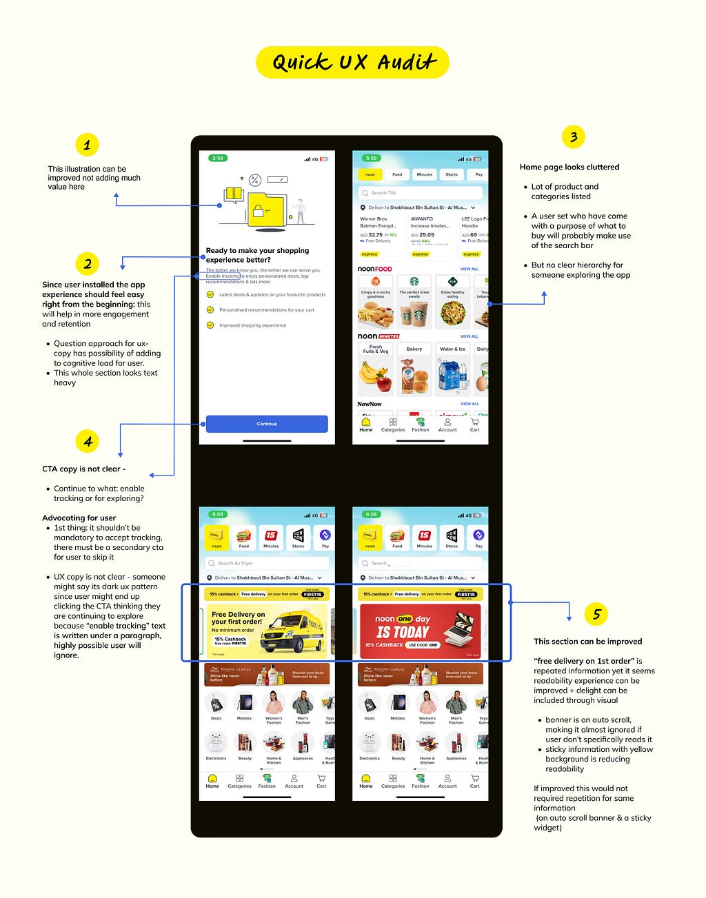
I performed Quick UX Audit & Experience improvement for “Noon”
Desclaimer — This is a project I have worked on my own and while working on it I was not associated with “noon” in any way. Solution being provided here lack business, tech, product & design context in which existing solution has been designed.
Backstory
I was scrolling LinkedIn when I came across a job posting by Noon — I didn’t know about noon prior to this. I did some quick research and found that — “Noon is an online retail company which offers fragrance, cosmetics, electronics, mobiles, clothing, shoes, home appliances, toys, groceries, books, tools, stationeries, and other product”.

As per above data top competitor for Noon is Amazon. I am a regular user of Amazon India and from my experience even though they have a vast variety of product categories which makes it a complex product, their design solution have good hierarchy and solves well for it.
I installed the Noon-app out of curiosity to explore, though I couldn’t make an orde since Its for UAE customes I set a random location to experince some flows for a 1st time user.

Next Step
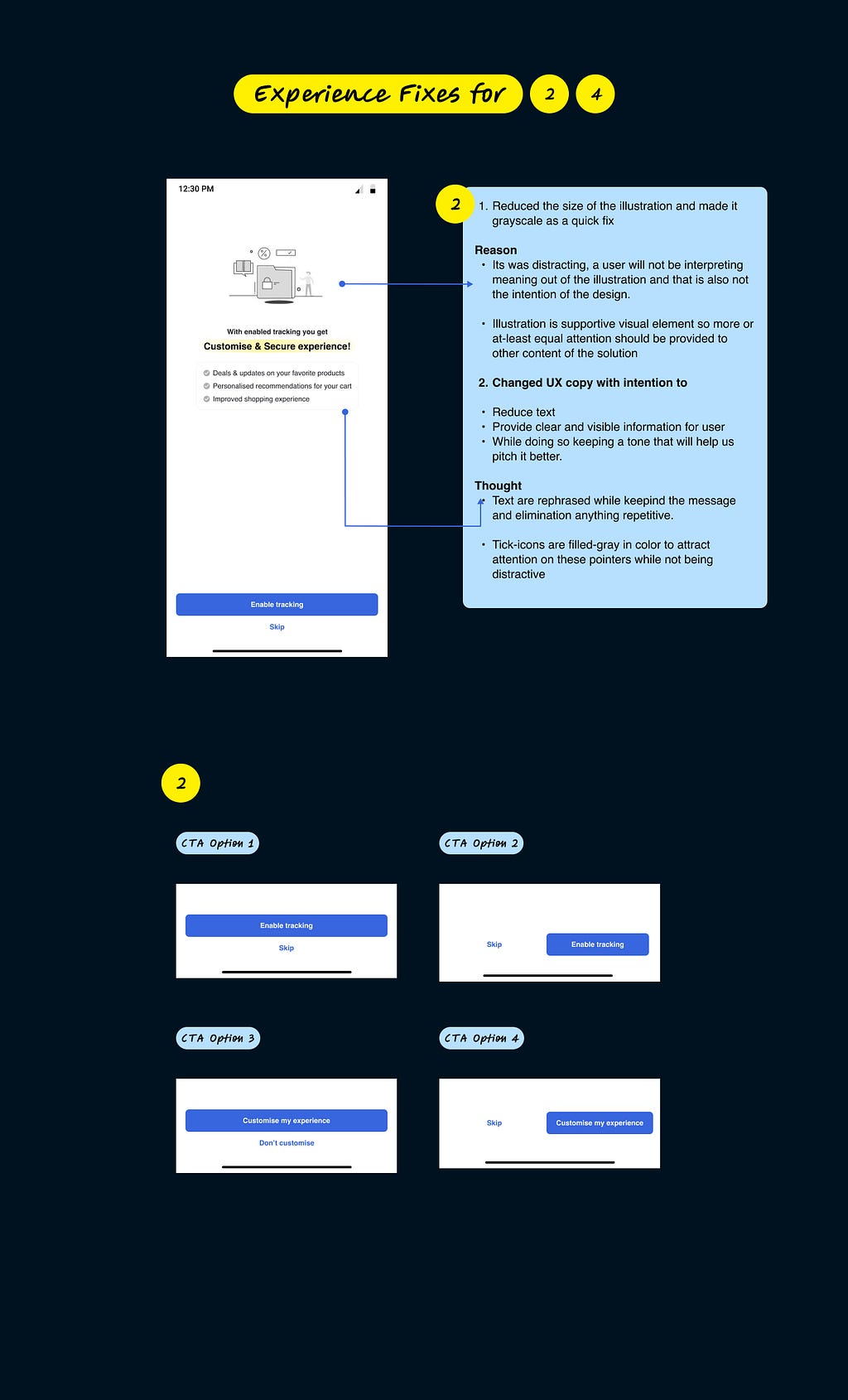
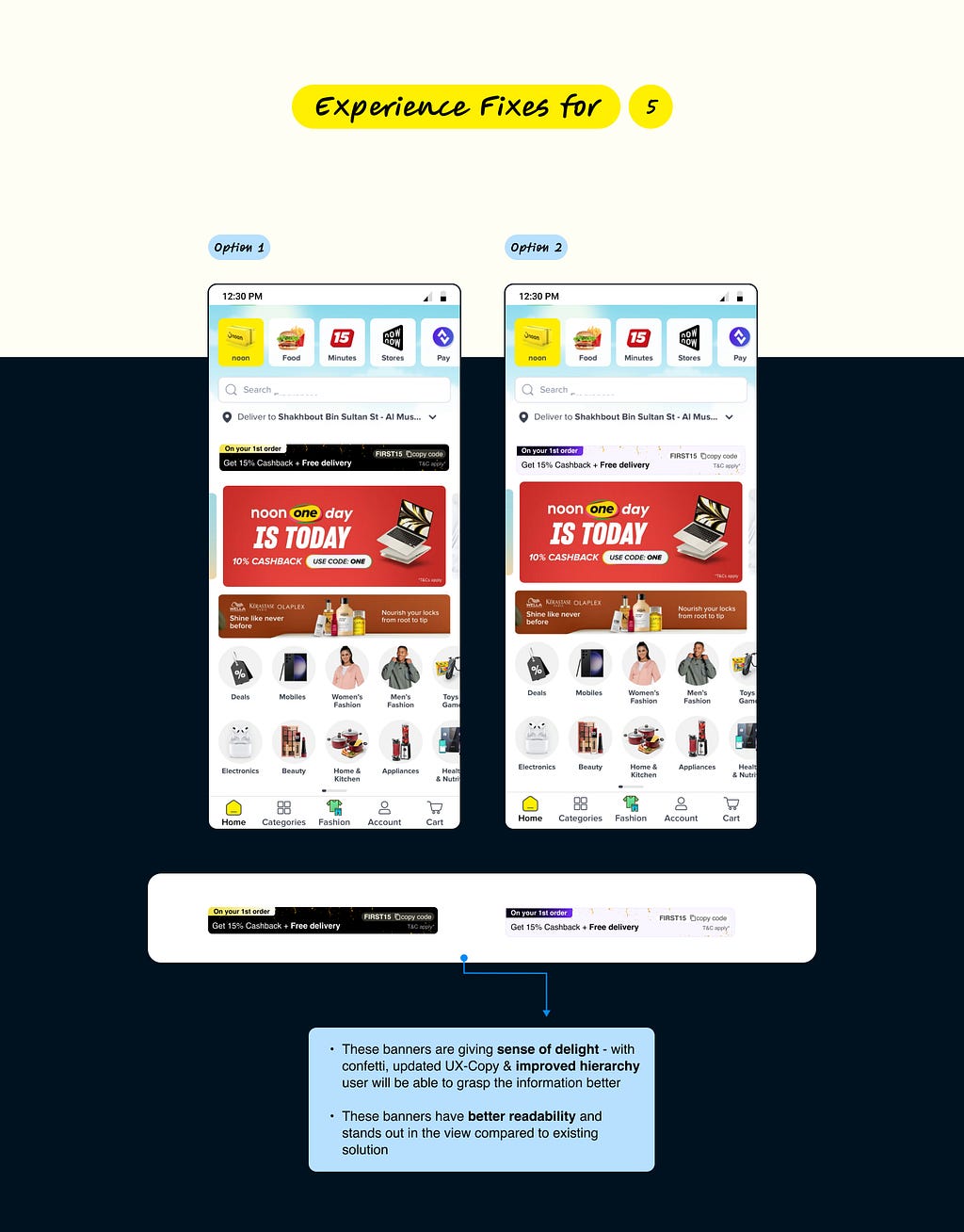
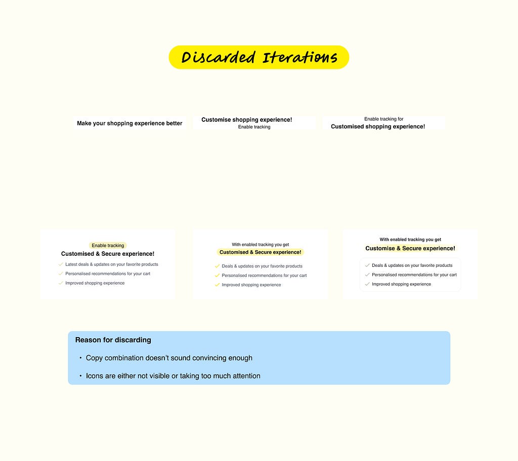
Out of listed issues I identified, I decided to solve for 2,4, 5 and partially solved 1.
Reason
— 2,4 & 5 were quick to solve, low effort with impact.
— 3 requires data around users interaction with the page to make decision and define hierarchy accordingly. this as well could have been made hypothetical but I decided not to invest energy for this now.


If you feel this article was informative or you have anything to add do drop your feedback in the comment section or on Linkedin . 🌟
I did Quick UX Audit & Experience improvement for “Noon” was originally published in UX Planet on Medium, where people are continuing the conversation by highlighting and responding to this story.