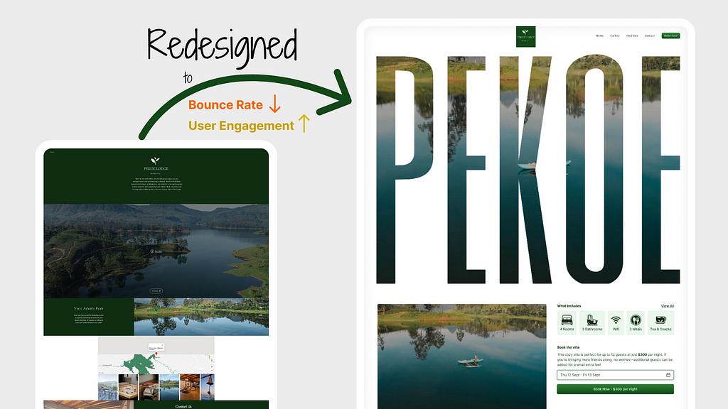
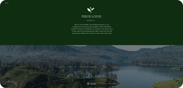
While searching for a villa for a vacation with my friends, I stumbled upon the stunning Pekoe Villa, which boasts an incredible view. However, when I visited their website for more information, I realized it didn’t do the villa justice, so I decided to redesign it.
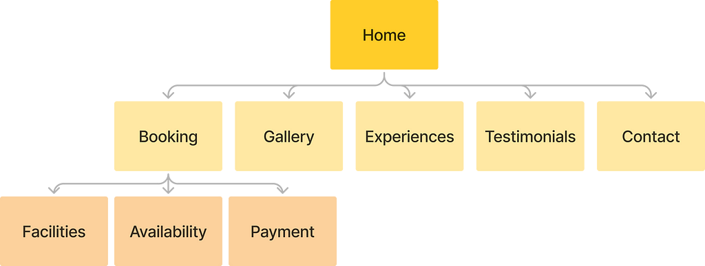
Since this is a simple website I created a simple IA (information Architecture)
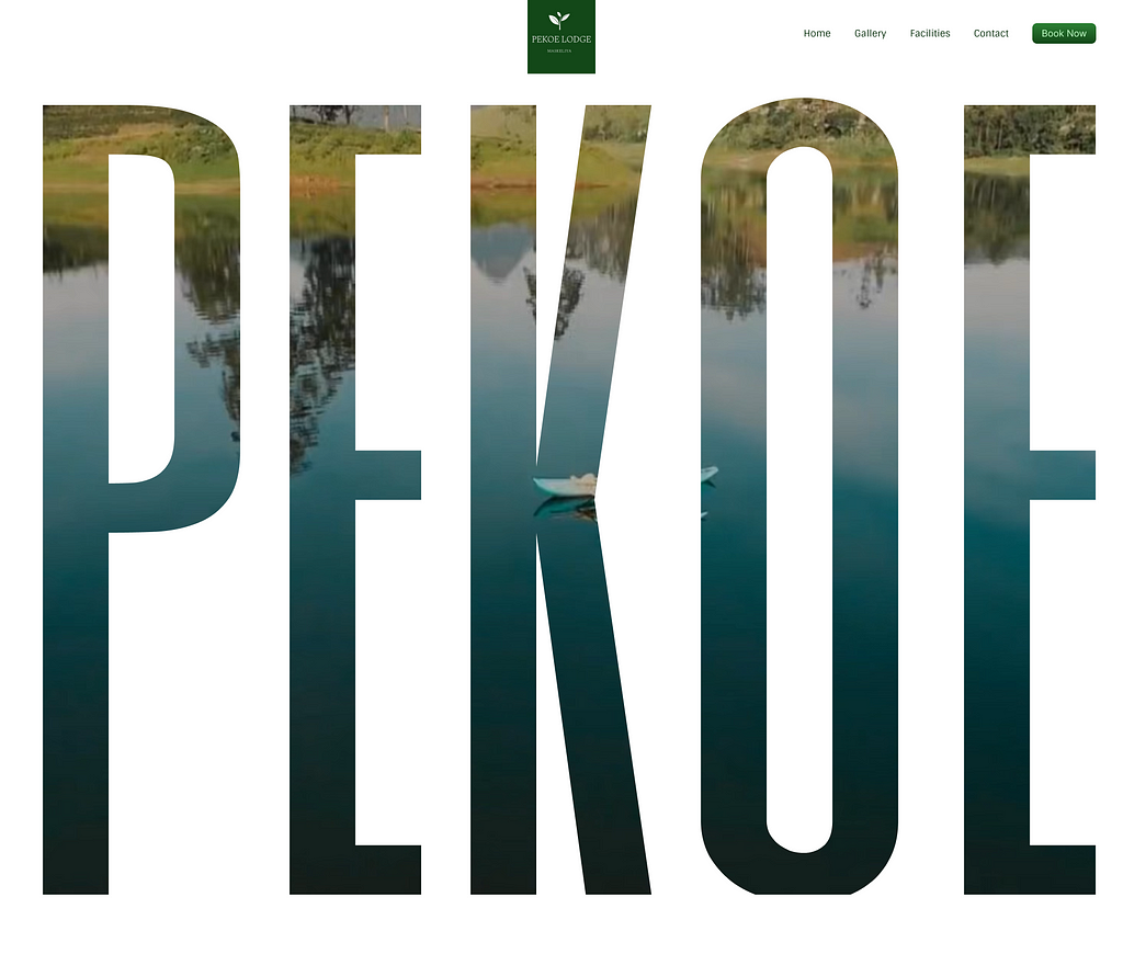
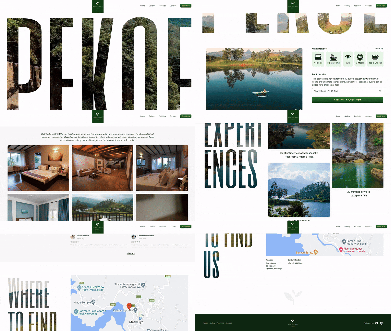
For the above-the-fold section, I decided to feature their stunning video, subtly masked with the villa’s name. The parallax effect adds a dynamic touch, capturing users’ attention and motivating them to explore the site further, ultimately helping to lower the bounce rate.
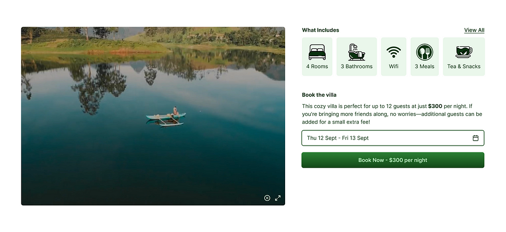
In the following section, I provided essential details about the villa, along with a booking option for available dates. To give users a better sense of what to expect, I placed a video alongside the information.

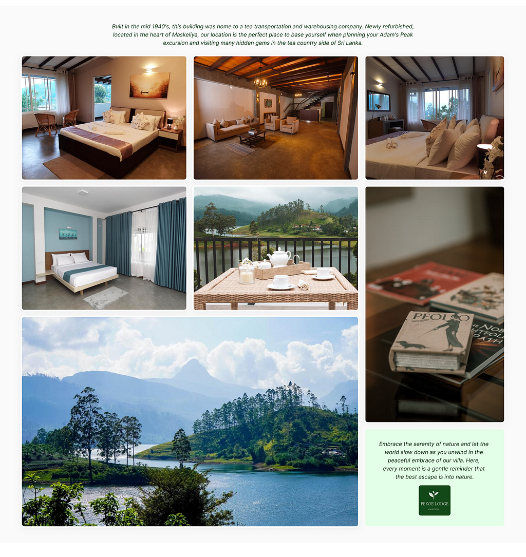
Next, I introduced a gallery and a brief history of the villa, which helps build trust and instills confidence in potential customers.
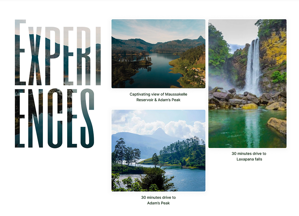
I then added an “Experience” section to inform users about nearby attractions and the ideal times to visit them, allowing guests to plan their stay more effectively.
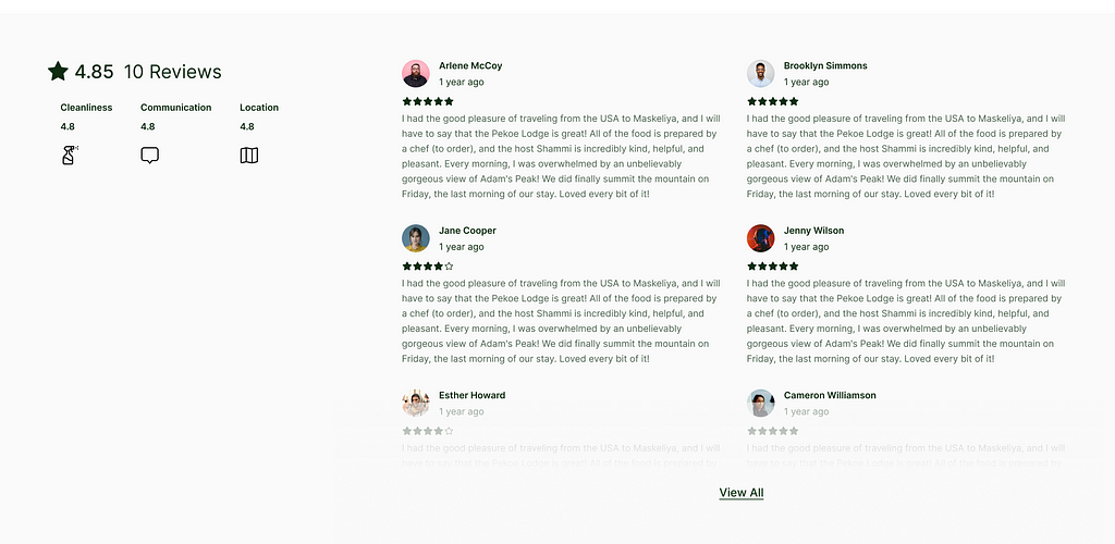
Reviews play a crucial role in deciding whether to purchase a product or book a vacation spot. To enhance trust and confidence, I added a section dedicated to customer reviews for those considering a stay at the villa.
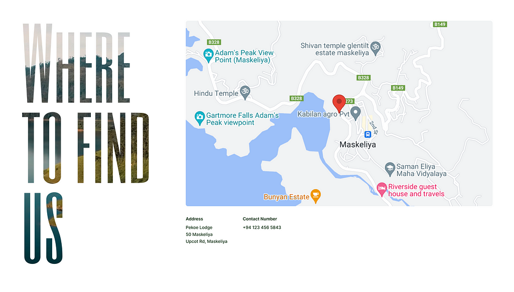
In the final section, I included contact details and a map to the villa’s location for easy navigation.
How did I test this
Since this is a redesign and I don’t have permission on the domain I don’t check on bounce rate and user engagement. But by sharing framer prototype with few people I was able to validate the mental model behind the website and confidence about this information architecture is working.
I shared Figma prototype with few people to get their feedback.
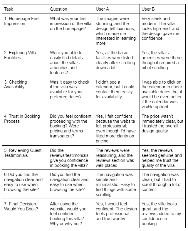
The redesign is a good start and effectively moves the website forward. However, further testing with additional users is needed to determine if any adjustments to the layout or content are necessary. Implementing heatmaps and other analytics tools can help us understand bounce rates and conversion rates, allowing us to assess the effectiveness of the design.
This is the final design.
https://drive.google.com/file/d/1Gg_-jEjy05KasiwomYFJtvbUCwBLvCVU/view?usp=sharing

Thank you
Reach out to me on shihanmalik.com | shihanmalik07@gmail.com | https://lk.linkedin.com/in/shihan-malik
check my designs at https://www.behance.net/shihan-malik
Website Redesign To Increase User Engagement was originally published in UX Planet on Medium, where people are continuing the conversation by highlighting and responding to this story.