UI design is significantly influenced by the Gestalt principles of grouping, a fundamental set of laws and guidelines many designers rely on to create effective interfaces. These principles explain how people visually group elements, with the five key categories being Proximity, Similarity, Continuity, Closure, and Connectedness.
This is my second article on Gestalt Principles, following the Proximity principle discussed in the first.
Similarity
Visually similar objects are seen as part of a group or pattern.
Color, shape, size, orientation, and movement can indicate that elements belong to the same group and likely share a common meaning or functionality.
Laws of UX
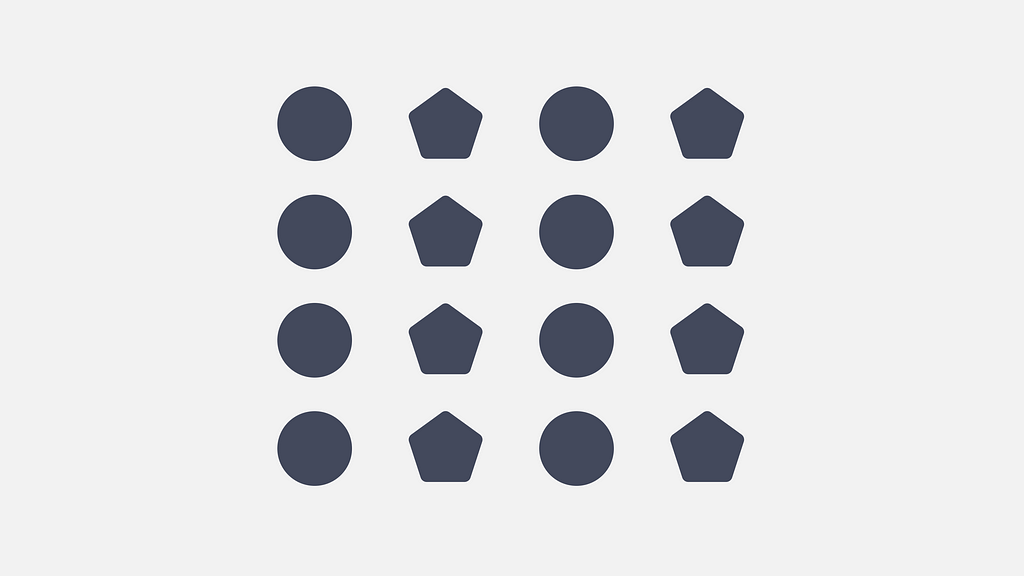
Similar shapes are perceived as a distinct group, with each shape forming a column.
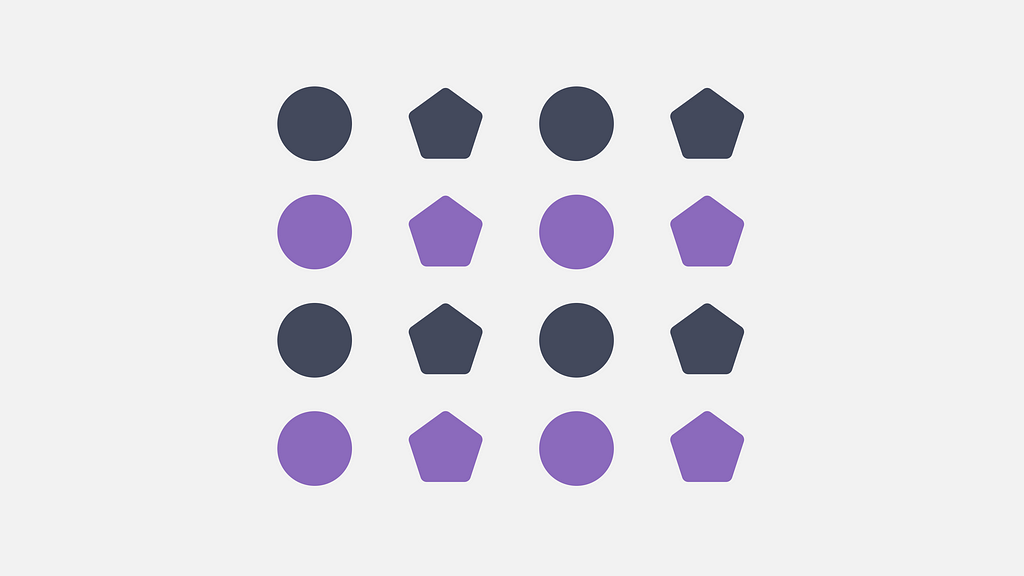
Color is a strong trait that helps unite these various shapes into rows now, even with their original columnar arrangement.
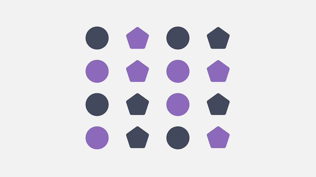
A similar color can still help distinguish and group elements even when applied randomly to different shapes.
In Photography

This photo shows trees in the shade as a separate group from those in the sunlight.
In Typography
Typography is a good way to use similarity to separate different elements. Different text styles, like headlines, paragraphs, and quotes, help to identify various parts of the content. This separation makes the text easier to scan. Without these differences, the whole text would look the same and dull.
In Interface
Color
Links are often the same color, which helps everyone recognize them. This consistent style makes clickable elements easy to spot, regardless of where they appear on the page. Users will see that all items with this color are related and work in the same way.
Shape
Buttons and filters are good examples of using similar shapes. Buttons are usually rectangular, making them easy for users to see. Filters often have rounded corners or a pill shape. This difference shows how filters are connected while keeping them distinct from buttons.

Size
In addition to color and shape, size is often used to indicate relationships and often signifies similar levels of importance.
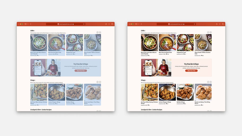
On a typical listing page, items usually share the same size and shape to demonstrate that they belong to the same category — such as products, articles, postings, etc. When an item differs in size or shape, it stands out. A common example of this is promotions displayed among regular listings, which helps differentiate them from standard items.
By grouping elements through shared traits like color, shape, or size, designers help users easily recognize patterns and connections. This improves navigation and usability across interfaces. Just like proximity, which we explored in the previous article, similarity works hand in hand with other Gestalt principles — such as closure, continuity, and connectedness — to craft intuitive and effective user experiences.
References:
1. Similarity Principle in Visual Design by Aurora Harley
2. Gestalt Principles of Design — Similarity by Christopher Butler
3. Gestalt Perception in Photography by Anton Gorlin
4. Laws of Similarity by Jon Yablonski
![]()
The Basics: Similarity Principle was originally published in UX Planet on Medium, where people are continuing the conversation by highlighting and responding to this story.