A practical guide to crafting user interfaces that communicate with purpose, clarity, and respect.

Introduction
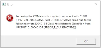
Have you ever seen an interface where the design is driven by technology rather than principles? Perhaps something like this:

Such designs commonly have the following attributes:
- Unnatural: It uses technical language and tone.
- Tech-focused: It reveals the underlying data structures.
- Complicated: It displays a lot of unimportant details.
What if there’s a better approach to designing a user-centric interface by:
- Leveraging everyday interpersonal communication skills that we’ve practiced all our lives?
- Helping you make confident, objective, and subjective design decisions by focusing on effective communication?
Enter UI is Communication — a better design approach suggested by Everett N. McKay in his book UI is Communication.
In this article, we’ll cover:
- The concept of UI is Communication
- Core principles
- Communication-driven design process with examples
UI is Communication
A user interface (UI) is a conversation between users and a product, to perform tasks that help achieve users’ goals.
Based on this premise, we can see UI as similar to the human communication we use in our daily lives. The difference is that it uses the language of UI instead of the natural language we speak every day.
By being communication-driven, we let communication guide both the design process and the UI design itself. We do this by first understanding what we need to communicate to users — before even thinking about screens.
Core Principles
Let’s look at the core principles of UI is Communication and the key attributes of communication-driven design.
Principle #1: Communicates purposefully
Useful: Good UI provides information that supports the user’s objective. Every UI element can be evaluated by what and how effectively it communicates. If a UI element communicates nothing, it should be removed.

Principle #2: Communicates with clarity
Concise: Good UI doesn’t over-communicate. It provides just the right amount of important information and, when appropriate, lets users access more details if needed.

Specific and explicit: Good UI also doesn’t under-communicate. It provides precise information, at the right level of detail, so users know what to do.

Natural: Good UI uses the language its users speak, conforming to their mental models. Users shouldn’t need special knowledge, documentation, or trial-and-error to understand something.
Timely: Good UI provides information at the right time — neither too early nor too late — and in the right context.
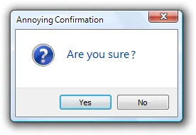
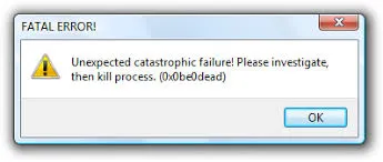
Principle #3: Communicates politely, respectfully, and intelligently
Good personality and tone: Good UI behaves like a likeable person who respects users.

Interrupts purposefully: Good UI doesn’t interrupt the user’s workflow with unnecessary or unimportant questions.
Inspires confidence: Good UI doesn’t over-warn or create false alarms. Nothing should be described as catastrophic or fatal.
Communication-Driven Design
How does it work?
Communication-driven design works by imagining you’re having a human conversation with your user in person. This includes:
- Steps: How would you describe or instruct users to complete a task in a logical order?
- Questions: How would you ask users for information, and when? Is the question even appropriate (maybe you already know the answer, the user doesn’t care, or they can’t answer intelligently)?
- Answers: What details would you share or not share with users, and when?
- Language and tone: What kind of language or tone would you use in this context?
The Process
To make the process more relevant and practical, let’s use an example. We’ll assume we’re designing a banking app where the user’s task is to transfer money from one bank account to another.
Step 1: Outline interaction conversations
Interaction conversations serve as a high-level guide for task and screen design.
The goal is to help:
- Think through how a user might complete the task in person.
- Identify information that would be exchanged in a real human conversation.
- Identify what the UI needs to support that conversation — through interaction and visual design.
At this stage, we shouldn’t be making UI design decisions yet.
Things to outline in the interaction conversation include:
- Instructions: What you’d say to guide users through a task.
- Questions: What you’d ask users to collect information.
- Choices: Options you’d provide to help users answer questions (consider defaults).
- Supporting UI: UI elements that help translate conversation into interaction (e.g. input types, actions).
- Success criteria: Requirements to ensure well-designed interactions and flows.
Example: Imagine you’re a bank officer helping a customer transfer money. You’d ask:
a. Who are you sending money to?
- Choices: Existing recipient, new recipient
- Default: Show most recent recipients
- Supporting UI: Action to add new recipient task flow, search filter (by name) for recipient
- How much would you like to transfer?
- Choices: Free input (2 decimal places)
b. Would you like to add a note?
- Choices: Optional text field
c. Could you review the information before we make the transfer?
- Choices: Confirm or return to edit
- Supporting UI: Summary page with confirm action
d. You’re all set. Your money has been transferred.
- Supporting UI: Success confirmation with action to exit
Once done, evaluate the conversation with the core principles and make sure all major use cases are supported.
Step 2: Design the task flow
The goal is to define:
- Required pages
- Information on each page
- Navigation between pages
Rather than creating detailed wireframes, focus on the essential steps and how they communicate. Break the interaction conversations outlined into:
- Main pages: Defined by interaction steps.
- Main instruction: Clear page headers.
- Core content: Key information needed to complete the task.
- Navigation: How users move through steps.
- Actions: Additional things users can do on each page.
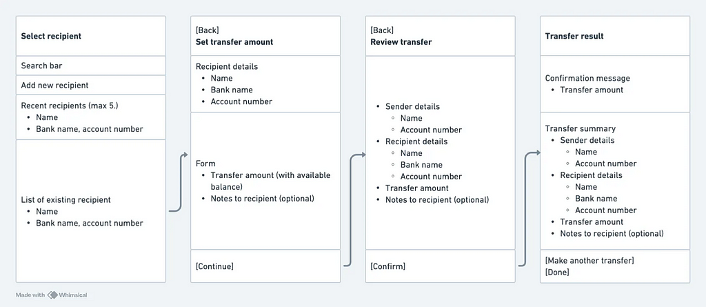
Once done, evaluate and optimize the task flow, ensure that:
- All steps are necessary and complete.
- Logical order is maintained.
- Grouping makes sense (combine or split as needed).
- Language is user-centered and natural — changed noun-based labels to verb-based ones (e.g., ‘Review transfer’ instead of ‘Transfer summary’).
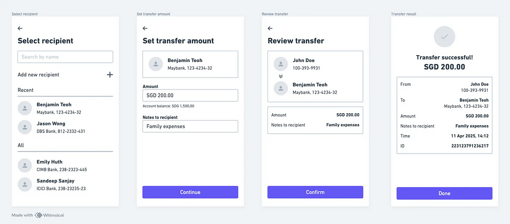
Step 3: Design the pages
Now detail the page-level design. Include:
- The right components for information display
- The right input controls (simplest and most constrained)
- Labels and helper text (e.g., input labels, placeholders)
- UI feedback
- Layout optimized for scannability
- (Optional) Dynamic interactions and behavior
🎉 Hooray!
We’ve now defined the UI using a communication-driven approach. The next step is to evaluate the design — whether through design critiques or usability testing, depending on your context.
Summary
To recap the key points of this guide:
- A UI is a conversation between the user and the product — using the language of UI instead of spoken language.
- Core principles: Communicates purposefully (usefulness); communicates with clarity (concise, specific, timely, and natural); communicates politely, respectfully, and intelligently (good tone, purposeful interruptions, confidence-inspiring).
- Communication-driven design starts by imagining a real human conversation — focusing on steps, questions, answers, language, and tone.
- The process includes — outlining interaction conversations; designing the task flow; designing the pages.
UI is Communication: A Communication-First Approach to UI Design was originally published in UX Planet on Medium, where people are continuing the conversation by highlighting and responding to this story.