
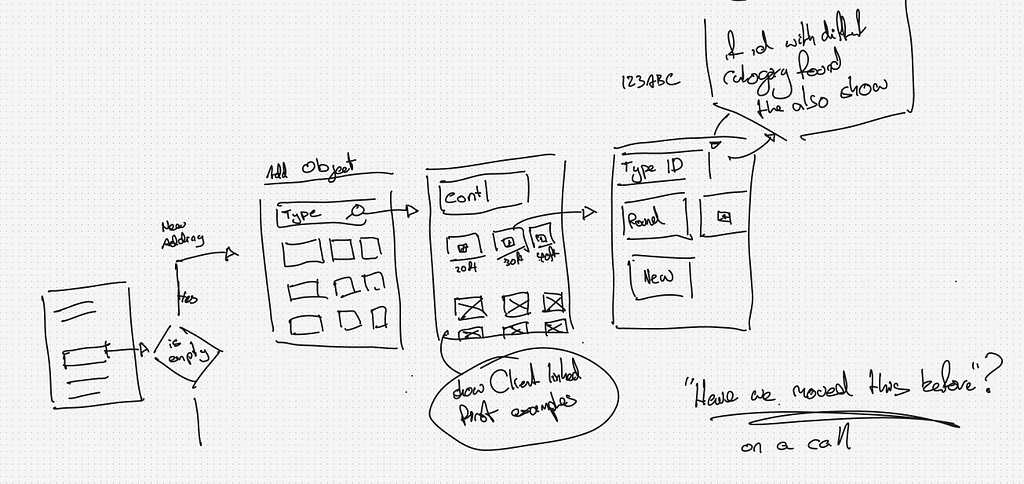
Back in 2018 I wrote about the most common UX mistakes low-code developers make.
A lot has changed since then, except for one thing:
Developers are still coming up with poor excuses to ignore good UX.
With vibe coding speeding up app creation, these mistakes are showing up even more often, especially when teams move from a single app to a full enterprise landscape.
Let’s dive into the most common UX pitfalls I still see in the wild, the excuses behind them, and how to fix them.
1. Consistency is King/Queen.
Build consistently. It’s the number one UX improvement every developer can make.
A design system only works when everyone builds the same page in the same way. When that happens, the benefits are obvious:
- Developers can work on each other’s pages without becoming bottlenecks.
- The CSS team deals with fewer one-off HTML scenarios.
- Predictable HTML makes theme swapping and real-time white labelling possible.
Yes, it might feel slower at first, but consistency will save you far more headaches later.
Excuses I hear:
- But this is how I have always built pages.
- Why is there not a building block for this?
- There are too many building blocks.
- Finding examples in the Living Style Guide is hard work.
- I have deadlines.
Responses
But this is how I have always built pages.
Then you have always been doing it wrong.
Time to get with the program.
Why is there not a building block for this?
Our design system treats developers as engineers. We provide the Lego blocks and show you examples of how to use them. Building and maintaining every possible block is not realistic. Blocks also do not cover complex screens with multiple dataviews or listviews.
There are too many building blocks.
Whenever we add more, developers complain there are too many and end up using only one anyway.
Consistency is not optional.
It is the foundation for scalable UX.
2. Interaction Patterns.
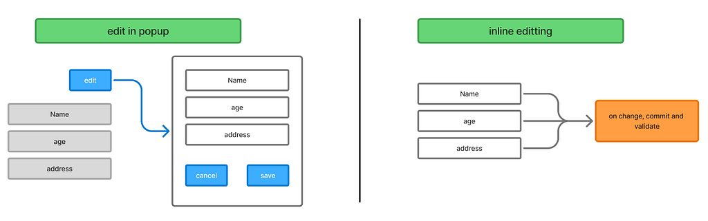
Users rely on predictable interaction patterns to understand and navigate your app. When popups or inline edits are used inconsistently, it disrupts their workflow, creates confusion, and makes the app feel unpredictable.
Common trouble spots:
- Editing data: should you open a popup with save-and-close buttons, or allow inline editing?
- Inline editing: how do you communicate that changes are saved or cancelled?
- Drag-and-drop: is data saved the moment it is dropped?
- Popups with popups? is this ever ok?
Excuses I hear:
- This is how the Mendix defaults work.
- I think this pattern is better than the one my colleague uses.
Responses:
This is how the Mendix defaults work.
Defaults are not always best. Many of Mendix’s defaults date back to 2015 and still exist for backwards compatibility. They are fast to generate but often misaligned with modern UX. For example, most users do not use the “new” button on datagrids because we often need more control over how objects are created.
We also avoid generated overview pages because our navigation is part of the layout and uses a different widget.
If you are unsure, talk to the UX owner.
I like this pattern better.
Do you like it because it is easy to build? Because it is easier for users? Because other developers will understand it? Or because it follows proper server syncing? There is a big difference between preference and good UX. Always align with the UX owner.
“Developers care about good UX, but the balance is tricky. Speed and polish both matter, and developers play a key role in clarifying the trade-offs. Ultimately, it’s the PM who sets the priorities, so the team can focus on building with confidence”
— Sophie Bakker, Mendix MVP
3. Too much or too little whitespace
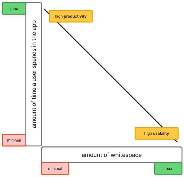
Whitespace is a constant debate. Some users complain about scrolling, others say things feel too cramped. You will never make everyone happy, which is why the design team should set the rules.
If no guidelines are available, use this simple rule of thumb:
- The more often a page is used, the less whitespace it should have.
- The less often a page is used, the more whitespace it can have.
Think about Figma. The main editor UI is dense and compact because people use it every day. The Figma homepage, on the other hand, has plenty of whitespace because it is visited less often and needs a stronger first impression.
Excuses I hear:
- Users hate scrolling.
- I want an overview of everything.
- It looks cleaner and easier to sell to management.
Response:
If your design system is set up correctly and developers build consistently, you should not need to worry about the right amount of whitespace. The design system defines it for you.
Example CSS:
.gutters.autolayout  { gap: var( - spacing-lg); }
.card.autolayout     { gap: var( - spacing-sm); }
.panel.autolayout    { gap: var( - spacing-md); }
Whitespace is not decoration. It is a functional part of UX.
The trick is knowing when to use more and when to use less.
4. Fancy widget misuse (toggle widget, this is you)

Just because a widget is fancy does not mean it is the right choice.
Low-code platforms make it very easy to swap basic features for flashy ones, but flashy does not always equal useful.
A common example, say you want to set a boolean attribute ‘isDone’ to true. Our options include:
- Button + microflow
- Checkbox
- Two radio buttons
- Toggle
Depending on your design system, only one of these options is correct. Choosing the wrong one breaks consistency and confuses users.
Tip:
Always follow consistent interaction patterns. Refer back to Section 2. If your team has agreed on rules for which widget to use in each scenario, stick to them. Fancy options should never replace clarity and predictability.
If you want to learn about correct toggle usage, check out the NN groups article on this
5. Table vs Layout-grid.
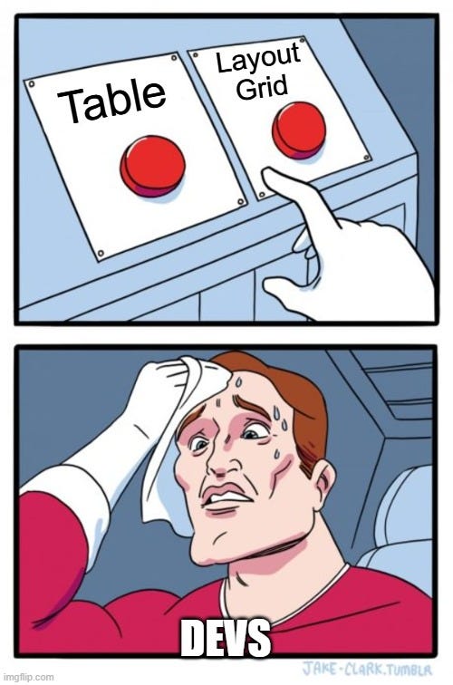
Knowing when to use a table and when to use a layout-grid is simpler than it seems.
The easiest question to ask is: What happens if you stack all the information vertically?
Tables
Tables <table> are not responsive by default. They show clear relationships between rows and columns, which matters when multiple entries exist, making them great for comparing data.
The DOM sees <table> and understands that it holds data in a tabular format.
Layout-grid
Layouts-grids (CSS Grid) communicate to the browser that this element is part of the layout. The element does not have a defined place or relationship with the data, because of this, the CSS allows us much greater freedom to position elements in relation to other elements.
Layout (single entry)
This is a layout because collapsing the content vertically keeps relationships clear.
Table (multiple entries)
This is a table because the relationship between columns and rows matters. Collapsing the table would break the data structure.
Scenarios that often confuse developers.
- A table with a single entry
It is still a table. - A table with a lot of data, but on mobile
Allow horizontal scrolling. - A table, but when viewed on mobile, it should collapse
Both. For the desktop, use a table; on smaller screens, remove the table, and opt for cards (that can be positioned as a layout-grid)
Questions to ask your UX team:
- Will the data always be shown in a table?
- Will it ever collapse?
- Will new entries be added frequently?
Bonus tip:
When building widgets, use the correct HTML elements instead of relying on JavaScript and inline styling. For example, if your data is tabular, render it as a <table> element. This allows users to copy and paste it directly into Excel or Google Sheets while preserving formatting.
Standardized, semantic HTML is a huge win. It makes your widgets easier to maintain, improves accessibility for all users, and ensures your content works smoothly across apps and platforms.
6. Cards vs panels.
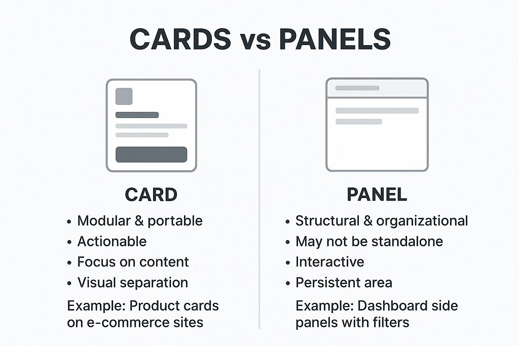
Many design systems distinguish between cards and panels, and understanding the difference helps maintain consistent UX.
- Card → Clickable unit.
Can contain content, but not other cards or panels. - Panel → Structural container.
Can hold nested panels or cards.
Summary / Key Takeaways
If you take anything away from this, let it be these six principles:
- Build consistently. Follow your design system so every page is predictable and maintainable.
- Stick to shared interaction patterns. Users learn your app once; don’t make them guess how things behave.
- Respect whitespace. Compact for daily-use screens, spacious for rare or goal-focused interactions.
- Use widgets wisely. Fancy does not mean better. Follow the patterns your team has agreed on.
- Know when to use tables vs layouts. Tables for multiple, structured entries; layouts for single or nested content.
- Understand cards vs panels and use semantic HTML. Cards for actions, panels for structure, and always pick the right HTML elements to improve accessibility and maintainability.
Follow these rules, and your UX will be more consistent, user-friendly, and future-proof. Small choices today, like picking the right HTML element or using a layout consistently, pay off in big ways across your apps and enterprise landscape.
Common UX mistakes everyone still makes 2.0 was originally published in UX Planet on Medium, where people are continuing the conversation by highlighting and responding to this story.