
Prompt treadmill is a situation that happens when you get stuck endlessly rewriting prompts to “make AI understand” your design intention, instead of actually moving forward. It’s one of the most annoying things that can happen when you work with AI, as you feel like you’re not moving forward, but instead burn rubber while remaining stuck in a rut.

In this article, I want to offer 5 practical recommendations that will help you avoid a prompt treadmill.
1. Shift from prompts → protocols
A prompt is a command we provide to AI so it can perform a task for us. When we interact with humans, our commands might be vague, but the great thing about humans is that we can ask clarification questions to understand the intention better. When it comes to AI, many times it simply does what we ask it to do. Yes, it can ask clarification questions, but this happens after the tool already generates something for us. This clarification feels more like an attempt to fix something that is not right, rather than do something right from the first attempt.
Luckily, we can reuse the approach that we have in our society for this specific situation, and it’s called protocol. Protocols are something that engineers, medical professionals, and officers use when they deal with a particular situation. The protocol minimizes the risk of mistakes/unwanted behavior and ultimately leads to more controlled output.

When it comes to design with AI, I suggest treating your workflow as a protocol, not a chat. It means that you define reusable design intents and structure them as parameterized templates. You use templates when you interact with AI tools. Here is an example of a protocol I use for Figma Make when starting a new session for a mobile design.
[Design Task]: Create mobile dashboard
[Brand Values]: Calm, innovative, premium
[Visual Language]: Glassmorphism, high contrast
[Platform]: iOS
[Constraints]: WCAG AA contrast, Apple HIG compliance
This way, you feed context once, and then feed AI-specific prompts to craft a particular screen/state or iterate output consistently (more about it in recommendation 3).
2. Use context layers
When you design a new user flow, you likely want to integrate it naturally into the existing design. So you don’t need an abstract design that will look good on your monitor. You need a design that you can take, fine-tune, and bake into the existing product. And if you want to achieve this goal you need to create a context layer for your AI tools.
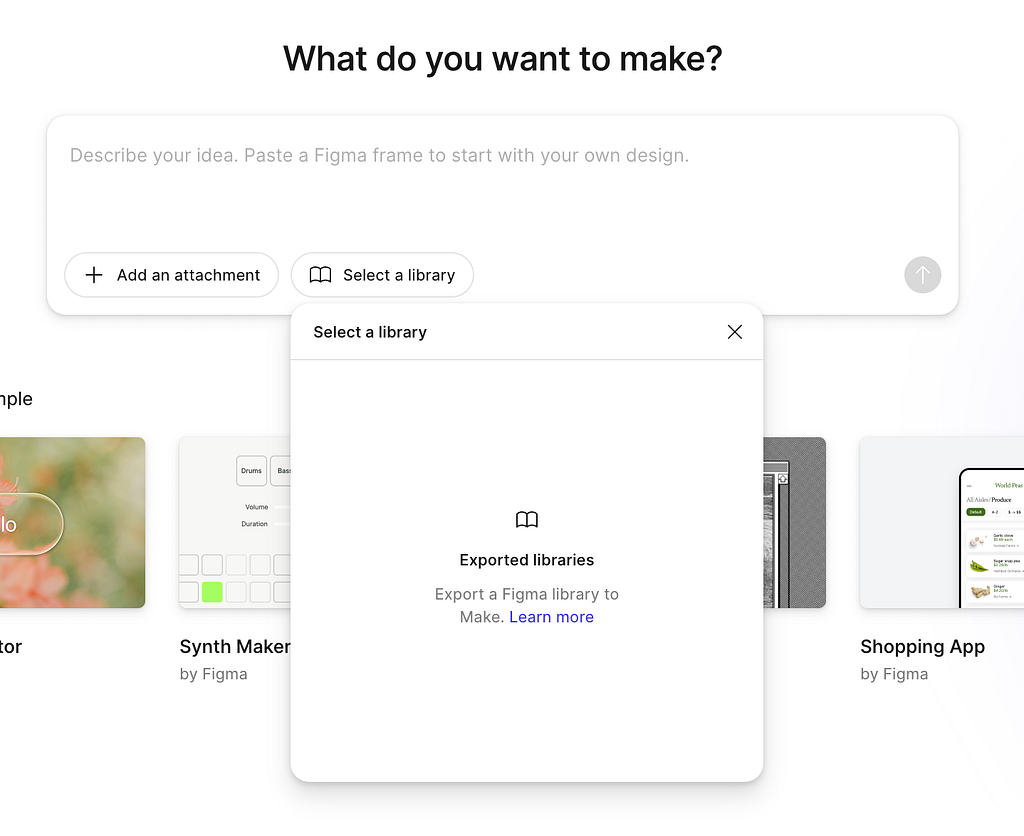
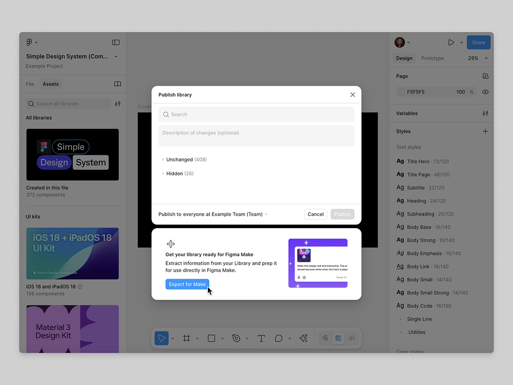
You need to embed your design system, tone, and accessibility rules into the session context. Tools like Figma Make allow you to add a library to your context. This way, the information about your design decisions, such as components you use or styles like colors and fonts, will be plugged into Figma Memory, and it will rely on it when building a design.
3. Modularize your prompts
When you have a protocol and design context in place, you can start crafting and iterating your design. And you will use text prompts for that. One common mistake that many designers make when they interact with AI is mixing different messages in a prompt. I call this situation a ‘prompt soup.’ An AI tool can have a hard time analyzing prompt soup simply because it doesn’t have a clear structure. For example, if you mix a styling command with a command about a functional logic, it’s hard for AI to understand which part of this command is more important at the moment. So I suggest avoiding prompt soup altogether.

Instead, you should break complex prompts into atomic modules:
- Goal prompt: “Design a checkout flow that reduces friction.”
- Visual style prompt: “Follow Apple-inspired minimalist UI.”
- Interactions prompt: “Ensure all interactive elements meet 44px tap target.”
Think of it not as a layers, but rather Lego pieces. You can combine and remix modules instead of rewriting from scratch. Here is how it works in real life.
Suppose you’re building a food delivery app and want to write this prompt
“Design a clean and modern iOS home screen for a food delivery app that feels local and friendly, with orange accents and a search bar at the top.”
This is a messy prompt because it mixes functional design decisions with styling. You can split it into functional modules: reusable “prompt blocks” for goal, style, constraints, and context.
Mobile 1 — Goal prompt
Defines what you’re designing and why.
[Goal]
Design a home screen for a food delivery app.
The screen should help users discover nearby restaurants and quickly reorder past meal
Module 2 — Visual Style Prompt
Defines the aesthetic direction.
[Visual Style]
Design style: Friendly, local, warm
Color palette: Orange, off-white, and neutral gray
Typography: Rounded sans-serif (like SF Pro Rounded)
Mood: Approachable and community-driven
Module 3 — Interaction & Layout Prompt
Defines structural logic and behavior patterns.
[Layout & Interaction]
Top: Status bar + logo centered
Below: Location + notifications row
Main: Search bar with placeholder “Search restaurants or dishes”
Next: Horizontal carousel of featured restaurants
Bottom: Tab bar with 4 icons (Home, Orders, Profile, Cart)
Module 4 — Accessibility & Platform Rules
Sets design constraints and platform-specific expectations.
[Accessibility & Platform]
Follow iOS HIG
Tap targets ≥ 44px
Text contrast meets WCAG AA
Use native bottom navigation patterns
Module 5 — Brand / Emotional Context
Adds tone and personality, ensuring brand consistency.
[Brand Context]
Brand values: Friendly, fast, local
Emotion: Sense of comfort and trust
Avoid over-polished “corporate” look — keep it human
You can stack or swap modules depending on what you want to achieve:
- Swap [Visual Style] to test a “premium dark” aesthetic
- Keep [Goal] and [Layout] unchanged
- Reuse [Accessibility] across multiple screens
It’s like prompt-based atomic design — each module is a reusable “atom” of context.
4. Ground AI in your design artifacts
Humans and AI have one thing in common — we both love visuals. Its nearly impossible to find a designer who won’t appreciate seeing a visual as a reference. Just like humans, AI works best when you feed it real examples — screenshots, style guides, tokens, and copy tone samples. When you’re exploring a new visual or functional language for your app, you can provide a visual sample that AI can see and learn from.
5. Iterate with feedback loops, not new prompts
I’ve been in the desing industry for more than a decade, and one interesting thing I’ve noticed is that not many people are good at communicating desing feedback. It’s quite common to hear things like “this is not good” or “I don’t like it” during design review sessions without any additional details.

Unfortunately, this ‘vague feedback’ problem is even more relevant in the era of AI. For example, many designers, when they review a design generated by AI and want to tune it, say something like this
“No, try again but make it simpler.”
This is an excellent example of a vague prompt. Just like a human designer, AI will have a hard time figuring out what is wrong with the design. So it’s better to provide a more detailed prompt like
“The visual hierarchy is too dense. Reduce typographic contrast and spacing by 20%.”
Precise, design-specific feedback will keep you on a focused iteration loop rather than a guessing cycle.
🚨 New AI-powered product design community 🚨
If you’re passionate about building digital products and want to make the most of latest tools (including AI tools), I’d love for you to join me in the Product Design Community on Skool. You will have access to tutorials and cheatsheets for design and automation tools as well as live Q&A sessions with me.
👉 Join for free here: https://www.skool.com/product-design-7868
![]()
5 Things To Do To Avoid Prompt Treadmill When Crafting Design With AI was originally published in UX Planet on Medium, where people are continuing the conversation by highlighting and responding to this story.