A side-by-side look at how two navigation giants solve the same problems differently
When you open a navigation app, you’re not thinking about design. You just want to reach your destination safely and easily. But behind that simple experience lies hundreds of small design decisions that influence how you drive, what you notice, and how confident you feel using the app.
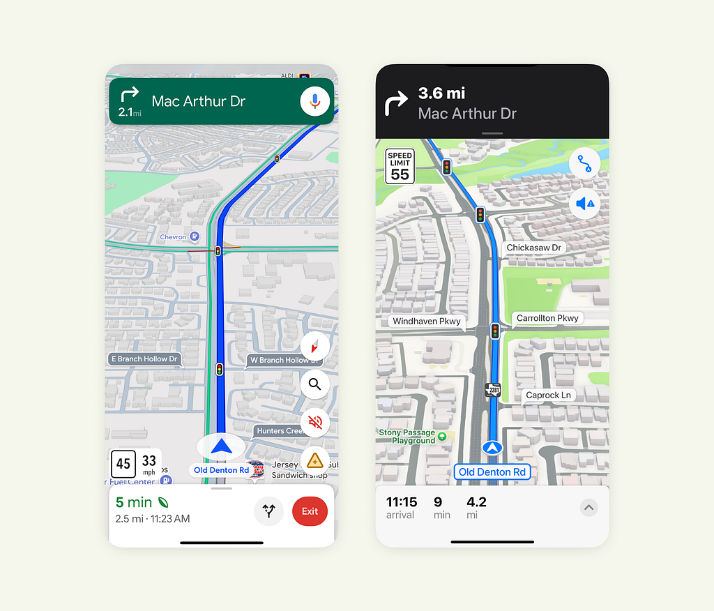
Both Google Maps and Apple Maps solve the same problem, helping people navigate, yet their design philosophies couldn’t be more different. One leans toward information density and quick action. The other focuses on clarity, calm, and visual harmony.
As designers, these details are worth studying. They show how interface design can shape user behavior without users even realizing it.
Let’s break down five design elements that reveal how these two products think.
1. Speed Limit Placement
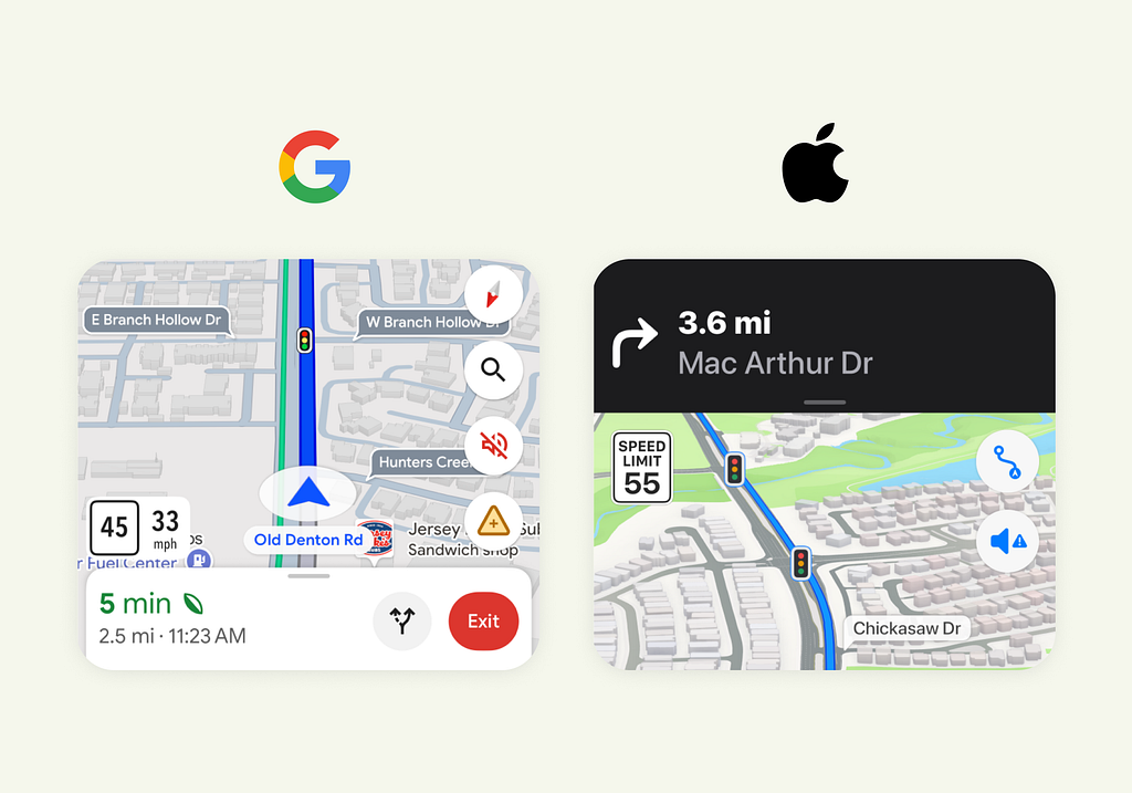
In Google Maps, the speed limit sits close to your current location and route line, exactly where your eyes naturally go when driving. The app also shows your live speed, and when you exceed the limit, it highlights the change to draw attention. This design helps users stay aware without shifting focus from the road.
Apple Maps places the speed limit near the top, just below the next navigation step. This spot makes sense too, since drivers often glance there for upcoming turns. The icon itself resembles a real-world speed limit sign, creating a sense of familiarity and instant recognition.
Both designs have logic behind them. Google focuses on at-a-glance awareness, while Apple leans on familiarity and visual consistency.
2. Bottom Bar Information
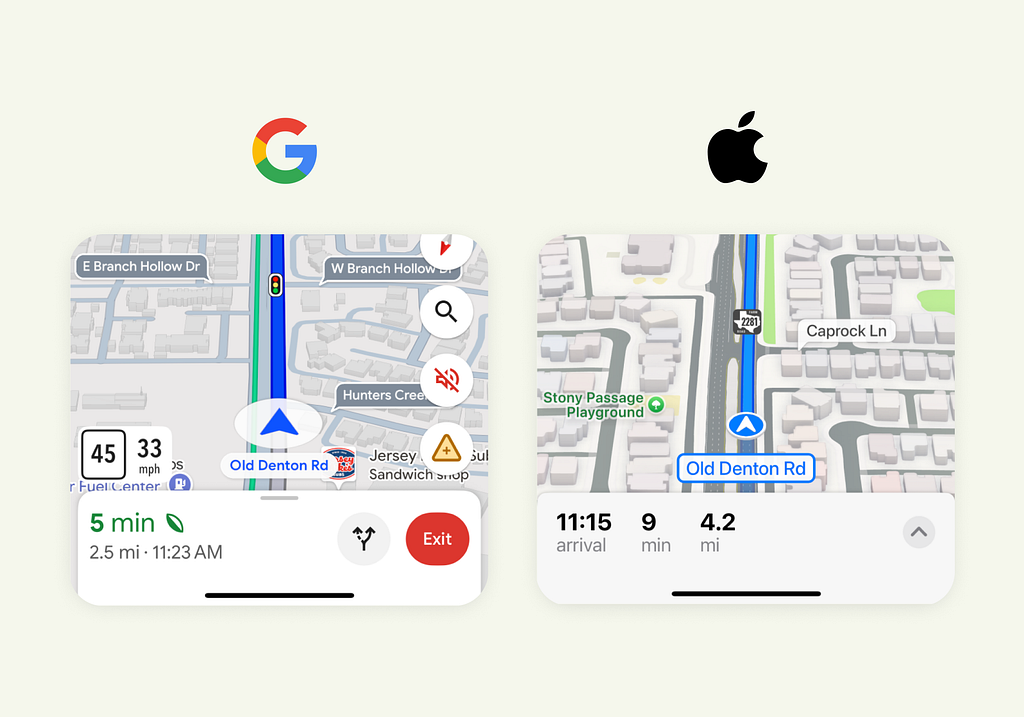
Google’s bottom bar carries a lot of weight. It shows distance, time, ETA, and sometimes even eco-driving info. The mix of colors, typography sizes, and icons helps users scan information quickly. But it can also feel dense, especially in bright environments or when you just want to focus on the route.
Apple takes the opposite approach. It keeps the bottom bar clean and balanced, using consistent typography and minimal color. The information is easy to process, but since everything looks similar, scanning specific details takes a bit more effort.
This difference highlights two design mindsets. Google optimizes for speed and quick scanning, while Apple optimizes for simplicity and calm focus.
3. Action Icons and Accessibility
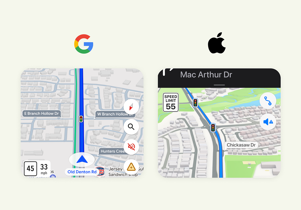
Google Maps places its quick actions, like zoom, layers, and report buttons, near the bottom right. This area is thumb-friendly and easy to reach on most phones. But there’s a tradeoff. The colorful icons draw attention and overlap the map, which can make the interface look busier and slightly block the view.
Apple Maps takes a restrained approach. It keeps just a couple of actions in the top-right corner, styled consistently in a neutral color. They’re less reachable, but they stay out of the user’s main visual path. For someone who doesn’t need these controls often, this placement keeps the interface clean and distraction-free.
It’s a simple reflection of different user assumptions. Google designs for active control, Apple designs for passive clarity.
4. Top Bar Design
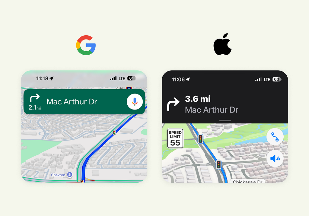
Google’s top bar floats over the map instead of blocking it. This makes smart use of space and keeps the navigation visible. The green color immediately stands out, even in sunlight, and the inclusion of the voice command button reinforces usability while driving.
Apple’s top bar feels more deliberate. It uses a solid black background that covers the header area, making it easier to read in any condition. The typography is bold, large, and minimal, showing only what’s essential. It’s less compact than Google’s version, but visually calmer.
Both are valid approaches. Google’s design favors efficiency and compactness. Apple’s favors clarity and cognitive ease.
5. The Map View Itself
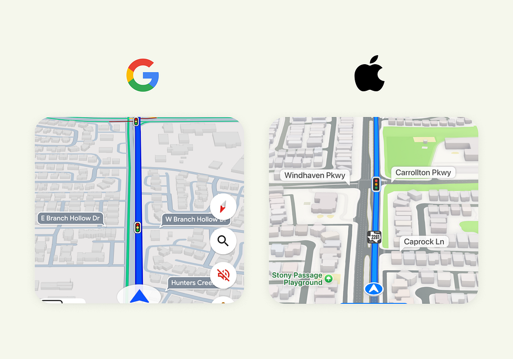
Google Maps prioritizes clarity and data density. Every detail serves a function: road labels, traffic layers, and POIs. The experience feels fast and informative, but a bit mechanical. It’s built for quick decisions rather than visual pleasure.
Apple Maps treats the map like a 3D environment. Roads have depth, buildings appear in realistic form, and colors are soft and balanced. This gives users a stronger spatial understanding and a sense of place. It’s less about raw data, more about visual orientation.
In short, Google optimizes for task completion. Apple optimizes for experience.
What This Comparison Really Shows
Design is a reflection of philosophy. Google approaches maps as a data tool, something to help you act quickly and confidently. Every decision centers around efficiency, clarity, and control. Apple approaches maps as a spatial experience, something that feels calm, human, and visually grounded. Every decision centers around focus, balance, and emotional comfort.
Neither is right or wrong. They simply prioritize different user needs and mental models. And that’s the real lesson here: thoughtful design isn’t just about where elements go, it’s about why they belong there.
Whether you’re designing a dashboard, a travel app, or a SaaS product, these micro decisions, placement, hierarchy, visual weight, and interaction cost shape how users feel and behave.
Because great design doesn’t just guide users. It guides attention, comfort, and trust.
PS: Apple recently refreshed Maps with iOS 26.
![]()
Google Maps vs Apple Maps: Subtle UX Choices That Shape How We Navigate was originally published in UX Planet on Medium, where people are continuing the conversation by highlighting and responding to this story.