Forms have better usability than conversational UIs for 9 reasons. There is one exception: simple and infrequent use cases.
Authors: Zsombor Varnagy-Toth is a UX Researcher and author of “A Knack for Usability Testing.” Nedda Nagy is a UX Designer. They both work at SAP Emarsys, but the views and opinions expressed here do not necessarily reflect the position of their employer.
Why is this topic important?
When teams rush to add LLM powers into their products introducing an AI assistant seems to be an obvious option. Unfortunately, for some use cases, AI chat only makes the experience worse. Trying to replace a form with an AI chat is one of these cases.
Form use cases
What are workflows that are best done with forms?
When we know in advance what inputs the system needs from the user, that’s a use case for forms.
We just put a form element on the screen for each of the inputs needed and that’s it.
Form use cases are doable with AI chat too
We can manage such a form use case with a conversational UI too. The AI assistant would simply read out the form fields to the user and note down their response as a surveyor does when administering a form on behalf of a respondent.

Forms vs AI assistants. A usability showdown.
To make a comparison let’s take an example workflow and look at the experience with a form and then with an AI assistant.
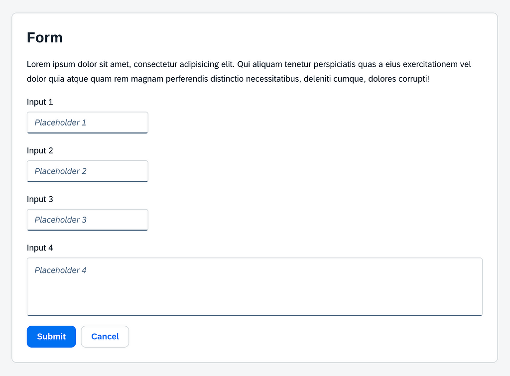
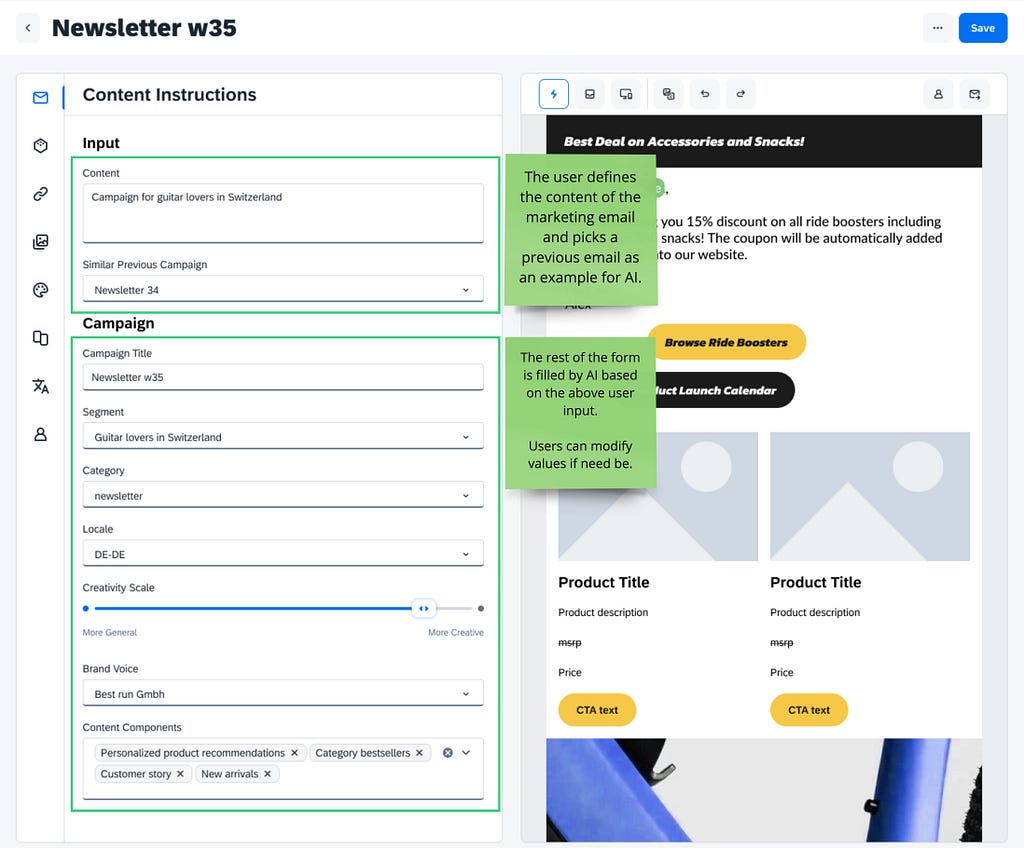
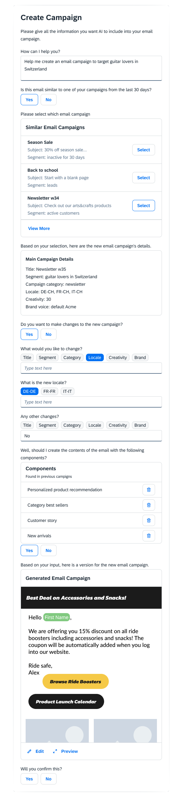
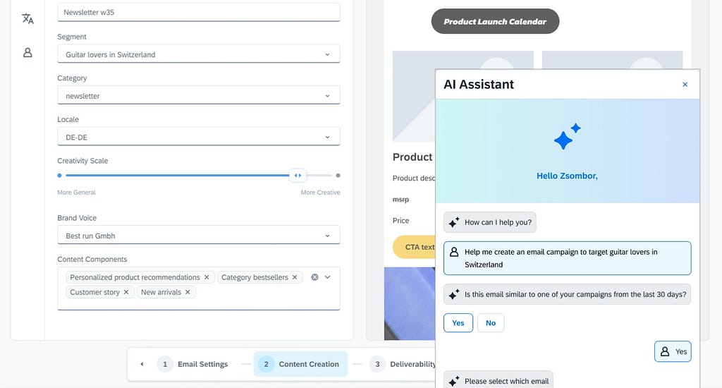
Example workflow: Imagine you are a digital marketer who is composing promotional emails for their e-commerce business. Today, the marketer needs to create an email addressing guitar lovers in Switzerland.
Example workflow, implemented with a form UI
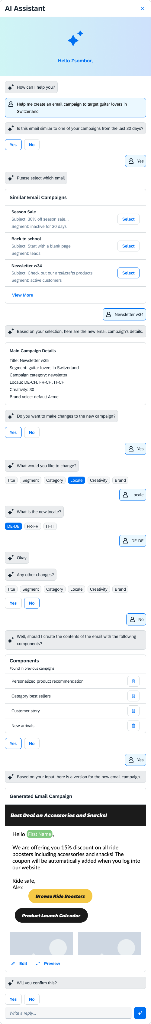
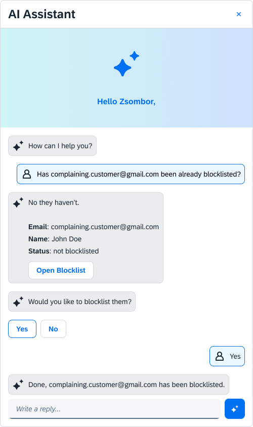
Example workflow, implemented with a conversational UI
This is how creating the same marketing email could look like using a conversational AI interface.
The trick of comparison
How do we compare the usability of a conversational experience to that of a form? It’s like comparing pears to apples.
The trick is acknowledging that the conversation is really just a form.
Everything that the AI assistant says is akin to a form label: it tells the user what kind of input to give to the system.
Everything that the user types in is like an input field in a form.
Each request-response can be translated to a form field, see the below example.
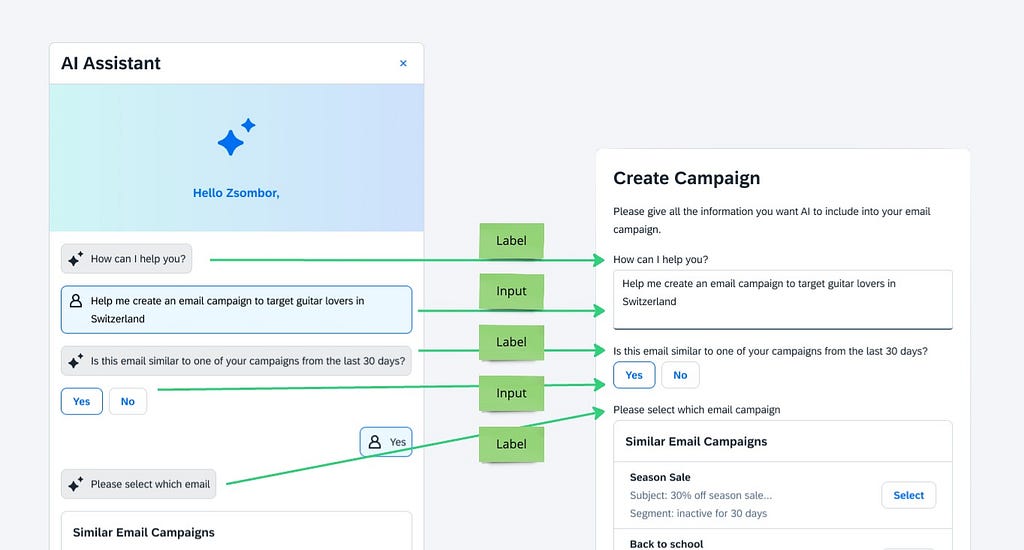
We can translate the entire conversation into a form:
With our conversational UI translated into a form we can now compare apples to apples.
(1) Overly verbose labels
The conversational UI (on the left) has labels that are full sentences. The labels on the purpose-designed form (on the right) are only a few words.

The reason for this difference is that on the purpose-designed form, a team of experts (UX designer, copy expert, domain expert) hand-picked the right words that convey the intended meaning unambiguously with the fewest words possible. In the conversational UI, the words are picked by an LLM that hasn’t been optimized for usability.
Additionally, this level of verbosity is expected from a conversational UI because if a system is anthropomorphized, it is expected to follow formalities, do pleasantries, and be polite. If that sounds strange, try translating the purpose-designed form into a conversation.
It’s a very efficient conversation, albeit a rather rude one.
Content?
Similar previous campaign?
Done. Byeeee!
Users can accept this level of “sharpness” from a form because the system is not anthropomorphized.
While conversational UIs are expected to be chatty, from a usability standpoint all these words are just clutter that the user needs to read through to get their job done. It’s unnecessary cognitive demand.
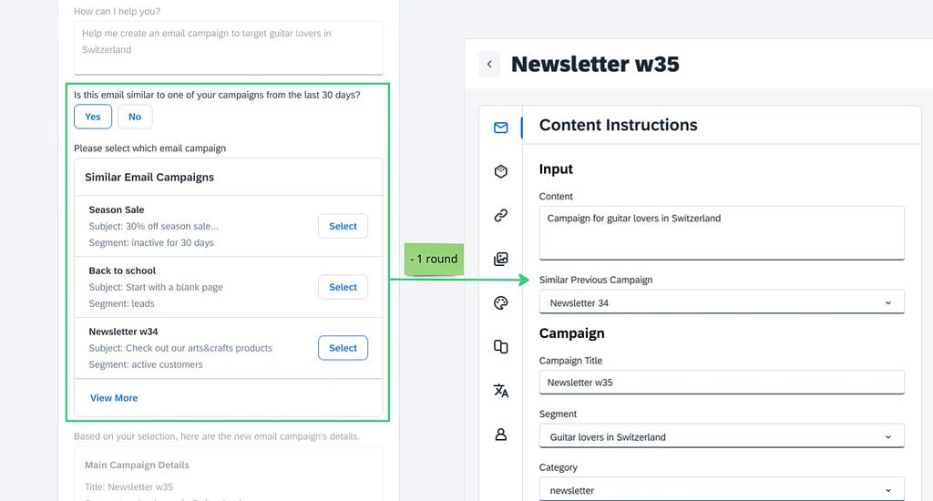
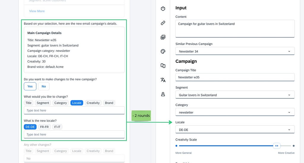
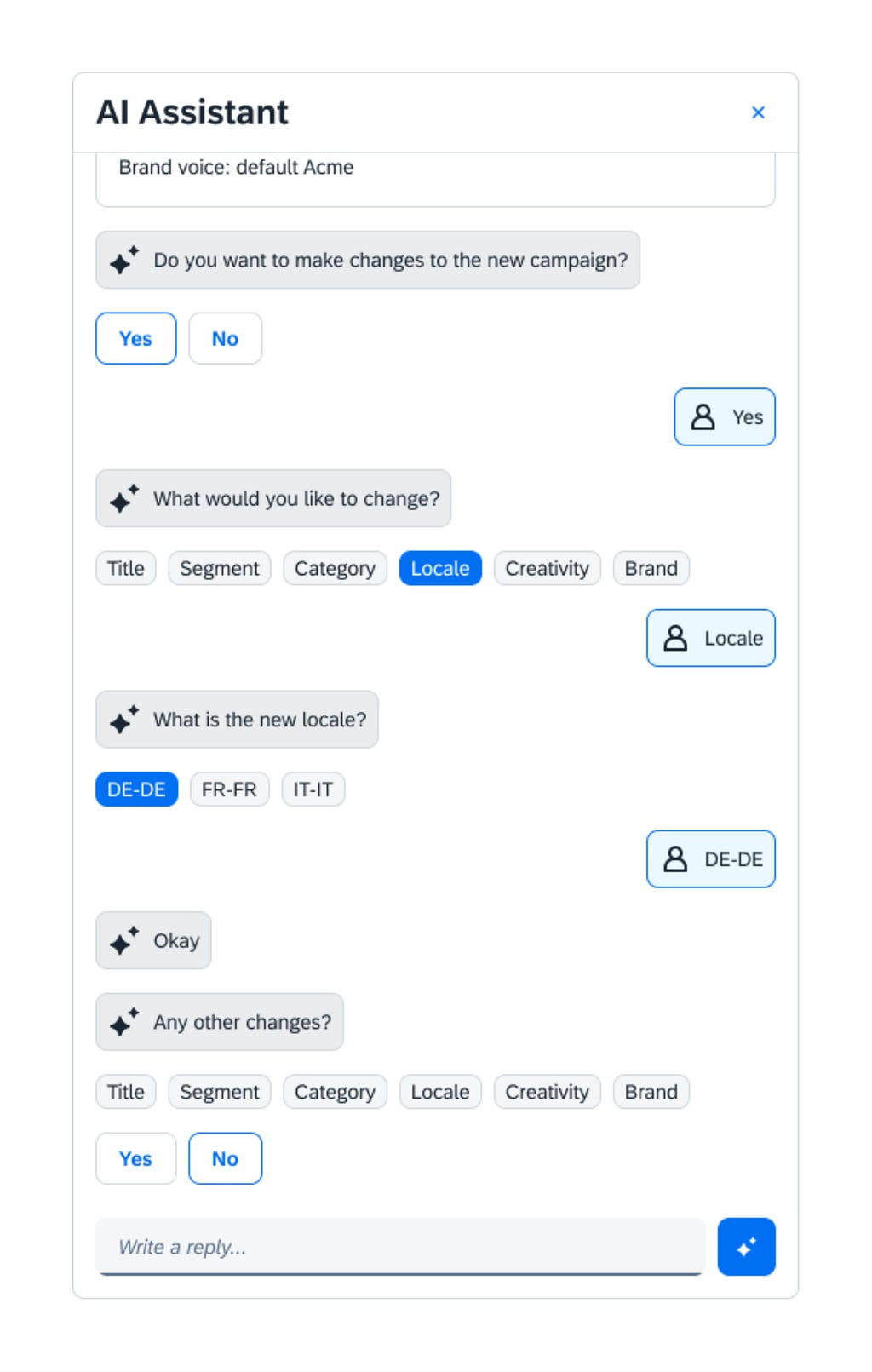
(2) Unnecessary interactions
It is a common design pattern in conversational user interfaces that interactions are broken down into simpler ones. That often leads to a piecemeal experience with too many interactions overall.
Consider the below examples. In each case, the purpose-designed form allows the user to complete the task with fewer rounds of interactions.
(3) Predictability, learnability
Because of the probabilistic nature of LLMs every time users go through the same workflow the AI assistant produces slightly different labels: different choices of words, different order of words, and different sentence structures. It may even switch up the order of the form fields.
Imagine if we did the same in a regular form. Imagine that every time the user opens the form page the labels would be different or even the order of the fields randomized.
Besides that being a terrible experience, it would violate Nielsen’s #4 usability heuristic “Consistency and Standards” as this is a lack of internal consistency.
This is a problem because it prevents users from becoming power users. If a user visits a purpose-designed form for the 20th time, they would not read the labels anymore because they would know exactly what is where. They could go straight to the part they care about, edit it, and move on.
This level of efficiency is just not possible with a conversational user interface. A user would need to read through the labels one by one pretty much every time they go through the same workflow.
(4) Loading time between rounds
With current LLM technology, the user needs to wait about 2–3 seconds until the LLM interprets their requests and a response is returned. This load time is repeated between every interaction.
Imagine if we introduced this lag into a regular form. The user would need to wait 2–3 seconds after filling each form field.

(5) Lack of visibility of progress
In our purpose-designed form when the user opens the page, they immediately see how much work is ahead of them: they see how many fields they need to fill. As they are completing the fields they see how much progress they have made and how much is left to be done.
This is not the case for conversational UIs. The past may have already scrolled out of view, the future is not rendered on the screen yet. This violates Nielsen’s #1 usability heuristic, “Visibility of system status”
(6) Hard to review
It’s typical for users to briefly review their inputs before they move on to the next stage in a workflow. In a purpose-designed form, this is an easy task, the user just takes a glance at the form and it’s done.
Getting an overview is a much harder task with a conversational UI because
- much of the data may have already scrolled out of view
- the key pieces of information are buried in the clutter of verbose labels and unnecessary interactions. The user needs to work to extract the relevant information, which is just more cognitive demand, less ease of use.
This is another manifestation of Nielsen’s #1 “Visibility of system status” heuristic because the key user inputs, that determine the system’s status, are less visible.
Note: One might argue that a conversation is easier on the user because it only shows one part of the workflow at any given time. As a counterargument, we can say that breaking down workflows into smaller steps is not unique to conversational UIs. We can easily break down forms into separate steps or sections too. The key difference between conversational UIs and purpose-designed UIs is that in the latter we only break down the workflow into smaller pieces if we need to, whereas conversational UIs break it down whether or not there is a need.
(7) Hidden functionality
Hidden functionality is not a problem for graphical user interfaces because the designer can put all functionality on the screen. If that’s too much, they can hide the secondary functionality under e.g. an “Advanced” tab. But even in that case the functionality is not absolutely hidden. There is a visible hint that more exists and the user can go and explore that.
That is not the case for conversational UIs. Hidden functionality is truly hidden. Nothing even hints at the existence of the functionality.
In theory, users can find out about hidden functionality by trying and erring. In reality, they rarely do and thus the functionality remains hidden and unused.
In conversational UIs there are two typical ways to get around this problem — each of them is a compromise in terms of usability.
- The AI assistant lists the available options. This approach is simply not viable above 3–5 options. Imagine that a form has 10 optional fields. The user can quickly review the 10 fields and decide if they need to use any of them. In the case of a conversational UI, the AI chat needs to ask the user field by field whether they want to use it or not. This adds unnecessary interaction costs.
- User needs to memorize their options. The assumption is that the user can learn what’s possible and when interacting with the conversational UI they can recall this information from their memory. This approach violates Nielsen’s #6 usability heuristic “Recognition rather than recall” which simply asserts that recalling something from memory is a lot more cognitively demanding than recognizing it in a menu that is presented to us.
(9) Limited screen space
When we purpose-design a form we can give it as much screen space as the use case demands.
The way AI assistants are typically designed, they follow a self-imposed limitation that every interaction needs to happen within the confines of a mobile screen-sized area. This, naturally, leads to design compromises to the detriment of usability.
Limited screen space is not an inherent limitation of conversational UIs. Some AI assistants can be put on full screen. In practice, though, designers tend to optimize interactions to the default state of the chat (the small screen area,) and then maximizing the chat won’t give a native full-screen experience.
Verdict: if a use case can be solved with a form, it should be solved with a form
As we have seen, when we compare a form with a conversational UI, the latter adds more interaction cost and provides a slower and less efficient workflow, which is more cognitively demanding too.
Conversational UIs provide inferior usability to forms because of their inherent limitations, not because the designers of such interfaces didn’t do a great job at designing them.
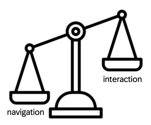
Exception: When the navigation cost outweighs the interaction cost.
The main downside of conversational UIs is the additional interaction cost they require. On the positive side, however, these AI assistants are typically implemented in a way that they are ever-present. They are just one click away and once the user clicks on them, they can start their workflow immediately. Navigation cost is reduced to zero.
For those use cases where the navigation cost had been high (it’s difficult to find the purpose-designed form) the cost saved on navigation may offset the excess interaction cost of a conversational UI.
We investigated these use cases and came to the conclusion that they can be identified by two characteristics: they are simple and infrequent use cases.
Simple because if they involved a long and complex series of interactions then the additional interaction cost of the conversational UI would add up, tipping the balance into the other direction. The savings on the navigation cost would simply not justify the extra interaction cost of the conversational UI anymore.
Infrequent because if the use case was frequent we would put the related feature in the middle of the home screen, eliminating navigation cost altogether, and therefore tipping the balance again. Even if the use case is not that frequent that we would put it on the home screen, but frequent enough that the user knows where to find it by heart, the navigation cost is still minimal, not justifying the use of conversational UIs.
Take home message
Adapting forms into AI chat has been an easy way to introduce LLMs into existing products since it requires minimal development effort. It just doesn’t make any sense because it doesn’t add any user value.
Replacing a form with a conversational UI does not improve the experience but, in most cases, deteriorates it.
We identified one exception to this rule: simple and infrequent use cases. A conversational AI assistant may cut the navigational costs while not adding too much additional interaction cost, so it may just be worth it for the user.
It’s up to you to decide whether your form use cases fall into this category or the other.
— — —
There are a lot of open questions around the UX of generative AI products. What are the best interfaces for this new tech? Is it chat? Is it existing UI patterns or something completely different?
The only way to find out is to try and see. All the above insights came to us from usability testing generative AI-powered products. If you wish to get similarly genuine usability insights, we have a book recommendation for you: A knack for usability testing (book and ebook). This is a book on taking this old method to new heights and gaining original usability insights.
Take care!
![]()
AI chat or not? If it’s a form, it should stay a form. was originally published in UX Planet on Medium, where people are continuing the conversation by highlighting and responding to this story.