Tips for Improving user Decision-Making Processes in AI apps

Design features that include AI capabilities are new within the field of human-computer interaction, and there is much to study and research.
Despite many generative AI applications being released daily, we still need a solid best design practice. Some companies have written UX/UI design practices for AI technology (for example, IBM Design for AI), but I believe they will evolve because AI technology changes quickly.
However, some design principles for interfaces that included AI capabilities started to repeat in many apps. One common practice in most AI-generated apps is giving users multiple choices.
I have used many AI tools within various AI platforms and tried to understand the best practices for this case. Is it better to give the user many options or show them one?
In this article, I present some ideas from various generative AI applications that showcase the diverse results generated by artificial intelligence.
This is not an article with best practices; instead, it demonstrates how different apps handle this topic, giving you a bird’ s-eye view of the subject.
What is the architecture of choice?
Many researchers have explored how people make decisions. Notably, Barry Schwartz and Daniel Kahneman have conducted in-depth investigations into the decision-making processes related to user behavior.
A key point in user-choice discussions within UX design is that offering fewer options is better. This approach helps prevent user confusion and decision overload, enhancing the user experience.
Take the pricing section as an example. Most products offer three pricing tiers, often based on user needs. While adding more is possible, limiting the number of choices helps users make decisions more quickly.
Consider the pricing section as an example. Products typically offer three pricing tiers:
- Budget option with fewer features.
- A mid-range option that balances features and cost.
- Premium option with many features.
This tiered approach allows users to compare value against price, making decisions easily.
However, providing too many options can overwhelm users, while offering too one option restricts their ability to compare and choose, limiting their freedom of choice.
Therefore, limiting the number of choices is optimal to help users make decisions more efficiently without taking away their freedom to choose.
The color options Henry Ford gave to his clients were:
“Any customer can have a car painted any color so long as it is black.”
Time has changed, and we are more flexible now, but we must remember that too many choices confuse the user.
The problem with generative AI
The problem with generative AI tools is that we cannot completely control what the AI model generates for the user.
We can play with the prompt, adjust the temperature value (temperature controls creativity in AI outputs), and some other parameters.
But here is the problem: if we cannot control the results well, we cannot know the quality of the results.
If we show one option but the user does not like it, they can say the app is useless because it does not give good results. On the other hand, if we show the user too many options, we make it difficult for the user to choose.
In some situations, presenting one option to the users is straightforward, mainly when the task is not creative. For example, offering users a single solution is sufficient when using AI to correct grammar errors.
Language grammar follows specific rules, and the margin for error is small. Large language models (LLMs) are trained on extensive datasets, enabling them to predict outcomes more accurately.
In contrast, AI must operate with fewer restrictions when generating creative text or images since creativity is naturally rule-free.
This raises a question: How can the AI system determine what is more or less creative? It relies on us to make that selection.
This leads to a paradox: How many options should we present to the users?
Different Patterns
Here are examples of various apps and ideas to address the issue of choices.
One Result vs. Various Results
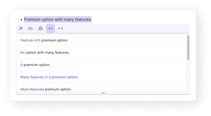
Grammarly and Wrodtune are both apps that help write text.
Grammarly offers one corrective suggestion for a text, focusing on achieving grammatical accuracy. In contrast, Wordtune caters to a writer’s need for variety by offering multiple ways to rephrase text.

After selecting a desired style (generic, informal, formal, shorter, or longer), Wordtune presents several options.
This approach reflects Grammarly’s focus on correctness, whereas Wordtune empowers users to be more creative with the text the AI creates, offering many options for a specific tone style.
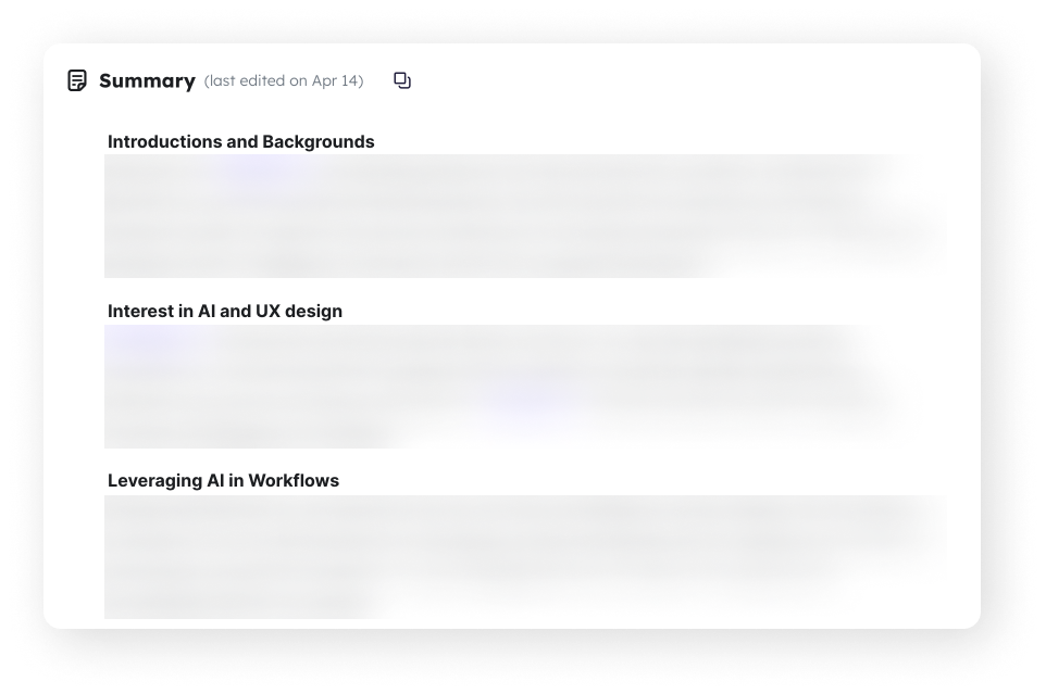
Krisp is an example of an AI-powered application where providing a single option to the user is sufficient.
The purpose of the app is to summarize meetings for its users. It processes the transcriptions of these meetings and then delivers a concise summary.
In this context, the summary does not require much creativity; it must understand and summarize the most important information effectively.
On the other hand, accuracy is crucial for this product because trust is vital. If the AI introduces information not discussed in the meeting inaccurately, it could lead to a loss of trust among its users.
If we talk about AI image generators, we can compare the results Midjourney gives us versus the results DALL-E 3 gives the users.
When discussing AI image generators, comparing Midjourney and DALL-E 3 is useful.
Midjourney provides users with four options for each image generation request. However, DALL-E 3 currently offers just one image per request.
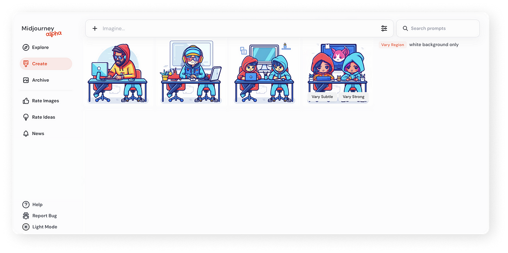
DALL-E 3 also previously provided four options, but following an update, OpenAI changed this to a single option.
When working with images, presenting multiple options to the user may be more effective, allowing them to choose from these. Since we need to discover the image we want during creation, providing this capability helps users better understand what they want.
Point to think about
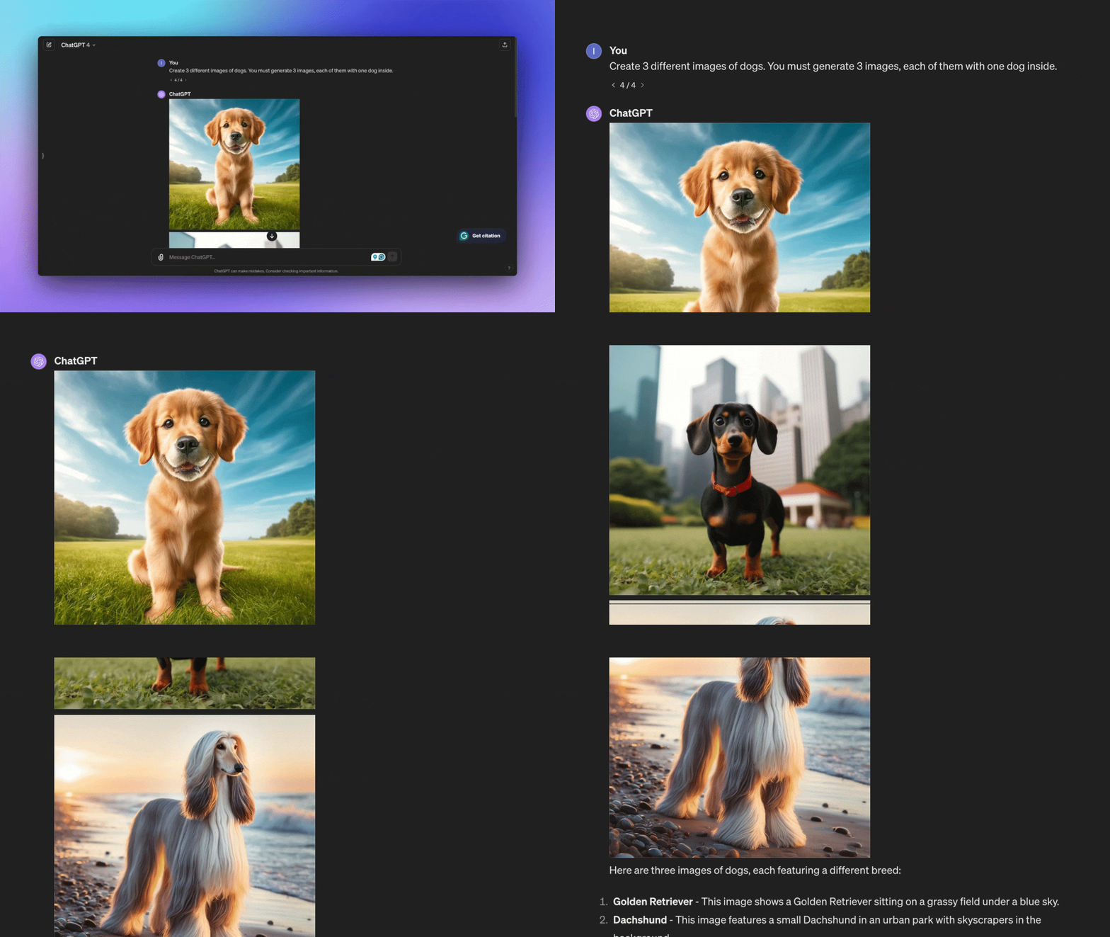
ChatGPT offers a lot of flexibility in how you interact with it. The user can freely write prompts to request multiple images, even though the default setting generates a single image. This capability allows users to override the default and get more images.
Here is an example of a prompt like this:
Create 3 different images of dogs.
You must generate 3 images, each of them with one dog inside.
The user picks how many choices they prefer
Some applications give users to control the quantity of generative AI outputs.
UX Pilot offers this flexibility by allowing users to choose between one or three wireframe designs.

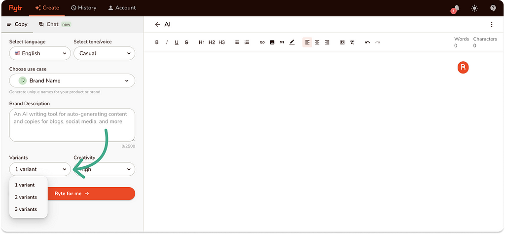
Similarly, Rytr enables users to select from one to three text variations.
Freepik Pikaso extends this control to visual content, where users can specify the number of AI-generated images.
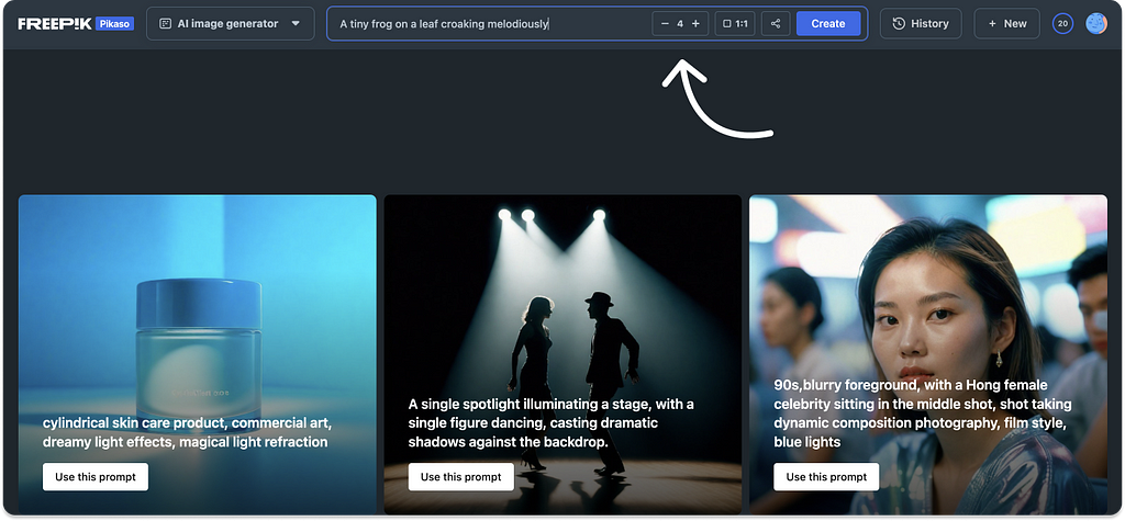
This feature increases user autonomy by giving users the number of outputs they want.
Two points to think about
- Generating more options increases production costs, especially for image-generating applications, which are more expensive than text. So, selecting the number of outputs gives the user control over the expenses in addition to the outputs.
- From a user’s perspective, generating a single solution can be preferable to multiple ones, particularly for long or complex tasks such as UI design. Dealing with multiple options slows progress, complicates decision-making, and shifts focus from refining a single solution to comparing several. This approach allows the users to select how many options they want to handle in the design process.
🌟 Master AI Skills (Including ChatGPT) in My Forthcoming Training!
Attend my next online workshop to improve your effectiveness in product design using AI methods (featuring ChatGPT).
Are you eager to upgrade your design expertise? Join here
Pick one output, but let the user switch if they want
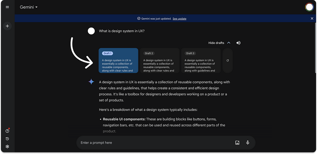
In Google’s Gemini, the system generates multiple outputs but presents only the top choice to the user.
If they do not like the output, users can select an alternative from the interface. This option is good because it allows users to choose another output without waiting for the system to generate a new option. The user clicks, and the output changes immediately.
Give users a regenerate option
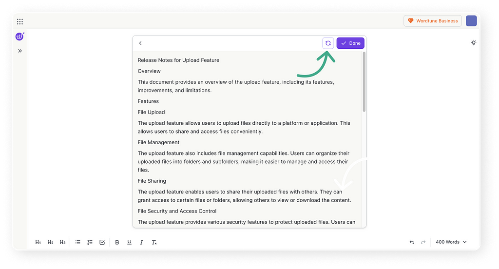
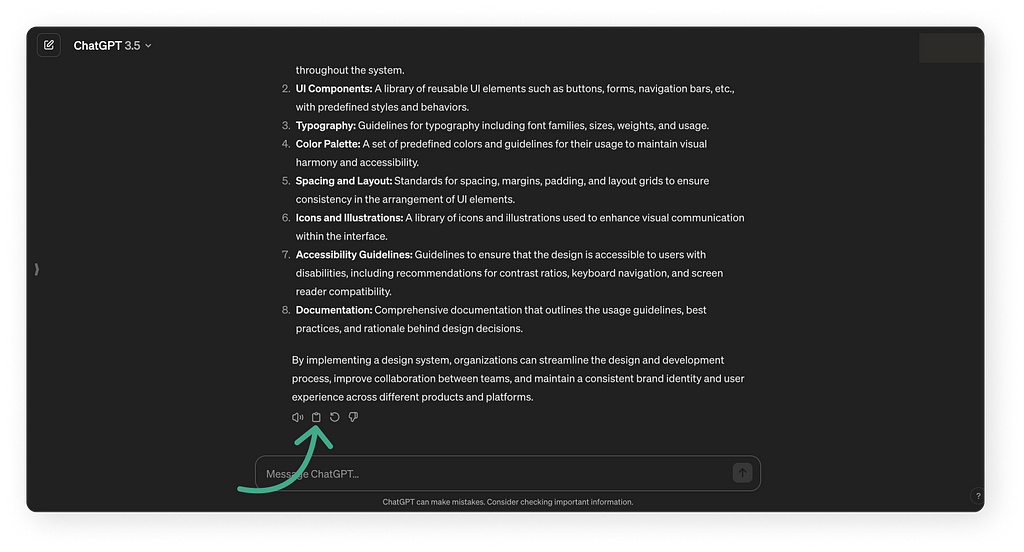
In many products, such as ChatGPT, Wordtune, and Claude, you can find a feature with a button to regenerate output, known as a “regenerate” or “retry” button.
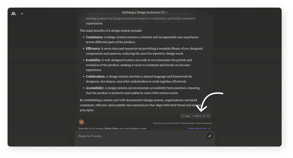
This button lets users quickly regenerate their output without re-entering the prompt, saving time and effort.
It’s important to note that regenerating the output with the same prompt might produce more accurate results. Thus, users might consider generating the output twice before changing their prompt to get better outcomes.
I wrote about this effect in my article “Behind the Scenes: Prompt Crafting Techniques for FigJam AI” when I suggested that I sometimes needed to run the same prompt twice to get the results I wanted from the FigJam AI.
Pre-set instructions boost results
For many use cases, it is better to give the user one super-accurate result because it saves time and is more efficient.
The accuracy of the user’s prompt is crucial to improving AI performance. Implementing default settings in the user interface will streamline the experience, eliminating the need for repetitive input.
This feature lets users pre-set preferences, such as Grammarly’s customizable text correction parameters and ChatGPT’s custom instructions.
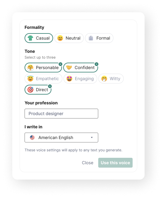
By adopting such defaults, users can ensure consistency in their interactions without specifying their requirements with each use.
This saves time and fosters more efficient and accurate results for the users.

The outputs need to be more precise in the future
As we integrate generative AI into applications, we recognize the technology’s initial limitations, including its potential for errors and the need to offer multiple output options to users.
This approach is currently acceptable, as we are in the early stages of adopting these technologies. However, developing systems that deliver a single, accurate result will become crucial as technology evolves, especially for straightforward tasks like email responses where the user’s intent is clear.
The necessity for such precision comes from a desire for efficiency and a need to build trust.
If users consistently get errors or have to modify outputs frequently, their trust in the AI decreases, and the technology becomes more of a burden than a benefit.
The goal is to streamline interactions, ensuring that working with AI saves time rather than consuming more, particularly in non-creative tasks where outcomes are predictable and less open to creativity.
To summary
In this article, we explored design choice patterns in generative AI systems. We saw four options you can use for your product:
- Redo option
- One Result vs. Various Results
- The user picks how many choices they prefer.
- Pick one output, but let the user switch if they want.
These options adapt to diverse needs, enabling the user to have the best experience.
Finally, I explained how you can help the user get better results with the prompts and why the results must become more accurate in the future.
🚀 Boost Your Efficiency: Uncover AI Techniques (Including ChatGPT) in My Upcoming Course!
Join my upcoming workshop to elevate your productivity as a product designer, learn AI techniques (including ChatGPT), and explore essential AI tools.
Thank you for reading the article. I hope this article helped you understand how to help the user make better decisions in an app with generative AI features. Please feel free to share it with your friends or team members, and if you have any questions, please let me know.
If you enjoyed my article, I suggest you follow me so you’ll receive an email whenever I post.
You can also follow me on Linkedin, where I share tips several times a week.
How to design AI interfaces to improve user choices was originally published in UX Planet on Medium, where people are continuing the conversation by highlighting and responding to this story.