Are Variables Worth the Hustle? Exploring the Impact of using Figma’s Variables and Conditionals in Prototypes

If you are a designer using Figma then you are probably familiar with building prototypes to help take your static designs into realistic versions of your product.
Prior to the launch of variables and conditionals, Figma’s prototyping tools allowed for basic clickthroughs, micro-interaction animations and screen transitions. Although there are limitations, creating a prototype without variables and conditionals can generate really good results. However, the experience is linear.
What are variables and conditionals?
Not to be mistaken with variants; variables and conditionals are a fairly new addition to Figma which, in my opinion, is another step closer to bridging the gap between designers and devs.
For this article, I want to explore the use of variables to create more dynamic and complex prototypes. Is it worth the extra hustle?
Variable types
There was a small learning curve and I did go through many iterations before I felt somewhat efficient in building more advanced prototypes.
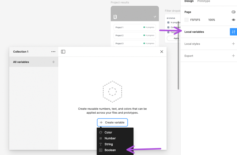
There are 4 types of variables. Understanding how these variables work and how I can apply them to my designs was a crucial part of my process.

Color. A color variable stores…you guessed it, color values. These values can also reference existing styles.
Number. A number variable stores number values. This can be used on components like input steppers and can even be used to add or subtract the quantity in a shopping cart using basic math operations
String. A string variable can replace any values that is treated as text. This can be used on components like input fields and date pickers to name a few.
Boolean. A boolean variable controls the visibility of a component by the values True or False.
My process
To be honest, I rarely made prototypes unless I wanted to show a cool transition or micro-animation. But when I did make them, i realized how much more valuable they were in meetings or refinements instead of static Figma flows.
The up side to these types of linear prototypes are that they can be built fairly quickly and still have the look and feel of the final product.
The down side is that there can only be one predefined experience, which is not super helpful if you want to do any user testing.
When Figma introduced variables and conditional logic, I wanted to explore the effort required to create close to dev-ready prototypes and determine if it would add value to my work.
Although this is not a step by step tutorial, let me share two ways I have used variables and conditional logic that helped me build more dynamic prototypes.
Filters with checkbox list items
I chose to create an example with checkboxes specifically because checkboxes allow for the user to select one or multiple options. In order to display the variations based on the users selections, I needed to build in some logic in my prototype.
As mentioned before, you don’t need variables or conditional logic to create a prototype. By simply creating multiple frames with varying results, placing them in a logical order and adding interactions between each frame is easy enough and gets the job done…if you’re the one driving the prototype. But what if I wanted the user to have the control? I can’t possibly know what the user will select and in what order. This is where the introduction of variables and conditional logic makes sense.
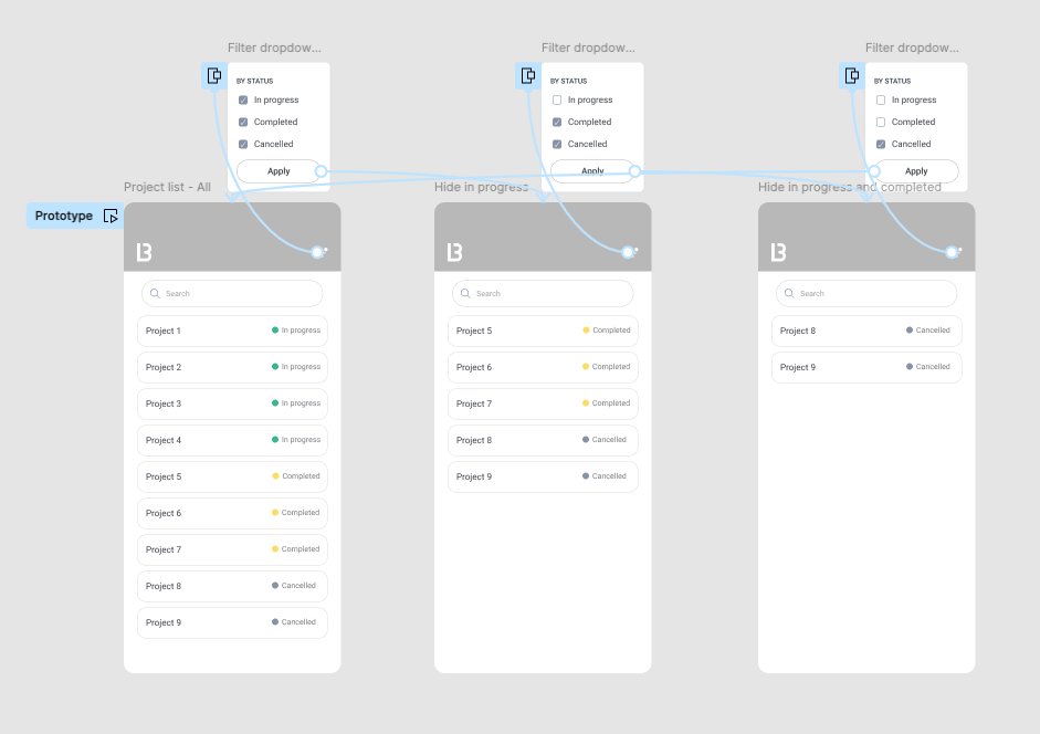
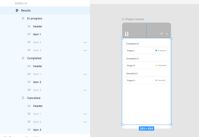
In the screen above, I have a list of projects that I would like to filter by status. If I were presenting a prototype (without conditional logic), I would create a storyboard with one pre-defined scenario. In this case it would be, uncheck the In progress checkbox, then press apply and then my frame would transition to the next screen and so on until I go through each step on my board.
However, with a few variables and some conditional logic, I was able to create a more dynamic prototype where any variation of selections in any order is possible….and I didn’t have to duplicate any frames.
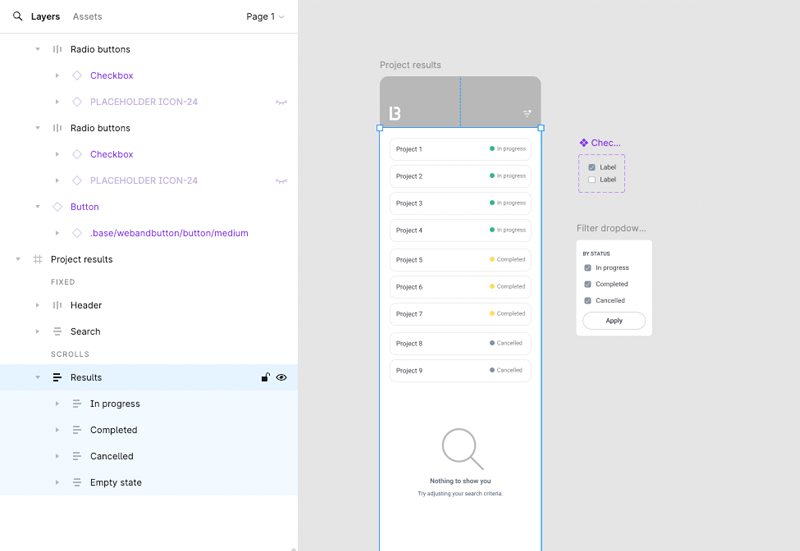
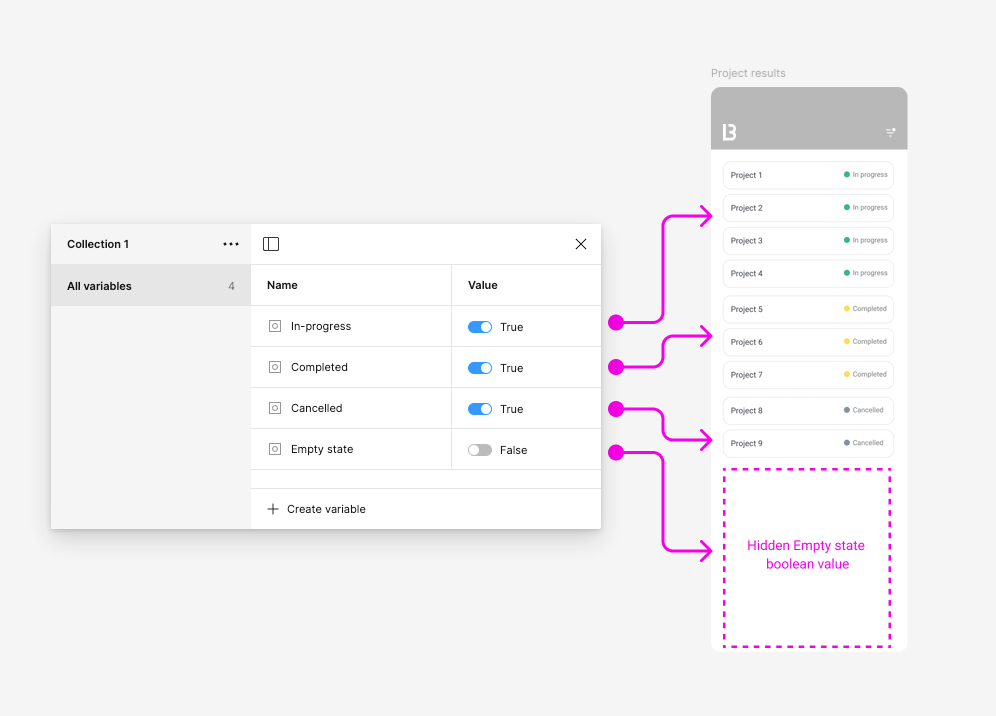
I created an auto layout frame for the results, where they were grouped in another auto-layout frame by status (In progress, Completed, Cancelled and I added an Empty state). I created a checkbox component with 2 variants (Checked and Unchecked) and use them to build a filter dropdown menu item for each category
Starting with the Results frame. I wanted all the project items to be visible by default but the empty state to be hidden and only visible when all the filters were unchecked, so I created a boolean variable for each status group where I set the value to True (visible) and one for the empty state where I set the value to False (hidden)

I then applied these variables to each corresponding layer. To do this,
right-click on the eye icon from the Layer property panel on the right sidebar. This will display the list of variables you just created.
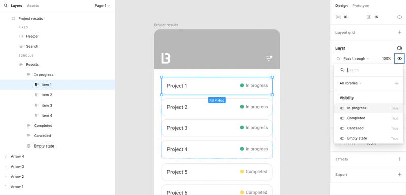

I often like to make sure I applied the variable correctly to the right layer by toggling the variable from True to False in the Local variables panel. If the layer’s visibility turns on and off then I know I did it correctly.
Once I applied the boolean variables to each layer, my frame looked like this:
The fun part was applying the logic to the Filter drop down menu item list. This is where it got a little but tricky at first but it become a lot easier the more I played around with different scenarios.
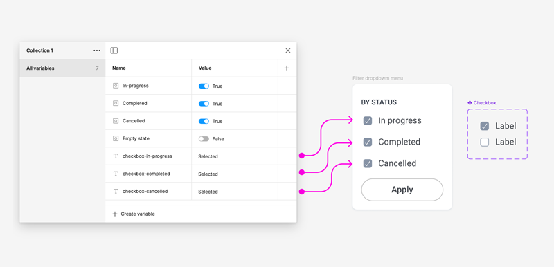
I created a checkbox and label component with two variants; a “Selected” state and an “Unselected” state. I used instances of this component to build the dropdown menu.

One distinction to make between variants and variables is that variants are made on the master component and any instance of that master component uses the same variants. Variables, however are used on specific instances of the master component. The reason being that you want to be able to target specific components independently when applying logic.
Because I wanted each checkbox to display as Selected or Unselected when clicked, I needed to create a string variable for each check box item in my dropdown menu.
I set the value for each variable as “Selected”. I used the word “Selected” as my value because it matches the exact name of the variant name I used when creating my master component.
So in my case, the value would either be “Selected” or “Unselected”. If I didn’t want these checkboxes to be in a checked state by default, then I would have set the value to “Unselected”.
The next step was to apply the string variables to each checkbox instance variant property. As I said it is really important that the variable value has the same name as the original variant value you created from the master component. By doing this I am able to target each drop down menu independently.

I then added an interaction on the filter icon where the dropdown menu opens as an overlay. From there each checkbox item had to have a conditional statement that would change states when clicked. For example: On click/tap, if the In progress checkbox is selected, change it to unselected. If it’s not selected, change it to selected.
Because I wanted the action to happen when the user presses apply, I also added a conditional statement to the apply button. For example: If the In progress checkbox is selected, display the items with the In progress status. If it’s not selected, hide them.
To translate these statements using interactions in Figma, I switched to prototype mode, selected one of the menu items and added a conditional interaction. Figma helps a little bit along the way by writing out the statement and guiding me along the way to fill in the blanks using the variables that I created, the statement looked like this:

I did the same thing with the other two checkbox menu items and then moved onto the apply button where I added a conditional statement that would show or hide the list items on the screen depending on which checkbox item was selected or unselected. The statement looked like this:

The last thing that I wanted to add was to display the empty state when all checkboxes were unchecked. If you remember I already created a boolean variable for the empty states that is set to false. I added the condition to the apply button and then completed my interaction by adding a Close overlay.

Let’s add some complexity
Taking the same scenario as above, I added more user interactions to the user flow.
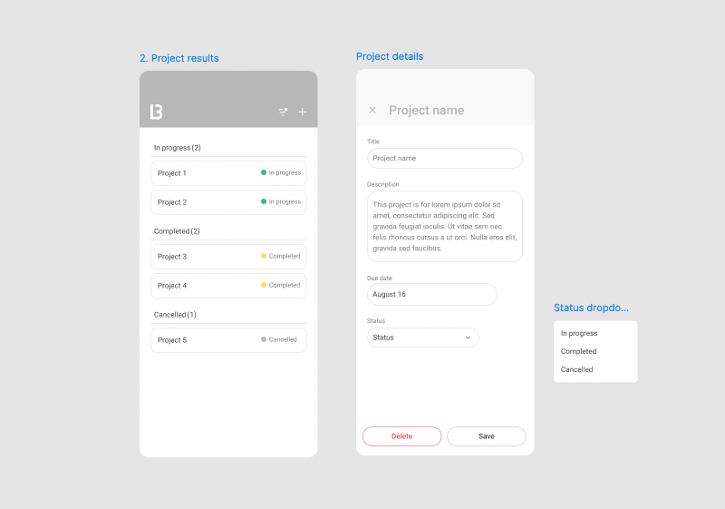
The project results page now has a category header with a counter that displays the number of projects within that category.
When the user taps on a project, the project details screen will move in. The Title and Status input fields are dynamic and will be pre-filled depending on which project the user is looking at.
To add a little more complexity, I also wanted to allow the user to be able to change the status and upon pressing save the project would go into the right category. The counter in the header would adjust depending on how many projects were in that category. And one more thing…if there are 0 projects in that category, the category header will be hidden.
I initially went a different way that didn’t end up working out and finally came to this:
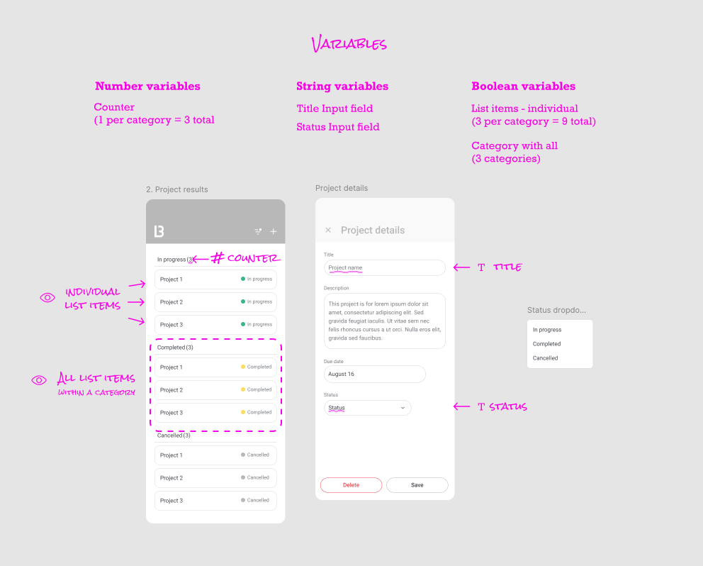
I built this in a way where I had a total of 3 projects and 3 categories. Each category was in an auto-layout frame with 3 projects in that frame. The goal was to control the visibility of each project so that no project was visible in more than one category at a time.
I created 9 boolean variables for each individual project and one for each category that contained all items. Along with all the other variables I created, my variables modal started to look a little messy so I created groups to categorize the variables which helped me keep track of what I was doing.

I applied all the variables to each corresponding layer and then started adding the interactions between the projects and the Project details screen.

For each project interaction, I set the variable title and status with the values that matched each project. So the title value for Project 1 would be “Project 1” and the title value for Project 2 would be “Project 2” and so on…So from a user’s perspective, whichever project they tap on to open the project details screen, the inputs would be filled with the right information.
I did this for all 3 project items in each category…so 9 times, and made sure to change the title and status value for each one. I was able to copy and paste an interaction from one element to another to save some time.
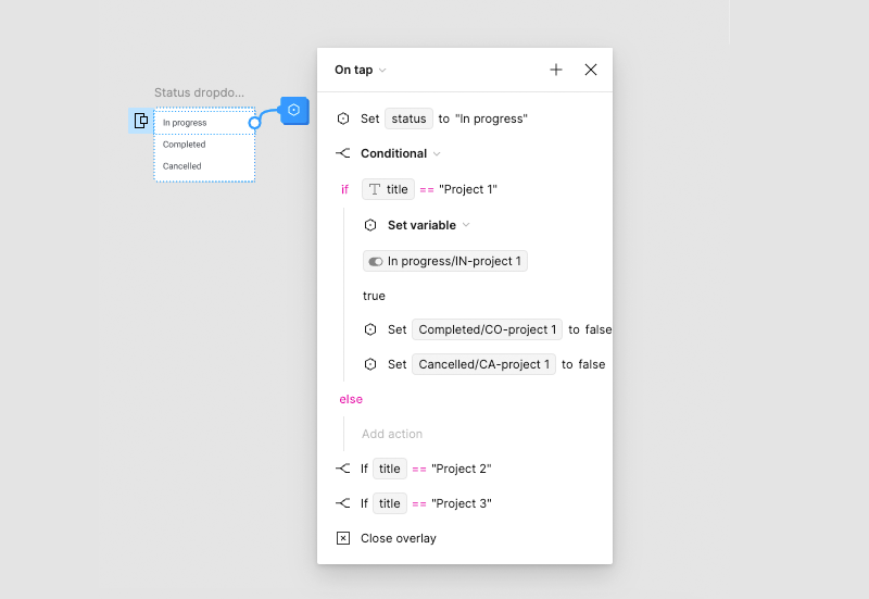
I then created the interaction for the status dropdown menu as an overlay and set the variable for the status–so that whichever dropdown item is selected the status value will update to that selection.

I decided to add some conditional logic at this point as well. In the screenshot below, the logic states that when the status is “In progress” and if the title is “Project 1” then make Project 1 visible in the In progress category but hide it from the other categories. I did the same for the Completed and Cancelled items.
After testing the prototype to make sure all the scenarios are working, I started think about how I would address the logic for the counter. This took me a few tries but this is how I did it.
Initially I set the default value for each counter to 1. I later created another number variable that would hold the total number of projects per category. In this case 3. I didn’t apply this variable to any component but used it as part of the calculation for the counter.

On pressing save a few things had to happen in this order:
1. Resetting the initial counter value to the total (3)
2. Conditional logic that states if the project is not visible within a category than subtract the counter by 1
3. If the counter is 0, hide the category header
4. Navigate back to the Product results page

This process was long and tedious. Not being able to resize the interactions panel makes this process even more laborious because it is so hard to read all the interactions on such a small space and to keep track of where you are. Also not being able to copy and paste within the same interaction panel adds to the frustration. Hoping Figma fixes this in future releases.
This was not a super complex flow but you can see how each small interactions can get complicated. The end results…if it all works, is definitely fulfilling and exciting. Most importantly, although I do recognize that Figma has limitations, I have a better understanding of how developers think when building our designs.
So is the effort worth it? I can say that for me it is, for the reason I mentioned above…building prototypes that mimic how developers think makes me a better overall designer.
Are Variables Worth the Hustle? was originally published in UX Planet on Medium, where people are continuing the conversation by highlighting and responding to this story.