
Finding the right color combinations for your design is one of the most challenging tasks. That’s why I want to share a simple 3-step process to help you. We will follow this process when choosing colors for the landing page of the design agency.
Preparation: make your layout design grayscale
Before choosing colors for your design, you should make the UI design grayscale so colors won’t distract you. This decision will also swift your focus to the content and visual hierarchy of UI elements so you can tweak it before choosing the colors.

Step number 1: Select the base color
We need to choose one base color for our app. This color will be the main color used in many different parts of our page. We can use it as a dominant color in UI design, for example, as a color of the background.
To maximize our chances for success, we need to decide what message we want to communicate to our audience using this color. The color we choose will create a certain mood, and ideally, we need to choose the color that will work well for the product we’re building.
If we are building a finance app, we might want to go with a blue color since it communicates a sense of safety.
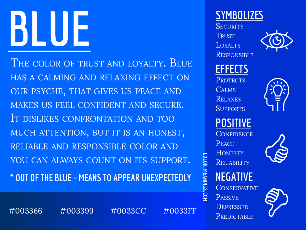
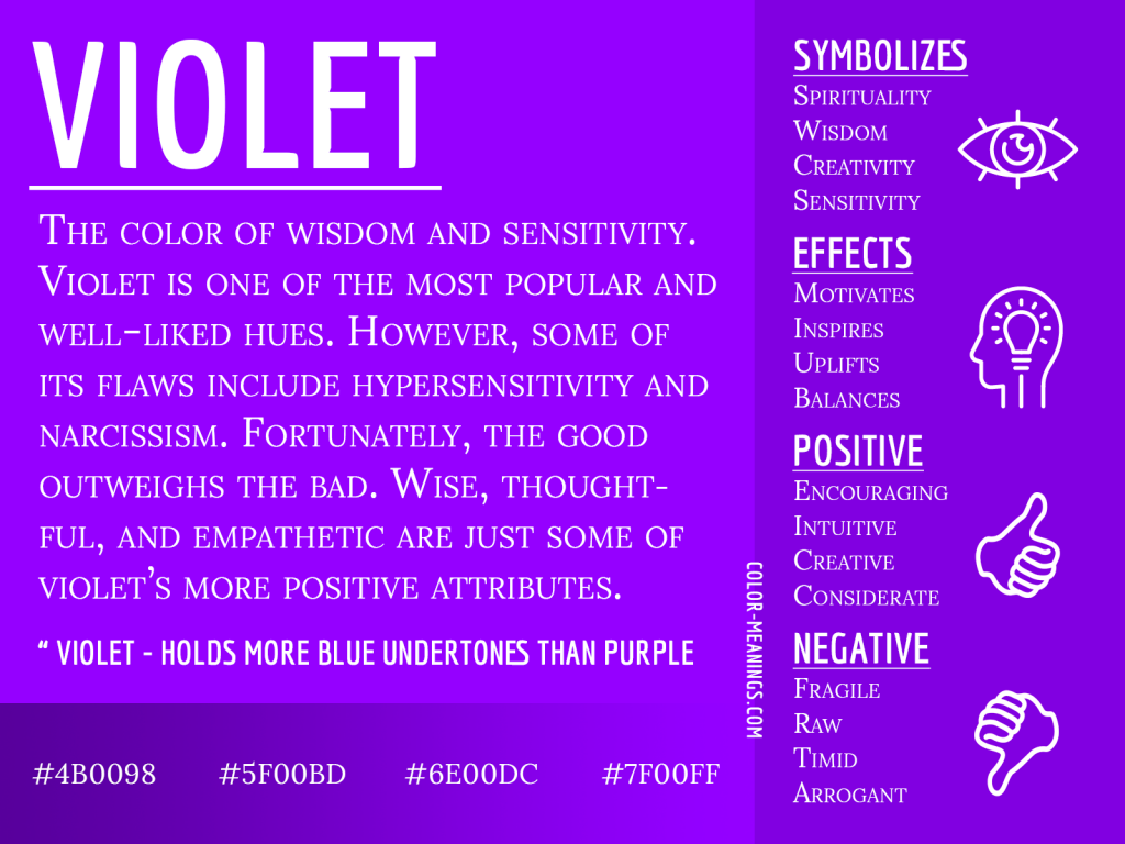
Since we’re building a landing page for a creative agency, we can go with violet because it communicates wisdom and creativity for the Western audience.
A quick note about brand colors: If you’re making a product for a company with established brand guidelines, you can use brand colors as inspiration when choosing a base color. But choose the brand color only if it works well for your design and communicates the correct meaning. So, when selecting a base color, I would say that the most important thing is color physiology.
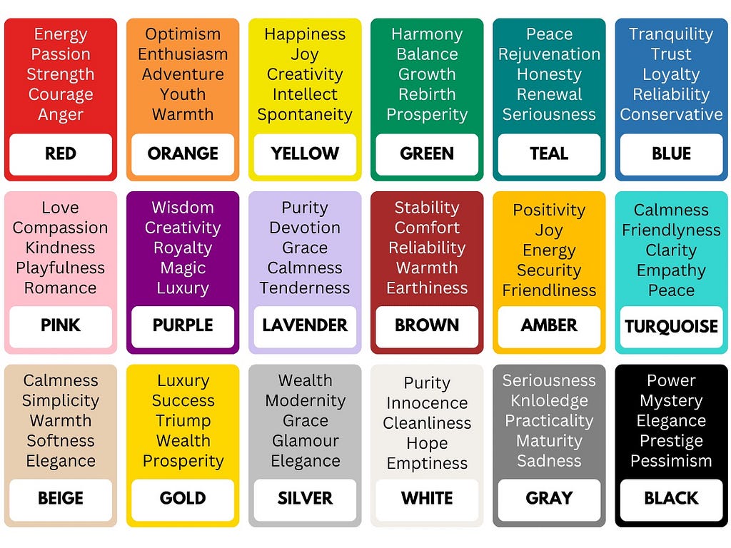
I recommend learning about color psychology and checking the resource called Color Psychology, which collects a lot of information about this topic, including the cultural meaning of colors. It will give you a reason why you should or shouldn’t use a specific color in your design.
Color Psychology 101: A Beginner’s Guide to the Meaning of Colors
Step number 2: Creating a color palette
Once we choose a base color, we must find colors that work well with it.
How many colors do we need? There is no right or wrong answer to this question. While it’s possible to create a color palette with a dozen different colors, it’s better to limit the number of colors because it will make it easier to apply colors in your design. The more colors, the harder it will be to apply them in design without creating a visual noise. In fact, it’s possible to create a very interesting design using a single color.
For most projects, it will be enough to choose three colors:
- Dominant color (primary, a base color for our design)
- Complimentary color (secondary, supports primary color)
- Accent color (the color that helps to attract user attention to specific elements such as call-to-action buttons; it should contrast well with the primary and secondary color but not overwhelm the viewer).
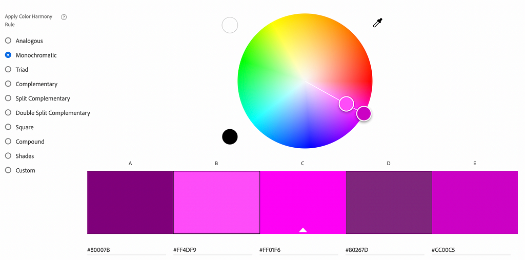
You can use the tool called Adobe Color Wheel to find actual colors. This is a free-to-use tool that will help you to generate a color palette for your project.
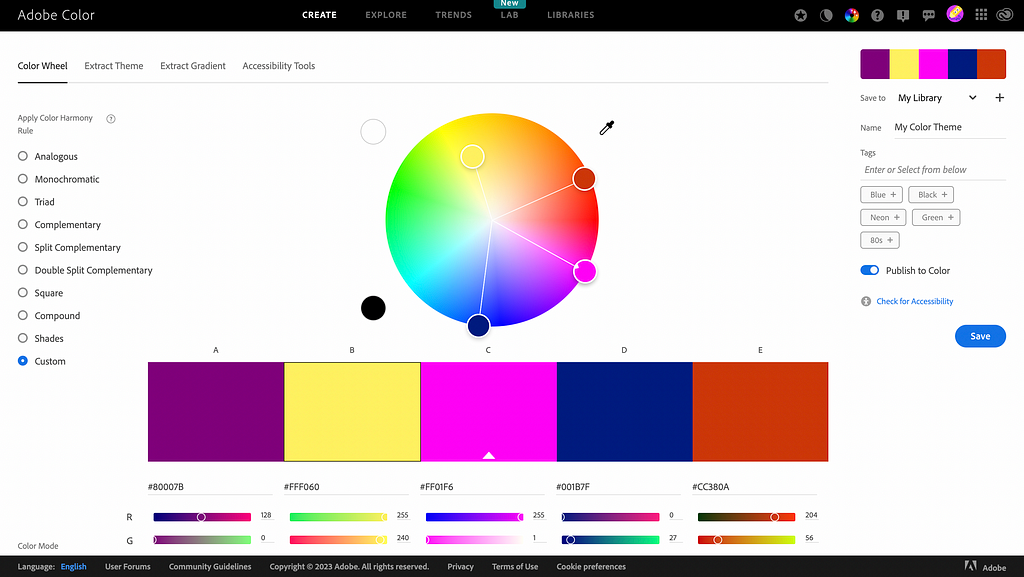
On the left, you can see different types of palettes. If we choose to use only one color, we can create a monochromatic scheme — a scheme that is created from different tones and shades of the selected color.
If you want to create a balanced design, you can use an analogous color scheme. These colors are located next to each other on the color wheel.

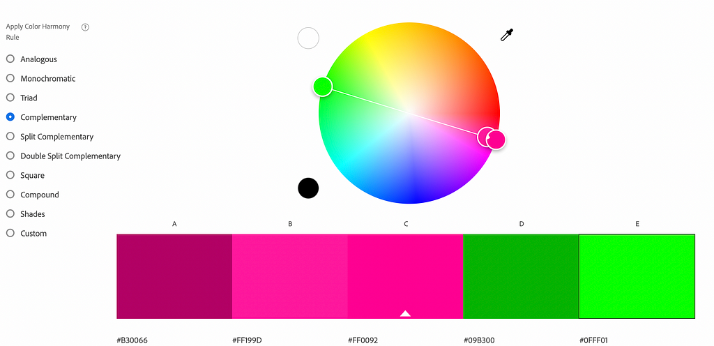
Lastly, if you want to add vibrancy to the design, you can use a complementary scheme. A complementary scheme is created from colors located on the different sides of the color wheel.
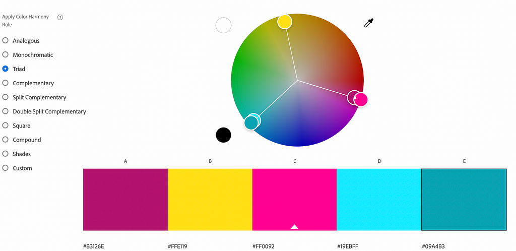
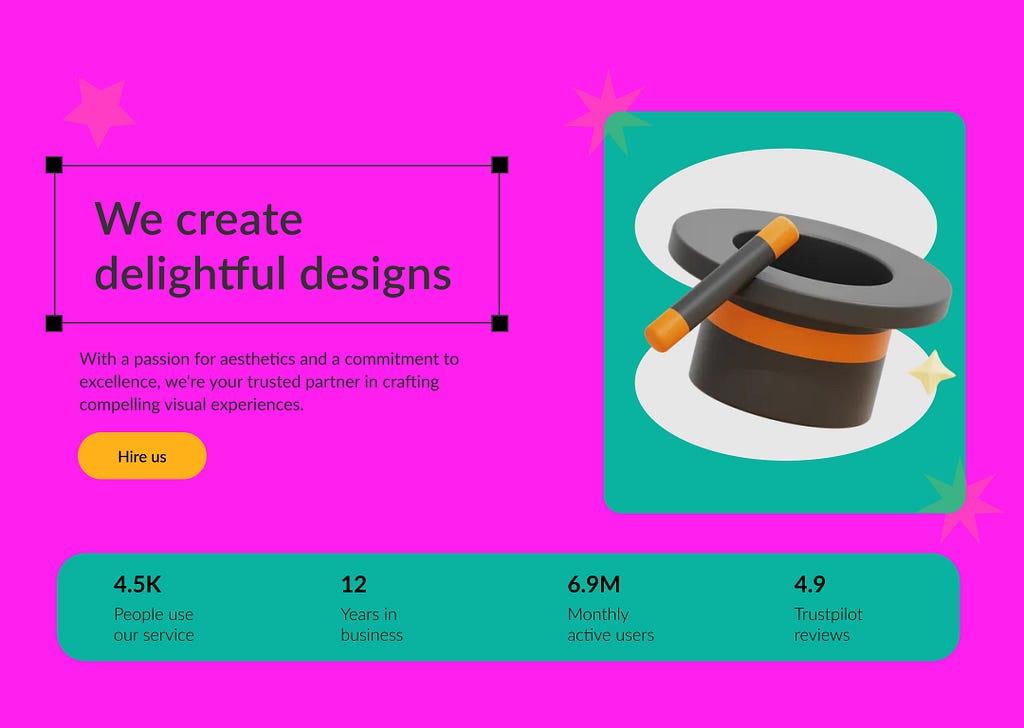
When it comes to actual colors that we will choose, your eye and taste will majorly impact your color selection. For our design of a landing page, let’s choose a more complex, triad color scheme and use the following 3 colors: #FF0092 as a primary, #09A4B3 as a secondary, and #FFE119 as an accent color.
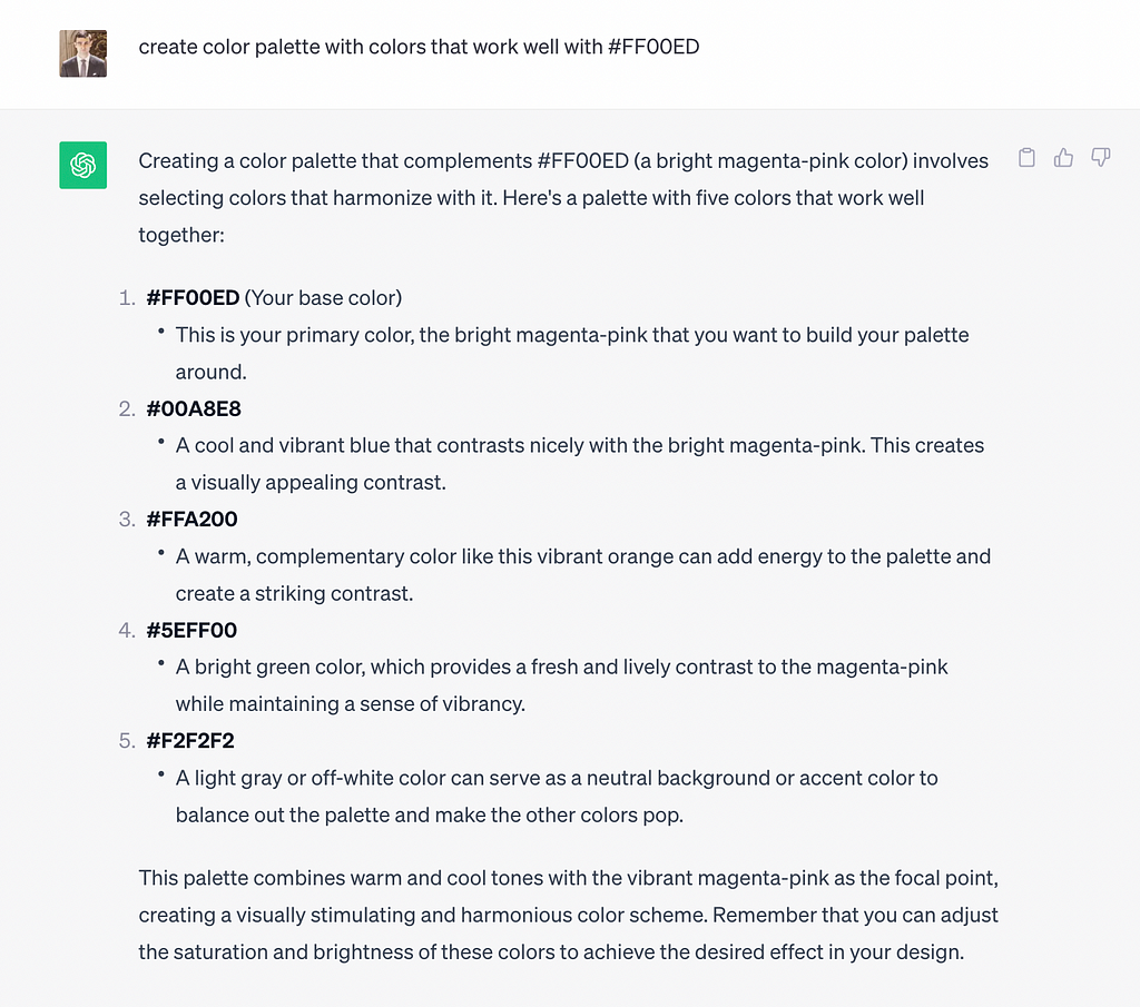
A color wheel might not be easy for creating a palette, especially if you’re starting in UI design. But you can use the power of AI to create color combinations — provide your base color and ask ChatGPT to suggest colors that will work well with it. Here is an example of the prompt.
create color palette with colors that work well with #800080
Step 3: Apply colors to a design
There is an easy way to apply colors to a design, and it’s called the 60–30–10 rule. It’s a classic decor rule that helps create a color palette for a space. It states that 60% of the room should be a dominant color, 30% should be the secondary color, and the last 10% should be an accent.
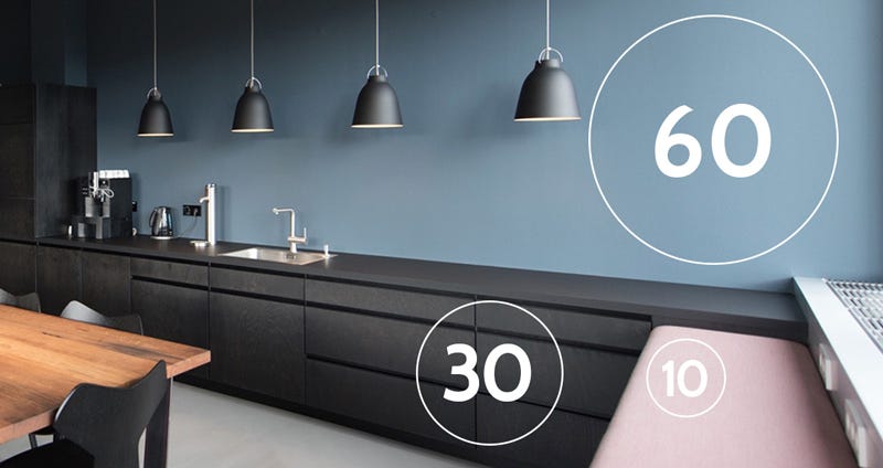
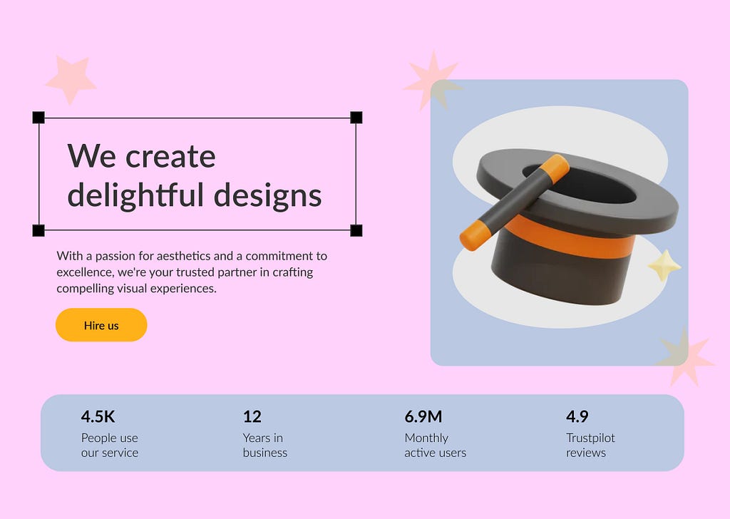
When it comes to UI design, we can use a primary color for the background, apply secondary for 30% of the layout elements, and use the accent color for the remaining 10% of our design for elements that users should notice, such as a call to action. Once you apply colors to the layout design, the result might not look as good as you expect.
You need to play with color properties like opacity to improve your design’s visual appearance gradually.
Want to learn UI design?
Try Uxcel. Uxcel will help you learn and improve your design skills with interactive UI courses and skill tests built specifically for professional designers. You will get 25% off discount for the Pro Yearly subscription if join through this link.
Build your UX design skills online
This post contains affiliate link(s)
Choosing colors for your desing in 3 simple steps was originally published in UX Planet on Medium, where people are continuing the conversation by highlighting and responding to this story.