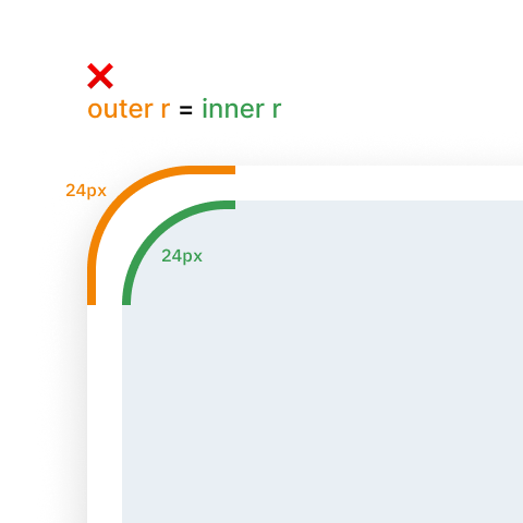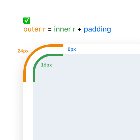
When nesting elements, we often use the same corner radius for both parent and child elements. However, this decision will lead to UI design that won’t look good from an optical point of view because when radiuses are the same, the thickness of the gap (padding) between parent and child elements is inconsistent (some parts are thicker and others thinner).

One approach is to use a slightly smaller corner radius for the child element than for the parent. This helps create a more consistent visual gap around the edges. To maintain the same curvature, use a simple formula:
Outer radius = Inner radius + Padding

Here is a CSS code sample for your reference:
.outer {
  border-radius: 24px;
  padding: 8px;
}

.inner {
  border-radius: 16px;
}
Note that this formula is not universal; it might not work in some cases. Calculation will give you a number, but once you use it, you might see that something is wrong. So it’s essential not solely to rely on math but also to train your eye to be able to spot the visual imbalance.
Tutorial: Corner radius and smoothing in Figma
Want To Learn UX?
Try Interaction Design Foundation. It offers online design courses that cover the entire spectrum of UX design, from foundational to advanced level.
This post contains affiliate link(s)
Corner Radius of Nested Elements in UI design was originally published in UX Planet on Medium, where people are continuing the conversation by highlighting and responding to this story.