Why are data-intensive apps in enterprise, healthcare, and the public sector so unusable and scary-looking?
Proven design techniques such as user research, information architecture, design patterns, and plain language guidelines turn data-intensive apps into information to easily act on. You don’t need AI to do this.
There is accounting for taste
When choosing an accountant, the adage to find someone stereotypically boring, committed to a long, unadventurous journey, but good with the numbers is well-known, though outdated.
However, this “dull and painful” advice still resonates in application experiences intended for data entry and view by citizens, journalists, healthcare workers, students, call centre teams, and more.
That’s not good enough anymore. Expectations about all digital user experiences have evolved.

Worry about the government
The higher education, human resources, financial, customer support, service, and healthcare worlds have plenty of implemented examples demonstrating how basic design thinking and user experience are alien concepts.
Let’s not excuse the government and public sector technology teamsfor being behind the times with those appalling UIs. There are government UX resources available for public-sector digital transformation (the political will to use them is another matter). Ireland, too, has now launched design guidelines standards for public sector digital deployments.
Let me through, I’m a doctor!
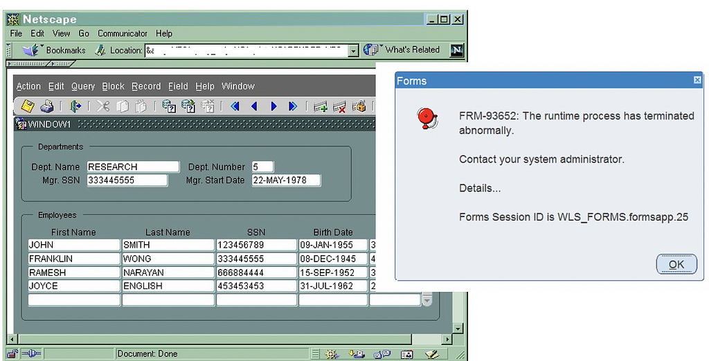
Yet, too often, we still see a green or blue-coloured UI with dozens of illogically laid-out data fields machine-gunned onto each page, designed by an ICT department, doctors, or middle managers who, bless them, think they know best, and the user is the testing team. Anyone could draw the underlying database schema just by looking at the UI labels.
Those CRUD (aptly named) UIs inflicted on the world of work terrify app users about doing the wrong thing, make training and support a nightmare, staff retention a fantasy, and are a productivity killer. It’s death by a thousand cuts. A licence to burn money; in the case of the public sector, belonging to somebody else (you and me).
It’s not all over for big screens
It is possible to provide a compelling user experience for data-intensive and dense-screen websites used on laptops and large monitors. AI and ML will do the heavy lifting on data analysis and insights, but big screens are not going away soon. Some roles demand them.

The day air traffic controllers start doing their jobs on Apple iPhones while sitting in Starbucks is the day I stop flying.
9 things to do better
Here are 9 things you can do to help design and deliver a better data entry and viewing experience, one that enhances productivity and satisfaction, even for those old sit-down jobs. Do you need AI to do this? No.
- Research how real people in different roles actually behave when getting the job completed. Observe and listen.
For example, a data-entry person might work a lot faster by using a keyboard to tab across UI fields instead of clicking around the screen in any order with the mouse. This requires page-level data validation at data save and submission time rather than validating each field on entry or an implicit save model.
If the customer role likes to navigate back and forwards across steps in a guided process (another solid idea for complicated journeys) before finalising a data entry task, then ensure the saving and validation of already-entered data, avoiding required fields, enables seamless navigation to amend data. - Lay the foundations of your experience with a task-based approach to designing how real people, doing real jobs, in real places organise their world of work onscreen. Easy techniques, such as using card sorts of topics, arranged by customers, let you in on mapping the mental model of real customers when they’re working, for example.
- Offer a role-centric journey for your data throughout. When your customer approaches the initial screen, provide an immediate visual answer for such questions as, “What’s going on here?”, “What do I need to do next?”, or “how can I discover more?”
Hiding key actions and information “beneath the fold” is a no-no. Think of glancing at visual analytics on dashboards rather than poring over rows and columns of numbers, as the gateway to further action. - Offer consumer-like, familiar, time-saving experiences by using proven design patterns. Need to find stuff fast? Use search suggestions or auto-fills to speed things up. Loads of fields on a page? Reduce them to the essential ones to commit initial data, and then edit the page later. Order the fields logically. Use progressive disclosure patterns to lighten the load on data entry, or contextual details-on-demand patterns for taking unnecessary data out of the eyeline until someone wants it.
- Use plain (or everyday) language for content and interactions. Avoid abbreviations and jargon. Domain-specific terminology is fine when it makes sense in context, but surfacing ICT terms to customer roles does not. When did you ever hear of anyone using a “wildcard” in Google Search?
Hire a professional information content designer. Keep ICT developers, doctors, and managers away from writing UI labels, messages, and any user assistance content.
A simple glossary of terms goes a long way in design and during usage. Got an older platform with different terms? Provide a mapping of terms (hey, if it worked for WordPerfect to Microsoft Word upgrades). - Allow for shortcuts and deep-dives by more experienced roles. These kinds of usability heuristics are as old as the hills (OK, since 1990). Seasoned business journalists or sociology lecturers might remember those NAICS codes off-hand, but who knows when a newbie will start or when someone might turn up with a hangover?
- Bring work or information to the role, not the other way around. Using alerts, notifications, messages, and visual indicators about exceptions lets people know if there is anything more to do or of interest.
- Understand how people actually “read” screens online. There is still huge value in knowing the F-shaped reading pattern when it comes to user experience and content design, for example.
- Invest in some UX designer time in preference to visual UI design. The first bite is taken with the eye. We form impressions of UI faster than we blink, true, but don’t overdo it. True, beautiful UIs can be usable, but more often, it’s the experience of quick and painless ways of getting the job done that’s considered the real joy.
Makeover ?
There are other ways of improving the look of data-intensive legacy systems, such as a UI refactor, sure. But this approach is akin to offering various shades of lipstick on a pig. It’s better to redesign your digital solution from a UX perspective by understanding the job to be done first. Try it. But learn from your mistakes first.
Like this? Dive a bit deeper with these
- InsurTech: Firing all the brokers is not the answer
- Gov IE Design System
- Lean UX: Applying Lean Principles to Improving UX
Ultan Ó Broin is a user experience design consultant and art school layabout. With over 25 years of product team enablement in Silicon Valley and Europe in enterprise-level domains, he writes and records content about UX design-thinking and innovation.
![]()
Data-intensive apps for work don’t need to be UX-hostile and butt-ugly was originally published in UX Planet on Medium, where people are continuing the conversation by highlighting and responding to this story.