I save many things each month that I find inspiring for some reason, and I like organized lists, so I figured I’d share those lists and maybe help someone out of a creative block.
But more importantly, I am pushing an old idea that inspiration is everywhere if you look with the right mindset. Being a product designer does not mean you can’t draw from architecture, graphic design, or type design. It also does not mean you can’t draw ideas and inspiration for your project by reading articles, brand stories, or tweets.
Pro tip: use the cmd + f to find the inspiration you need faster. For example: “Portfolio inspiration”
1. Anti-chair
‘arm’ chair is not another chair; it is an anti-chair. it celebrates nonsense, and gleefully breaks the chair design rule book. it is uncomfortable; in fact, it cannot be sat on. it is the outline or symbol of a chair, produced in fine American oak.
Clark Bardsley runs an award-winning design studio in Auckland that is truly multidisciplinary. Our projects range in scale from the tiny to the architectural, and everything in between. Every project is treated as an opportunity to work with new materials and processes, and to provide some joy in the everyday.
This is a classic example of taking a component that has been untouched for decades and giving it a new narrative.

2. Microsoft Office’s new default font: Aptos
Microsoft is replacing its Calibri default font with Aptos, a new sans-serif typeface inspired by mid-20th-century Swiss typography. Aptos will become the default font across Word, Outlook, PowerPoint, and Excel for hundreds of millions of users.
– Aptos was designed by type designer Steve Matteson, who also created the Segoe font used in Windows and Xbox. Calibri has been the default Office font since 2007, replacing Times New Roman.

Meet Microsoft Office’s new default font: Aptos
3. Portfolio — Director of brand design at Webflow
Have you ever wondered what the portfolio of a VP or Director of design looks like? Check out Jessica’s portfolio, currently Director of Brand Design & Creative at Webflow, formerly MURAL, Twitter, and Cloudflare.
Personal taste and tone are not replaced with a serious ‘business’ tone here. Her portfolio is fun, vibrant, and colorful (you can change the main color), and uses both a modern font and pixel font, which I always like.

Jessica Rosenberg ⇢ Creative Leader
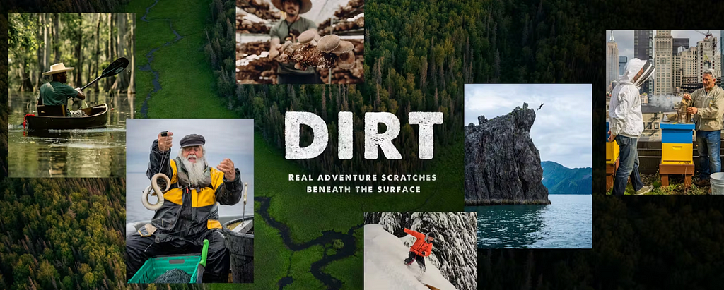
4. Video of the month — DIRT by Huckberry
Huckberry’s brand vision centers around curating and providing high-quality, stylish, and functional gear for men who love adventure and the outdoors. They aim to inspire and equip their customers for a life of exploration and discovery, combining style with rugged practicality. Their vision reflects a blend of adventure, craftsmanship, and storytelling, appealing to those who seek unique and durable products that enhance their lifestyle.
Teaming up with local chefs to craft one meal that truly represents a region, host Josh Rosen goes looking for the unique ingredients, makers, and communities that give every place its own special flavor.
This video series is an accurate manifestation of this brand vision in my opinion. Highly recommend.

5. Portfolio — 3D & Art Direction
Daniel Lepik is an Estonian designer and art director. His portfolio is the definition of a personal style and high-quality taste. Great inspiration for minimalism and how to showcase your visual assets.

6. Creative agency — With conviction™
Kali Adams’s independent practice, with conviction™, was created to support brands, startups, and individuals with a strong belief in making the planet healthier. Bringing creative dexterity to marketing and product innovation within the climate solutions and health + wellness spaces.
Her clients include Ritual, Impossible Food, and even the White House.
The website is very accurate to the messaging, positioning it perfectly for your next green project.

7. Article — Lessons of Design
Fabricio Teixeira wrote one of the best articles I have ever read when it comes to principles of better design. He touches on things learned over the years, and how they impacted more then just design, but life itself. This article is great inspiration for what you should focus on to improve as a designer or a creative, and more than that is how to improve your take on your own career and work.
Subjects covered —
– Conceptual models and why they’re important for creating consistent and scalable digital products.
– How Simplicity is achieved by removing redundancy and carefully considering what to show and what to hide
– Framing your design decisions and reasoning is crucial for getting buy-in from stakeholders.
and more.

8. Linn + Jony Ive Product design — turntable
Since 1973, Linn has been designing, engineering, and manufacturing systems that deliver exceptional detail and emotional impact in home audio. From their first product, the Sondek LP12 turntable, Linn has been at the forefront of home audio technology.
Design Guru Jony Ive approached the company and together they made one of the most iconic home audio devices lately.
BEatuful inspiration for collaboration based on design principles, and creative outcomes.

Sondek LP12-50 | Turntables | Linn International
9. Pinterest alternative — COSMOS
COSMOS is basically the Pinterest for art directors and designers, it’s built with a bank of the most modern and creative assets. You can browse, save, and create collections, too.
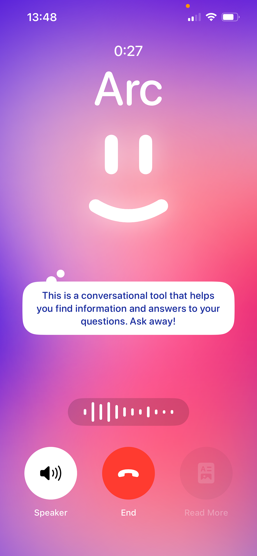
What’s also a great source of inspiration is their manifesto, a well-designed short text about their approach and vision. Every project in this space should start with a good manifesto, or at least a very strong opinion about where it should go. This reminds me of Arc’s manifesto, shaped as “Notes on road trips”.

10. Swiss Passport redesign
Here’s a surprising source of inspiration, the new Swiss passport.
Have you ever wondered what goes into designing a passport? From hidden UV functions to visual narratives, the new Swiss passport is an expression of the country’s identity and offers more than meets the eye. The Geneva-based creative agency RETINAA was responsible for the design. In this interview, founding partner Carl Guilhon talks about the inspiration and design elements that make the passport unique, and why he only flew with SWISS as a child.
Carl, what was the idea behind the design of the new Swiss passport?
With the design, we wanted to redefine what a Swiss document looks like in the 21st century. The design of passports often looks outdated, even though the technologies used to produce these documents are extremely innovative.
Instead, we wanted to create a contemporary design around a visual narrative. It allowed us to incorporate security features that are not only difficult to counterfeit, but also play a role in the narrative. Ultimately, the passport should be a document that holders can trust, identify with and be proud of over the next 15 years !

Behind the Design: The Story of the New Swiss Passport
Summing up
If you just scrolled past this list and said “There’s nothing here that helps and ignites creativity”, you need to adjust your curiosity. These links offer hundreds of sub-links, more references, additional work, more inspiration, and resource banks. Scroll back and now really look.
I hope you found this useful, Let me know in the comments.
-SH
Bonus


Design Monthly Vol. 12 was originally published in UX Planet on Medium, where people are continuing the conversation by highlighting and responding to this story.