I’m back! Wartime in Israel had me occupied with active combat reserve duty. All is good and I’m happy to be back and share my latest inspiration.
I save many things each month that I find inspiring for some reason, and I like organized lists, so I figured I’d share those lists and maybe help someone out of a creative block.
But more importantly, I am pushing an old idea that inspiration is everywhere if you look with the right mindset. Being a product designer does not mean you can’t draw from architecture, graphic design, or type design. It also does not mean you can’t draw ideas and inspiration for your project by reading articles, brand stories, or tweets.
Pro tip: use the cmd + f to find the inspiration you need faster. For example: “Portfolio inspiration”

1. Landing page inspiration — Takeprofit.com
I love landing pages that tell a story, unlike most pages that display information in a formal, structured way. There’s a fine line between boring and messy; inside that line, there’s “I get the message, cool”.
Well done!
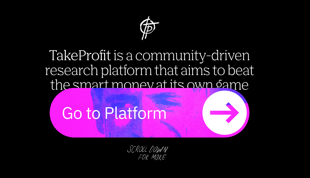
TakeProfit: Empowering Traders to Take Profit With a Community-Driven Research Platform.
2. Inspiring people — R. Buckminster Fuller
Dedicating his life to making the world work for all of humanity, Fuller operated as a practical philosopher who demonstrated his ideas as inventions called “artifacts.”
Fuller did not limit himself to one field but worked as a ‘comprehensive anticipatory design scientist’ to solve global problems surrounding housing, shelter, transportation, education, energy, ecological destruction, and poverty. Throughout his life, Fuller held 28 patents, authored 28 books, and received 47 honorary degrees.
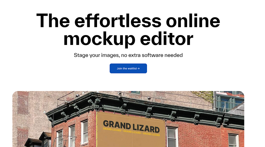
3. Web design — Maneken
Another way to have a great web design is to “show, don’t tell”. Short lines of easy-going, relatable text, with live, visual demonstration. Nothing more nothing less.
4. Ikko Tanaka’s work — Graphic designer
Tanaka is widely recognized for his prolific body of interdisciplinary work, which includes graphic identity and visual matter for brands and corporations including Seibu Department Stores, Mazda, Issey Miyake, Hanae Mori, and Expo 85. He is credited with developing the foundational graphic identity for lifestyle brand Muji, emphasizing their products’ “no brand” quality through unadorned, charming line drawings paired with straightforward slogans.
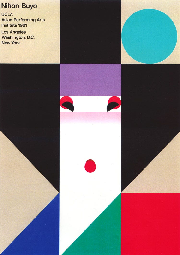
https://www.moma.org/artists/5800
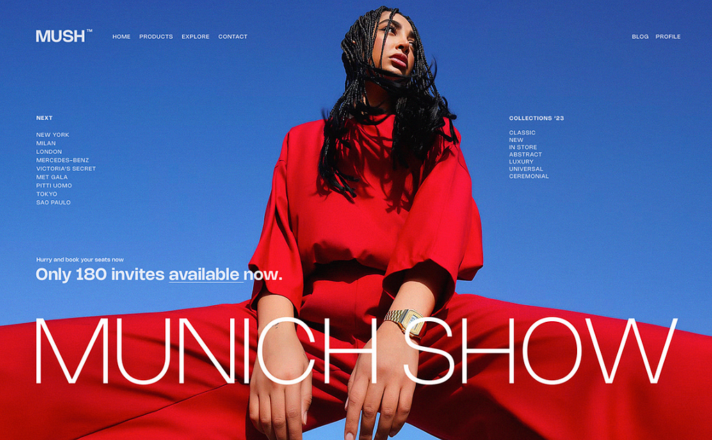
5. Font — NOHEMI
Rajesh Rajput is back with another modern display font very suited for your next fashion project. Check it out.
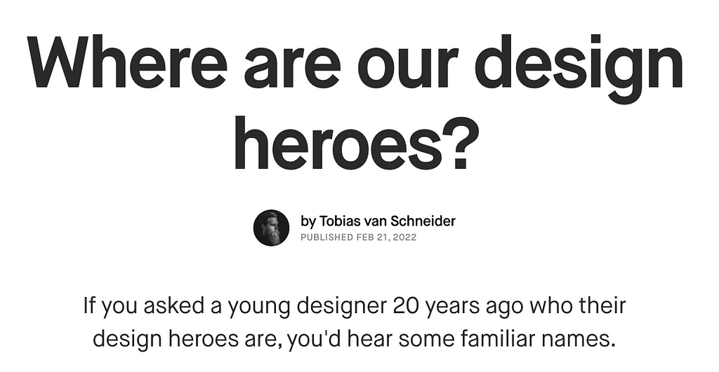
6. Article — Where are our design heroes?
Tobias van Schneider’s very important article has a strong point — designers today have no actual design heroes. Not influencers who share tips and tricks, but actual inspiring designers with years of meaningful and moving work.
7. Pete Lloyd — Illustrator and designer
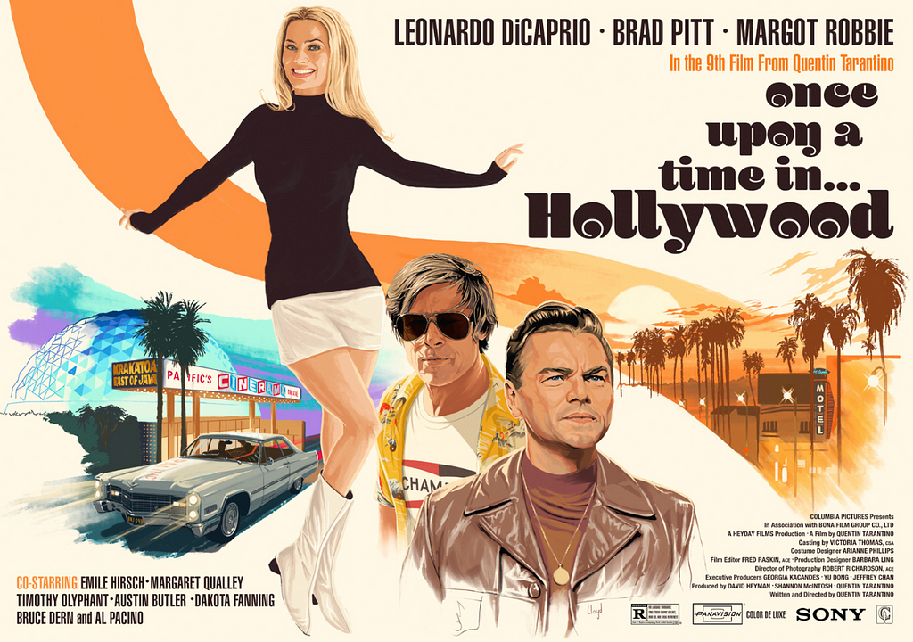
Pete Lloyd is a Northern Irish illustrator and designer residing in Madrid, Spain. He creates narrative-driven images for clients in entertainment, film, publishing, editorial, and advertising.
His craft, definitely built with years of practice is precise yet inspiring and gives light on a story and its emotions. Check out his work.
8. Product read — AirBnb
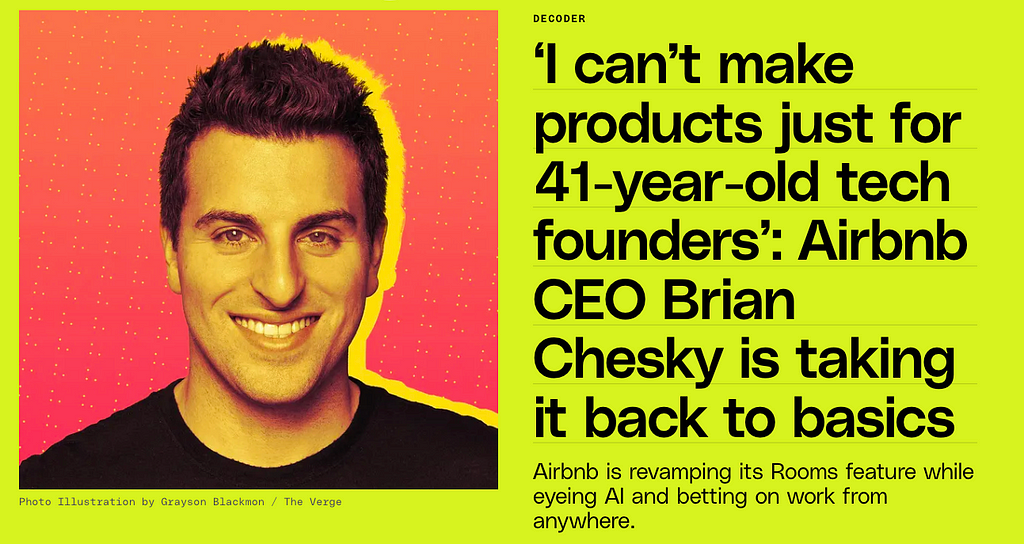
The Verge released this interesting interview with Brian Chesky, on the mega changes the company and the product are having.
I think I see this a lot, and I think this happened to us, and we started focusing on a lot of new offerings, a lot of new exciting things because you want to expand, and something comes maybe somewhat easy to you and you think you can now do everything. And over the years, I just kind of felt like we just really needed to get back to the roots of the company, back to our original founding ethos of sharing.
As companies grow, the focus expands and sometimes the one suffering from this is the product and its initial offering, the first value that got the company this far. Brian has amazing product and design capabilities in reading and feeling where tides shift and being able to focus back. I’m excited to see how this develops.
9. Design read — Spotify Design
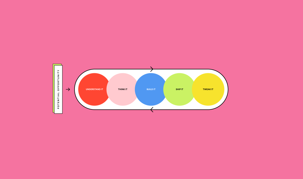
What I like about Spotify Design’s articles is the way they break down and communicate their process on such a human, simple-to-digest level. It’s not easy work for sure, but when you can communicate it is simple. You’re halfway there. Enjoy.
Collaboration Secrets: Design X Engineering
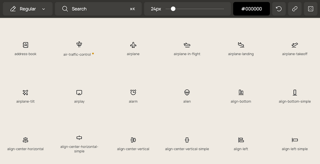
10. Resoucre — Phosphor Icons
Phosphor is a flexible icon family for interfaces, diagrams, presentations — whatever, really.
Summing up
If you just scrolled past this list and said “There’s nothing here that helps and ignites creativity”, you need to adjust your curiosity. These links offer hundreds of sub-links, more references, additional work, more inspiration, and resource banks. Scroll back and now really look.
I hope you found this useful, Let me know in the comments.
-SH
Bonus:
- WORK LOUDER™
- Arlen McCluskey · Design Portfolio
- Mozilla’s setting up shop on Mastodon and trying to reinvent content moderation
Design Monthly Vol. 7 was originally published in UX Planet on Medium, where people are continuing the conversation by highlighting and responding to this story.