
10 Best practices for UI designers
An accordion is a UI component that allows the user to hide or reveal content. This article will review 10 best practices for creating the perfect accordion.
Why to use an accordion
Accordion helps save screen space. It makes essential information easily glanceable and reveals more details upon a tap or click, if necessary. As a result, user will see critical information first and access secondary info only when they really need it. Accordions are typically used in FAQ pages and as a part of the navigation experience.
How to design an accordion in Figma
Here is a 3-minute tutorial on how to design an accordion in Figma without using 3rd party plugins.
Design recommendations
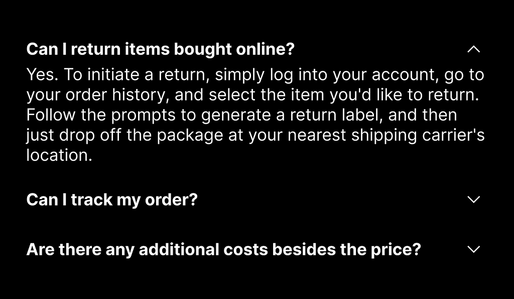
1. Write clear title
Users should easily understand the content within each section. A clear title will help them with that.
2. Visual distinction between title and body text
You need to have a clear visual hierarchy for all parts of your UI, including accordion. It’s worth using different font styles for the title and body text to make it easier for the user to distinguish the objects and identify the parent and child elements. For example, you can make the title bold while leaving body text regular.
3. Design proper default state
If one section contains the most critical information, it might be beneficial to have it open by default rather than make the user open it.
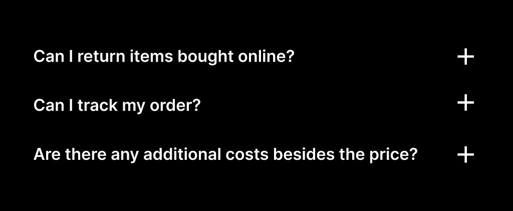
4. Use conventional icons for expand/collapse
Arrow and chevron icons are typically used to indicate the expand/collapse action. There are two reasons for that. First, most users recognize arrows and chevrons and understand their meaning. Second, these icons can serve as cues for change in the indicated direction (arrow down = Closed state, arrow up = Open state).

It’s also possible to use a plus/minus sign as long as it doesn’t conflict with other parts of your UI. For example, if you are already using + as an action “Add” , using this icon for your accordion might confuse users.
5. Place the expand/collapse icon in a conventional place
There are two places where we can place the icon — either before or after the title.
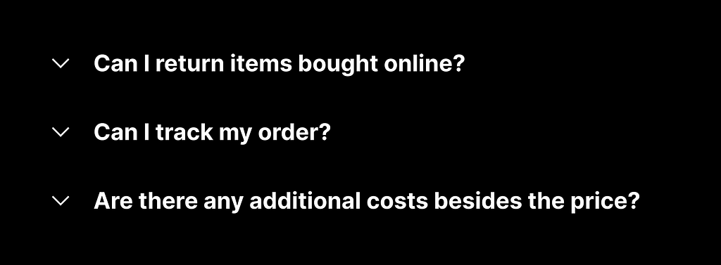
There is no huge difference between the ‘before’ and ‘after’ placement, but the second option is more common in UI design. By placing the icon after the title you also align your design with the F-shape reading pattern — users will read the title first, and after that, they will decide whether they want to click the icon to read details.
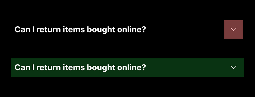
6. Make both icon and title interactive
Some users interact with icons to access detailed information, while others click on the title to do the same. When the entire header (both title and icon) is interactive, it makes interaction more comfortable for both groups of users.
7. Make the icon large enough for comfortable tapping.
The size of the icon should be at least 44×44 px (~9 x 9mm) for comfortable interaction.
8. Add subtle animation
Don’t open details instantly. Instead, use subtle animations to indicate the opening and closing of sections. Animations will make the interaction more comfortable for users.

9. Make accordion accessible
Ensure that users can navigate through the accordion using the keyboard. This is crucial for accessibility and improves overall usability.
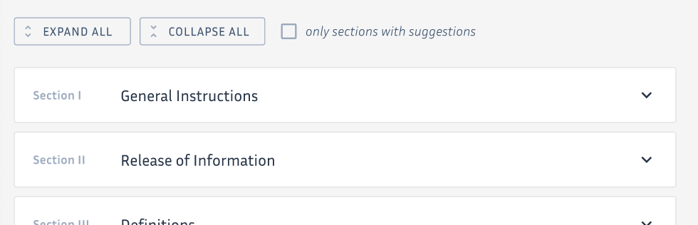
10. Offer a “collapse all”/”expand all” button for accordion with many items
If your accordion has a lot of options, it might be worth adding a control that allows the user to expand or collapse all options. When users have to go through all options, this control will help to avoid unnecessary clicks or taps.
Want to learn UI design?
Try Uxcel. Uxcel will help you learn and improve your design skills with interactive UI courses and skill tests built specifically for professional designers. You will get 25% off discount for the Pro Yearly subscription if join through this link.
The best way to learn UX design
This post contains affiliate link(s)
Designing Perfect Accordion was originally published in UX Planet on Medium, where people are continuing the conversation by highlighting and responding to this story.