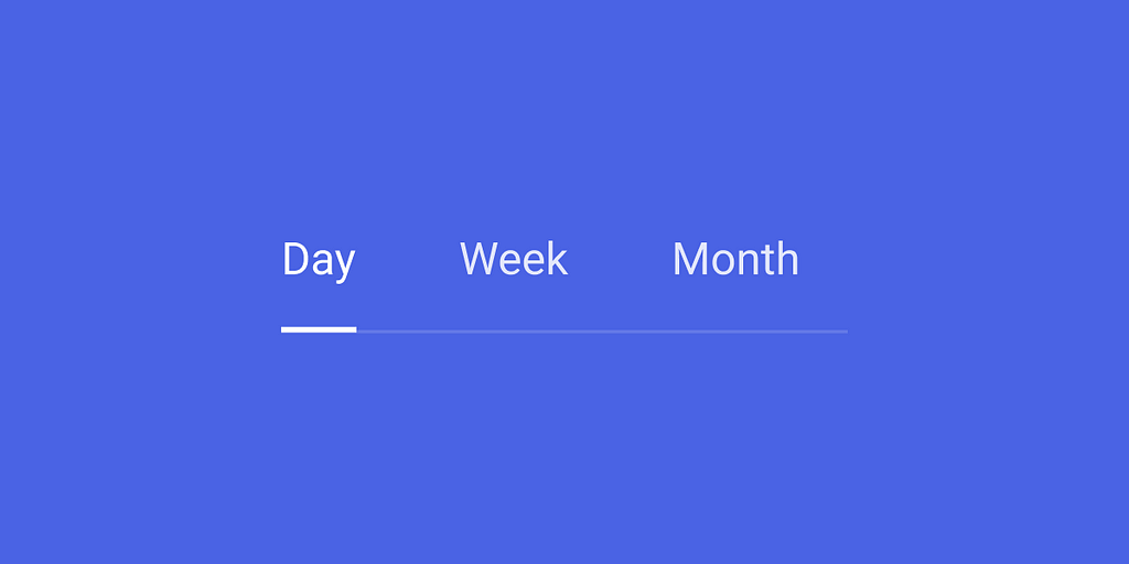
Tabs organize content into multiple sections and allow users to navigate between them. In this article, we will review essential design recommendations for creating perfect tabs.
General design recommendations
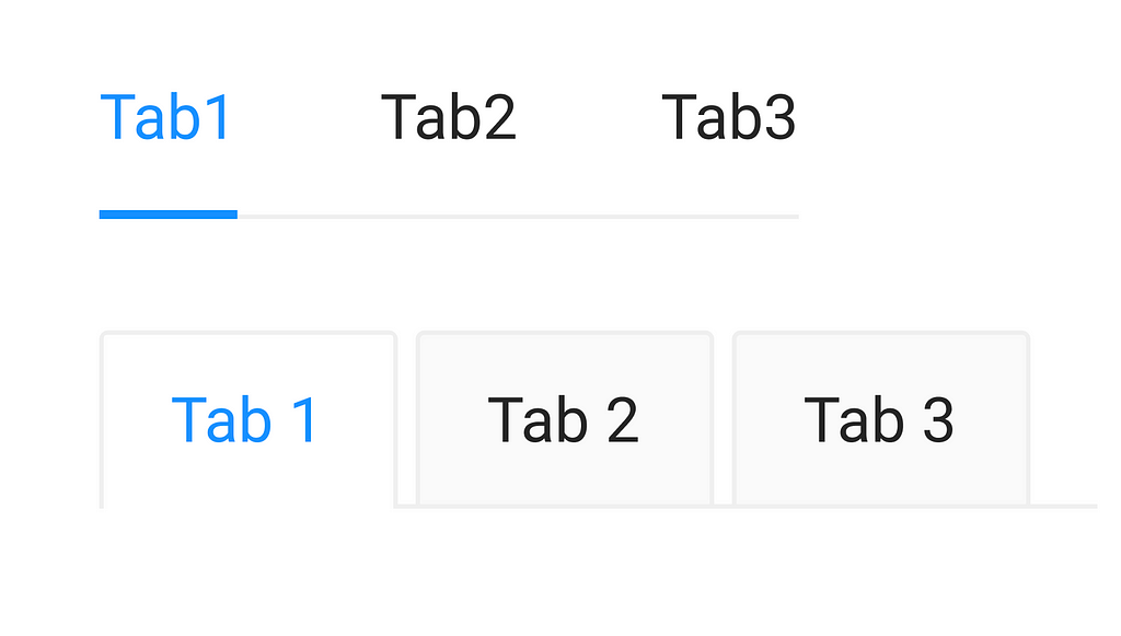
Tabs always contain at least two items, and one tab is active at a time. The visual styling of tabs can vary, but here are two of the most common styles:
1. Context
Tabs are used in the context of individual pages to organize content groups or settings so users do not have to navigate away from a specific page to complete their task.
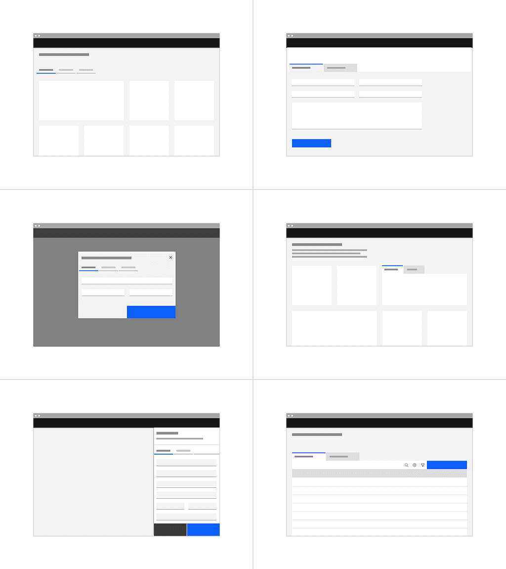
When designing an interface, don’t force users to switch between multiple tabs to compare info. Tabs should contain enough information to help users make informed decisions.
2. Text label
Use short tab labels that are clear and specific. Labels should be one to two words, as these are easier to scan. Text labels should clearly communicate the content users will see when they click on a tab.
3. States
Tabs allow for three states: selected, default, and disabled.

- Selected. One of the tabs should be selected by default when the user loads the page. Usually, it is the first tab. When a user chooses a new item, the previous tab is automatically deselected.
- Default. All of the other unselected, available tabs.
- Disabled. A tab item in a disabled state indicates that the tab item exists but is not available for selection right now. This state can be used to communicate that the tab may become available later.
4. Icons in tabs
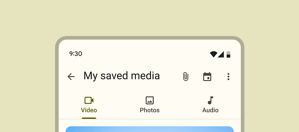
If an icon makes the tab easier to understand, consider pairing the icon with a text label. Try to avoid designing icon-alone tabs since only a small number of icons have universal meaning.
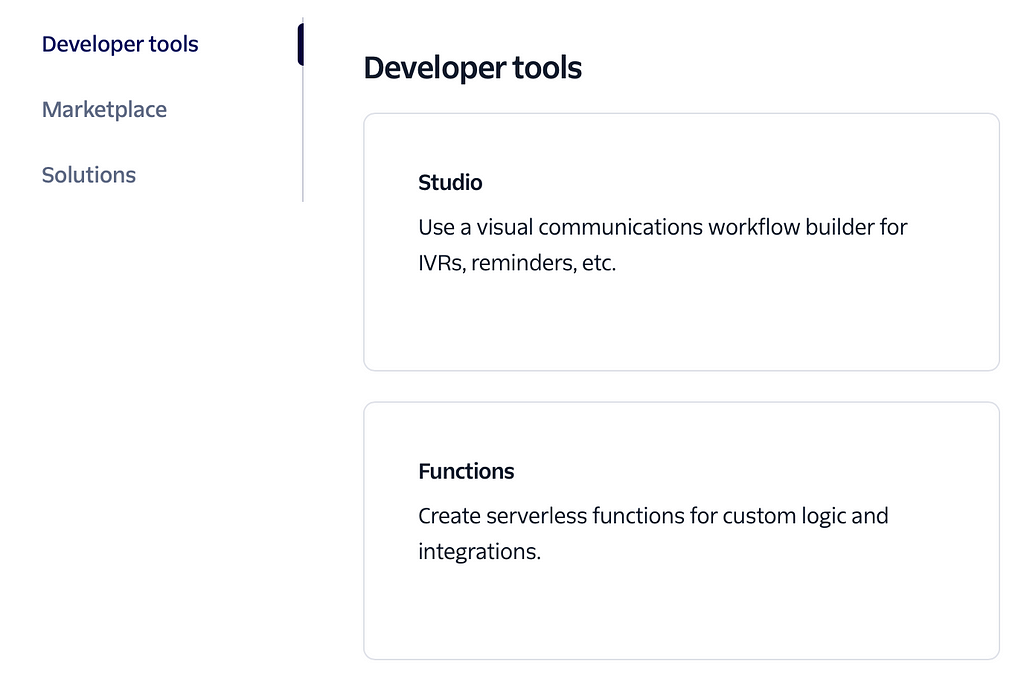
5. Vertical tabs
By default, tabs are horizontal, but its also possible to use vertical tabs when horizontal space is limited. Vertical tabs can be used as anchor links to different parts of the page (i.e., shortcuts to sections of a document).
Best practices for designing tabs
1. Use tabs for related content
Tabs are used to organize related content. They allow the user to navigate between groups of information that appear within the same context.


2. Don’t design nested
Avoid having multiple levels of tabs. You can use accordion or collapsible panels if you need to create a second level.

3. Don’t use tab bar to indicate progress
Use the progress indicator instead.


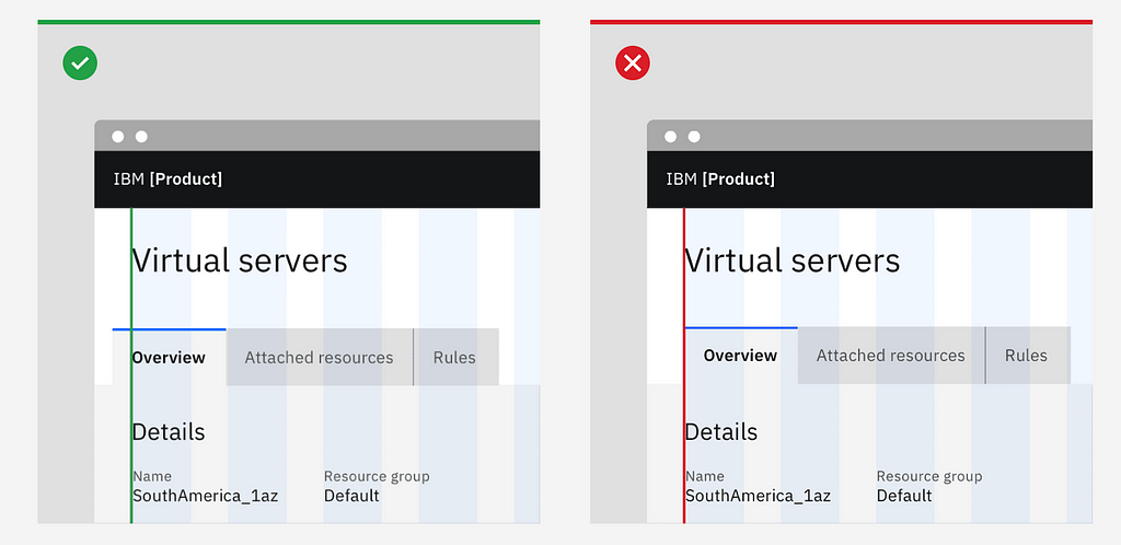
4. Align tab navigation properly
As a rule of thumb, the first label for both line tabs & contained tabs align with the grid and the text below.
Want to learn UI design?
Try Uxcel. Uxcel will help you learn and improve your design skills with interactive UI courses and skill tests built specifically for professional designers. You will get 25% off discount for the Pro Yearly subscription if join through this link.
The best way to learn UX design
This post contains affiliate link(s)
Designing Perfect Tabs was originally published in UX Planet on Medium, where people are continuing the conversation by highlighting and responding to this story.