
My aim is to share the techniques I used to develop the design styles and guidelines for Sexyicons.
Far back 2020, I encountered a common challenge: I needed an icon that wasn’t available in the icon pack I was using. The pack also didn’t feature the necessary documentation to create more icons with the same style. So, I made my own set of icons, which was enjoyable and fulfilling.
Approach
I began by exploring concepts that would significantly influence the fundamental properties like stroke width, corner radius, etc. This exploration allowed me to define the essential visual characteristics.
Next is the icon grid, followed by a keyline, crucial in unifying the icons and regulating their placement within the established grid.
The basic shapes were carefully positioned and aligned on the icon grid. Then, the shapes were combined and manipulated to create more complex and intricate forms using Boolean operations, such as union, subtraction, intersection, or exclusion.

Throughout this process, I developed, documented, and adhered to the established guidelines, ensuring consistency in stroke width, corner radius, and overall visual style.
Additional styles, such as different weights and tones, were explored. Simultaneously, I applied and refined the guidelines of the icons as I created more.
Fundamentals
The concept
The Sexyicons concept revolves around creating visually captivating icons characterised by their boldness, curves, and appeal. I aimed to capture attention and make a powerful visual impact using larger icons.
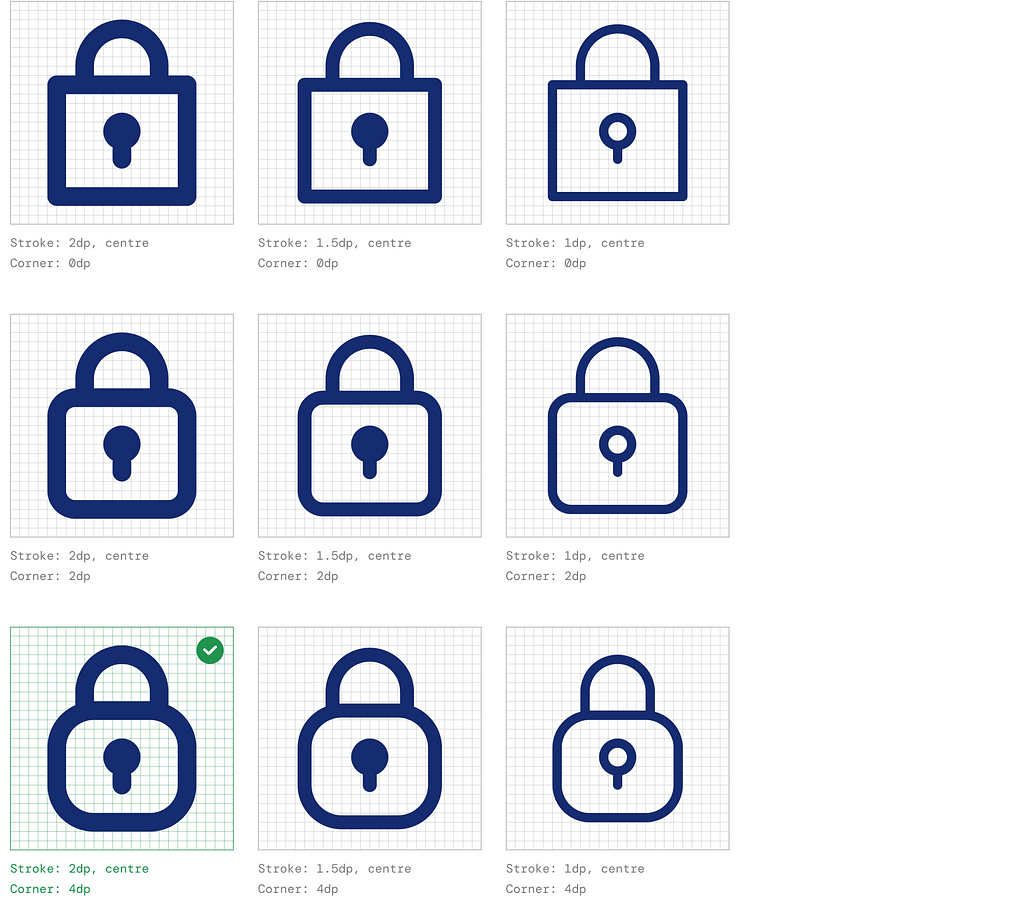
Their boldness allows them to stand out against backgrounds and within user interfaces, ensuring enhanced visibility and easy recognition.
Grid and layout
The icons are designed to be displayed at 24 x 24 dp (density-independent pixels), ensuring optimal clarity and detail.
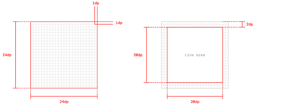
It’s recommended that their content be confined within the live area to ensure that the icons are easily visible. Further, to provide enough space for the icon’s graphical elements, the dimensions of the live area are set at 20dp x 20dp. A padding of 2dp is applied around the perimeter to prevent the content from being too close to the edges of the live area.
Keyline and shapes
The keyline is a spin-off of Google’s Material Icons; mine is a little more rounded and curvy, which will potentially contribute to the intended sexy look.


This is then utilised for different shapes, including circles, squares, rectangles, orthogonal, and diagonals.
Rules and principles
Strokes
Sexyicons employs a uniform stroke width of 2dp across all elements, including curves, angles, and interior and exterior strokes. The consistent stroke width of 2dp ensures its legibility.
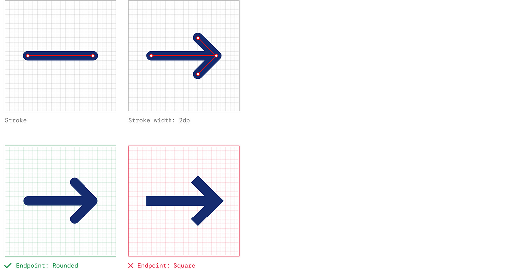
However, some icons can be complex as they may feature intricate details like patterns, fine lines, or delicate shapes. In cases like this, a stroke width of 1.5dp can be utilised for inner strokes to prevent the outer strokes from overpowering these intricate details, allowing them to stand out and be easily visible.

This is then utilised for different shapes, including circles, squares, rectangles, orthogonal, and diagonals.

Corners and curves
Corner is the meeting point of two converging lines forming an angle. The corner radius determines the curvature at the corners of icons. With a default value of 4dp, the corners have a subtle, rounded appearance, adding a touch of softness to the overall design. This radius helps maintain a consistent visual style and ensures the icons have a cohesive look across the set.

On the other hand, the curve refers to the degree of roundness exhibited by an angle or corner. The curve value, 24dp, determines how many angles or corners are rounded within the icon design. A higher curve value produces a more pronounced roundness, while a lower value creates sharper angles and less rounded corners.

Having curved corners on all edges may not be suitable in certain situations. In such cases, a corner radius of 0dp is applied as long as the joints are rounded.

Enclosing area
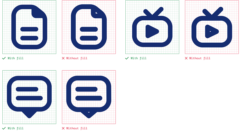
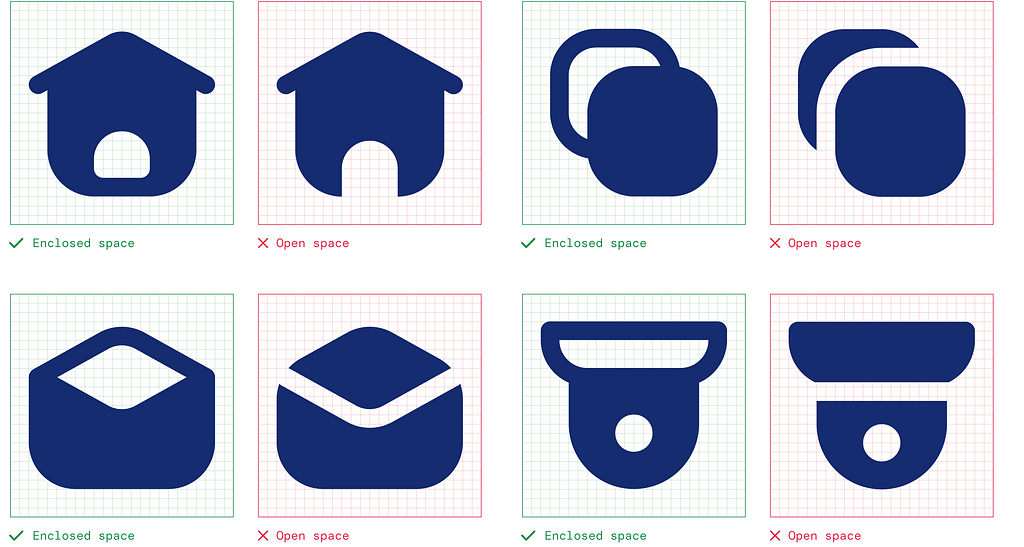
The enclosing area refers to the space that is surrounded or enclosed by two shapes or strokes. It represents the area where the elements within the icon are contained. A minimum space of 2dp is recommended for an enclosed area. This helps to distinguish the individual components, preventing visual clutter.

Silhouettes
As an alternative method, silhouette can be created by filling the enclosing area with a solid shape. This technique is beneficial when there is less than 2dp of space between the shapes or strokes. This approach is practical when maintaining a clear distinction between individual elements is less critical, and the primary goal is to create a bold and unified visual impact.
Anatomy Grid
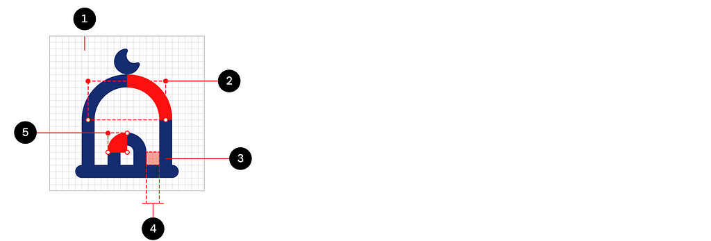
1: Grid
2: Curve (24dp)
3: Stroke (2dp)
4: Enclosing area (2dp)
5: Corner (4dp)
Exploring other styles
Solid style
The solid style is a critical attribute that significantly influences the appearance of Sexyicons. It provides the flexibility to transition from a more outlined style to a reversed or filled style, offering various design options.

This style choice allows for a more pronounced and visually impactful representation, drawing attention to the icon and enhancing its prominence within the user interface.
Duotones
While monotone icons are well-suited for text-heavy or action-oriented contexts, duotone icons provide an opportunity for creativity. They can be effectively used in menu icons, illustrations, and decorative elements to enhance the visual appeal and engagement of the design.
Using two tones in duotone icons allows for a visually striking contrast that captures attention and adds depth to the overall user experience. With the ability to play with different colour combinations, duotone icons offer a versatile and engaging visual style that can elevate the aesthetics of the design and make it more memorable to users.
1. Lineal style
Lineal styles add visual interest, depth, and distinction to the composition, creating a creative and engaging representation of the intended concept or idea.

It can be introduced by applying a secondary colour to the secondary shapes or strokes of the line style.

2. Bulk style
Alternatively, a secondary colour on the primary shapes or strokes within a duotone composition will yield a bulk style. This style choice fills the primary areas with the secondary colour and vice versa, resulting in a visually cohesive and impactful representation.

The solid style offers designers flexibility in emphasising key elements and creating visually striking compositions across different design applications.

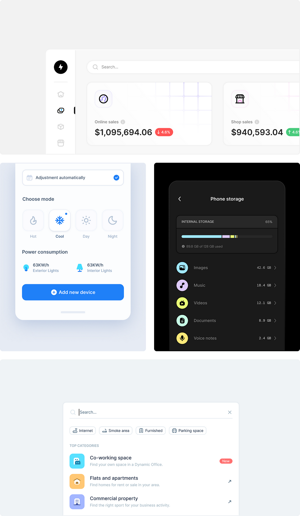
Icons speak louder than words
Credits
Material Icons by Google
A complete guide to iconography by Bonnie Kate Wolf
Basil Icons by Craftwork
Universal Icons by 123done
…
Developing design guidelines for an icon pack. was originally published in UX Planet on Medium, where people are continuing the conversation by highlighting and responding to this story.