Disabled Buttons UX — Usability Issues and How to Avoid Them

This article describes the impact of disabled buttons on the overall user experience (UX). What are the usability issues related to disabled buttons UX and how can we avoid them?
First, let’s learn what disabled buttons are and why they can be a reason for bad UX. The next section describes a few practical examples where disabled buttons work well. The last section shows better alternatives to a disabled button explained with practical examples.
Key Takeaways
- Whenever you feel like adding a disabled button on the UI, first ask yourself whether there is a better alternative.
- Think of the listed scenarios and try to relate your situation. Then find a better solution.
- If using disabled buttons is the only way, try to make them as convenient as possible for the users so they can understand their purpose and enable them by performing the required action.
What are disabled buttons?
A disabled button is a user interface element, typically a button, that is temporarily inactive and cannot be interacted with by the user. It is visually distinct from an active button. It is often grayed out or displayed with reduced opacity to indicate its disabled state.
Disabled buttons are commonly used in web forms and applications to convey that a specific action or functionality is currently not available based on the current state or user input.
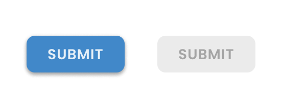
Why disabled buttons can cause bad UX?
Below are a few common issues regarding disabled buttons UX.
Confusing for users
Users find disabled buttons ambiguous and might not understand why they cannot interact with them. Users will look at the button and think about what it does, why it is disabled, and how to enable it. They even don’t know whether it was disabled initially or it has changed its state to ‘disabled’ in response to any of their actions.
A disabled button indicates that there is an action users must do to enable it. But they need to find that action on the UI which usually causes frustration among users.
Broken experience
Finding a disabled button on UI after completing a form on the screen, the users feel clueless. It seems to them if there is an issue with their input that’s why they are not allowed to move forward. They start looking at the page from the start to find any error they have made or they keep on looking for any required fields they might have missed.
Keeping the ‘Submit’ button disabled makes the user think something is wrong. But it doesn’t tell them what. Also, they will not be able to figure out if there is an issue with their input, with the system, or with the internet.
It is hard to find any input validation errors or missing fields which is annoying for users. This leads to a negative experience especially if users feel restricted without clear reasons.
Bad accessibility
As mentioned by Vitaly Friedman in his article related to disabled buttons UX, disabled buttons suffer from insufficient contrast and hence it becomes difficult to differentiate them from other active buttons on UI. Also, users with disabilities will face challenges recognizing these buttons and reading the low-contrast text on them.
No focused state
As mentioned by Adam Silver in this article related to problems of disabled buttons UX, disabled Buttons don’t have a focused state. Since users can’t interact with them, nothing should be changed when the user hovers on or clicks a disabled button.
This unfocused state is confusing for users since they are unable to find a clue as to why the button is disabled and when it will become enabled. Users don’t expect to click on an unfocused button, so providing a tooltip on hovering a disabled button is not a good idea.
Interrupted Flow
Disabled buttons disrupt the user flow since users need to stop, wait, and see why the button is disabled and how to enable it. They need to find the error or missing field(s) that can be a reason behind it.
Sometimes, users start filling out the form from scratch to correct any possible errors they made earlier. This makes the process slower and can waste the user’s time.
Ineffective communication
Design is communication, and disabled buttons do not effectively communicate the reasons for their existence. Users feel annoyed when they cannot find a clear clue about disabled buttons and how to interact with them. This lacks the communication that users expect while interacting with an interface.
When can disabled buttons be used?
There are a few scenarios where using a disabled button works if you consider certain UX best practices.
(i) In a content management system like Google Drive or SharePoint, the ‘Share’ or ‘Download’ buttons are disabled if the user has not selected an item. Users need to choose an item before these options become active.
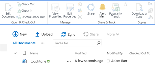
(ii) In collaboration and messaging apps like Slack or Microsoft Teams, the ‘Send’ or ‘Post’ buttons in a chat or discussion thread are disabled until the user enters a message. This encourages users to provide content before trying to share it.

(iii) In collaboration apps, a ‘Join’ button for meetings remains disabled till 15 minutes are left before the meeting starts. The user can come at that time to join the meeting.
(iv) In editors like Microsoft Word or Google Docs, certain formatting or editing options remain disabled until the user selects the relevant text or object to apply those changes.
(v) Social media platforms like Facebook or Twitter disable the ‘Post’ button until users enter a minimum number of characters in their status update. The button gets enabled as soon as the user starts typing the content.
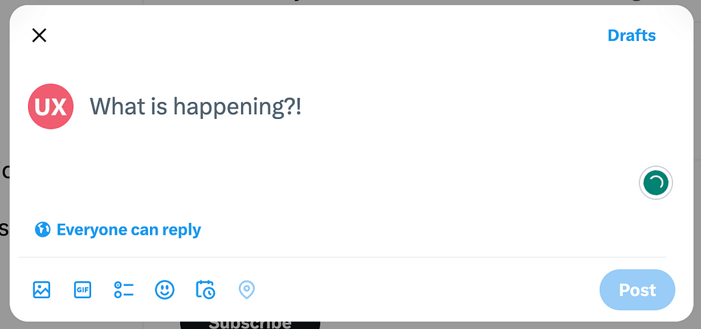
To summarize, a disabled button on the UI means there should be a way for the user to enable it. That way should be clear to users so that they are not wandering here and there to find the solution. In the above examples, users expect to get the button enabled after some time or in response to an action.
What are the alternate solutions?
To ensure a better user experience, there are a few alternate solutions that can be used instead of disabled buttons on the UI.
Hide button from UI
Instead of disabling a button, you can hide it completely from the UI. However, there are certain conditions where this solution works.
(i) The button will not become enabled in any case for the current user. For example, it can be a permission-based ‘Delete’ action and the current user might not have the right to act.
(ii) There is no valuable action that the user can perform by clicking the button. For example, the user is asked to move to the ‘Next’ page when there is no data available to show on that page.
Otherwise, hiding a button from the UI and showing it again on a user action is a negative experience. Users will get confused as to when and where the button will be displayed. Users will search for the button and spend time looking for it, possibly refreshing the page, restarting the browser, etc.
Provide a tooltip showing the reason for disabling
Display the button in its disabled state and add a tooltip explaining why it is disabled and how users can get it enabled. This way users will know both the reason and the required action to enable the button.
There are a few scenarios that need to be considered while going for this option:
(i) Find a suitable placement for showing the tooltip or help text. Since the disabled buttons don’t have a focused state, the user may not expect to hover or click on them to see a tooltip. You may require a separate icon where the user can hover and see the details.

(ii) You can display a help text on the main UI somewhere closer to the button. Make sure the text is not looking awkward on the screen.
(iii) Performing input validation for a form becomes vague if the button remains disabled after filling all the fields and users need to find the issue by themselves. You should provide an instant validation that tells users about any issues when they move to the next field in the form.
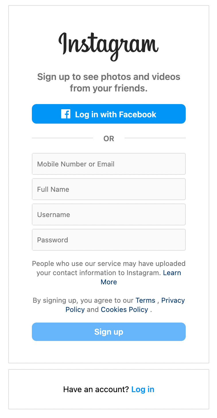
Use a better way to communicate with users
Instead of disabling the action, think of something alternative that can be communicated to users in a better way.
(i) When an item is not available for purchase, instead of providing a disabled Out of Stock button, you can provide an ‘Add to Wishlist’ or ‘See Similar Items’ button. This conveys the meaning to users and they can show their interest in the item that will help them in the future.
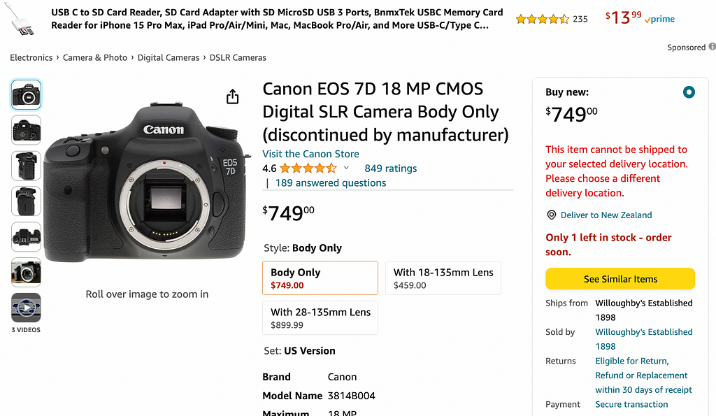
(ii) When the user opens an item for purchase, select the default options of size and color for the user instead of disabling the ‘Add to Cart’ button. The user can change the details if required.
Do not use disabled buttons at all
Keep the buttons enabled all the time and let users click on them. Allowing users to click on buttons and find the possible errors is an efficient experience as compared to the cognitive load of searching for the reason why the button is disabled.
(i) Perform an input validation on the button click
(ii) Highlight the error(s) on the page
(iii) Move the user to the location of the first error on the page and show a description of the error along with the relevant field.
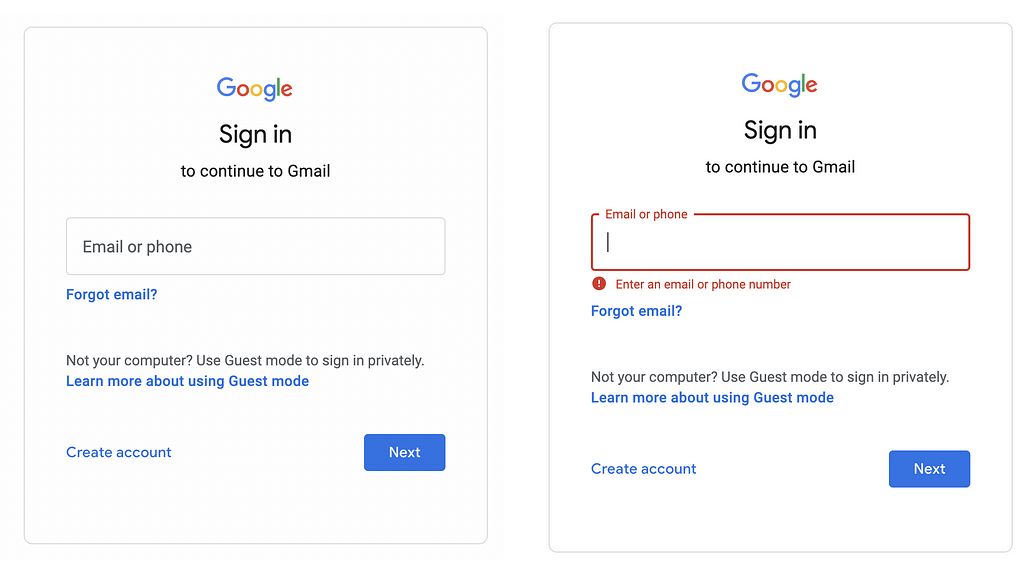
Google Sign In page makes the Next button enable all the time. If the user clicks on it without writing the correct information, an error displays along with the control.
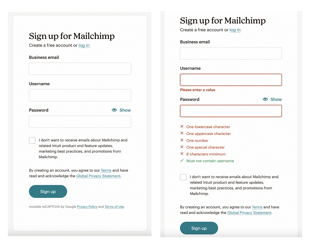
Mailchimp displays an active Sign Up button. If the user clicks on it without providing the necessary information, it shows all the errors in the form.
Conclusion
The above explanation helps you design a user experience that avoids frustration when designing disabled buttons UX and will provide you a foundation to design an accessible and simple interface that has fewer complexities for users.
Originally posted at uxdworld.com.
If you have any questions, contact us here: Facebook | YouTube | Twitter | Instagram | Linkedin
Disabled Buttons UX — Usability Issues and How to Avoid Them was originally published in UX Planet on Medium, where people are continuing the conversation by highlighting and responding to this story.