What does designing for emotion mean, and how can you do it?
Introduction
Think of something you love. Try to picture it in your mind.
It might be a functional tool, or a decorative object. Perhaps it’s something you made, or a gift from someone who knew you’d appreciate it.
The thing itself doesn’t matter — it’s not what you love, but the why that’s relevant to this article.
The reason you love that thing is likely because it taps into all three levels of emotional processing — visceral, behavioural and reflective — to produce a delightful and meaningful relationship with it.

In this scenario, you’re both experiencing and benefiting from emotional design. But how do these levels of emotional processing work? What does designing for emotion really mean? And how can you do it in practice?
Let’s go deeper…
What is emotional design?
The concept of linking emotional processing with product design was introduced to the world by Don Norman in his book Emotional Design, where Norman made the following core argument:
There’s more to UX than usability — designing for emotions is key for creating products and experiences that people truly love.

It’s difficult to summarise a whole book in one section of a single article. But before we get into how to design for emotion, it’s important to briefly take a closer look at what these levels of emotional processing are (and the way they work, psychologically).
The visceral level
This is the base level of emotional processing — the primal, subconscious and automatic response to new stimulus. Visceral responses can be good (e.g. excitement) or bad (e.g. disgust), although with UX design we’re obviously aiming for positive emotions.
Designing for visceral emotions is about creating pleasurable reactions, and it can tap into all senses.
Some examples of this include:
- the sight of a sleek, aerodynamic sports car
- the smell of freshly printed pages in a book or magazine
- the feel of a perfectly weighted smartphone in your hand
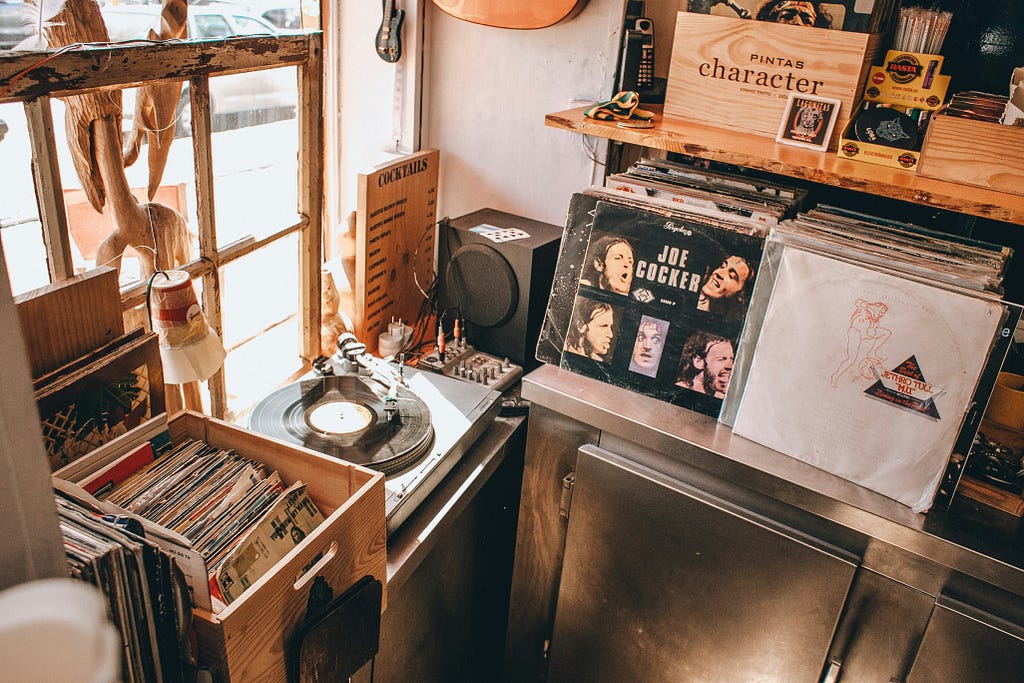
- the sound of a crackling vinyl record when the needle drops
- the taste of food rich in salt, sugar or umami flavours
The behavioural level
This level is all about learned skills, performed subconsciously. This is as close as emotional design gets to classic usability design principles and heuristics.
Products that perform well at the behavioural level of emotional processing are intuitive and enjoyable to use.
What matters at this level is that every action is associated with an expectation. Emotional satisfaction or frustration will depend on whether the feedback resulting from your actions matches your expectations.
Some examples of this include:
- Websites and apps that follow established design patterns (Jakob’s Law), for example affordances like search and navigation menus — we expect them to look recognisable, behave predictably and be located in a familiar area of the screen.
- Software/user interface feedback — we expect to be alerted when the status of a system changes, e.g. order conformation, notification bubbles, etc. Without this, we don’t know if anything has happened or requires action, and so we get confused and frustrated.
- Physical product ergonomics — we expect phones to be operable one-handed, and controls of other devices to be located and sized for easy use, e.g. buttons on a VR headset (these need to be intuitive so we can operate them without looking).

The reflective level
This is the conscious, deeper level of emotional design. And it can lead to long-term satisfaction or anger with a product.
What’s happening at this level is you’re thinking about whether the product meets your goals, and reflecting on how your relationship to the product makes you feel. In other words…
At the reflective level of emotional processing you’re consciously deciding what owning or using the product says about you
As much as we might want to deny it, we believe certain brands and products say something positive about who we are. They signal the kind of people we are to ourselves, and what our values are to the world.
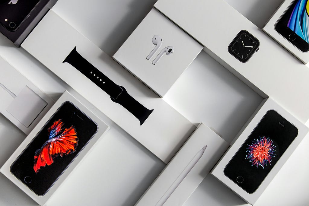
Even within the narrow context of owning a smartphone, there are many subtle nuances. For example:
- the model — do you have the latest iteration (making you an early adopter) or are you rocking a phone that’s five years old (perhaps signalling you care about making things last, or that you’re simply indifferent to the latest technology).
- the accessories — is your case bright and colourful (suggesting a playful personality) or simple and sturdy (suggesting you care more about durability than aesthetics).
- the brand — your choice between one of the market leaders (Apple or Samsung) versus a company with a tiny market share (Google Pixel, Fairphone or Nothing Phone) might actually be a statement about fitting in versus standing out from the crowd.

Combining all three levels in design
Great emotional design combines all levels of processing into more than the sum of their parts.
General example: Apple
An obvious example of a company that does this well is Apple — a brand that consumers buy into as a lifestyle choice. They design for emotion at:
- the visceral level by making their hardware products sleek, shiny and premium-looking.
- the behavioural level by ensuring their software is quick, intuitive and matches user expectations.
- the reflective level by ensuring everything they do — products, websites, social media, launch events, stores — is consistent with the brand aesthetic customers identify with.
Before we move on to practical suggestions, let’s take a look at one more example of emotional design. This may be a bit indulgent, but hopefully it helps make sense of emotional design in a more personal and relatable way.
Personal example: Marshall headphones
I’ve used Marshall headphones for over a decade, and about a year ago I bought the Marshall Monitor II. Let’s take a look at how Marshall’s design works for me on all three levels of emotional processing.

First let’s consider the visceral level. I love the Marshall design language. Visually, they have that old-school cool recording studio vibe that evokes Marshall’s guitar amp heritage. They also build in some visible wiring, (vegan) cracked leather textures and handwriting typeface logo. They feel great to hold with a pleasing heft, and when you switch them on you get a scuzzy guitar riff as feedback which is a nice touch.
Now for the behavioural level. These headphones are incredibly easy to use, primarily operating a simple control knob. The way it works is intuitive, with actions mapping naturally to results, e.g. up for louder, down for quieter. It’s also easy to switch between different pre-set modes and toggle the ANC on/off with other buttons. It all just makes sense to me, and physical buttons feel satisfyingly tangible (as opposed to other headphones which rely on more subtle taps and swipes).
Finally, the reflective level. What do these headphones say about me? Quite a lot. I originally bought a pair of more expensive Sony WH-1000XM5 headphones, but I sent them back. Why? They just didn’t feel like me. I’m a Marshall person, not a Sony person. What does that mean? I suppose it means I align with that authentic, tactile and slightly alternative aesthetic and not a sleek, shiny mainstream consumer lifestyle brand.
You’ll notice nowhere in this example have I included what these headphones actually sound like, which is the main point of headphones. In a nutshell: they sound good. But that’s almost irrelevant to emotional design! Even though most tech reviews rank Sony headphones above Marshall on sound quality, I go for Marshall because of how that brand and its products appeal to me on an emotional level.
To be clear: this is not a sponsored post — I have no affiliation with Marshall. I just really like their headphones and it’s a useful example of emotional design at work.
How to design for emotion
We’ve looked at what emotional design is, and how the three levels of emotional processing work together. But if you’re a UX/product designer who mainly works on things like websites and mobile apps, how can you actually design for emotion? How can you make people love those interactive experiences?

There are many, many ways to design for each level (and combine them). But here are some suggestions…
Designing for the visceral level
- Aim for a minimalist design aesthetic by default, e.g. remove clutter, increase negative space and help users focus on the content.
- Make use of a clean, bold typeface that’s easy to read.
- Use images that are large, high-quality and diverse/representative to make people feel both engaged and included.
- Include motion to add playfulness and delight to the design — for example animated scroll bars or loading feedback.
- Avoid bad practices likely to immediately trigger negative responses, for example dark patterns or poor accessibility.

Design is an art form, and there are endless ways to do good visceral design. These are some ‘rule of thumb’ suggestions, but you can match the design to the audience, e.g. good visceral design for children will look different to most products aimed at grown-ups.
Designing for the behavioural level
- Ensure your design is externally consistent: follow commonly used design patterns and components — remember users spend most of their time on other people’s products, so make yours feel familiar (Jakob’s Law).
- Ensure your design is internally consistent: ensure that your design system is set up so UI elements look and work the same across your product, e.g. a ‘Continue’ button always behaves the same way when you interact with it.
- Carry out plenty of usability testing as you create products to harness the feedback loop: test-learn-improve. This is the classic UX approach of designing products through continual testing to incrementally or iteratively improve designs.
- Add meaningful and recognisable icons, and avoid harming usability by misusing them (e.g. abstract icons — if they won’t mean anything to people on their own, it’s just visual clutter).

These ideas should help you iron out negative behavioural responses, and ensure that user actions and expectations are in sync.
Designing for the reflective level
- Ensure that all your products embody the values of your company or organisation — what do you stand for, and how can you reflect that in your designs?
- Make sure your brand design language is consistent across every product and every touch-point with your users or customers, e.g. website, mobile app, newsletters, social media, etc.
- Remember your brand covers everything from design aesthetic (e.g. logo, fonts, colour palette) to your tone of voice, approach to customer service and how you treat your staff.
- Design new products to seem like a natural progression of previous ones (not a jarring departure). Bear in mind even an innovative revolution of your product line can feel like a natural progression if it still captures some essence or ‘DNA’ of what your brand is about.

Following these ideas will help your brand come across clearly and consistently to customers. It helps people recognise your brand, identify with its values, and lays the groundwork for them to form a loyal, long-lasting and emotional relationship with you and your products.
Final thoughts
Emotional design is a powerful concept for the UX/product designer.
People don’t just use products, they form emotional relationships with them and the brand behind them. We own products because we have immediate positive responses to them, they behave intuitively and they say something meaningful about us.
So we should design for that. As long as humans are recognisably human, designing for emotion will always make sense.
Sources
Norman, D. (2004) Emotional design. New York: Basic Books.
Walter, A. (2020) Design for emotion. 2nd edn. A Book Apart.
About the author
Andrew Tipp is a lead content designer and digital UX professional. He works in local government for Suffolk County Council, where he manages a content design team. You can follow him on Medium and connect on LinkedIn.
![]()
Emotional design: why it matters in UX was originally published in UX Planet on Medium, where people are continuing the conversation by highlighting and responding to this story.