Enabling creators to track their content-creation journey on Graphy — A product design case study
In this case study, I want to share how we solved the problem of keeping creators informed about their progress and growth on the Graphy platform.
Team and responsibilities
I was the sole designer who owned this project. Parul Bhatti was the lead who helped me with design feedback and exploration of visual directions. My responsibilities included product thinking, user experience, visual design, and collaboration with stakeholders.
Context
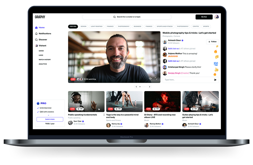
In the initial quarter of 2023, Graphy built a business-to-consumer (B2C) platform with the aim of facilitating content creators in generating and monetizing their content through live streaming.
Let’s say you are a content creator who teaches finance. You could use the Graphy live streaming platform to conduct live streams and teach your audience, as well as monetize your knowledge business.
💰 There are two ways a creator can monetize on the Graphy live streaming platform:
- Pro referrals: A PRO subscription enables a learner to use features like asking a doubt during a live stream and unlimited chats. When anyone from the creator’s audience (let’s call them a learner) buys a PRO subscription while they are watching the creator’s livestream, a certain percentage of the amount is given to the creator.
- Watch time: Based on the watch time of a creator’s content, a certain amount is calculated and given to the creator as revenue.
Objective and problem statement
If you’ve ever created content online, you understand that it’s a lot of hard work. It requires consistency and perseverance. And it requires the creators to create content with intention. As a platform, it was our responsibility to make this journey encouraging as well as rewarding for our creators.
One such way to do that was to help them track and understand their progress. This would enable them to understand what is working for them and what they may need to change for the metrics to move.
Hence, we decided to build an analytics dashboard that would provide the creators with all the data points they’d need to better understand their content creation journey on our platform.
Success metrics
As established previously, our aim in building the analytics dashboard was to help the creators gain a deeper understanding of their content and journey on our platform.As a result of which they could employ strategies to grow faster and better.
While there are no first-order effects that we can track of their growth in relation to the analytics dashboard, one metric that does help us understand if the creators are finding the dashboard useful is the engagement rate and retention rate. Hence, these were our success metrics for this project.
Solving the problem
Initial thoughts and feelings
When I first heard the words “analytics” and “dashboard” from the product manager, the first thing that came to my mind was a lot of numbers, a couple of charts, and a cramped screen. Not having designed dashboards previously, this seemed slightly overwhelming.
Old design as a proof of concept
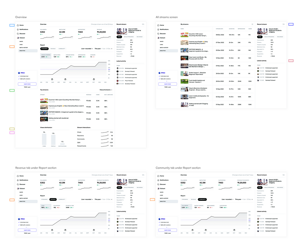
We had an old design that was previously put together very quickly by our other designers. The purpose of this was to present to our stakeholders and leadership a proof of concept (since this live-streaming platform was one of the 0–1 projects we were working on).
Given brief
The brief that was given to me was to rethink the entire dashboard design and improve the user experience.
Thoughts on the old design
When I started analyzing the old designs, I observed that they were too information-heavy, which could lead to a lot of cognitive load for the user when they try to read and understand this data. Another observation was that there were too many points of action for the user. This could lead to confusion and difficulty in navigation.
💡 These things led me to wonder:
- Is all of this information even needed for our creators at this point? Could we do better at scoping this data?
- What is the information that would be crucial to the creator’s journey versus the not-so-important information that could be eliminated or hidden to avoid confusion and cognitive load?
Ideation
Apart from solving just the issues that were observed in the old design, I also wanted to zoom out a bit and approach the task at hand from a fresh perspective.
It felt right to ask the most basic question first:
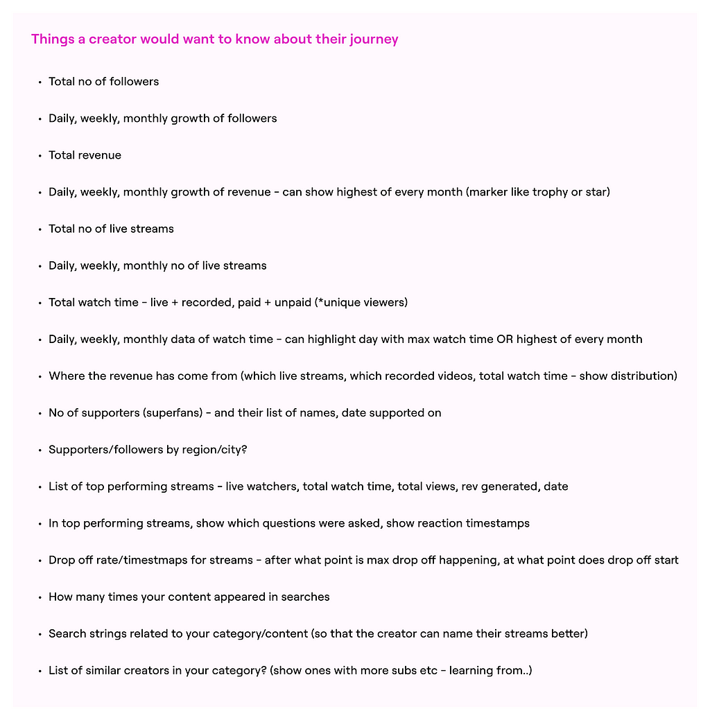
“What are the things that a creator would want to know about their journey on our platform?”.
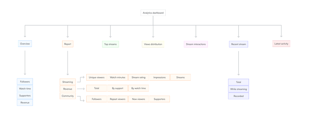
Below are a few points that I initially listed.
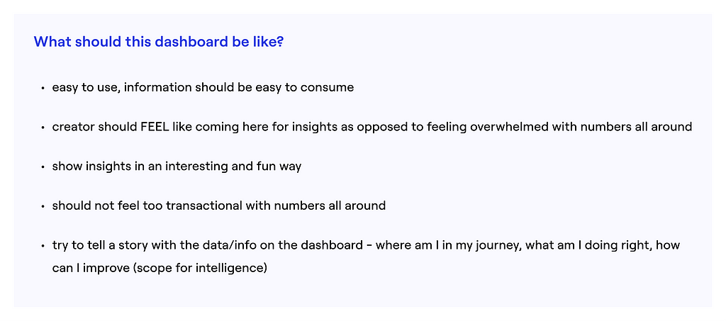
I also had some thoughts about how I wanted the dashboard experience to be for my users. I listed those down and shared them with the team to get their alignment on the approach.
Research and insights
Upon researching dashboard design inspiration, I saw numerous displays cluttered with an excessive number of figures and graphs, making them challenging to read. It was difficult to understand the information on those dashboards.
However, after reading a couple of articles on dashboard design, I realized that many experts suggest displaying as much data as feasible above the fold on the screen. This notion seemed counterintuitive, prompting me to delve deeper into the rationale behind such recommendations.
During my conversation with my team lead, we discussed that typically dashboards are used by data and business analysts. They are qualified and skilled in reading data in a certain way and need to view a large number of metrics at once. However, my user is not an analyst but a creator. It could be anyone, like you or me.
Context is important!
When designing the dashboard, I wanted to make sure that it was easy to navigate and consume. The creators should ‘feel’ like coming here for insights as opposed to feeling overwhelmed. It should be simple and not overly transactional.
While doing a competitor analysis, I examined the approaches used by other products. My focus was on companies with a similar consumer-based target audience rather than an analyst-centric audience. Some of the examples that I found to be very impressive and relevant were Airbnb, Vimeo, Unsplash, and YouTube.
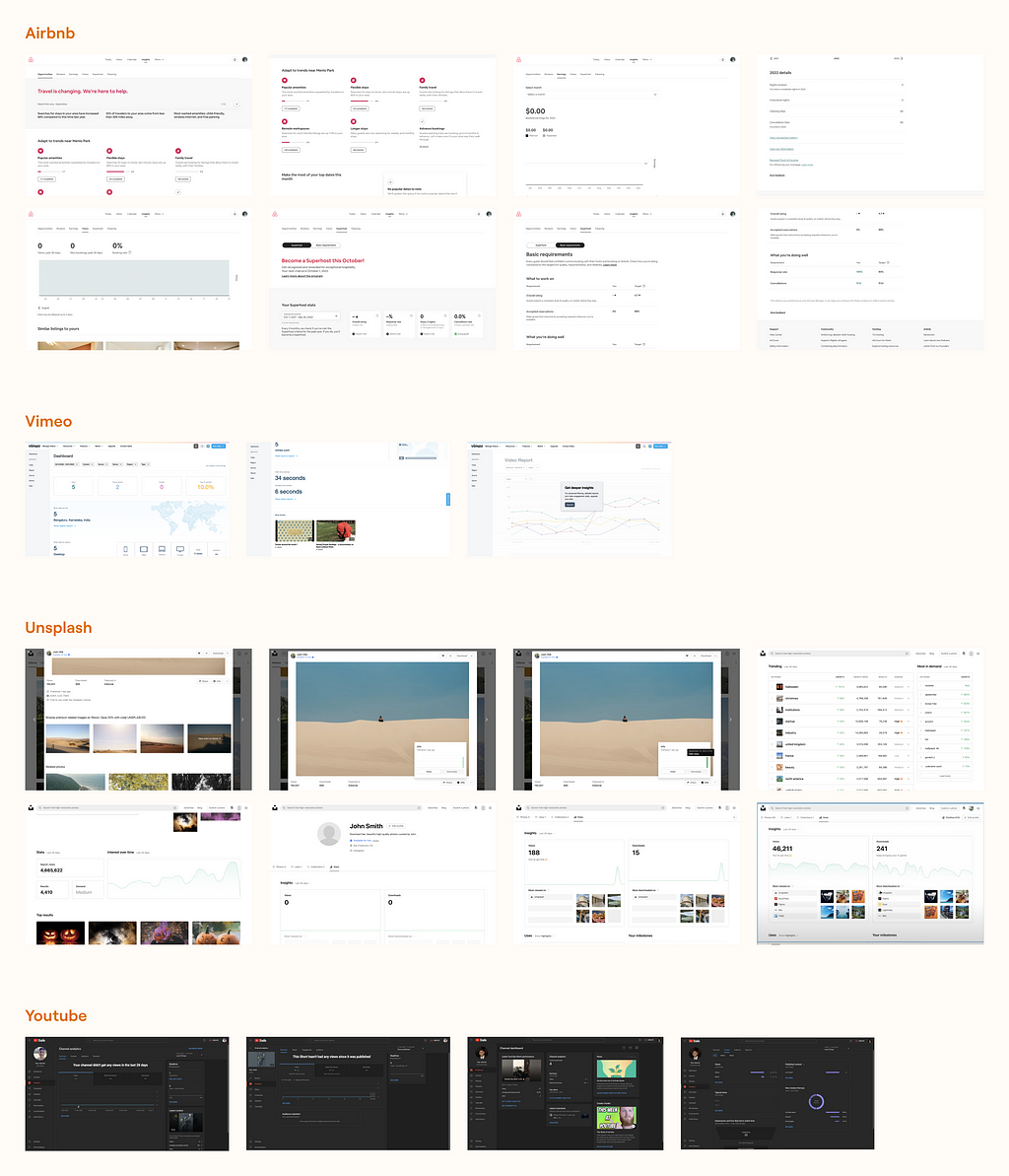
Some things I observed and learned from competitor analysis:
- Simple ways of representing data (for example, what types of data visualization are used and how graphs are designed for easy reading)
- Hierarchy of information (for example, how labels are written, how important numbers are highlighted)
Information Architecture
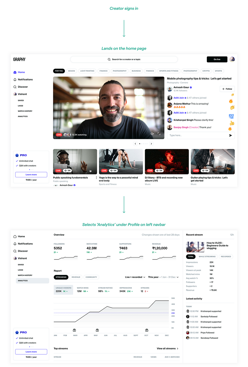
At this point, it seemed right to get on a brainstorming call with the product manager and finalize all the data points that we’d like the analytics dashboard to show. As we saw, the old design had a lot of data points. There were two things I wanted to address here:
- Identify the data points required versus not required for the creators as they start their content creation journey on Graphy
- Reconsider and rethink the coupling of data based on what makes more sense as well as our previous experience in the creator economy space

Visual design
These are the designs for the first release of this project.
As soon as the user lands on the analytics dashboard, they see the Overview screen.
All the information and data points are classified into three sections:
Overview, Content and Payments.
This makes it easy for users to navigate through the dashboard and consume the data effortlessly.
➡️ Overview
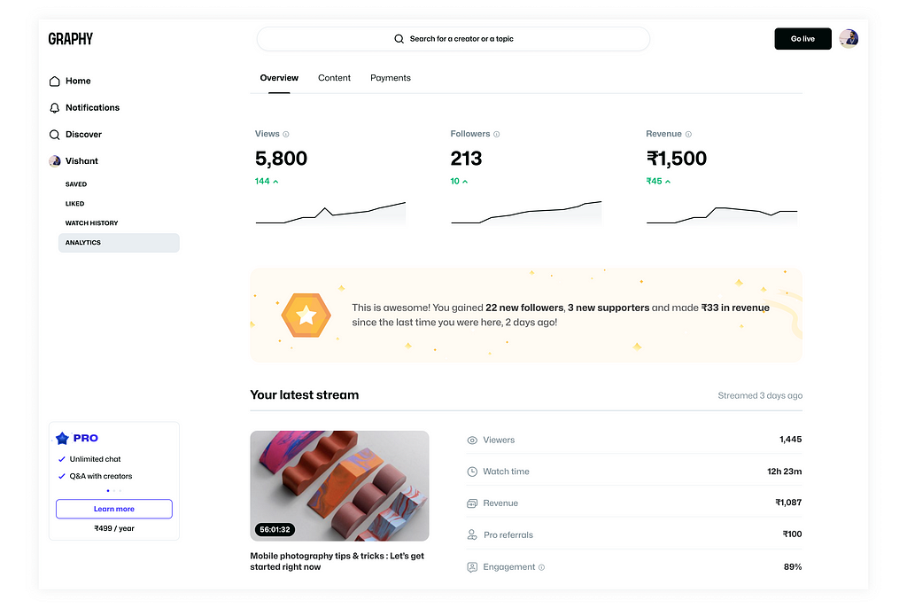
After a couple of brainstorming sessions, we decided that we wanted the creators to focus on three major metrics that would help them grow faster. These three metrics were: Views, Followers, and Revenue.
Here we see the total lifetime number of views the creators’ content has, the followers that they have, and the revenue that they have generated.
Below the total lifetime number, we show the change in the last 28 days.
Why show total lifetime data and not monthly data?
This is because, as the platform was very recently launched, the creators wouldn’t have enough data that we could show on a monthly basis. Hence, we decided to initially show lifetime totals and eventually move to monthly data.
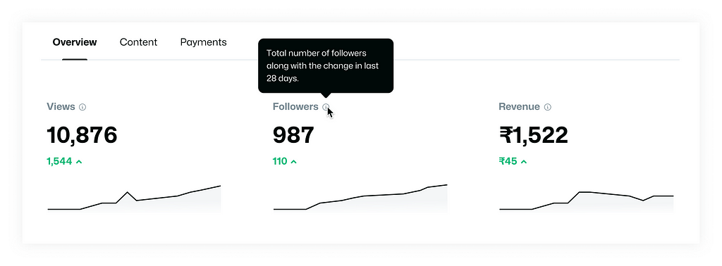
The tooltips give more information about what a particular metric means and also informs the user that the data is a lifetime total.
We decided to show graphs along with the numbers so that the users easily get a gist of their growth pattern.

As I established previously in this case study, I wanted the user to feel rewarded and motivated about their content creation journey on our platform. Also, I didn’t want the dashboard to be too transactional.
Hence, we decided to add this banner with the latest updates (since the last time they were on this dashboard) in the metrics, like increase in followers, gain of supporters, and so on. This kind of information motivates users to visit the dashboard and understand their growth better, rather than dreading it. Showing them even the slightest progress makes them feel good about their journey.
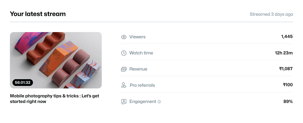
Other than the overall metrics, we decided that we also wanted to show how their recent stream was performing. This is something that creators generally want to track to understand their performance for the most recent piece of content that they have put out.
➡️ Content
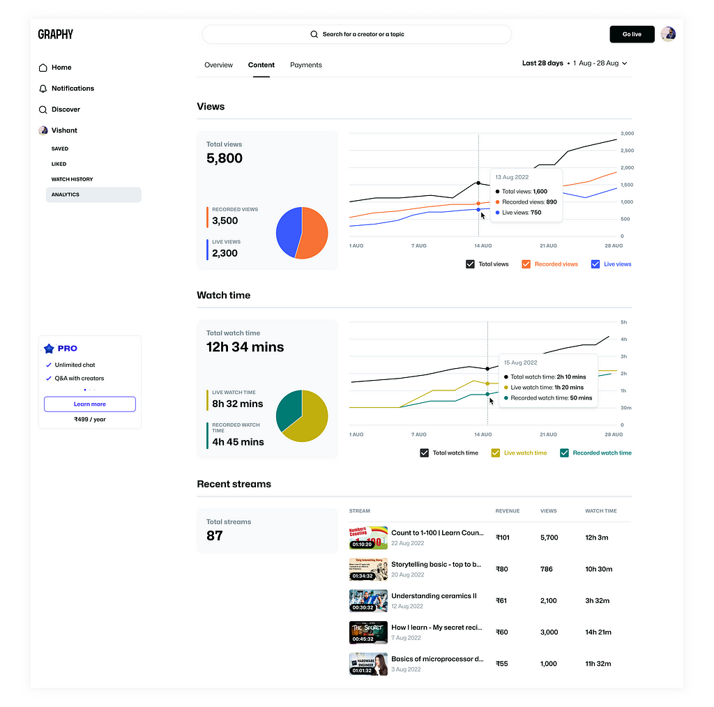
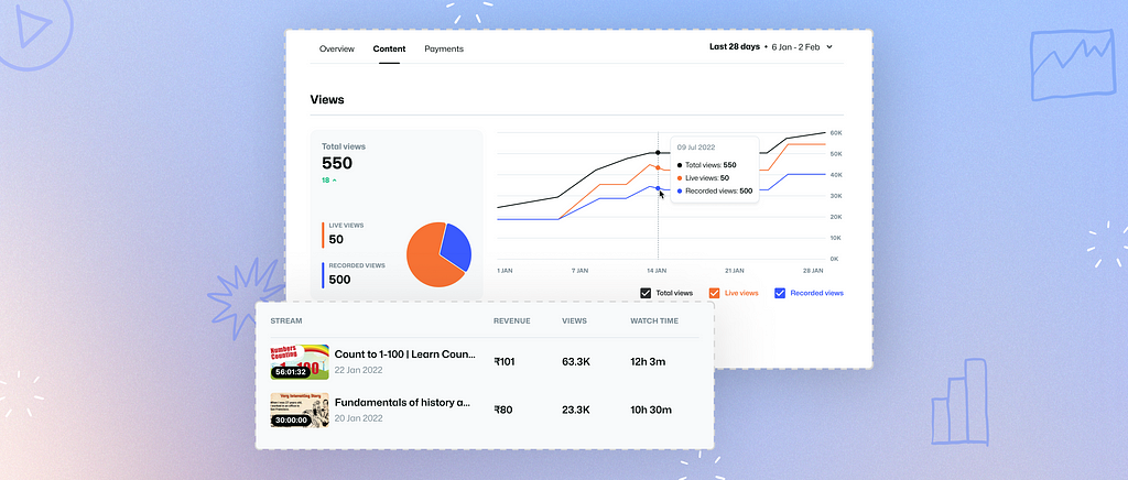
Within the Content tab, we decided to show all data points related to Views, Watch time, and Recent streams, which are all metrics related to the content that the creator creates on our platform.
Here,
Live views are the total number of views live streams got while the creator was streaming.
Recorded views are the total number of views that recorded live streams got. (Every live stream is recorded by the platform and is available for consumption at a later time by the learners.)
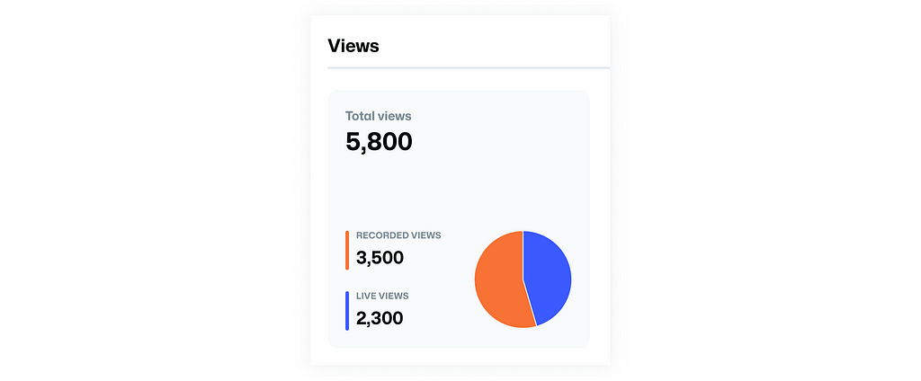
A pie chart is shown along with the number of views in order to make the bifurcation between live and recorded views clear so that the reader of this data gets a gist of the proportion at a glance.
📊 Selecting the type of data visualization
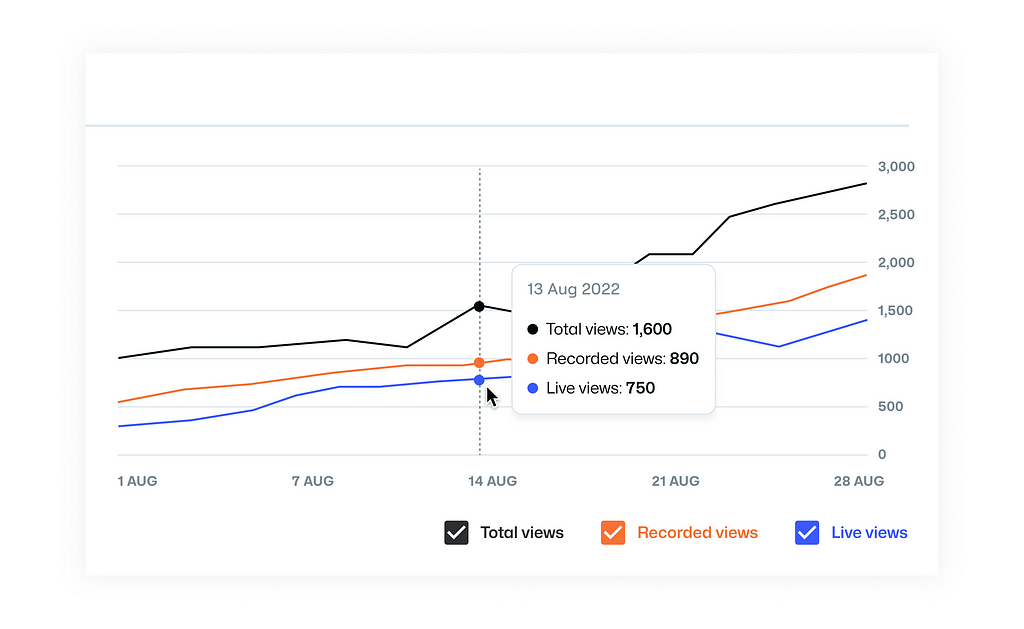
I considered multiple data visualization (data viz.) options but finalized a line chart for its simplicity, familiarity, and ease of consumption. Links for some of the articles I referred to get a better understanding of the dataviz.— Material Design, UC Berkeley, Chartio.
The decision to have multiple lines in the line chart was made so that the total views, live views, and recorded views were easily comparable.
The chart legends are also actionable checkboxes that the user can check or uncheck to see or unsee any particular line.
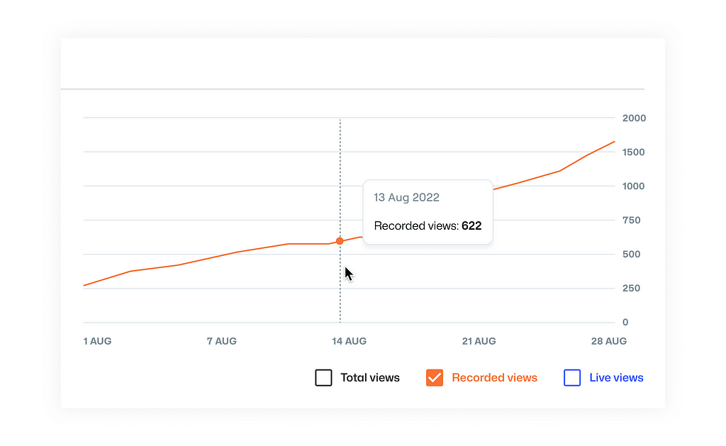
These legends are designed this way so the user has more agency over what data they want to see and what they want to hide. As opposed to not having the checkboxes and the users having to see three lines at all times, which might result in a case of information overload in some cases.
🎨 Colors in data visualization
It was important to be mindful of the color selection for data visualization used on the dashboard. To better understand how to use colors in dataviz, I referred to some resources like — Material Design, mysidewalk Style Guide, Chartio, Datawrapper Academy, and more.
I also checked the colors in a Color Blindness Simulator to verify if all the colors that I have used will be differentiable for people with any sort of color blindness or accessibility challenges.
🌀 Filtering the data
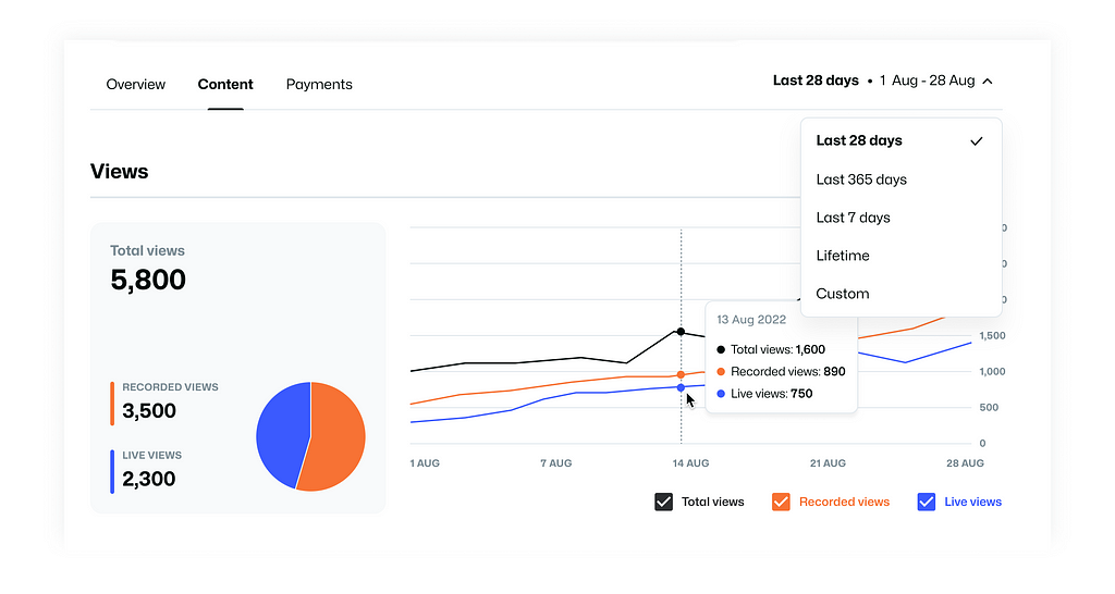
The duration of the data can be filtered using the dropdown, where the default value of the filter is set to 28 days. This seemed to be the most appropriate default value since the platform was very new and creators had been recently onboarded. Another reason for having the default time set to a month was that a period less than a month, say a week, was too short to show enough trend, and longer periods might show an overwhelming number of data points. Also, based on my competitor analysis and general research, most dashboards showed data on a monthly basis, so it made sense to follow that pattern unless there were any specific contextual reasons to do otherwise.
➡️ Payments
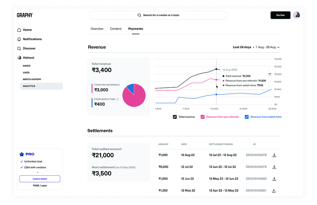
Within the Payments tab, we show all data points related to Revenue and Settlements. A settlement is the amount the creator has received from Graphy based on the revenue that they generate on a monthly basis.
Impact
This dashboard was live for around two months before we shifted focus to other 0–1 projects that we were working on. Listed below are some metrics we observed:
- Out of the total traffic on the Graphy platform, 40% was seen on the Analytics Dashboard.
- Day 1 retention was observed to be 55% while day 7 retention was 40%.
- Engagement % (people interacting with the charts, switching tabs, etc.) was 70%.
- The average engagement time (the amount of time each creator spends each day on the dashboard) was 1.5 minutes.
Learnings
- Since this was the first time I was designing a dashboard, it was a new learning experience for me, and I absolutely enjoyed the process and the brainstorming involved.
- While working on this project, I was reminded that design can be very contextual at times. It’s very important to understand our target audience and design accordingly, as opposed to blindly following patterns.
- As a result of working on this project, I got a chance to read up a bit about data visualization, and I’m sure this information will be helpful in future projects that I work on.
Future scope
I feel like there is a lot more we can do to make the analytics dashboard experience more intuitive and informative. The idea is to not just show data but to help the creators derive insights from it. We could also go one level up by helping the creators convert those insights into something actionable that will help them move the metrics.
One such idea is that we can show milestones in the creator’s journey. Let’s say a creator has gained a certain number of followers and as they sign in, we could do a celebration with confetti animation and give more details about their milestone, for example, how much time it took to reach this milestone, which was the turning point, highest performing stream, etc.
Another idea is that we can show the top-performing streams and more details about them—like how many questions were asked during the live stream, reaction timestamps, engagement rate, peak views, and so on. This could help the creator understand what content performs better and why.
Parting words
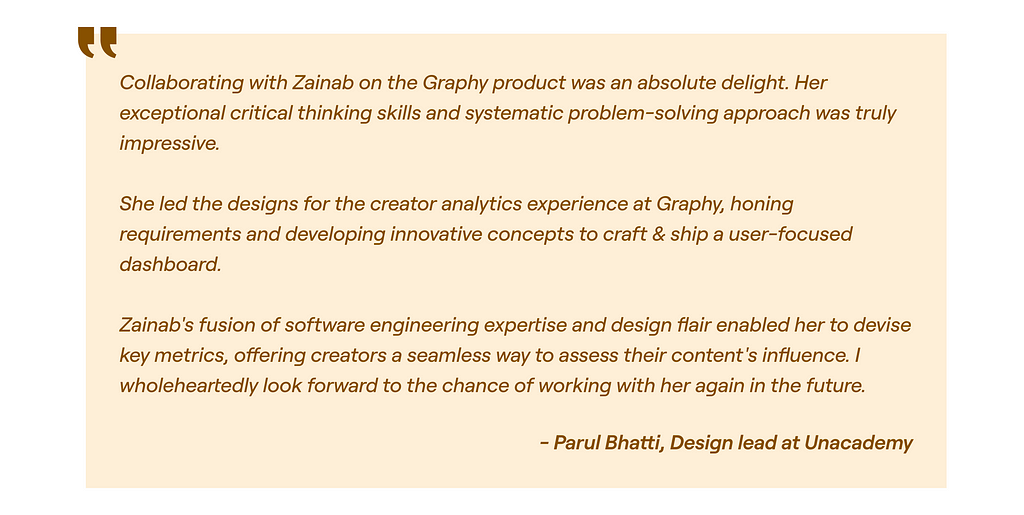
Below are some words from Parul describing her experience working with me on this project.
Thank you very much for reading! I’m happy to answer any questions or clarify any doubts. Feel free to ping me on any of my social media handles.
You can also check out some of my other work on my website.
Enabling creators to track their content-creation journey on Graphy — A product design case study was originally published in UX Planet on Medium, where people are continuing the conversation by highlighting and responding to this story.