And how I dealt with it

I’ve been an avid Figma user since I first crossed paths with it years ago. Ever since, it is like the home for me to design from. But recently I’ve had more and more instances where Figma just didn’t feel … right.
During my studies, when I first started prototyping user interfaces I first dove Axure RP. Exciting to make my first step to designing digital products, it felt like a new world was opening up before my eyes. As an all-digital nerd I had always wanted to work with interfaces, and now the time had come.
However, I quickly realized that Axure was in fact not the ideal solution for the project at hand. The project at the time was a IOT product-service combination which had to be prototyped. I remember having Bluetooth as an integral part of the exact interaction that we were going to test around campus. Accepting that I was going to have to test a lesser version of the designed user experience felt like missing something in my arsenal.
About a year later I got introduced to Protopie, another more high-fidelity prototyping tool that was able to integrate real Bluetooth interactions into your prototypes. This exact product would have saved me the year prior.
It is not uncommon for me to face a wall while prototyping ideas and conversations. So far, the traditional pen and paper have helped me much further than I can imagine. It does, however, leave a lot of room for personal interpretation.
With more complex digital platforms (smart goggles, EV dashboards, AI-products) in upcoming products I am beginning to see this problem more and more. As our digital systems, which serve our user experiences, are beginning to become more complex, so do the interactions that we design our experiences with.
How do we prototype complex digital interactions?
That raises a personal question that I haven’t quite been able to solve — How do we prototype and communicate complex UX interactions through traditional methods? And do we need to revert back to more primitive methods?
On a more personal note, I am working on a design research tool that leverages AI to understand user interviews at scale. To add to the complexity of the project, the whole things is built on top of a collaborative whiteboard.
This leaves Figma to become great for things like — Where does the toolbar go? What shadows do I use? What does following another user look like? But it leaves a lot of the core product to be left open for interpretation. This makes for a very hard design process, making actual experience design impossible.
I think Leapfrog is a great example on where traditional tools, like Axure, ProtoPie and Figma would have all failed me. There would be little room for explaining my intention for the product with these tools.
Understanding user needs through drafting principles
Having discussions with interested people from my Leapfrog mailing lists did help me to get an idea on what customers were expecting. During these interviews I talked about principles with which to design AI into the product and what they thought was going to help them do better research.
Bringing these principles with me did help me shape my thinking in a way, sparking new ideas for Leapfrog. But to put those ideas back in front of the people that were supposed to use the product has turned out to be impossible.
I could, however, discuss the established principles with customers to understand their principles around AI-powered tooling. We established rules like:
“AI needs to not replace my research task, but guide me through it more easily.”
Another big principle is to have as much freedom in what you can do as possible, hence the whiteboard.
How a simple flowchart can enhance your idea communication
While most of the ideas for Leapfrog are AI-powered, the interaction is not always a direct one-on-one copy of the input vs. output. Leapfrog is not fit to use chat, for example. Instead, it focuses on assisting designers to get valuable insights out of their interview and survey data.
That means that common design patterns, like chat, are not the right fit. Instead the design I had in mind where more focused on different interactions with the AI backend.
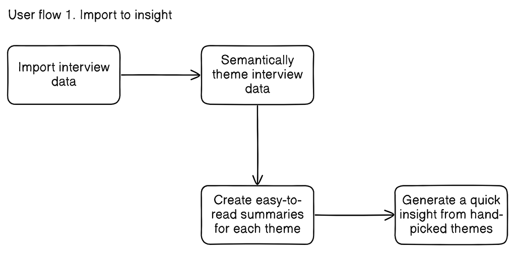
With the earlier mentioned principles and intended goal of the interaction in mind I could now far easier see an interaction come to life. To communicate (not prototype) those ideas my best friend was a flow chart.

Being able to draw a user flow out does help a lot, but as you might imagine, it still leaves a lot open for interpretation. Again, not the best fit for Figma etc.
Development can be part of design
It did give me opportunity to understand other peoples opinions on the vision I am presenting. But certainly not enough to be 100% sure it this was the right proposed interaction.

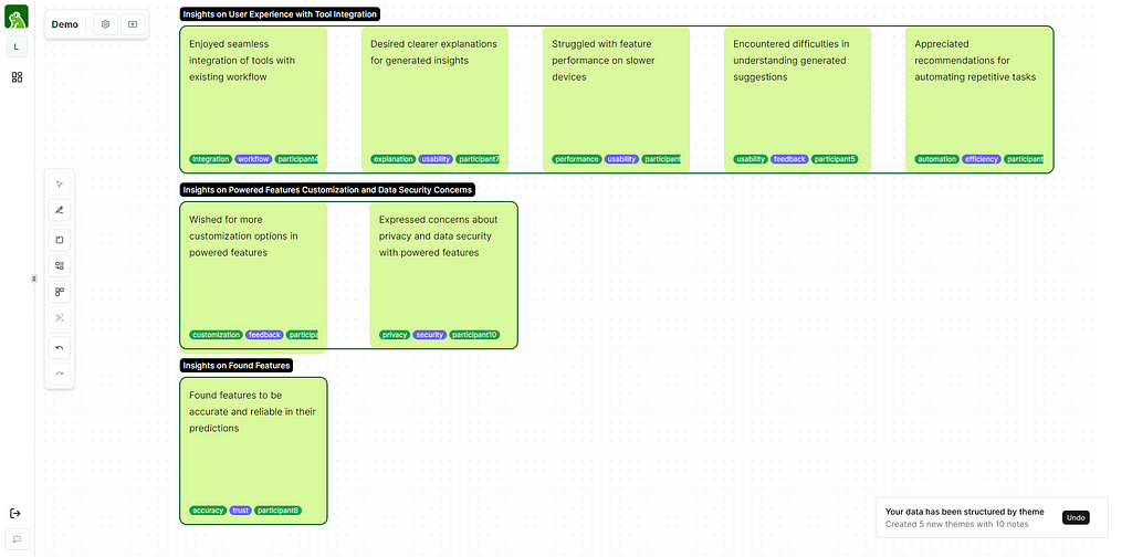
Above you can see a screenshot of the theming flow created in a live environment. For this feature to function a couple of this have to happen:
- The data has to be grouped semantically
- Each group will have to be assined a theme name
- The user will have to be able to revert the suggested grouping (as per principle)
From all these principles, Figma is not suitable to prototype the necessary fidelity that one would need to test semantic grouping with AI. It can not communicate what will go where, how the items move over the screen. I can only show the ‘undo’ interaction through Figma, maybe because it is a more traditional interaction.
In the end I just started building the actual product. Turns out, development can be a powerful design tool too. It gives me the opportunity to, at full fidelity (or 80% on the way) test the user experience. I can now, on a more precise and directed way, talk to users and understand where the advantages and disadvantages of this interaction lie.
This reactive mechanism has helped me to build the right thing at the right time. It has also gives me the opportunity to understand the product requirements much better than an traditional prototyping tool would’ve.
Prototyping is a tool in the design process, but methodology stretches much further
What this experience has thought me is that we might not always need to fall back to our defaults, like Figma, to be able to test our ideas. Prototyping is a great tool to reduce development time and test before building. Sometimes our traditional tools fail to produce the minimal fidelity of a prototype we need. That is when we need to look at our methods and change our tactics.
Prototyping is part of the toolbox we have to understand user needs and desires. It is part of the process, and often a huge part of what we do on a daily basis. But the reality is that design stretches much further than just one tool. It is a process to understand the intricacies of stakeholder needs and make concrete decisions with those intricacies in mind.
As grateful as I am for Figma and its cousins, I think our design methodology, and our prototyping activities, should look to enhance the design process. They can help us to communicate, sure. But they fail to replace design as a whole.
Figma failed me was originally published in UX Planet on Medium, where people are continuing the conversation by highlighting and responding to this story.