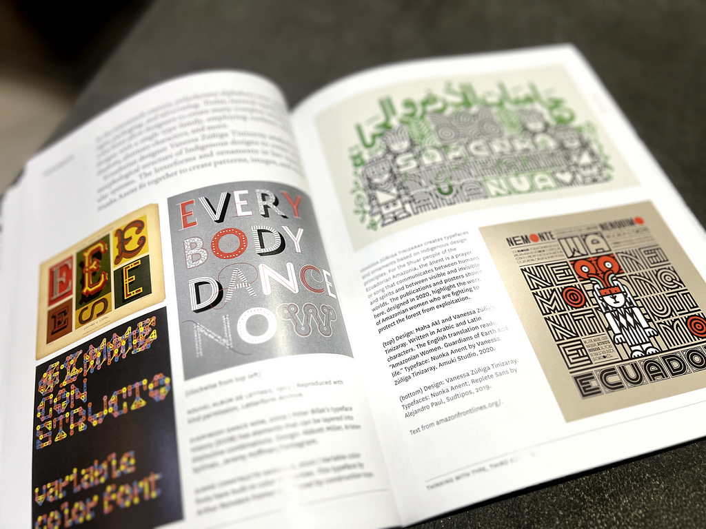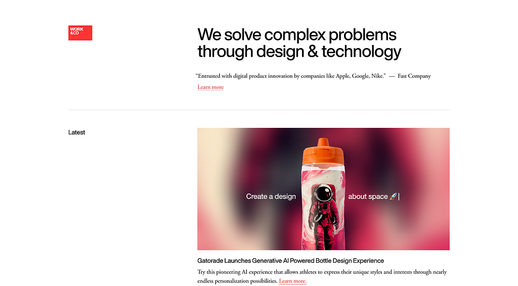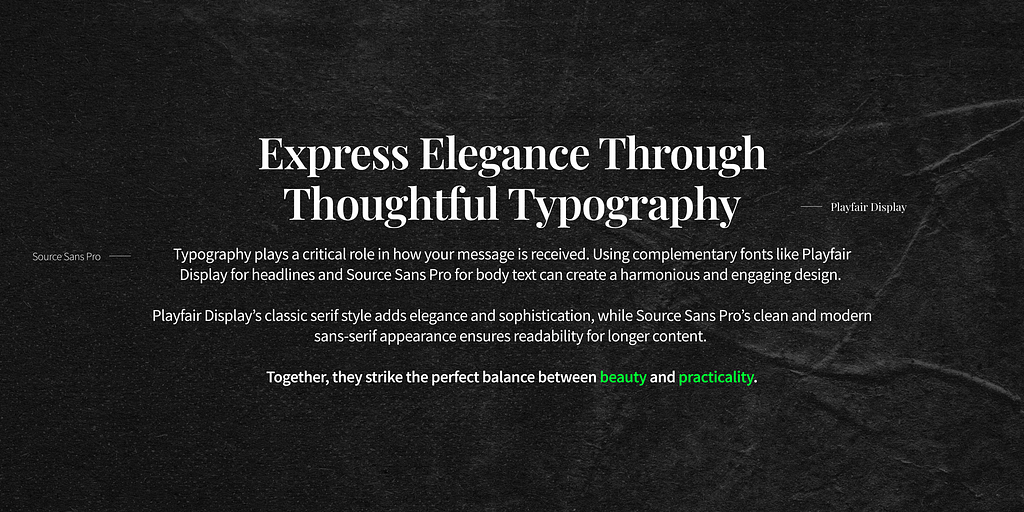
Typography is everywhere — on websites, packaging, ads, books, and even memes. Yet, too often, its true power is overlooked.
Fonts aren’t just letters; they’re your silent salespeople, your brand ambassadors, and the storytellers of your brand

Ellen Lupton’s Thinking with Type reveals just how transformative great typography can be.
In this article, we’ll explore some critical principles from her book which I’ve personally found really helpful. Even though I barely read, this book is a great dive into typography.


Whether you’re a designer, marketer, or just someone who loves beautiful things, this guide will show you how to elevate your work with typography.
1. The Art of Mixing Fonts: Balance Chaos with Harmony
Mixing fonts can be like hosting a dinner party. The right pairing creates lively conversations (or designs), but too many loud personalities can turn things into a chaotic mess. Ellen Lupton’s rule? Contrast and complement.
Why Mixing Fonts Works
Mixing fonts creates visual interest and helps guide your audience’s attention. It can:
• Establish a clear hierarchy (e.g., bold for headlines, simple for body text).
• Convey multiple emotions (e.g., playful headlines with professional content).
• Reflect diverse brand elements (modern yet classic? Playful yet serious?).

But remember, less is more. Stick to two fonts — or three, if you’re feeling adventurous.
How to Mix Fonts Like a Pro
- Create Contrast: Opposites attract in typography. Pair serif fonts with sans-serif fonts for a timeless combination.

Example: Garamond (serif) with Helvetica (sans-serif).

Why it works: Serif fonts feel traditional; sans-serifs are clean and modern. Together, they balance each other out.
2. Think Proportion: Fonts with similar heights and weights play nicely together. Look for fonts with complementary x-heights (the height of a lowercase “x”) and line spacing.
Lowercase letters with similar x-heights (the height of a lowercase “x”) work well together, even if the fonts look different overall.
On the other hand, if the x-heights are too different, it can make the text harder to read and follow. Matching x-heights create a balance — giving your fonts enough contrast to stand out while still working harmoniously together. This simple adjustment can make a big difference in how polished and readable your designs feel.

Example

3. Match the Mood: Fonts should align with the tone of your message. Writing about a tech startup? Go for sleek sans-serifs. Designing for a wedding? A script font like Pacifico can add elegance.
4. Mind the Message: Let’s say you’re designing for a legal firm. A classic serif for headings (like Times New Roman) paired with a modern sans-serif (like Arial) says, “We’re rooted in tradition but embrace innovation.”
Font Pairing Inspiration
Here are some tried-and-true pairings:
Classic Combo: Georgia + Open Sans

Modern Minimalist: Montserrat + Lato

Playful Pair: Lobster + Raleway

Remember, the goal isn’t to make your fonts “pop” (a term that makes designers cringe). It’s to make them work together seamlessly.
2. Typography as a Brand Ambassador
Fonts aren’t just visual elements; they’re emotional cues.

Think about your favorite brands. What do their fonts tell you? Apple’s sleek sans-serif screams modernity, while The New York Times’ serif whispers authority and tradition.
Why Typography Reflects Your Brand

Your font choice is often the first impression your audience gets of your brand. It tells them:
• Who you are: Professional or casual? Minimalist or bold?
• What you value: Tradition, creativity, or innovation?
• How you make them feel: Trustworthy, excited, or curious?
Crafting a Cohesive Brand Identity
1. Stick to a Font Family: Use the same typography across all platforms — website, social media, print. Consistency breeds recognition.
2. Test Across Mediums: Fonts that look great in print might not scale well on mobile screens. Always test on different devices.
3. Evolve with Intention: Brands grow, and their typography should, too. Google’s switch from a serif to a sans-serif logo in 2015 reflected their shift to simplicity and adaptability. But the key? They didn’t abandon their essence — they modernized it.
Typography in Action
• Serif for Tradition: Think of Harvard University or Vogue. Serif fonts ooze sophistication and trust.
• Sans-Serif for Modernity: Google, Airbnb, and Spotify all use sans-serif fonts to convey simplicity and approachability.
• Script for Luxury: High-end brands like Cartier and Chanel favor script fonts for elegance.
• Display for Impact: Brands like Disney or Coca-Cola use bold, custom display fonts that are instantly recognizable.
Your typography should feel like an extension of your brand’s personality — consistent, memorable, and authentic.
3. The Power of Type Families: Know Your Tools
To design confidently, you need to understand the tools in your toolbox. Type families are the categories of fonts, and each serves a unique purpose. According to Ellen Lupton, mastering these families is the foundation of good typography.
The Four Main Families
1. Serif Fonts

• Look: Decorative “feet” at the ends of strokes.
• Personality: Traditional, formal, trustworthy.
• Best For: Books, newspapers, academic content.
• Examples: Times New Roman, Garamond.
2. Sans-Serif Fonts

• Look: No decorative strokes; clean and simple.
• Personality: Modern, sleek, approachable.
• Best For: Websites, apps, presentations.
• Examples: Helvetica, Arial, Futura.
3. Script Fonts

• Look: Flowing, cursive, mimics handwriting.
• Personality: Elegant, creative, sometimes playful.
• Best For: Invitations, luxury branding, creative projects.
• Examples: Pacifico, Lobster.
4. Display Fonts

• Look: Bold, unique, attention-grabbing.
• Personality: Loud, playful, or dramatic.
• Best For: Headlines, logos, posters.
• Examples: Impact, Bebas Neue.
When to Use What
• For Legibility: Use serif fonts for long-form text like blogs or books — they’re easier on the eyes for extended reading.
• For Digital Design: Sans-serif fonts are ideal for websites and apps because of their clean lines.
• For Personality: Script and display fonts should be used sparingly, reserved for moments when you need to make a big impact.
Pro Tip: Combining Families
Want to mix it up? Use type families strategically:
• A serif font for headings and a sans-serif for body text create a polished look.
• Avoid pairing two script fonts or two bold display fonts — it’s too much drama.
Final Thoughts: Let Your Typography Speak

Typography isn’t just about making things look nice. It’s about communicating your message and amplifying your brand.
Whether you’re designing a website, creating a poster, or launching a product, the right typography can capture attention, build trust, and even inspire action.
Things to Remember:
• Mix fonts wisely — contrast and complement.
• Let your typography reflect your brand — be consistent and intentional.
• Know your type families — serif, sans-serif, script, and display are your best friends.
Ready to elevate your designs? Start experimenting, and let your typography do the talking.
Take Your Designs to the Next Level
Typography is just one piece of the design puzzle. Imagine pairing perfect fonts with stunning, ready-to-use UI templates designed to save you time and elevate your projects.
Introducing 100+ UI Templates for Designers!

These professionally crafted templates are tailored for websites, apps, and digital platforms. Each template is thoughtfully designed to complement a variety of font styles, helping you create harmonious, visually stunning projects effortlessly.
🚀 Save Time: Focus on creativity instead of starting from scratch.
🎨 Customizable Designs: Easily tweak layouts to match your vision.
🌟 Versatile Styles: Perfect for portfolios, e-commerce, and modern interfaces.
Unlock access to over 100+ professionally designed UI templates, offering a wealth of inspiration and ready-to-use designs to elevate your next project. This resource is a must-have for every UX designer in 2024.
Get here: Free UI Design Screens
My Community Profile: Figma.com/@avisaxena
I am a UX Designer you can reach out to me on these platforms:
Linkedin | Instagram | Twitter | Behance
Fonts that Speak: How Typography Can Transform Your Design and Brand was originally published in UX Planet on Medium, where people are continuing the conversation by highlighting and responding to this story.