Glaring UX Mistakes on Real Apps — Part 1
Learn from existing design mistakes, so we can do better!

As a product designer, I frequently tend to check new apps, both to try and get some inspiration as well as look for things that can be done differently or better.
I frequently come across rookie mistakes on real, commercial apps managed by well-run and well-funded organisations with sufficiently big design teams. The mistakes can be anything from oversight to negligence to laziness to just outright poor design decisions.
In this post I’ve compiled 5 such mistakes, so that you don’t repeat them in your design journey. This is the first in a likely series of such articles. As and when I get more such examples from other apps, I will add a Part 2.
NOTE: This list doesn’t include interfaces where the aesthetics could have been better — that’s a subjective call and I am no SME on that. These are scenarios in which the functionality is impacted, and users can’t perform actions easily or quickly enough.
#1. Faulty Design: Where are the last 2 inches?
App: Welltory (Health & Wellness)
Designing input fields and sliders is fun, and contextual. Contextual because input methods are very specific to what kind of information the user would be feeding in that context. Which is why –
- their length should be suited to the content type
- they should accommodate all use cases for the said content type
- appropriate input validation should be used by devs wherever possible to ‘gate’ the inputs and receive relevant inputs.
The design below misses the 2nd point — the oversight could have been avoided by simply understanding that a 0–9 loop in the inches slider doesn’t account for the 10th and 11th inches in a person’s height! And maybe doing some more user testing.

#2. Inefficient design: Inscopicuous, 2-click Wishlist
App: Audible (E-books)
A Wishlist/Wish List (or other names like Save for Later) is an indispensable product feature for any e-commerce platform. A typical customer journey involves a much higher time in the exploration/discovery phase compared to the actual buying & payment phase.
Invariably, customers like a lot of items which they aren’t sure about buying right away — this is the need gap that a wishlist solves for. Audible has a wishlist feature for saving the books you’re not sure about buying immediately.

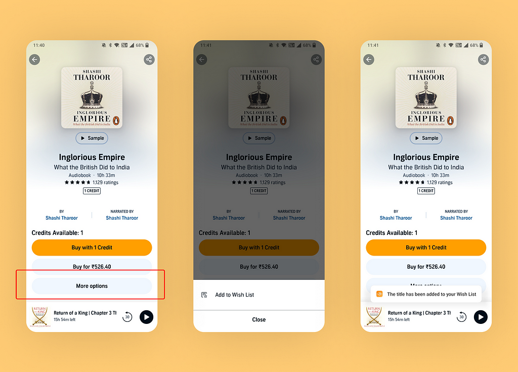
The problem? It’s inconspicuous.
- First of all, there’s no single-click icon/button to add a book to your wishlist. This would have been a very efficient way of putting it. Just to the left of the share button.
- So the users now need to look around for this feature. When the users tap on ‘More Options’, they see an ‘Add to Wish List’ option. Ok, but you see the problem?
- ‘Add to Wish List’ is literally the ONLY option here. Audible might have thought of adding more options here later, but seems like it didn’t materialise. So more options literally has one option, and users need to click 2 times to do something they could’ve done with one.
- Bonus loophole. The benefit of taking the 1st route above is that a user who comes back to this page later can always view whether an item is in a ‘Wish-Listed’ stage, with zero interaction. That information isn’t readily shown in the current design, unless you again click on ‘More Options’ and see ‘Remove from Wish List’ as the only option! Such a pain for a simple feature.
#3. Lazy Design. Let’s play ‘Find the Button’?
App: Amazon (E-Commerce & Payments)
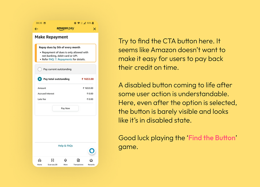
Why use buttons that aren’t visually distinguishable at all, when the Amazon Pay design system includes other buttons that would be far more relevant here? I could understand using this button
- If it was a secondary CTA (like a ‘Cancel’ or ‘Skip for now’) alongside a more prominent primary CTA button that would drive the most expected user action; or
- If it was in disabled state but came to life when all required inputs are fed (or options selected) by the user
But it was neither of the above. It’s just a lazily designed and hastily put button that looks very inconsistent with some other interfaces within Amazon Pay. And trust me, it looks much better here in the screenshot.

#4. Ill-thought design: Where am I?
Website: Cricbuzz (Sports)
Every interactive UI element has various states (which define how the element appears and behaves in various situations). For example, a disabled button becomes enabled and vice-versa depending upon the user input. States also help in conveying the present context to users.
Knowing where they are makes it easier for users to decide where to go next.
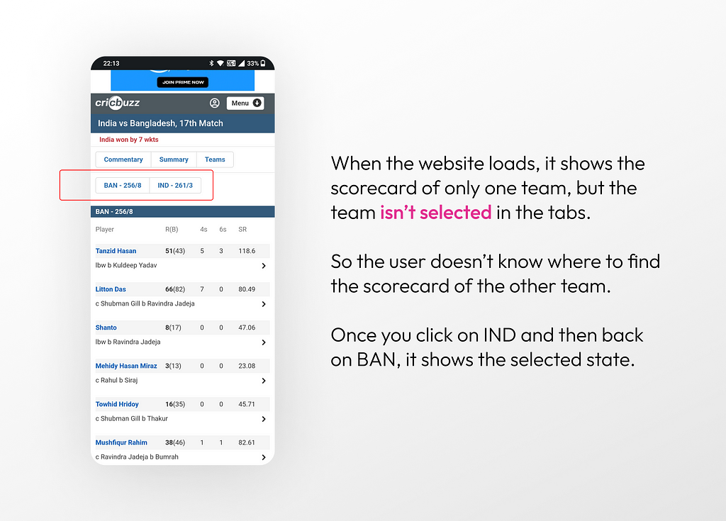
In the below example of a sports app, the score for one of the teams is already being shown, but there’s no indication of where to go if one needs to view the score of the other team.

This could have been avoided by simply showing the currently selected team as a ‘selected tab’, which would immediately communicate that you need to click on the other tab to view the details of the other team.
#5. Poor UI/UX Testing
App: Namma Yatri (Transport)
Namma Yatri is a transport & ride-hailing app developed and maintained by the Fintech platform Juspay. And I didn’t expect this rookie mistake from them. This is most certainly a miss which got overlooked during testing.

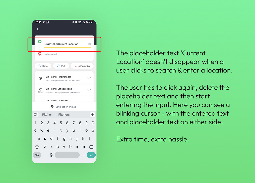
This doesn’t just plainly fall under poor communication between design & development, and development is more to blame here — because it’s universally understood that the placeholder/default text should clear itself and make way for the user input as soon as user interacts with the field.
Because that isn’t the case here, the user needs to click again, select and delete the placeholder text and re-enter the location manually. And this for a time-critical ride-hailing app where you want to find rides quickly!
How to avoid such mistakes as designers?
It’s difficult to imagine that big organisations with scores of members in the design and testing team would miss such errors. All products are periodically reviewed internally to iron out niggles and make them more user friendly. But such misses are a fact, and user frustration is an unintended outcome.
As designers, we can do a few basic things right to avoid such glaring mistakes and turn off our loved users.
- Consider all use-cases when designing elements that require user interaction. Consider all edge-cases and outliers under the sky.
- Keep the user informed via feedback. Every small interaction, every state of an UI element (or its absence) communicates something, no matter how subtle! And we don’t want to communicate shoddy design.
- Testing, Testing & Testing! No matter how many notes you’ve added for devs, it’s the job of UI Testers (and to some extent designers) to collaborate and identify defects. After all, if users aren’t seeing what we designed on Figma, then the larger purpose is defeated.
Enjoyed this post? If yes, please show some appreciation by clicking on the “clap” button. Fun trivia — you can hit it up to 50 times! It helps the content reach out to more like-minded people.
If you love my work and want to support my efforts, you can buy me a coffee with ko-fi. Thank you for your kindness and generosity!
Please share your thoughts and feedback in the comments below. This will help me improve and also inspire me to create more.
I try to publish regularly on Medium. Follow this account to receive similar content in future, and click here to get each post directly in your email. You can find me on Linkedin and Twitter as well.
Glaring UX Mistakes on Real Apps — Part 1 was originally published in UX Planet on Medium, where people are continuing the conversation by highlighting and responding to this story.