This article delves into grid systems, outlining their anatomy, types, and responsive layouts to help you in crafting consistent and cohesive designs.

What it is?
A grid system is a structure of columns and lines that dictates where design elements should be placed on a page.
Why use it?
To maintain consistency in layout, create visual hierarchy, and establish predictable design patterns.
Anatomy of a grid
- Column: The building block defining element placement.
- Gutter: Negative space between columns.
- Margin: Negative space between the outer column and the frame.
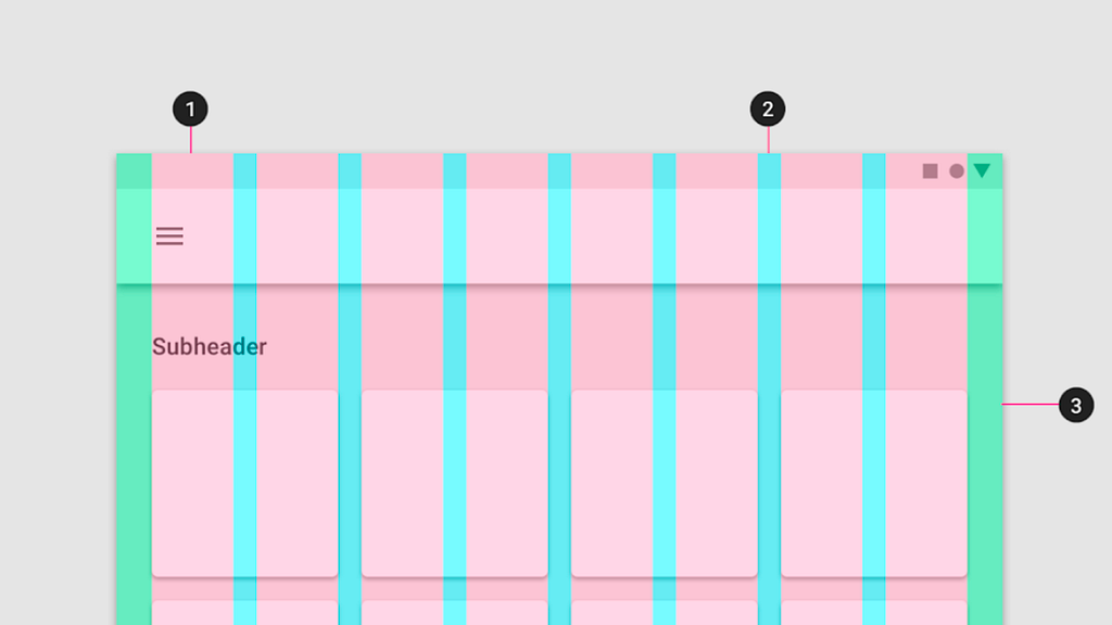
Types of grids
Manuscript Grid
A one-column grid spanning the entire content area. Ideal for defining margins on a block of content like a manuscript.

Column Grid
Evenly spaced vertical fields for aligning elements. Suitable for designing web applications.

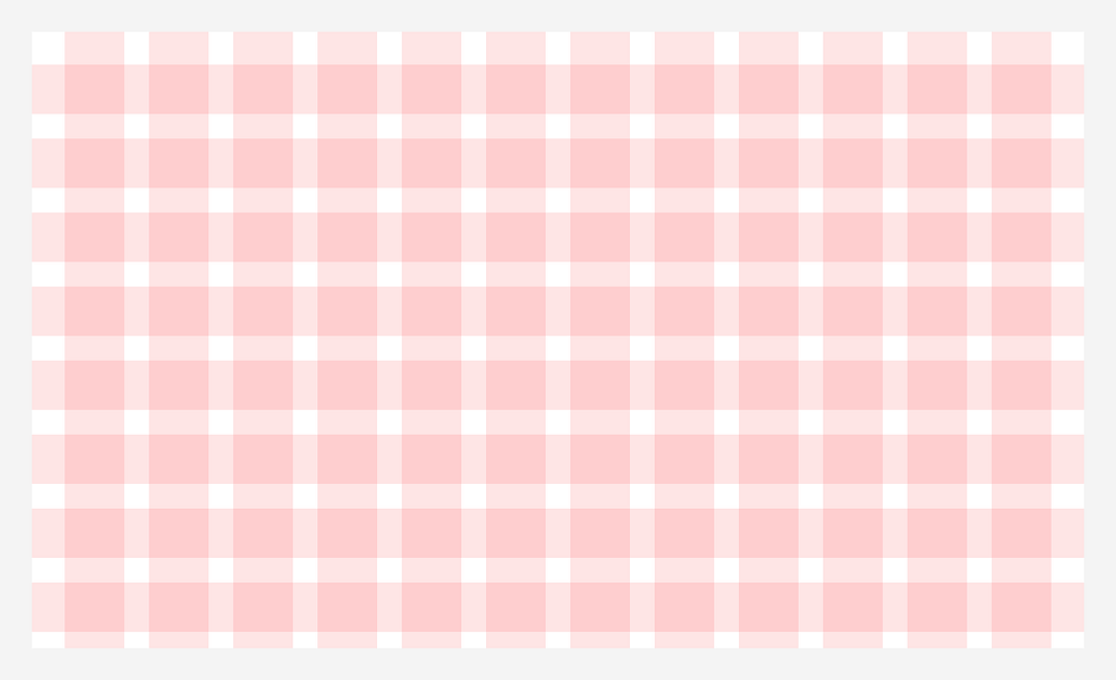
Modular Grid
Consists of columns and rows intersecting to create a matrix of cells or “modules.” Ideal for designing complex web layouts, such as e-commerce pages.
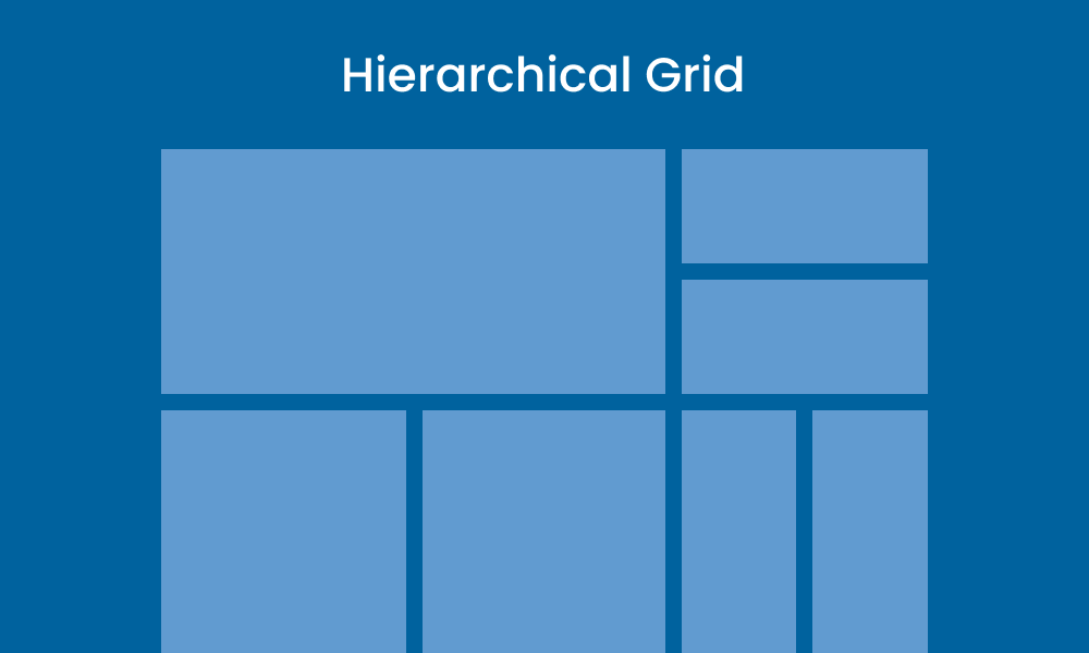
Hierarchical Grid
Irregular grids composed of different grid types brought together or free-form. Organising content by importance, where critical elements take up larger portions.
Responsive layout grids
Responsive grids scale based on device breakpoints, ensuring consistent layouts on various screen sizes.
Types of layout grids
Fixed Behaviour: A layout with a fixed-width container, maintaining its size as the screen changes, while the margin increases or decreases in size
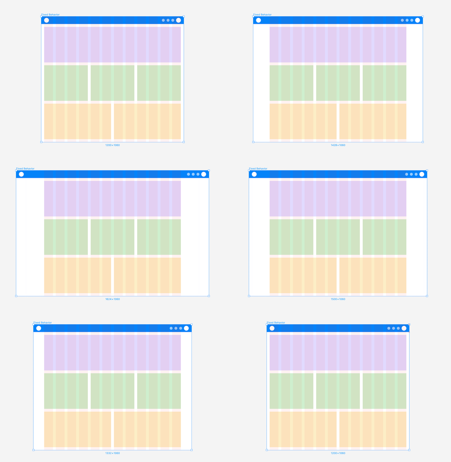
Fluid Behaviour: A layout with a fluid container, adjusting container and column sizes as the screen changes, while the margin and gutter widths remain constant.
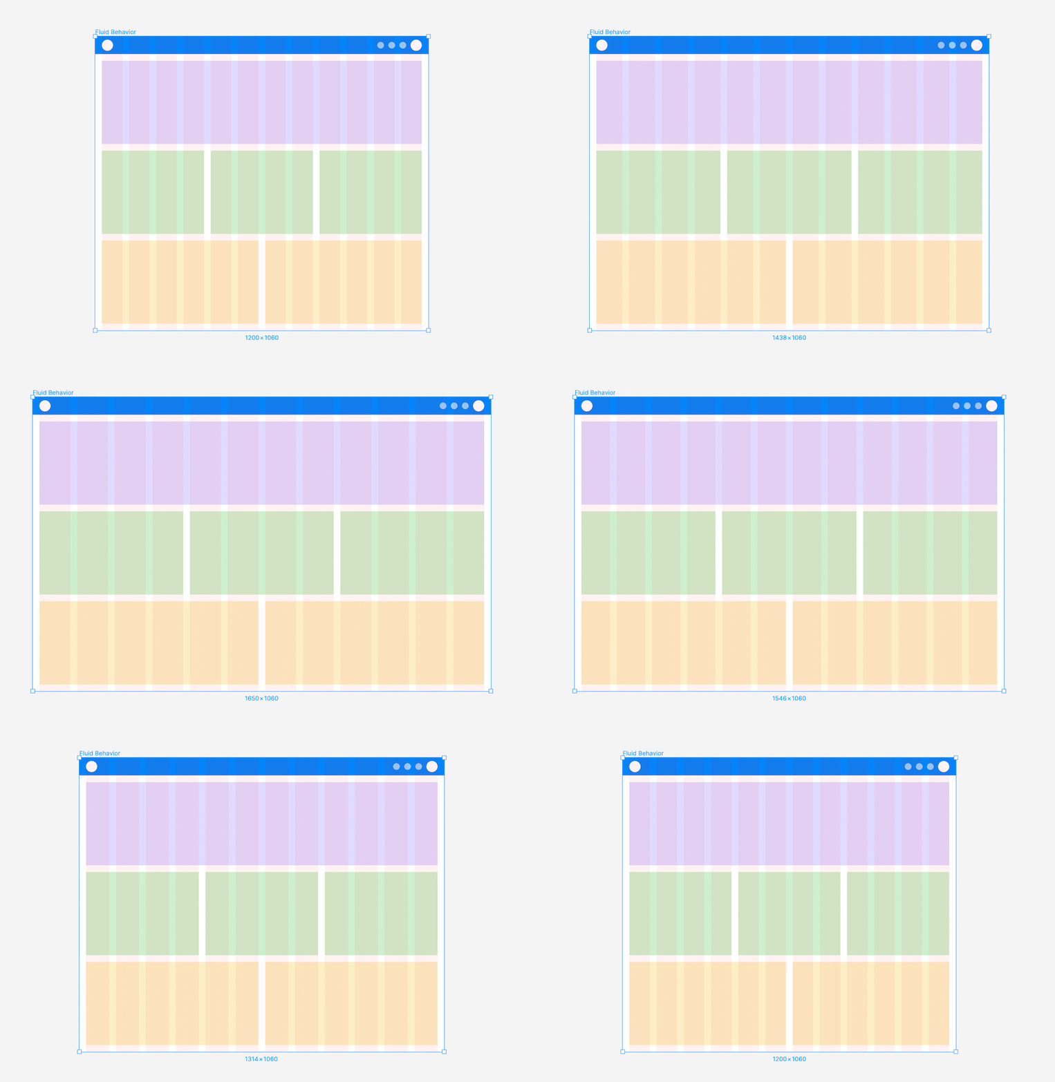
Choosing the right layout grid
Selecting a fixed or fluid layout depends on user behaviour and the website type. Consider if you need to support different breakpoints.
For instance, a fixed layout suits data-intensive web-apps that are only used on desktops, while a fluid grid is ideal for responsive marketing websites, where users might want to browse the site on different devices.
Breakpoints
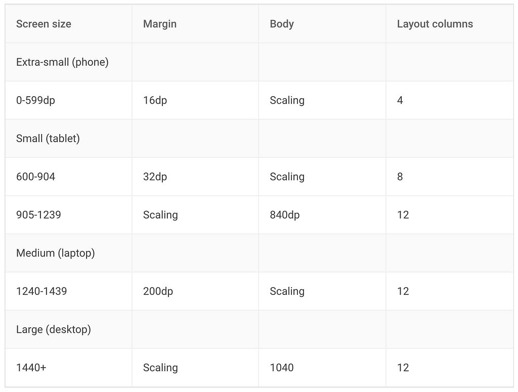
Determined by specific layout requirements, dictate when the layout adjusts for different screen sizes. Common ranges are:
- Small (0–599)
- Medium (600–899)
- Large (900–1439)
- Extra Large (1440+)
When scaling, the grid, body, and margins adjust to accommodate different screen sizes. Material UI provides a starting point for guideline breakpoints:
Summary
- A grid system is a foundational structure of columns and lines essential for achieving consistent layouts.
- The key components of a grid include columns, gutter, and margin.
- There are four distinct types of grids: manuscript grid, column grid, modular grid, and hierarchical grid.
- Responsive layouts dynamically adjust based on device breakpoints, allowing for customised designs across various screen sizes.
- Responsive layouts exhibit two behaviours — fixed and fluid — choose the behaviour based on user expectations, and the nature of the website.
Grid Systems in Design was originally published in UX Planet on Medium, where people are continuing the conversation by highlighting and responding to this story.