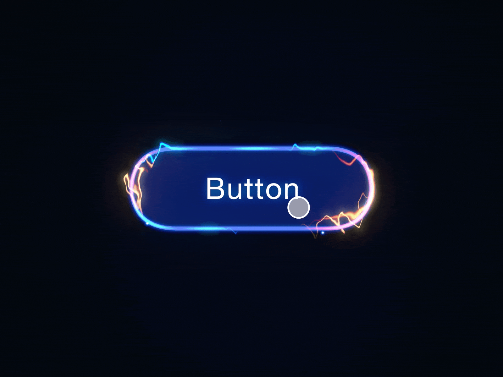
Hover effect is a powerful tool in UI design that adds interactivity and feedback to user actions. Similar to a loading spinner, hover offers users a sense of control, reinforcing a sense of direct manipulation with the UI.
This article reviews when and how to use hover effect.
When to use
Hover effect is primarily used on desktop:
To highlight interactive elements
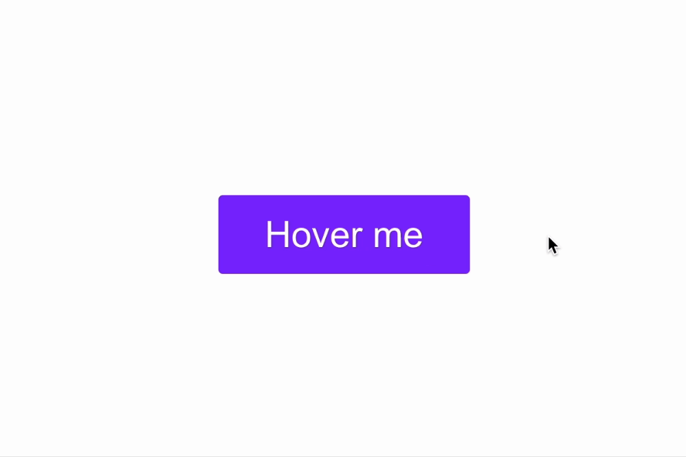
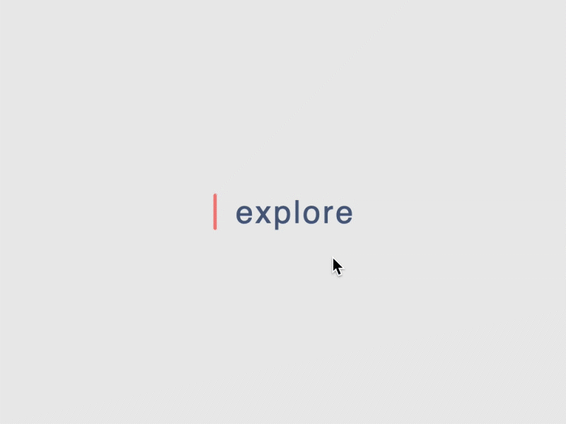
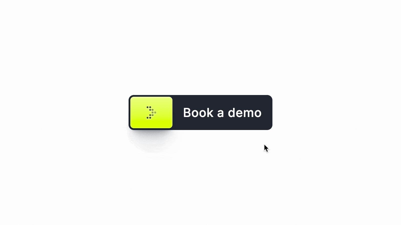
Hover effect can clearly indicate that a certain UI element is interactive. It can be used for buttons, links and cards.
To provide contextual information
Hover effects can be used to show additional information or options (like tooltips), helping guide users without overwhelming them. Since hover effects won’t work on touch devices, ensure important content is accessible without hover actions on mobile.
How to use it
Use hover effects that enhance usability, not distract
Avoid heavy animations when designing hover animation. Overly complex animations, like 3D rotations, large-scale transformations, or fancy decorative elements, can slow down the interface, particularly on lower-powered devices. Also, fancy animation can look annoying for regular users (imagine you see the same fancy effect over and over again when you interact with a product).
Hover effect should use subtle animations like color changes, underlining, or slight scaling. You should also change the cursor—use the pointer cursor to further reinforce that an element is clickable.
Right timing
Hover states should provide immediate feedback that assures users their action is recognized. Both too slow and too fast animation will annoy users. Slow animation can convey a sense of performance issues (users might assume that the system performs slowly).
Use smooth transitions with a duration of 200ms to make hover effects feel fluid and natural.
Uniform effects across similar elements
Keep hover effects consistent for similar components to create a cohesive experience. For example, all buttons in your UI should exhibit the same hover animation.
Reinforce brand identity
Custom hover effects can align with brand personality. For instance, playful hover animations can reinforce a fun, creative brand, while minimalistic effects can reflect a more professional tone.
Want to master your UI design skills?
Whether you’ve been working as a designer for years or are completely new to design, Designlab has programs and courses to help you take the next step in your design career. Check Advanced Figma courses to master your UI design skills.
Online UI and UX Design Courses and Bootcamps | Designlab
This post contains affiliate link(s)
Hover Effect in UI Design: Tips & Tricks was originally published in UX Planet on Medium, where people are continuing the conversation by highlighting and responding to this story.