In this case study, I will share my insights on my design decisions while revamping the “Challenge” feature in the Uable (now PowerClub) app.
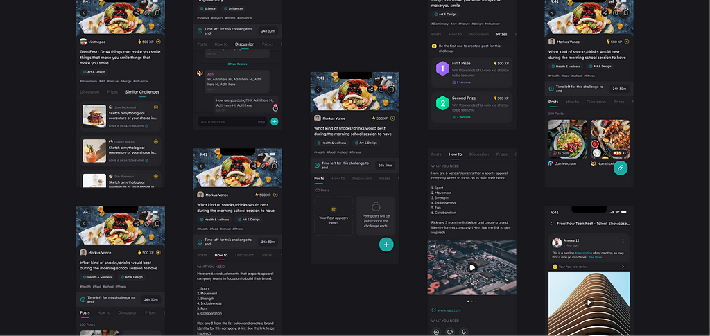
This case study details how we tackled the problem of low user participation in our “Challenge” feature. By researching, we developed a new set of challenges called “Skilled” and “Fun” that helped boost participation.
Additionally, we revamped the challenge details page to enhance the user experience. Our findings also showed that factors such as the home page, challenge time, and complexity impacted participation. This project was a collaboration between our community management, learning experience design, product, and growth teams.
So let’s buckle up this one is going to be a long one!
Glimpse of how the Final screens
So, what is Uable?

Uable (now PowerClub) is a career discovery platform for teenagers to build real-world skills in exclusive communities.
Here, teens take on challenges based on real-world scenarios designed by industry experts from top global organizations. These challenges help them prepare for 21st-century skills like creative problem-solving, critical thinking, and collaboration.
What is the ‘Challenges’ feature?
Challenges is a feature in the app based on the learning model ‘Challenge-based learning.’
What is Challenge-Based Learning?
Challenge Based Learning is an engaging multidisciplinary approach to teaching and learning that encourages students to leverage the technology they use in their daily lives to solve real-world problems. Challenge Based Learning is a collaborative and hands-on method. Ask students to work with peers, teachers, and experts in their communities and worldwide to ask good questions, develop more profound subject area knowledge, accept and solve challenges, take action, and share their experiences.
Key Components of Challenge Based Learning process begins with a big idea and cascades to the following:
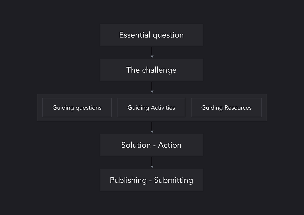
Check out this link for more details about Challenge based learnings: Link
Let’s take a look at the Challenge MVP first!!
Below is the MVP version we created,
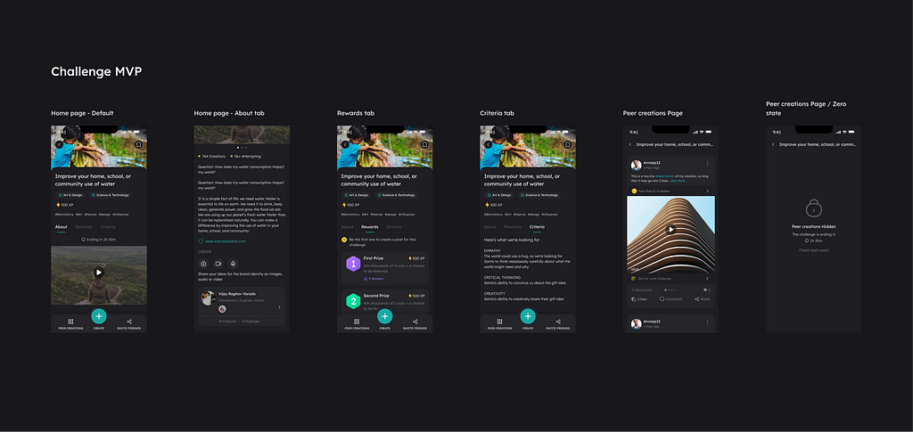
It contained all the essential features needed in Challenge-based learning.
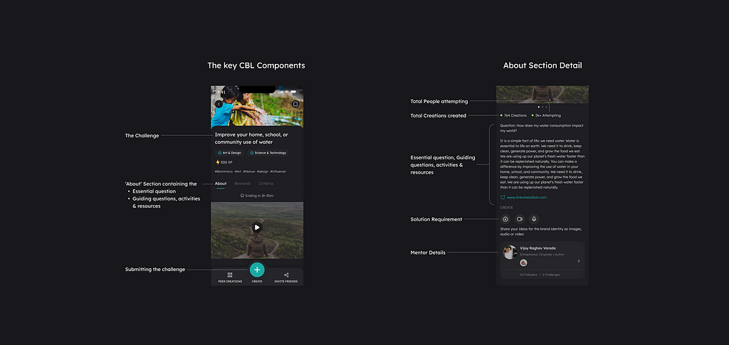
The teens’ response was quite positive, and they seemed to really like it.
Why was the revamp required?
After a few months of launching this feature and testing it in the market, we got some exciting feedback and insights to work on.
Even though this type of feature’s need was validated by the user’s feedback and retaining users, a considerable percentage of users’ actions said differently. The data showed low conversion and completion rates of the challenges, and we understood the needs and problems our power users faced in detail.
🎯 The Challenge
To increase the participation and completion rates for Challenges.
Our goal for the project was to help users understand the value of Challenges. We wanted to create a solid, Unique Selling Proposition that brings users back to our app more frequently and attracts a more diverse user base.
Our high-level goals were to:
- Make it easy to use for everyone
- Creating a more supportive environment to solve.
- Help them understand the value of the feature.
🕵️ My Role
I led the revamp of challenges, collaborating with the Product and Design managers. I also worked closely with the Learning design team (Challenges complexity-related problems), community managers (Understanding the users, getting feedback), and Growth team (Notification, Social media promotion of challenges) for the changes related to the Challenge content and reach, respectively.
This project took around seven weeks. Spanning from Nov — Jan 2021
⚽️ Kickoff
At the start of the project, I collaborated with the community managers and the learning experience designers to understand the insights from the power users as they communicate with the users more often.
Early Insights from Power User
Most of the Power users were members of our Official Uable Discord server. This is a place where we run competitions, discussions on various topics, and more, and they also provide us with outstanding feedback for the app.
For the user interviews, we used the Funneling Technique. We started with Broad open-ended questions for the user interviews to generate new, unanticipated insights. After this, we focused on a couple of specific questions, such as:
Firstly what do they like the most about ‘Challenges’?
- Got access to real-world challenges 🥊
- Got to explore new exciting topics 🔬
- Helped understand how things work practically 👨🏻💻
- Peer’s creations motivated them to do more 🚀
- Helped make friends via discussions 👩🏼🦰
And what did they dislike about ‘Challenges’?
- Less ‘Challenges’ in their particular interest areas ⬇️
- Even if challenges exist in their interest areas, it takes time to find/search for them. 🔦
- Have to go through long lists to find challenges. 📜
- Difficulty in finding people to discuss challenge-related topics on the App 👨🏼🦰
- Fewer resources than needed in the About section 📉
- Lack of quick feedback or doubt-clearing sessions 💬
These interviews helped us understand the motivations of users behind Solving Challenges.

This helped us find that the best way to improve the adoption is to attract users via Extrinsic and help them identify the value of challenges that can motivate them to participate further.
Problems Discovered
This made us aware of the factors influencing the challenges our power users were facing beyond just the challenges and challenge details themselves. This insight was valuable in helping us understand the broader context and constraints our users were operating within.
- Making changes in the Home page for better discoverability
The discovery of challenges mostly happened on the home page, but it took a lot of work for the user to find relevant & exciting challenges.
2. Need of search and Filters in Challenge Listings
- Better tagging of the ‘Challenges’ against clubs and hashtags
- Better naming of Challenges for search-ability
We decided to keep the search and filters feature low priority as we wanted to learn more about challenge participation behavior, gain more control over it, and increase activity in the latest Challenges. Another reason was the low-tech team bandwidth.
3. Better resources in the About section
4. Need to discuss spaces related to the challenge that are easily findable.
Out of these problems, we prioritized the Home page, About page resources, and Discussions space. We also found out these were problems faced by the Power users; the non-power users interviewed also backed them. Solving them now made sense, as these things would be helpful for all the users, so we prioritized them.
This case study won’t contain the details about how we made improvements to the home page to solve the discovery problem. But it was essential to show the issues we discovered during research that affected the Participation. The Research for Challenge and Home took place simultaneously by different designers.
Deeper insights
After learning about the problem from our power users, we turned to the data to see what other users’ concerns were in addition to the issues that the power users were facing.
Let’s dive deep into the data to understand the user behavior and what was causing specific actions.
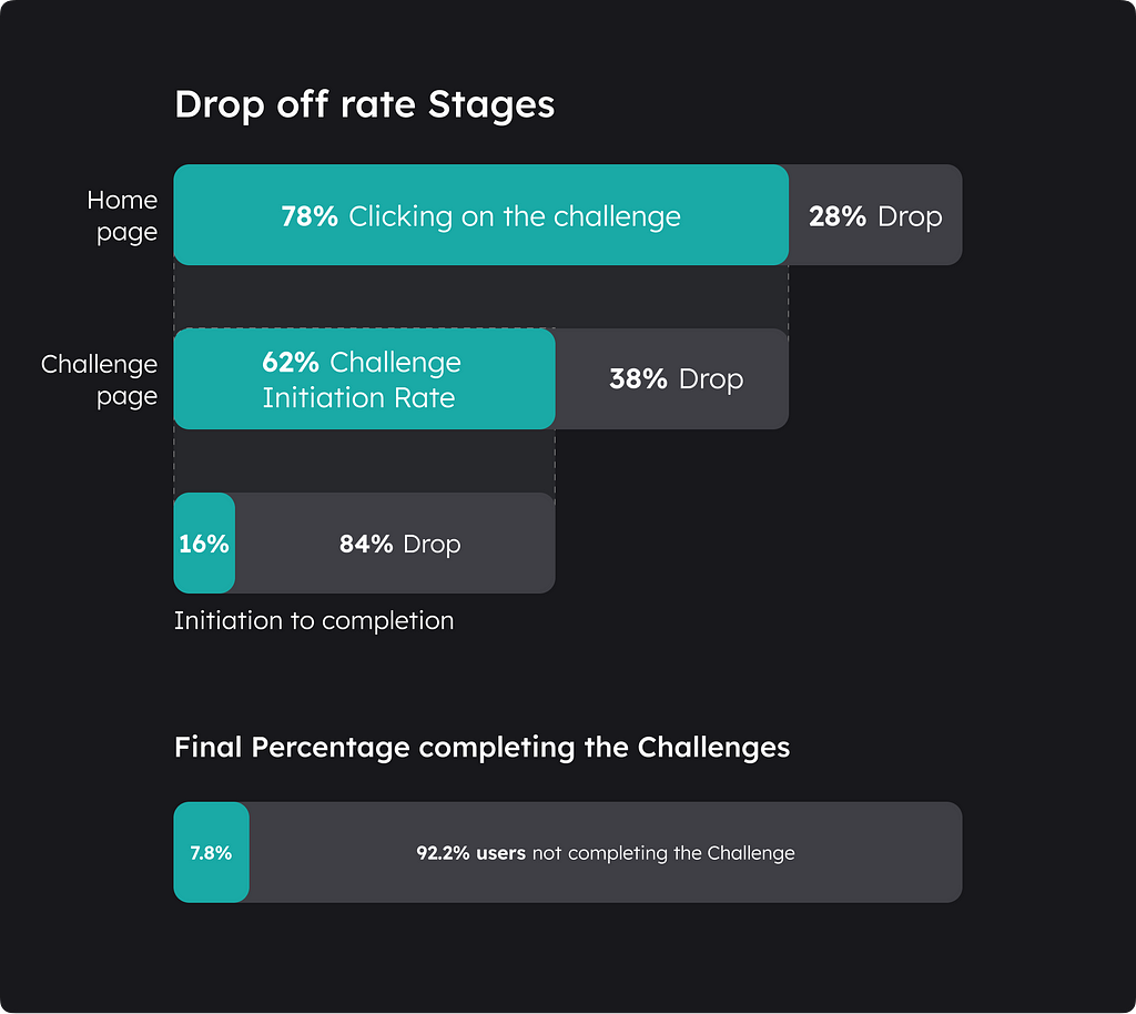
The Drop-off rates
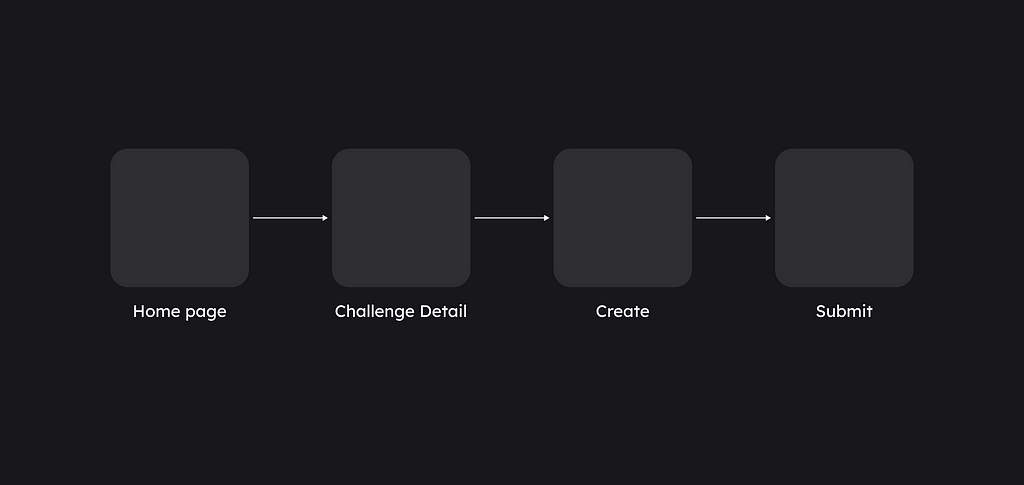
- The Click-through rate for the average challenge was 78% which is pretty good, but the Challenge Initiation Rate was low, almost 62%
- The Initiation to completion went down to 16%.
- The second-time returning user participating in the challenge was just 20%
This was an important metric as it gave insights into whether the user liked the Challenges and was interested in more on them as they got the value it had.
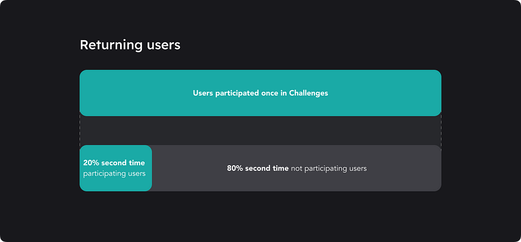
This is a huge difference!!! Even though we knew challenges were difficult for everyone to comprehend and participate in, we were still surprised by this data.
This showed that there are some deeper problems than discovery, which we didn’t get from just interviewing the power users.
To better understand this, we interviewed each batch of users to better understand the intentions behind their actions.

This gave us insights at every stage into the users’ problems and what prevented them from becoming power users.
Prioritizing the problems
Understanding and prioritizing the problems better to solve
All of these insights and interviews assisted us in identifying the critical problems to fix and the reasons behind those difficulties, allowing us to prioritize accordingly.
Common problems faced and the reasons behind them
- Some Challenges were too complex to solve
- They lacked fundamentals of certain subjects
- Were required to be made aware of the topics
2. Too long of a time commitment.
- Many students had their schools started after the pandemic and needed more time to solve the hassle challenge, which is why some of them gave up during the process because of the time it took.
- Various other personal reasons like homework, extracurricular activities, etc.
3. Difficult to Comprehend the Challenge.
- English language barrier (Which I was a little shocked by).
- Needed help understanding the Social & cultural context.
4. Some challenges required resources that only some students had.
- Quite a few lacked instruments or gadgets required
5. Teens were intimidated by their peers and by Challenge’s difficulty. They thought there was no chance of winning.
I got into depth to understand how Intimidation works and how we can solve this.
Intimidation is of two types Intentional and Unintentional.
- Unintentional Intimidation
Sometimes, things intimidate us through no fault of their own. We might be intimidated by people we perceive attractive, successful, or confident. When we’re self-conscious, we might feel overwhelmed by people who seem more self-assured than we do.
In our case, the peers caused this by their outstanding creations and the total number of people participating. - Intentional Intimidation
Intentional Intimidation is when someone wants you to feel scared or intimidated by them.
The challenge/mentor itself causes this by being so complex.
6. Procrastinated to start and delayed until they figured out the correct info.
But why does procrastination happen? Let’s go into the details
- Procrastination psychologically happens when students worry about performing inadequately or fear their success may raise others’ expectations of them.
- Refrain from believing they’ll enjoy doing the task, so avoid making themselves unhappy,
- Need clarification on the complexity of a task or when they’re overly distracted or tired.
Psychologists have also identified various drivers of procrastination, from low self-confidence to anxiety, a lack of structure, and simply an inability to motivate oneself to complete unpleasant tasks.
7. They did not find the challenges interesting, mainly because
- Didn’t like the topic, the process, the results, etc.
The underlying reasons for this were
- Found it difficult
- Not able to comprehend
- Didn’t want to try something challenging
8. They had forgotten they had initiated
- Missed the notifications — Had not turned on the notifications
- They had to attend School
- Some needed to be more severe about challenges, not valuing them.
9. Getting stuck in the middle of solving the Challenge
- Lack of knowledge
- No one to easily communicate to and clear doubts
🔮 The Challenge Revamp!
Introducing “Fun” & “Skilled” Challenges
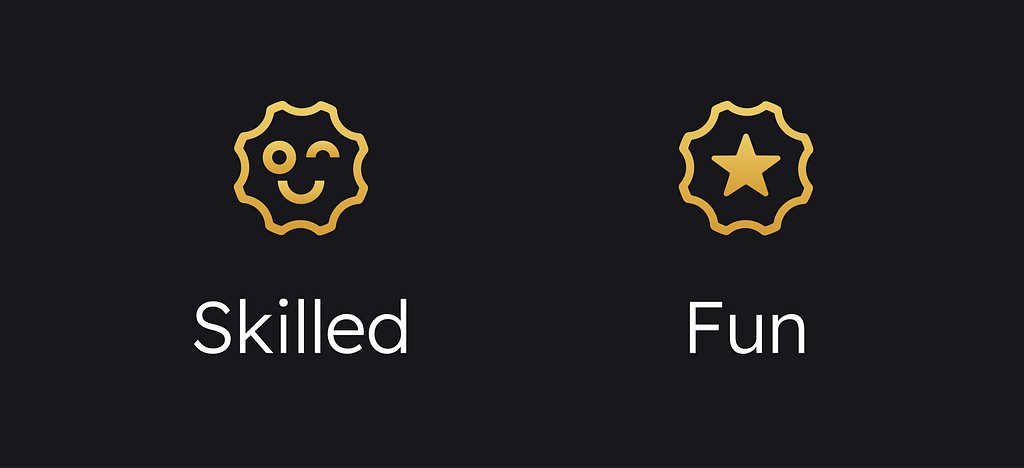
What are “Skilled” Challenges?
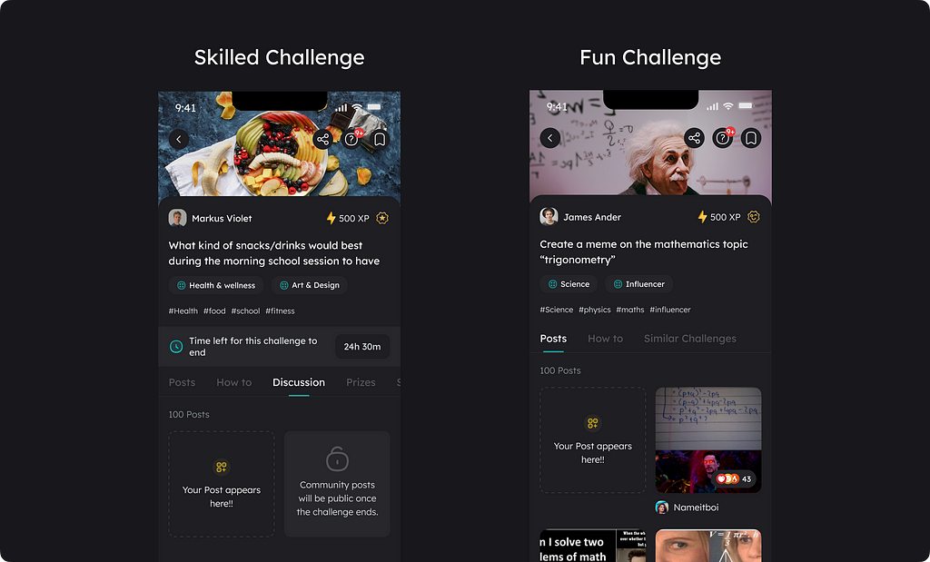
These are the same Complex challenges as before, but they will be differentiated from the “Fun” challenges via an icon. Only this type of challenge will be rewarded.
What are “Fun” Challenges?
These are less complex challenges, enjoyable (games, memes, other related fun activities, etc.), and take less time to solve comparatively. These challenges will not contain rewards, so the peer creations will not be hidden.
Is such a new type needed?
This was the question everyone asked. As the Challenges were one of the main USPs of our platform, what made it the USP was that they were different, challenging, and a new type of educational feature that the teens were not accustomed to.
Adding simple challenges is the first solution that pops into the mind, right? But what about our USP? This question stopped everyone, especially the Learning design team.
However, the research helped us see the need precisely for it and how and what made the Challenge complex.
We noticed that most of the issues are interconnected to each other, leading to Complexity. We tried to map these things out
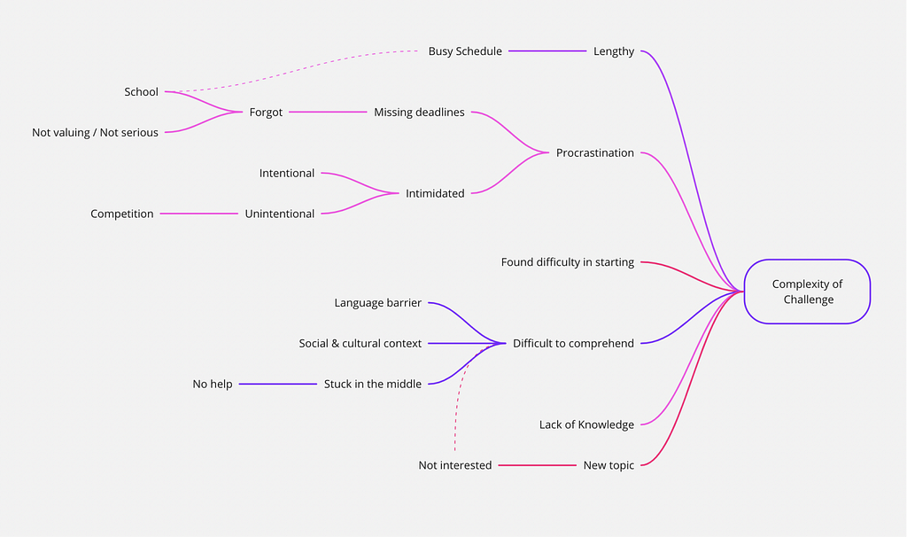
The most influential proponent of this is the complexity of the Challenges themselves, which prevented the teens from getting the value.
User Value > KPIs
Another interesting thing we saw in the 4–5 months of data was that once users participated in more than 2+ challenges, they were bound to stick and return to the app and solve one challenge once every two weeks. These users understood the value of solving challenges, i.e., the power users. This is what we wanted to achieve for more users.
What type of challenges do users solve the most?
From the top 10 challenges with the most participants. The 8/10 “challenges” were related to Art and design. This seems evident that creative challenges might get more participation. But from the interviews, we got to know this was because:
- easy to find inspiration
- low barrier to create, creating just with images and not writing big paragraphs about topics
- familiarity with the challenge
This again demonstrates a need for another challenge that is less complex, short, easy to comprehend, and related to common topics with which most of the user base is familiar. However, it should also be considered to educate teens via it and help them understand the value of “Challenge.” The Learning design team played a huge role in this.
Another goal here was to help users find challenges to solve which are in their flow state.
Ok, so what is a flow state?
In Csikszentmihalyi’s words, flow is “a state in which people are so involved in an activity that nothing else seems to matter; the experience is so enjoyable that people will continue to do it even at great cost, for the sheer sake of doing it” (1990).
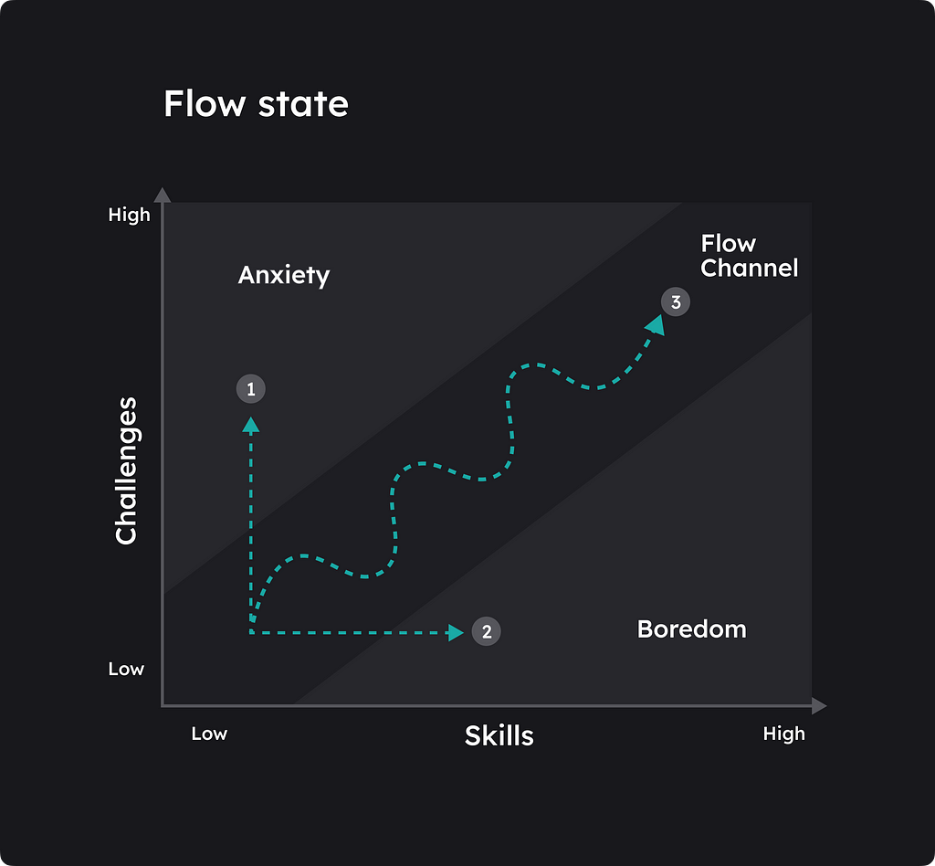
Also, the balance of perceived challenges and skills is an essential factor in flow. On the one hand, when a challenge is more significant than one’s level of skills, one becomes anxious and stressed. On the other hand, when the skill level exceeds the size of the Challenge, one becomes bored and distracted.
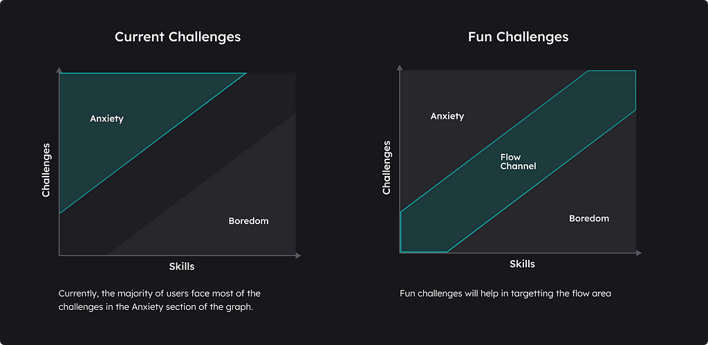
Changes like the following also help make the challenges less intimidating and decrease procrastination.
- We added no time limit to solve
- No ranks and prizes removing the competition aspect
- No hidden peer creations
I’ll detail these in the “Post tab” section.
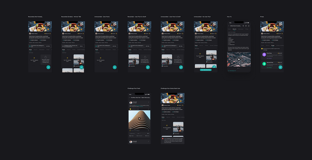
So what will be the difference in the journeys between Fun and Skilled challenges?
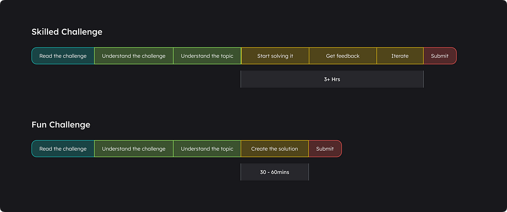
This way, the fun challenges will work as a bite-size learning experience so that every teen can enter into challenges and try to learn at their own level possible, and sooner or later, they will try to enter skilled challenges.
Let’s see the Fun Challenge example in details

This not only ensures that they learn and understand the topic first but also that they have fun while doing so.
The Learning design team designed more challenges for the teens. Again hats off to them!

Post tab
The challenge details section will have a New tab called the Post tab. This will contain the Creation created by the peers upfront here, depending on the state and what kind of Challenge it is.
Also, we changed the name of the images created, which we called ‘Creation,’ to ‘Post’ to use the standard vocabulary with which users were comfortable.
In skill challenges, peer creation will follow the same logic as before and will become public only after the results are released. Until then, it will remain Private.
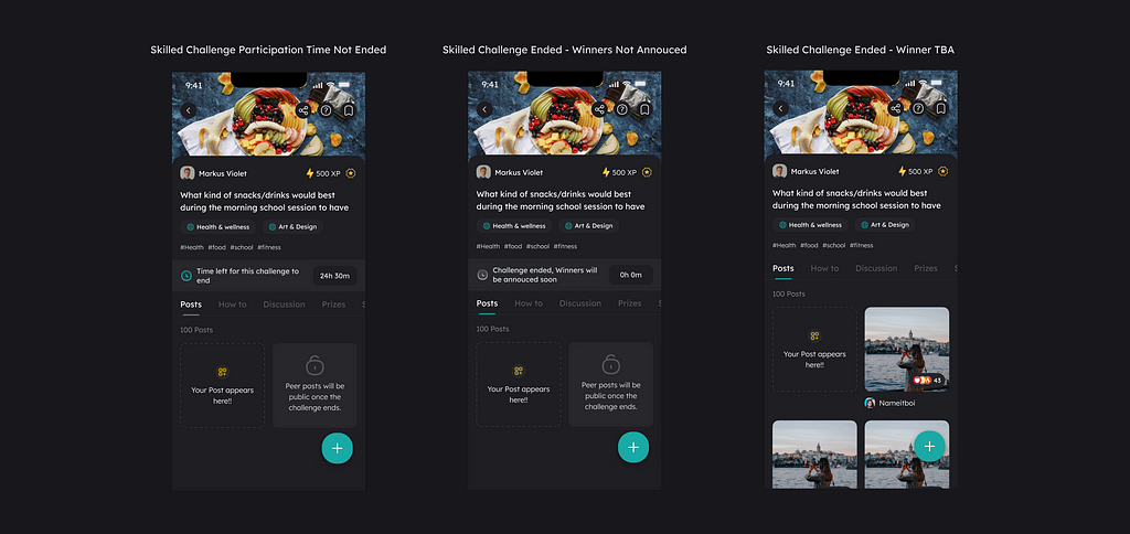
For fun challenges, peer creations will be upfront on the challenge page. This will be the same for all states.
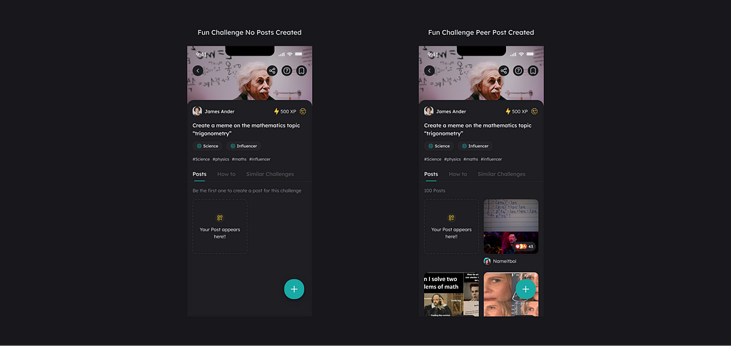
Why bring the Peer Posts up Upfront?
Previously, we had the peer creation CTA at the bottom dock, but data revealed it was ineffective.
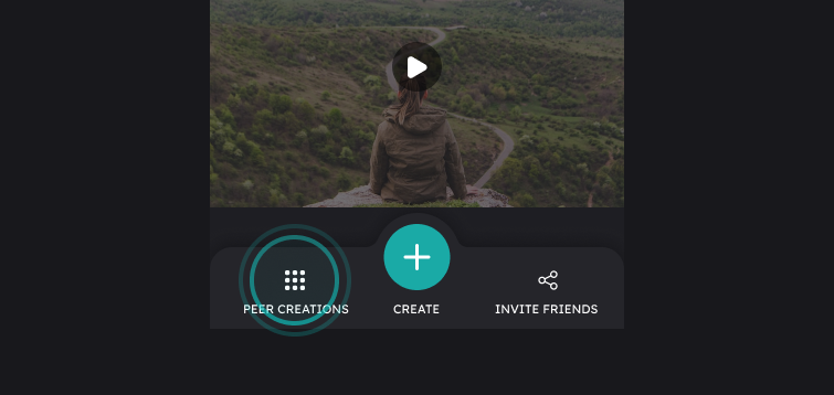
The Peer creation CTA’s Clickthrough rate (CTR) was 55% by the users visiting the Challenge details page.
Of these, 70% clicked it when the challenge was live and never returned when it ended to see the peer creations. This didn’t help them, as you can’t view the peer creation when the challenge is live.
This was a little confusing 🤷🏻, to be honest.
On asking the users, these were some of the reasons they stated for not opening the peer creation page:
After the challenge ended
- Weren’t interested in it after the challenge ended
- Didn’t come to their mind to check out peer creations
- One shocking discovery many users made was that after seeing the zero state earlier, they assumed the same would happen because they didn’t care to read it.
Never checked out “Peer Creation”
- Didn’t notice the peer creations
- Weren’t interested in it
- Did not understand it and had no idea what the word ‘peer’ meant
Now, even making it a bigger CTA or a button or some kind of a banner won’t work, as it would face the same problem again.
So what if we showed it up upfront?
But won’t intimidation be a problem, showing it upfront?
In the case of the fun challenges, the peer creations will be shown when the Challenge is live and Skilled only after the Challenge has ended. And even though some might be intimidated, the majority might not be because these won’t be Skilled challenges but rather Fun challenges.
This made me think, would intimidation really be a problem here, and if yes, how can we solve it?
- Fun challenge and a more readily understandable copy can solve Intentional intimidation again.
- Unintentional intimidation was tricky as it was caused by mostly seeing the total people solving, but it also motivates people to solve as it has more competition.
- Also, fun challenges can help build motivation!!

Had to test this out!
With the help of the Learning design team and community managers, we ensured this method of showing peer creation worked by conducting a few such challenges in the Discord server to validate this Concept.
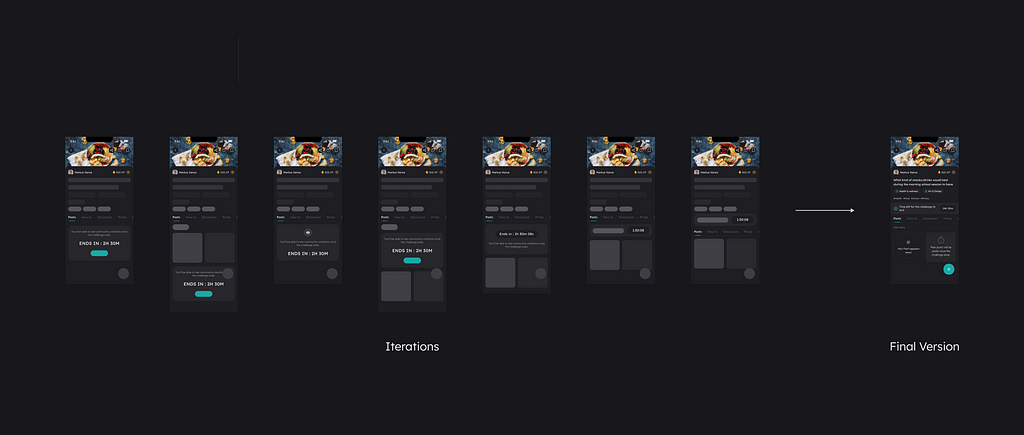
Explorations Post Tabs
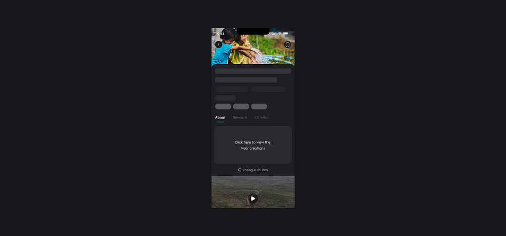
Before deciding on showing the Creations upfront
The first try was to show the peer creation box in front, stating Click here to view the Peer creations.
But here, we decided to show the creation upfront because that would be much better than going to another page to view it.
After deciding on showing the Creations upfront
Next was collections, which took a lot of real estate.
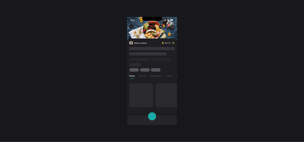
This didn’t work, as we also wanted to show the user’s state in the creation process to inform them. Currently, only a button states that.
So how can we make it more noticeable?
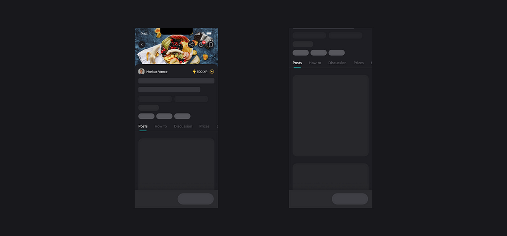
A feed view also doesn’t work here because the user will have to scroll too much.
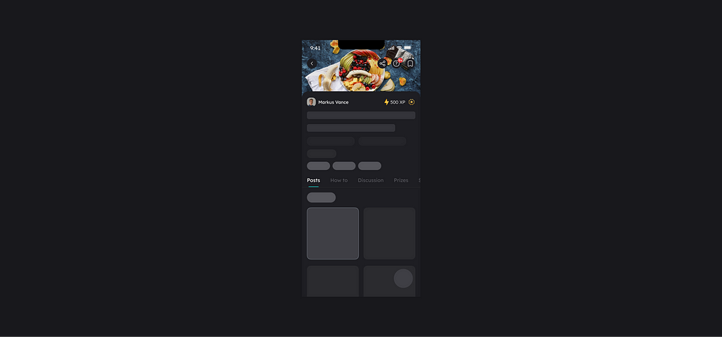
Finally, we decided on a tile layout. This also serves the current state’s purpose and the other creations. Another advantage was that it was also a modular design, which will help in different states (we’ll see this forward in this section).

Total users attempting data point
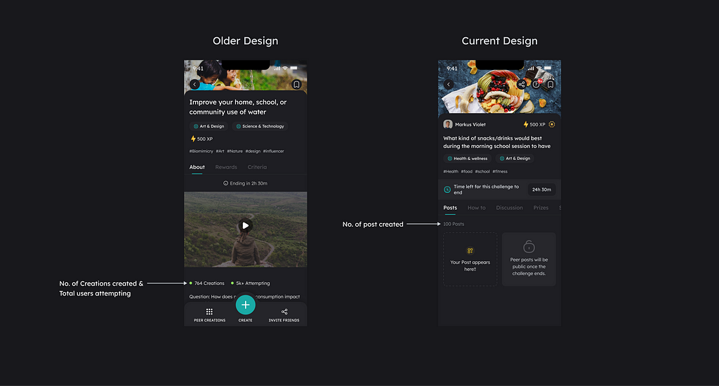
Next, in the live challenge state, we removed the data points for attempting challenges and kept the number of creations created. The average trying number was 80% more than the total submitted to ensure it was less intimidating. Also, this was added earlier in the app because it was invite-only, had fewer users, and helped motivate the user to participate in challenges.
User Post thumbnail
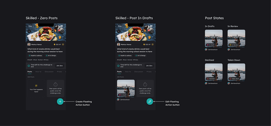
To help users with completion, we started showing the post-process state upfront. This means that users are constantly informed whenever they are on the detail page, and people hate the tension created by incomplete tasks. The floating CTAs also change according to the state of the user’s post.
This is the Zeigarnik effect, which refers to the tendency to recall interrupted tasks better than completed tasks in some circumstances.
We tried some of the iterations for this component.
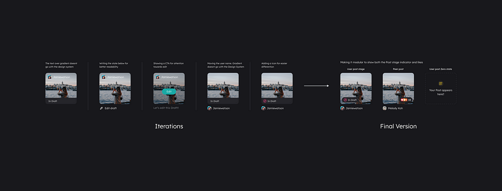
Peer Post thumbnail
To help users understand quality creations easily, we decided to show the likes on the thumbnail.
For Skilled Challenges, the ranking will be according to the Reward ranks, after which it will be according to the no. of likes (most to least).
For the Fun Challenges, the ranking will only be based on the number of likes (most to least).
This helps motivate the users to create posts of good quality.
Deadlines made clear!

The new Time bar for the Skilled Challenge
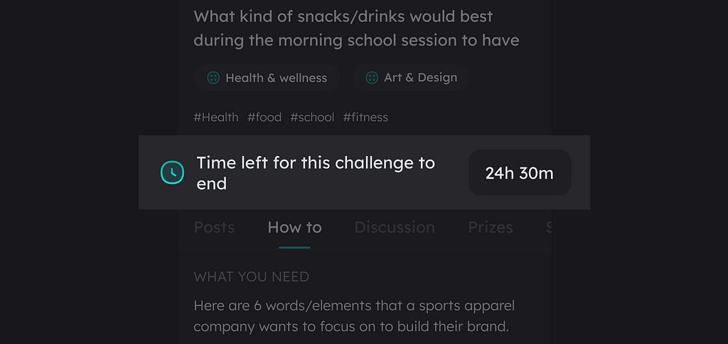
We added a New bar to show the time remaining to solve that particular Challenge.
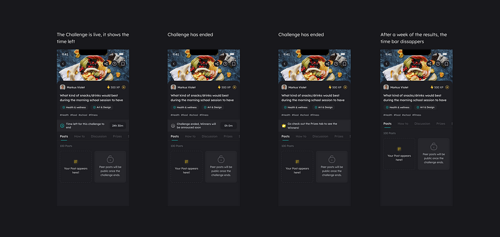
This would be only present in a Skilled challenge and changes according to the state of the Challenge
Why was this needed?
- There was a need for more emphasis on the Time left available to solve the Challenge.
- Time management was a big issue with the teens. Many of them needed to be made aware of the deadline and were missing it, which also led to Procrastination.
These showed the requirement to show and highlight the available time left.
Another thing to consider
What else can we do to improve time management? Is just making the deadlines clear going to solve the problem?
We decided to look at when the users are usually most active.
They had the whole day earlier in the lockdowns, but now it was different from the School started.
Data showed that most activities happened between 5 pm — 1 am.
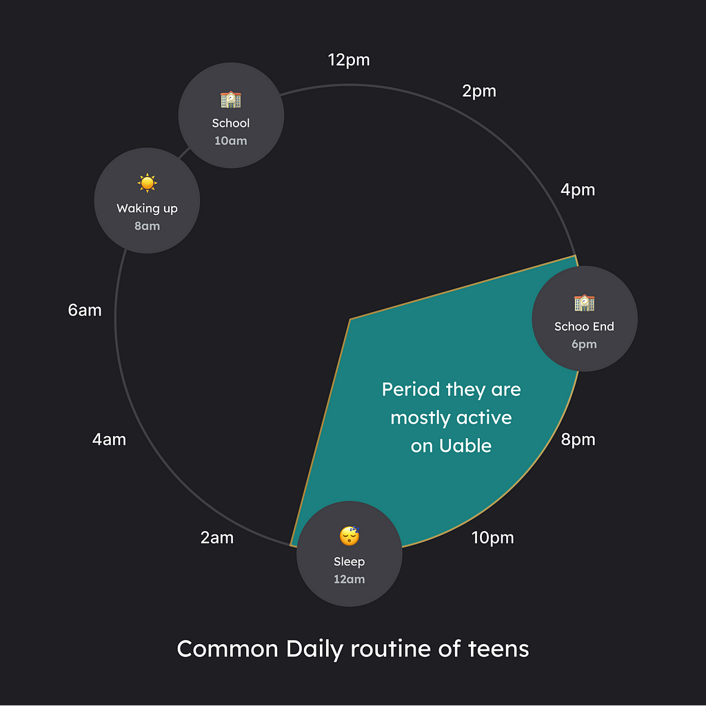
This meant teens had around 6 hours of access to the app to work on challenges. However, their time is usually consumed by other things like tuition, playing, etc.
This gives us an idea of how we can help the users have the maximum time to solve a challenge.
So to help users maximize the time to solve, we changed our challenge timings from X days (2,3 days, etc.) from when it was created (this was the default) to midnight on the end date.
So earlier, let’s say the Challenge started on 11th September at 1 pm, and its period is two days. So it’ll end on the 13th at 1 pm. This used to work in the lockdowns, but this wasn’t the case anymore.
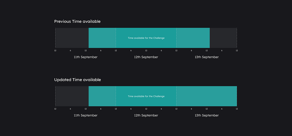
Now this Challenge would end at the 13th midnight (12 am).

This meant that the challenge submission would be at midnight, no matter when it was created. Which will ensure that the user gets enough relaxing time to work on the challenges.
Creator name
We moved the challenge creator info to the top of the Challenge details from the previous, which was at the bottom of the “About page.” We removed the credentials from the card as they served no different purpose, as the user can get the info by going to the user’s profile. So we decided on just the simple name with a tick.
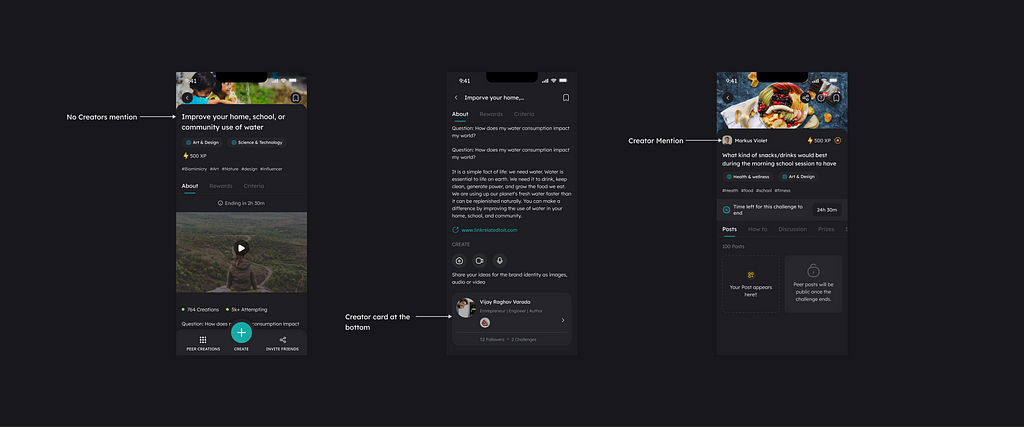
Discussion and clearing doubts are essential steps in the CBL model learning. Some users didn’t find the Mentors Card and needed to figure out who to communicate with, so we thought of making the name upfront. This makes it easy to find a mentor to clear doubts quickly in any challenge and also acts as social proof.
The “How to” tab
We changed the name of the “About tab” to “How to.” The only change in this tab will be the absence of a Creator card. The position of the tab would be second after the “Post” tab.
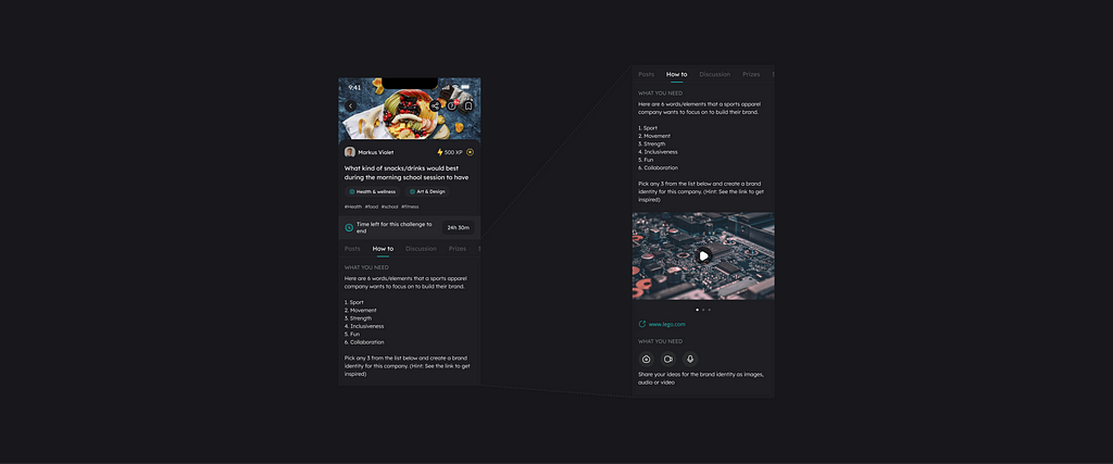
Why?
- The “About” tab lacked resources, and the learning design team worked on it to provide better help.
- We changed the name as it needed to convey the right message as this tab had resources on how to solve this Challenge, and calling it “About could have made more sense. It will also no longer have the Creator card as it has low visibility.
- As we wanted to prioritize the post tab, we moved the About tab to the second position.
Discussion Tab
Clearing doubts and discussing was a huge problem. Even though creators were accessible, the teens were still intimidated as it was equal to asking questions personally by going to the staffroom to the teacher, which is rare. So now the question was how can we make a classroom environment such that an AMA session is going on?
Our first solution was to link the Dialogue feature to the particular Challenge, as Dialogues provided the same function, and the Challenge creator/mentor will create this Dialogue.
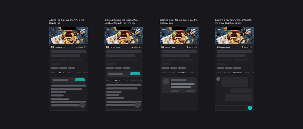
This will help them start the Challenge, avoid getting stuck in the middle, and connect with other folks. It will also increase their motivation to solve problems and provide them with feedback, which will help solve procrastination.
But to add a dialogue tab in the Challenge, we would also have to work on the creative flow to add Dialogue. Also, the tech workload will increase for development, and as the backend architecture was set up in such a way, connecting the Dialogue to the Challenge won’t be a good idea. Jumping into the Dialogue was also bad as it would break the flow.

We had another idea of having an open group chat-like feature. Here in the discussion tab, it’ll be similar to a group chat DM we have as a feature, but here, it’ll be for the users to discuss the particular Challenge, which we decided to go with it finally.
Solution
Introduction of Discussion Tab
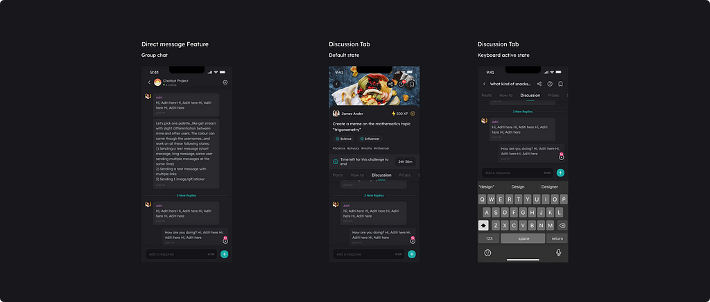
A place where the users can interact with the mentors to clear doubts or even discuss with fellow peers who are also interested in that particular Challenge.
Here a user comes to the challenge details page. If they get interested in the Challenge, they can ask their doubts if they have any in the Discussion chat, OR they go through it to see what other users are discussing to understand the Challenge better.
Similar tab
Users found it difficult to find interesting Challenges, and the learning design team was working to solve this concern. We also made a point of better tagging challenges for discovery on the “Home Page.”
This made us think, what if we leverage the tagging? And use that to show similar challenges in a separate tab.
Introducing “Similar Challenges” Tab
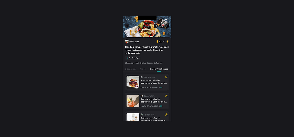
As the name says, this would contain similar challenges to the Challenges you are on the detail page. Here the particular topic, area of interest, and difficulty would decide the similarity.
Top Bar
As the app during the challenges MVP was Invite-only, we wanted to promote the app via referrals, which is why we had a share option in the bottom dock to increase the same. After removing the Invite-only model, we no longer needed the upfront docked share CTA.
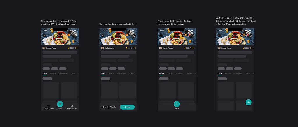
We also saw the need for a quick help button, as many users might still need clarification despite the new changes.
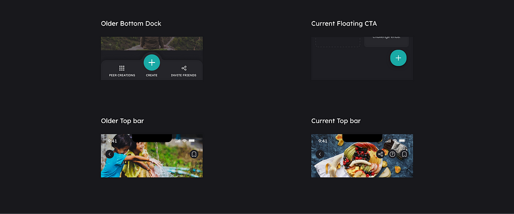
So we moved the share to the top bar and added a help icon that opens a Fresh chat. At the bottom, we have just the floating create CTA.
Notifications
The data showed that most users turned off the notifications at the start. This can be because of the other app’s behavior, or they assume that they don’t require them without learning why they would be required.
This was a big issue for the challenge notifications that we usually send, such as the New Challenge and Ending Soon, both of which the user has participated in OR one that is in their particular interest area.
To tackle this in the Challenge section, we stopped showing allow notifications at the start of the Sign-in/up but started showing Notification permission Popups occasionally when the users want a notification to get a particular value.
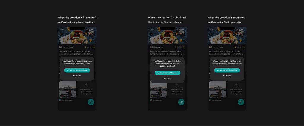
Such as
- Firstly, when the user participates in the challenge, the creation is kept in the drafts. Here there is a need to have a reminder before the deadline so they can submit it.
- Next, if they submitted the challenge, they would like to know about the results, if it’s a rewarded challenge, OR if they would also like to know about something similar.
How does this help?
- It gives them the context — They will likely want a reminder if you’ve invested time participating in a challenge. This small ask is perfectly timed.
- Value—It focuses on the user’s benefit (getting a reminder) instead of abstract features (alerts, sounds, etc.).
- Conversational — It’s easier to agree to simple yes/no questions. After all, when was the last time anybody answered? “Allow” to a question in real life?
The Launch
Before the Launch, it took us another four weeks to test the Challenges with the users and develop them. The learning design team designed and tested the challenges to find the best way to create them. After which the Launch happened!
Impact
After two months of release, the results were positive. The overall Challenge participation rate had increased by a whopping 13% in the first month and 18% in the second month.
However, the participation in the Skilled Challenge only increased by 5%. I believe this change will take longer until the users understand the value and enjoy the challenges.
For confidentiality grounds, I have omitted the precise values of the metrics.
Personal Learnings!
This was my second major project at Uable after the Profile, and I was able to contribute to strategic decisions through research. I was fortunate to collaborate with various teams, and this project required deep collaboration in order to succeed. I gained valuable insights from the other teams, learned new perspectives, and, most importantly, gained a thorough understanding of how the product works. Through user interviews and testing, I learned about the differences between what users say and what they actually mean. Additionally, I learned how to use data effectively and when to trust it.
That’s a wrap thank you for reading.
Hope you found it useful and interesting!🙂 Feel free to reach out to me on Twitter | LinkedIn | Dribble
How we revamped our Challenges feature to increase Participation was originally published in UX Planet on Medium, where people are continuing the conversation by highlighting and responding to this story.