Use these 8 scrolling animations to stand out on your next web design project.
I usually spend the last few minutes browsing through random designs on Muzli or Daily Design News before wrapping up and hitting the bed. One day I was scrolling through one Portfolio design — I felt a little overwhelmed as I scrolled, there were a lot of animations going on which, to be honest, wasn’t bad at all. But I’m usually mindlessly scrolling these websites but this one made me alert. Something hit me and I’ve seen a sense of pattern across many of these Portfolio websites. That’s when I re-watched the website curiously looking at every page scroll transition and thus the idea of sharing this with you all.
Here are a few page scroll animations that I was able to recall (and re-create) from multiple websites I’ve seen. What I’m about to show is a base structure of how the animation worked. Use it as your next inspiration and build something great on top of this.
Enjoy!
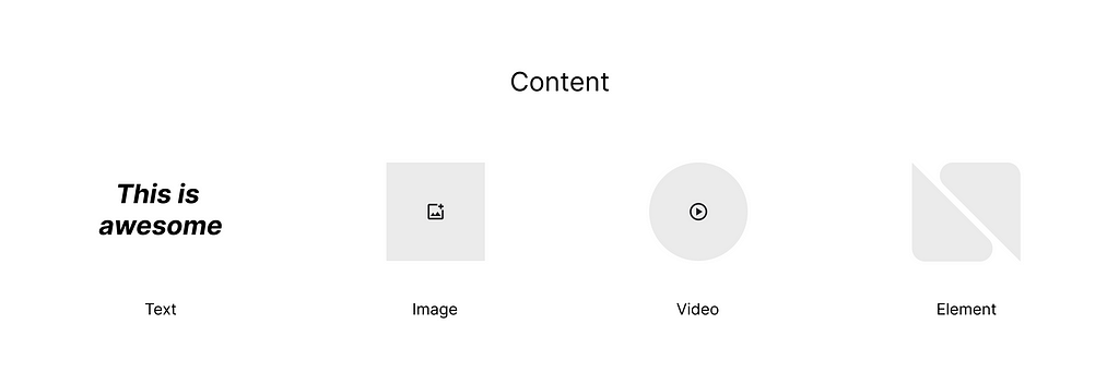
Note: The animation usually works on the interaction of two content. This “Content” can be your text, image, video or a visual element.
1. Content on top of other content
In this, content is fixed on the screen while another layer of content scrolls on top. Great for showcasing a project name and images rolling up the image.
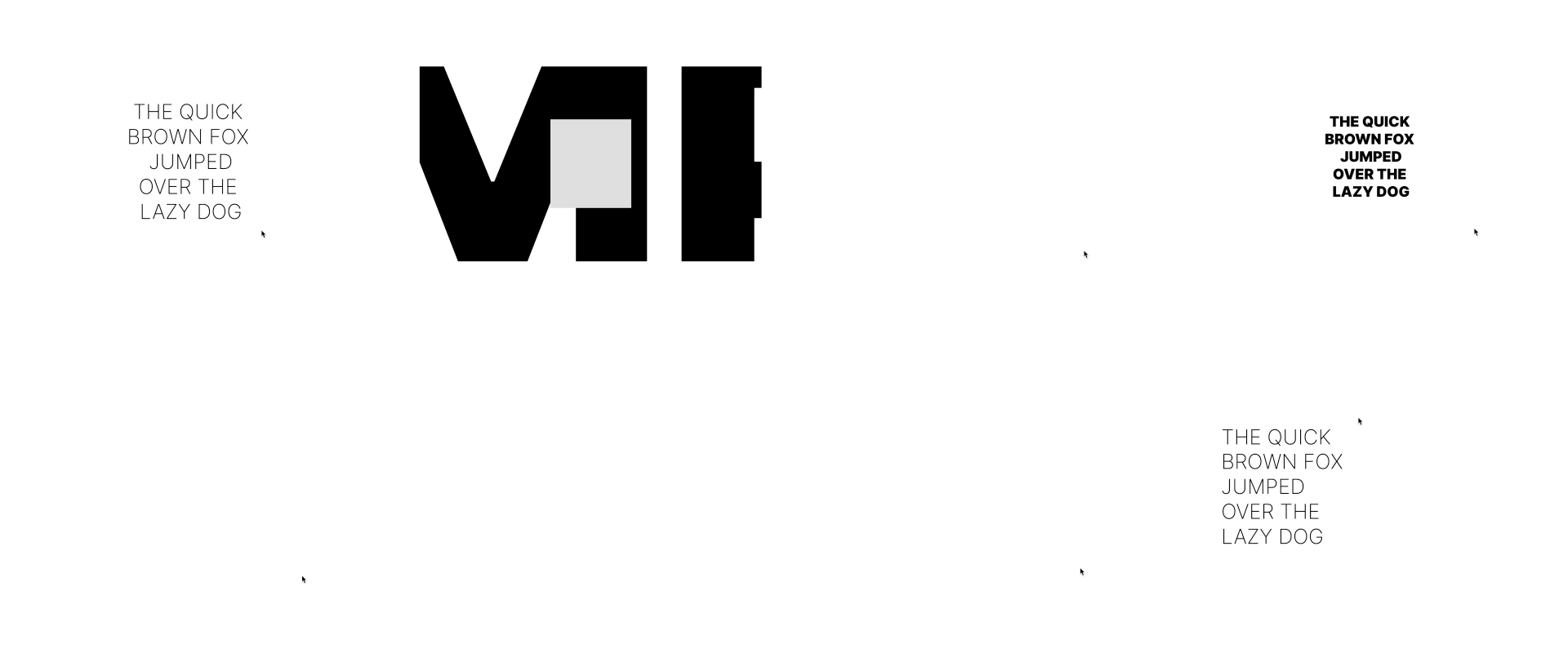
2. Content Zoom In (or Out)
This animation adds 3D depth to your scroll. It gives a sense of three-dimensional space when experiencing a website. The content is fixed and another one zooms out from behind. Great for showcasing the “values” and “whys” of the company, and super easy to grab someone’s attention.

3. Content Stacking
This is one of those experiences that has been inspired by the real world. A game of Spades, as you throw a card on top, it stacks up! Great to showcase testimonials or project sections.

4. Content Fade Out
Similar to the first scroll I mentioned (Content on top of other content), except this one shows content and fades when the next content comes up. Super useful for showcasing short bursts of content, Maybe like clients you have worked with, or showcasing key metrics.
5. Content goes from left to right (or vice-versa)
This adds a sense of break between sections in a website, it’s an easy way to grab the user’s attention when trying to showcase something important that is quick, short, and fast to read.
6. Marquee
This I guess we all have seen. Our good’ol marquee is an effective way to show something without taking up much visual space. Helpful for important announcements or section breaks or for showcasing key information. it’s all up to you how you use it.

7. Content Zooms to fit the whole screen when scrolled
This one was my favorite so far. Perfect to showcase your best case studies thumbnails at a quick yet impactful glance. The card comes to the middle of the viewport and then expands to fit the screen while another card with a different contrast comes up and takes the whole viewport. Lovely.

8. Content change based on hover
Another interesting animation choice that I’ve seen on websites. The transformation of content is based on what you hover. Perfect for side-menu option hovers or project highlights.
All these animations serve as a base to add your visual elements. Feel free to use this or remix it as per your web design requirements. Overall, it’s a good practice to have a designer with a keen eye on the details of how elements, scroll, click, hover, etc on a webpage. Inspiration can come from anywhere, you just have to be more aware.
Thanks for reading, and if you enjoyed then follow me for new design stories, tips, and tricks.
Let’s connect Dribbble | Bēhance | Instagram | LinkedIn | Facebook
Stay tuned for more content!
Cheers 🥂
![]()
I noticed a pattern in page scroll animation on websites… was originally published in UX Planet on Medium, where people are continuing the conversation by highlighting and responding to this story.