How transparency and timing turned a risky redesign into a smooth experience
Instagram’s latest navigation update isn’t just a feature change; it’s a lesson in how to communicate design changes without frustrating millions of users.
If you’ve been using Instagram for a while, you know this isn’t how they used to do things. In the past, updates just appeared. You’d open the app one morning and the navigation bar was different, buttons were rearranged, and muscle memory went out the window.
No heads-up. No explanation. No sense of control.
And the internet would explode with backlash.

This time, though, Instagram learned from its mistakes. They rolled out the redesign in a way that respected user trust, reduced friction, and actually felt considerate. Let’s break it down.
They Informed Users First
Before changing anything, Instagram showed an announcement right inside the feed.
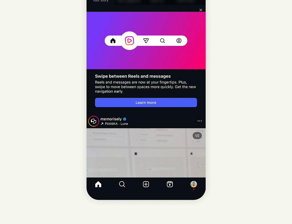
“Swipe between Reels and messages.”
The banner explained the upcoming navigation update with a short sentence, a clean visual, and a “Learn more” button.
It didn’t interrupt your session. It didn’t feel forced. It invited curiosity.
That alone is a big shift in mindset, from forcing change to introducing change.
They Explained What’s New
Once you tap “Learn more,” you’re shown exactly what’s going to happen next.
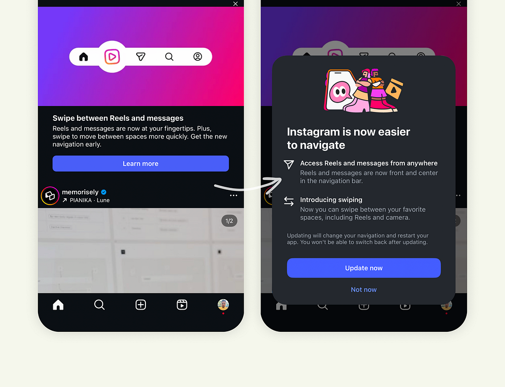
The overlay breaks down two things:
- What’s changing: Reels and messages are now front and center.
- Why it’s better: You can access them faster and swipe between spaces.
It’s clear, visual, and to the point. Then comes the real UX gem — the choice.
Two buttons: “Update now” or “Not now.”
That moment of choice matters. It gives users a sense of control and reduces the psychological resistance that usually comes with UI changes.
People don’t hate new designs; they hate feeling blindsided by them.
They Onboarded After the Update
After you accept the change, Instagram doesn’t just switch the layout and leave you hanging.
The new navigation appears instantly, but with a quick overlay explaining how to use it and why it’s designed that way.
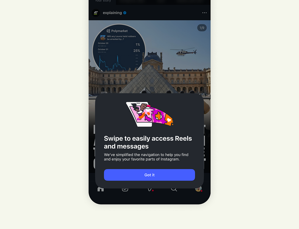
It’s contextual onboarding shown at the exact moment it’s relevant.
You don’t have to guess what changed or dig through patch notes. You see it, you understand it, and you move on. Smooth, predictable, human-centered.
The Psychology Behind It
Here’s what makes this update rollout work so well:
- Anticipation: Prepares users mentally for change.
- Transparency: Shows what’s changing and why.
- Control: Let users opt in, reducing friction.
- Education: Guides users right when they need it.
It’s a classic example of change management through UX. Instead of pushing users, Instagram walked with them.
What Product Teams Can Learn
Most redesigns fail not because the design is bad, but because the communication around it is.
Here’s what Instagram’s team nailed that’s worth replicating:
- Tell users before you change anything. Even a single in-app message helps build trust.
- Explain the “why,” not just the “what.” People accept change more easily when they understand its purpose.
- Ask for permission when possible. Giving users control changes their mindset from a victim of change to a participant in change.
- Guide users afterward. Contextual onboarding is one of the most underrated UX tools.
- Respect the user’s habits. Design changes are not just about pixels; they’re about behavior.
Final Thought
Good UX isn’t always about fancy animations or clever layouts. Sometimes, it’s about respect for the user’s time, attention, and familiarity.
This rollout is proof that even small decisions in communication can completely change how users feel about a product.
Instagram didn’t just ship a redesign. They shipped trust.
![]()
Instagram’s Latest Update Shows What Good UX Communication Looks Like was originally published in UX Planet on Medium, where people are continuing the conversation by highlighting and responding to this story.