For years, we’ve preached the gospel of the design system as the “single source of truth.” We built libraries, evangelised tokens, and perfected our handoffs. However, despite all our efforts, the system often remained just that: a library. It was a meticulously organised collection of design assets that lived next to the real product, a reference file that designers owned and everyone else chased.
That paradigm is now obsolete.
The 2025 announcements from Figma’s Config and Schema events signal a fundamental shift. The “single source of truth” is no longer a passive file we consult; it’s an active engine we build with. This new paradigm is built on three pillars: the system is now interactive, intelligent, and integrated.
1. Interactive: The System as a Real Product
The “component-to-code race” — the endless chase to make our Figma components perfectly match our code components — is finally over. The new paradigm isn’t about matching; it’s about using.
- The Old Way: Prototypes were simulations. We linked static pictures of components together to imitate a user flow. The “truth” was split between a visual-only Figma library and a functional-only Storybook.
- The New Way: With Figma Make now supporting npm package imports, designers can pull actual production React components from the design system’s codebase directly onto the canvas. We are no longer building with pictures of buttons; we are building with the real button. This makes the prototype an interactive, high-fidelity extension of the product itself, not just a drawing of it.
The impact: The “race” is over because the design file now uses the code component. The system is no longer a static reference; it’s an interactive toolkit for building real products.
2. Intelligent: The System as a Guardian
The old library was “dumb.” It relied on human “librarians” to manually police its use, creating a bottleneck and endless design-debt reviews. The new system is intelligent and governs itself.
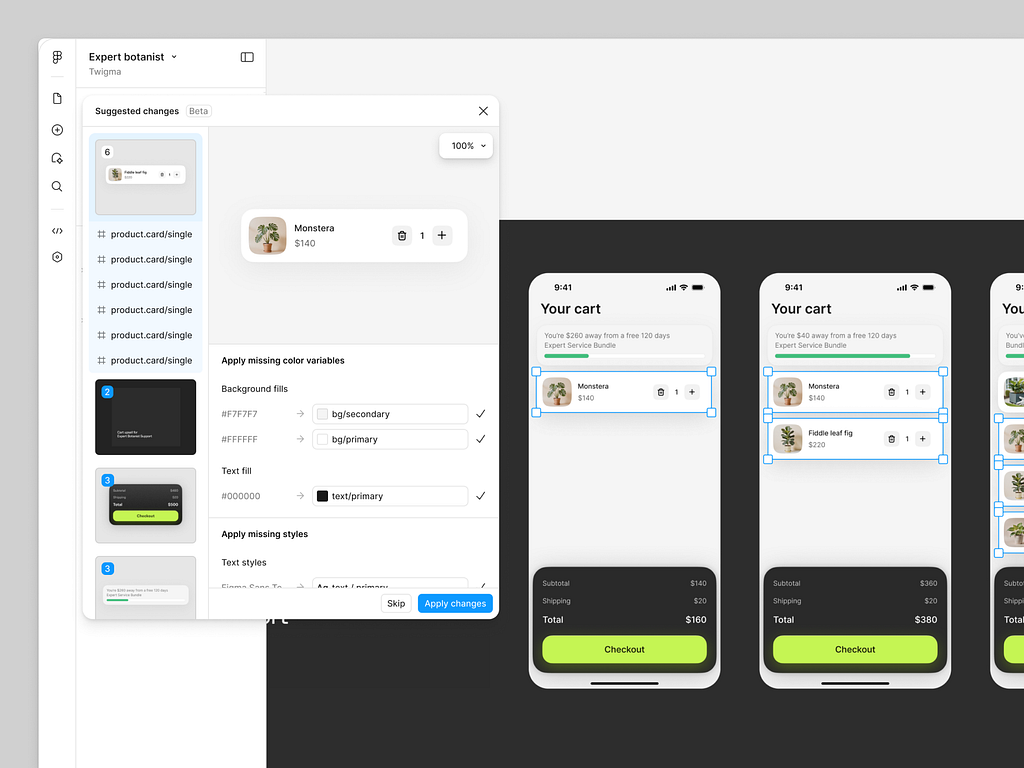
- The Old Way: Governance was manual. A designer, in a hurry, would use a hard-coded hex value (#4E2CD6) instead of the correct token ($color-brand-primary), and it would go unnoticed until a painful manual audit.
- The New Way: The system is now an automated guardian. Check Designs (now in early access) is an AI-powered linter that constantly scans files for non-compliance. It automatically flags hard-coded values and suggests the correct system variable.
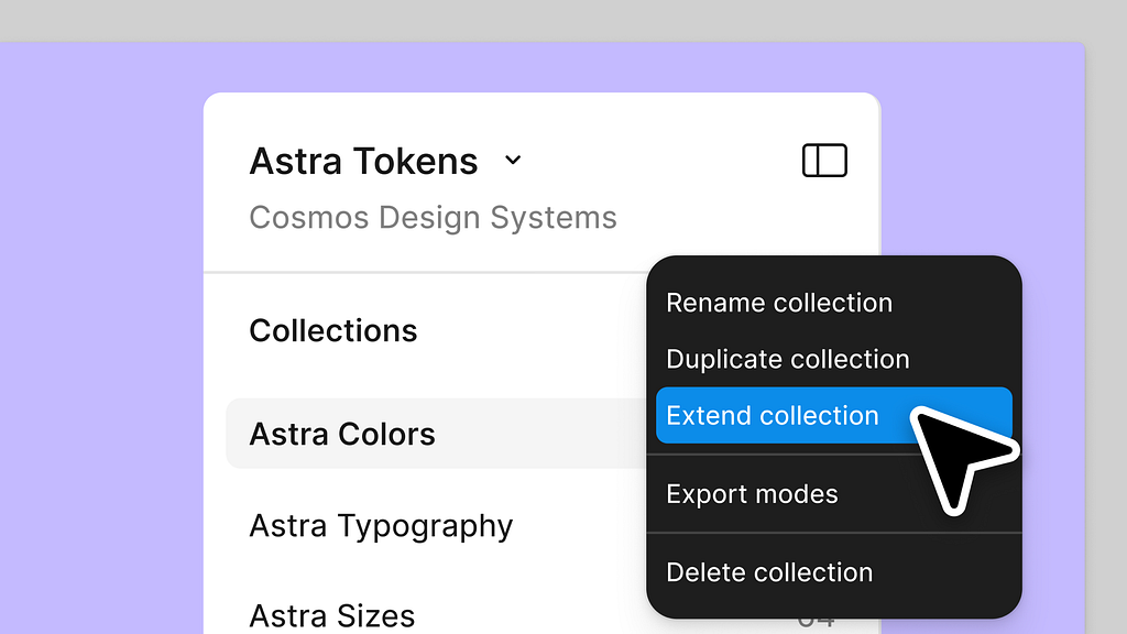
At the same time, Extended Collections (Enterprise) provides smart inheritance, allowing a “core” system to be extended by sub-brands without breaking the upstream connection.
The impact: The system moves from a “suggestion” to an “intelligent partner.” It scales itself, enforces its own rules, and automatically kills design debt before it starts.
3. Integrated: The System as a Central Hub
The biggest lie we told ourselves was that the design system was “just the designer’s job.” It was a file, in a silo, that others had to “inspect.” That silo is gone.
- The Old Way: The system was a .fig file. Developers had to “translate” it. Marketers had to “request” assets from it. It was a bottleneck.
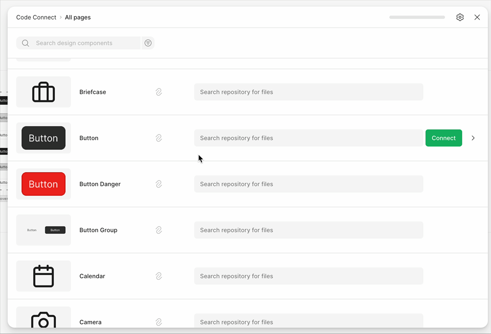
- The New Way: The system is now an integrated, company-wide hub. The Code Connect UI (now Generally Available) formally links components to their GitHub repos, making it a true developer resource. Figma Sites and Figma Buzz plug directly into the same system, meaning the same tokens and components that power your app now power your live marketing website and your social media graphics.
The impact: The design system is no longer a file in the design team’s folder. It’s the central, integrated engine for developers, marketers, and product teams. It’s finally everyone’s job.
The New Truth
The “single source of truth” we always talked about has finally arrived. But it’s not the static “library” we imagined. It’s an interactive engine for building, an intelligent partner for governance, and an integrated hub for the entire business.
A quick note: All placeholder assets and links are based on official announcements from Figma and are used here for reference and illustrative purposes.
For Deeper Understanding
To explore these new features, here are the official sources and best analyses:
- What’s new from Schema 2025 (Figma Help Center): This is the definitive technical guide to all the Schema announcements, including Extended Collections, Slots, npm imports, and Check Designs.
- Config 2025: Product Launch Keynote (YouTube): The official keynote from CEO Dylan Field, introducing Figma Sites, Make, Draw, and Buzz.
- Inside Figma’s 2025 Update: For Designers who Think in Systems (Grey Truffle): A fantastic third-party analysis on the strategic shift towards system-led design.
- Figma on YouTube: The official channel, which includes the Config keynote and deep-dive demos of new features.
Let’s Build This Future
This new paradigm isn’t just a set of features; it’s a fundamental shift in how we build. What does this mean for your team? How are you preparing to move from a “library” to an “engine”?
I’d love to hear your perspective. Let’s connect for a design discussion and explore how we can build this new future together.
Interactive, Intelligent, and Integrated: The New Design System Paradigm was originally published in UX Planet on Medium, where people are continuing the conversation by highlighting and responding to this story.