Removing roadblocks on the user’s way to understanding your product
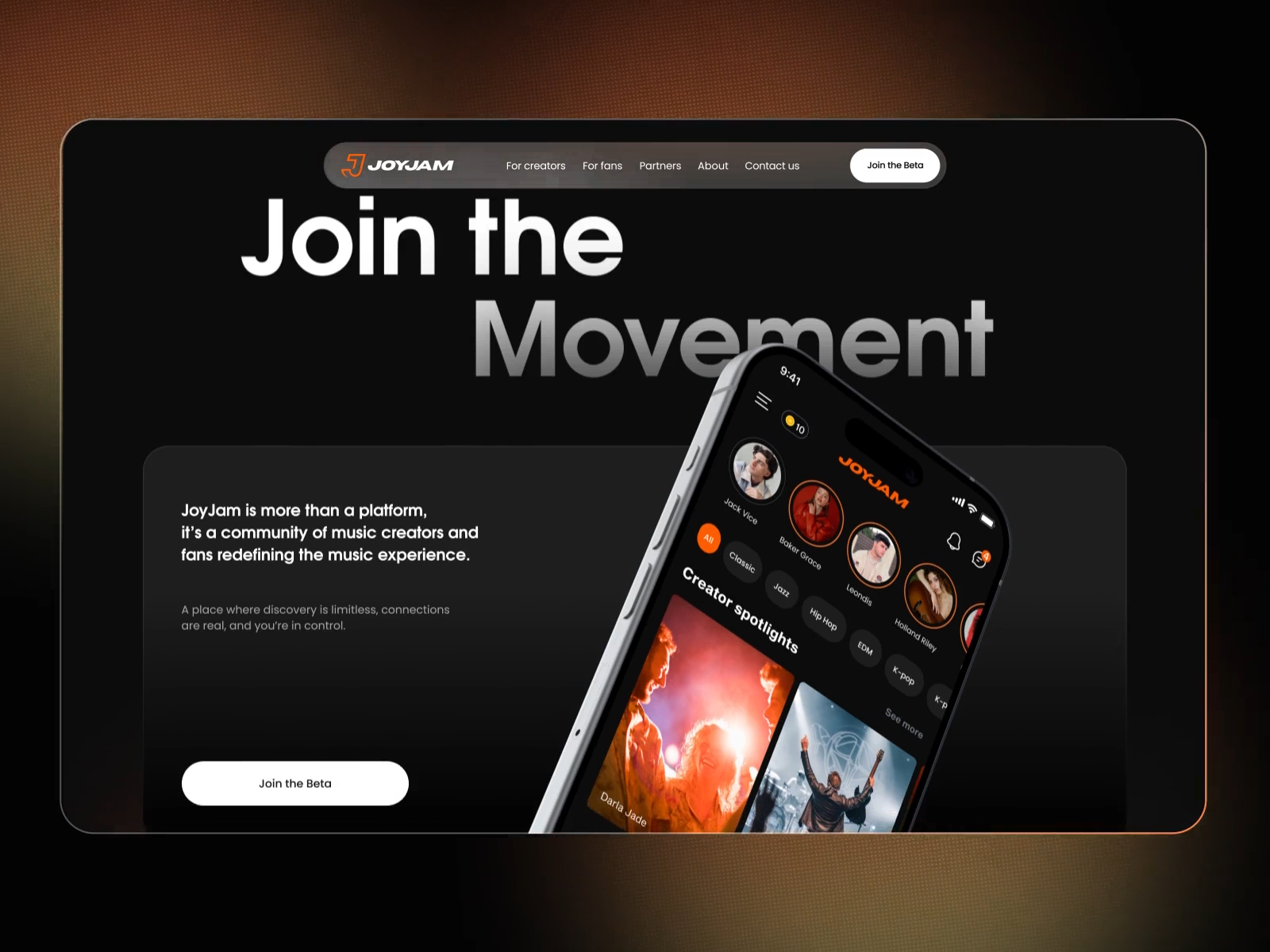
Expectation: Came, saw, conquered.
Reality: Logged in, got confused, left.
That’s pretty much what happens when you run into a poorly designed interface. The only “intuition” you feel is the urge to run away.
So what does confusion really look like? It’s not one single obstacle. It’s a whole pile of rocks scattered across the user’s path. And people don’t always leave right away. Sometimes they give up after a few failed attempts.
Here are the main “rocks” that can make your interface harder to understand. Spot them, clear them out, and you’ll make the journey smoother for your users.
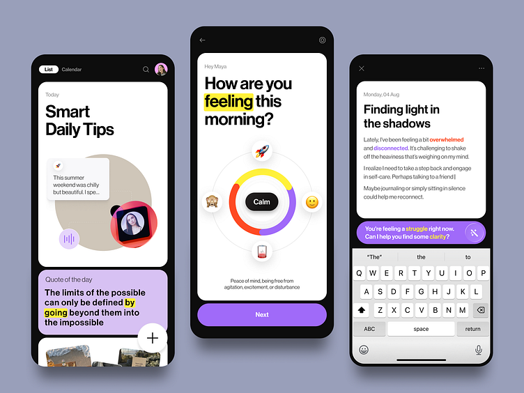
1. Clarity isn’t a ready-made solution
There are a few key factors that make an interface clear. They shape how people see your product, whether they want to come back, and if they’ll repeat the experience.
Right now, there’s no magic template — not even AI — that can instantly make your design obvious and attractive. A truly intuitive interface comes only from systematic work: taking into account the business goals, the product itself, and the way your audience thinks.
A template ≠ an intuitive interface
Think of an intuitive interface as a map you can easily follow. Yes, intuition means predictability: people know where to find the menu or what happens when they click a button. But that’s not the whole story. Predictability alone doesn’t make an interface clear.
2. Quality is the foundation of clarity
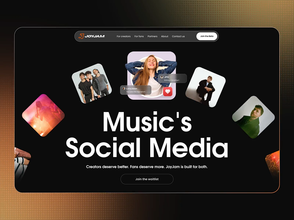
The overall visual design instantly sets the tone: do I trust this, do I want to continue? First impressions matter. Poor visuals are picked up subconsciously and can make even the simplest tasks harder. Bad design feels confusing.
Example: Change your phone wallpaper to a loud, patterned background and see how quickly you can find your apps. Everything’s still in place, nothing moved — but suddenly it’s harder, less comfortable. Your brain needs time to adjust. That’s not what clarity looks like.
Bad UI design can kill even the most brilliant structure and navigation.
Remember: don’t blame UX if it’s the UI that’s sick. Poor visuals make familiar patterns unrecognizable.
Good design speaks clearly. Logical, structured, and consistent visuals naturally guide users to their goals.
Clarity builds confidence and keeps people moving forward.
3. Meeting expectations
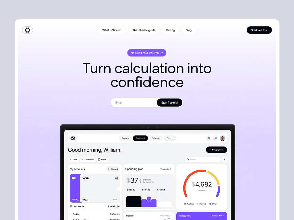
This also starts with visuals. Imagine a medical website in a black-and-red color scheme. Even before clicking anything, the user feels something is off.
Unjustified creativity breaks expectations and confuses. The key word is unjustified.
Creativity is welcome when it helps people understand faster.
The user’s main expectation? To reach their goal. Anything that slows them down or distracts them (visually or cognitively) feels like friction and creates disappointment.
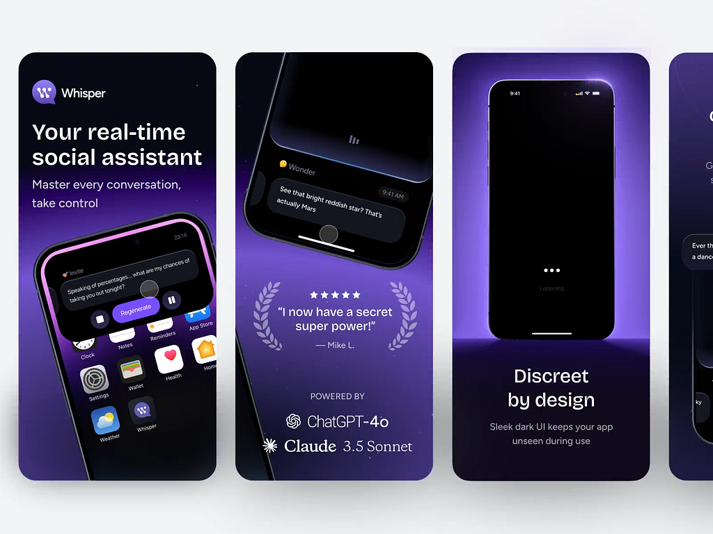
4. User experience is not your experience
A friend of mine once wanted to compose her own track. She went to some platform, messed around for several days, got lost in a bunch of options and tools, despaired, and gave up. I must be so stupid,” she said sadly.
I feel sorry for such users. I wanted to grab the developer and give them a good shake. 🙂
Designers and developers often understand any interface right away. They’ve seen enough of them to connect the dots. But users don’t. And that gap isn’t just about experience.
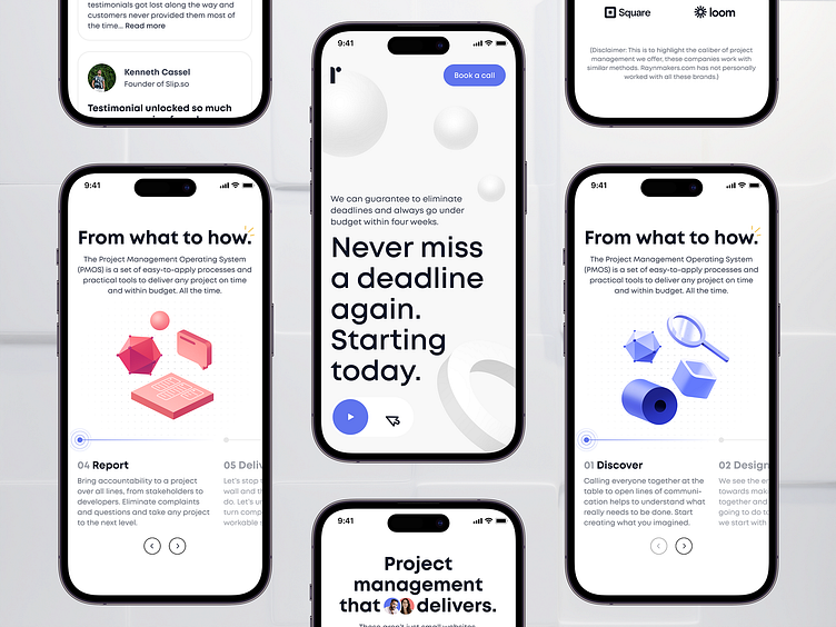
Clarity is tightly connected to how fast someone can learn something new. It’s painful to watch older users wrestle with yet another update. What designers see as an “improvement” can make users feel lost, old, or dumb. Was that really the goal?
Don’t let your users feel stupid.
This applies to everyone, not just seniors or people with special needs. Our team builds complex platforms that require onboarding. Most of our audience is young and quick to learn. Still, we map every step carefully to reduce cognitive load, make details easier to grasp, and speed up the learning curve.
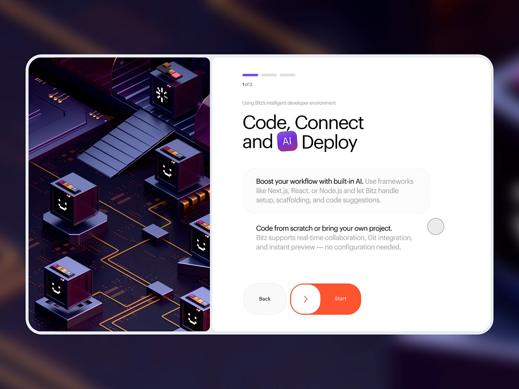
The longer it takes to understand, the dumber people feel. Patience runs out. And then they leave. Nobody wants to feel like an idiot.
That’s why we need to know as much as possible about a user’s prior experience. We need to speak their language. Only then can we help them feel confident and get things done.
For example, something new might scare an older person but spark curiosity in a younger one. Either way, the principle is the same:
Adapt the interface to the user, don’t force the user to adapt to it.
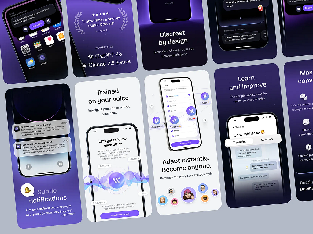
First encounters with an interface shouldn’t trigger negative emotions. What’s “negative” depends on the audience: their cognitive load, learning speed, motivation, and more.
And don’t think only seniors suffer from “improvements.” One designer on Reddit summed it up perfectly:
“It never ceases to amaze me how companies feel this constant urge to change things that already work. The new interface looks different, sure — but why? There’s no real improvement, just a new coat of paint. We’re here to work, not to constantly adapt to pointless updates.”
Even designers can get thrown off. Companies often want to emphasize their coolness, show off all the features of their product, and prove they’re always on the cutting edge. Their focus shifts from the client to themselves.
People don’t need change for the sake of change, or improvement for the sake of improvement.
Let’s focus on helping them get the job done.
5. User scenarios — the road to the goal
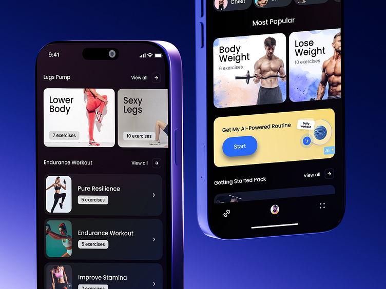
User scenarios are the backbone of an intuitive interface. They map out every step toward the goal and how the system responds along the way.
You can’t create predictability without knowing what users will do and what they expect. Do they prefer fewer choices? Do they want full control? Some want constant tips, others hate them. These “little things” aren’t little at all.
Each audience has its own patterns.
You need to know them before forcing people into cookie-cutter templates. Sometimes research shows that not “everyone is used to it” — or that there’s a better way.
And every change should be tested again and again, or “improvement” risks turning into its opposite.
6. The interface of the future — and why to think about it now
A good interface is invisible. Users should stay focused on their task, not on fighting through settings or decoding cryptic icons. That’s true today. But what about tomorrow?
The interface of the future isn’t buttons and screens. It’s natural interaction: voice, gestures, emotions, AR/VR, even neural control. It will be invisible and contextual — predicting actions and adapting to people.
Think of Minority Report, where the hero manipulates data with gestures. Or Iron Man, where Tony Stark talks to Jarvis while moving holograms around. Or Her, where the “interface” is just a voice. None of this is sci-fi anymore. It’s a preview of where UX is headed.
The principle stays the same: interfaces will keep adapting to people.
That requires deep knowledge of users and their reactions. It means dropping outdated templates and building tools that feel natural.
Even when the medium shifts to voice, gesture, or AR, people still expect clarity and beauty. Designers will spend less time “drawing buttons” and more time designing experiences: how a system reacts to a look, a tone, or a context. And we can start doing that now.
Instead of a conclusion
An intuitive interface isn’t about lucky templates or familiar button placement.
It’s about thoughtful design centered on real people and their tasks. It feels like an invisible guide, speaking your language, anticipating your steps. Like a smooth road without obstacles — where the destination fills you with anticipation, not frustration.
Intuitive design will always be about people. Tomorrow’s interfaces will be even more responsive, more empathetic, and engaging more of our senses.
Forms will change, but the human will always be at the core.

Intuitive Interfaces: What Actually Makes Them Clear was originally published in UX Planet on Medium, where people are continuing the conversation by highlighting and responding to this story.