Small details in product design can create big moments of friction. This is one of them.
TL;DR (In Short)
While commenting on a Substack post (not a note) via iPhone app, I accidentally kept hitting the Send button mid-thought because it’s placed on the left side with barely any padding for my big thumb.
It broke my writing/ commenting flow multiple times. I was actually trying to write a genuine long comment.
In this post, I break down why that’s a UX issue, how it could be fixed, and what it says about the importance of small interface decisions.
I’ve been started using Substack recently. Writing, reading, commenting. On the whole, it’s a joyful product with a joyful audience.
“Even Braindumps are safe”
But recently, while commenting on someone’s post from my phone, I hit an unexpected bump.
Not a bug, not a crash just a tiny UI decision that disrupted my flow in a way that tripped me up.
And it came down to… where the Send button lives when you start to comment.
The Issue: Send Button Placement on Mobile
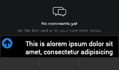
While typing a comment on mobile, I noticed that the Send button sits on the left side of the input field and worse, it’s very close to the typing area.
No margin. No buffer. Just… tap and it’s gone.
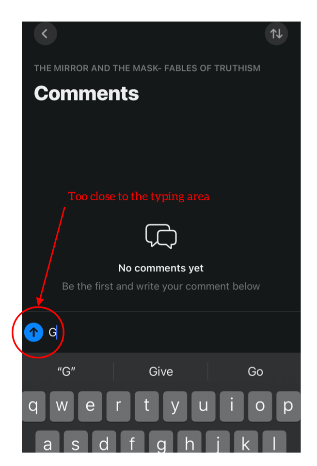
As someone with reasonably normal (but definitely not stylus-thin) thumbs, I accidentally hit Send multiple times in the middle of writing a comment.
How Did It Happen
This specially happens when, I have to edit the word which is near the send button.
I have to tap to the first letter of the word which is quite adjacent to send button and my fat thumb presses the send instead.
In the image below, the cursor is at the end, and if I have to change the first word i will have to move my thumb to the first word. Notice the arrow. High change of clicking the send button.
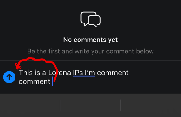
Each time, I had to go back, edit the comment, and re-send it. Not the end of the world, but definitely not the frictionless experience Substack usually offers.
“Imagine a word which you wrote but did not mean to send , got sent unknowingly”
Design Insight:
This issue may seem minor, but these are the friction points that erode trust and disrupt momentum in creative tools. Users won’t always report it, but they’ll feel it.
Why It’s a UX Problem (Not Just a Personal One)
This issue does not agree with a few fundamental interaction design principles:
- Predictable Patterns: Most messaging and writing interfaces (WhatsApp, iMessage, Instagram DMs, etc.) place Send on the right, aligning with common thumb movement patterns and muscle memory.
- Touch Target Separation: Placing action buttons (like Send) close to active input zones ,without padding or hierarchy creates accidental interactions.
- User Flow Disruption: Commenting is supposed to feel casual, not stressful. When I’m thinking and typing or editing mid-flow, any accidental send gives me a micro friction .
This is what we often call “invisible friction”. The kind that doesn’t scream, but still interrupts.
How could I Fix It
You could solve this in two ways:
Option 1: Follow convention.
Move the Send button to the right side of the input field. It’s where users intuitively expect it.(the image below is of telegram but , you got my point)
Option 2: Keep it left, but give it space.
If there’s a design reason to keep it left-aligned (perhaps for language direction or visual minimalism), then increase the spacing significantly enough to account for two fat thumbs rather than one.
The Bigger Lesson: Small Design Choices Matter
Substack is a tool used by writers. Although AI writing is on the rise but still there are people who are thoughtful while commenting.
When they’re mid-thought ,especially on mobile any unintended action breaks the rhythm.
In the grand scheme, this is a micro-interaction. But micro-interactions shape trust. They signal care. And when done right, they disappear.
And they say
“Good UX is something that goes unnoticed”
No tool is perfect. But as someone built with design and now observing, I believe we owe it to each other (and our users) to spot and share these details.
If you are on substack and expereinced this comment below , would love to year your misadventures while commenting.
![]()
Invisible UX Friction: A Substack Mobile Quirk That Tripped Me Up was originally published in UX Planet on Medium, where people are continuing the conversation by highlighting and responding to this story.