
Let’s start with a quick interactive question, shall we?
Below are 2 images, can you tell which image is harder to consume and is putting more stress on your eyes/brain?
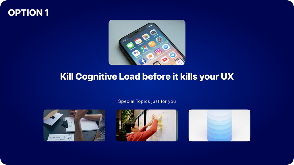
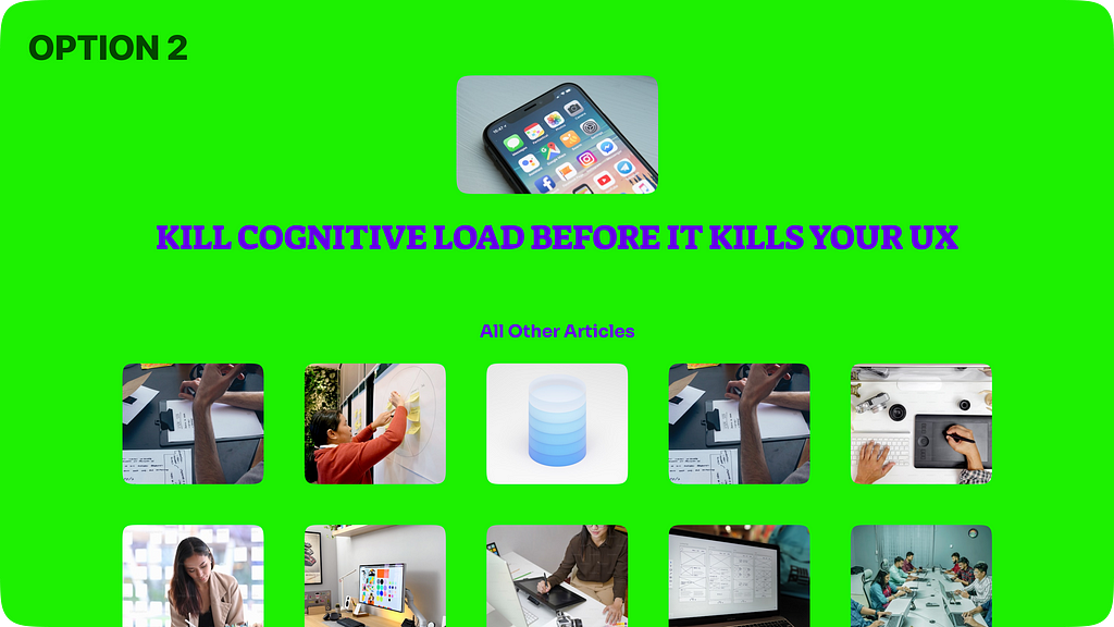
Obviously option 2 is killing the eyes and brain.
Interesting trend is, most of the companies are actually creeping towards becoming Option 2 because of business demands and no proper attention on how to design UX for presenting large number of options to their users.
Pushing everything on homepage leads to monstrous Cognitive Load which then churns the user base, reduces engagement & diminish conversions without leaving a trace (such a pun).
What exactly Cognitive is Load?

Cognitive load refers to the mental effort required to process information. In UX, it’s the amount of brainpower your users need to navigate your design, make decisions, or find what they’re looking for.
Higher the Cognitive Load, harder it is for users to interact with your product.
But, why Cognitive Load has such a big impact?
We are living in an era where users want everything, Right here, Right now! Which makes the behaviour of how fast they are able to make decisions at each point in the application very important.

Users overwhelmed by too many choices or complex interfaces often experience Analysis Paralysis, where they become so overwhelmed by the options that they can’t make a decision at all. This often leads them to drop off entirely, abandoning the process and leading to fewer conversions.
In short It’s a domino effect that starts with cognitive overload.
But then, how do we design UX without actually reducing what a product has to offer.
Now, I know just because of this you or your product team ain’t gonna cut down the offerings of your product, we all know that KAREN!
Hence..
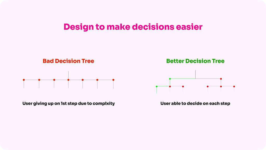
Design simpler decision tress for the users vs a big complex one to prioritise information.
For example :
Rather than saying here are 100 movies we offer on our platform, break the choices into smaller simpler decision trees like, We have 10 movies in 10 different genres, which genre would you like to watch today..
Top it up with custom decision trees like, Top 10 most watched movies or 10 movies you would like because you watched xyz.
This would save user a lot of brain power which would intrinsically make them more loyal to your platform/product because most of the times they would get what they want with lesser effort.
You would see most of the Top apps are already following such practices which are helping them immensely.
Then comes the Visual cognitive Load
Now that we’ve talked about the elephant in the room (Number of choices), Yes, UI elements also determine the overall Cognitive Load.
Nice, You’re getting smarter already!
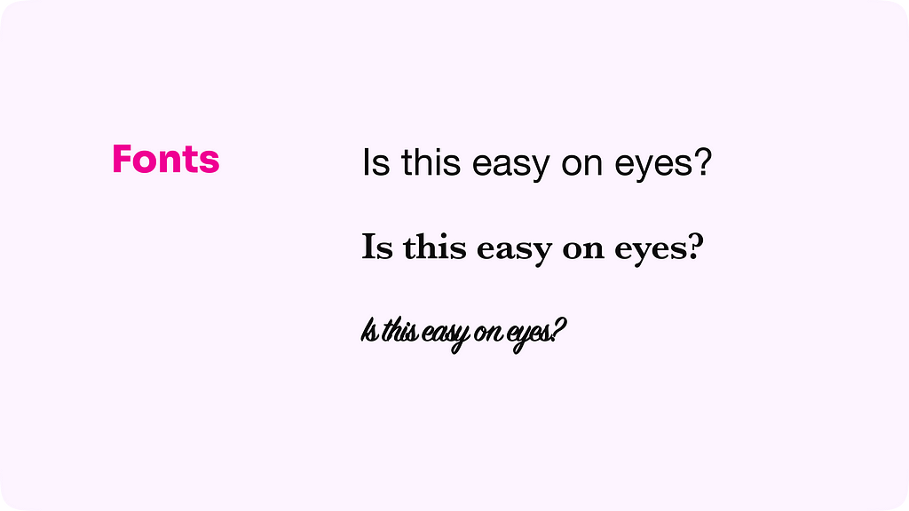
Most common factors that have direct impact on cognitive load are
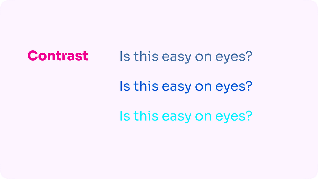
- Fonts
- Colors
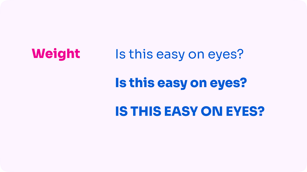
- Weights (text & images)
- Strokes
- Heavy Animations (if you overdo it)

Conclusion
Cognitive load is a powerful concept, when understood and utilized correctly, you create an experience that’s not only visually appealing but also functionally effective, leading to higher engagement, better retention, and increased conversions.
So, the next time you design, break choices into simpler decision trees, focus on visual hierarchy & remember : less is more
![]()
Kill Cognitive Overload before it kills your UX was originally published in UX Planet on Medium, where people are continuing the conversation by highlighting and responding to this story.