A tech+design fusion saga of building a product!
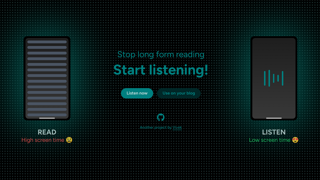
What’s Listen?
Best explained with a video! Listen is a web app that can help you listen to any written material (instead of reading on your screen), in a variety of languages.
Who are you?
Hey that’s rude! Just kidding, I am the designer and developer of Listen 🙂 And this is the story of building the 4th and 5th version of Listen.
Previous versions and epic failures
Let’s go over a little bit of history?
v1 named We Speak (2020)
Only basic functionality, too ugly to use, for anyone other than me.

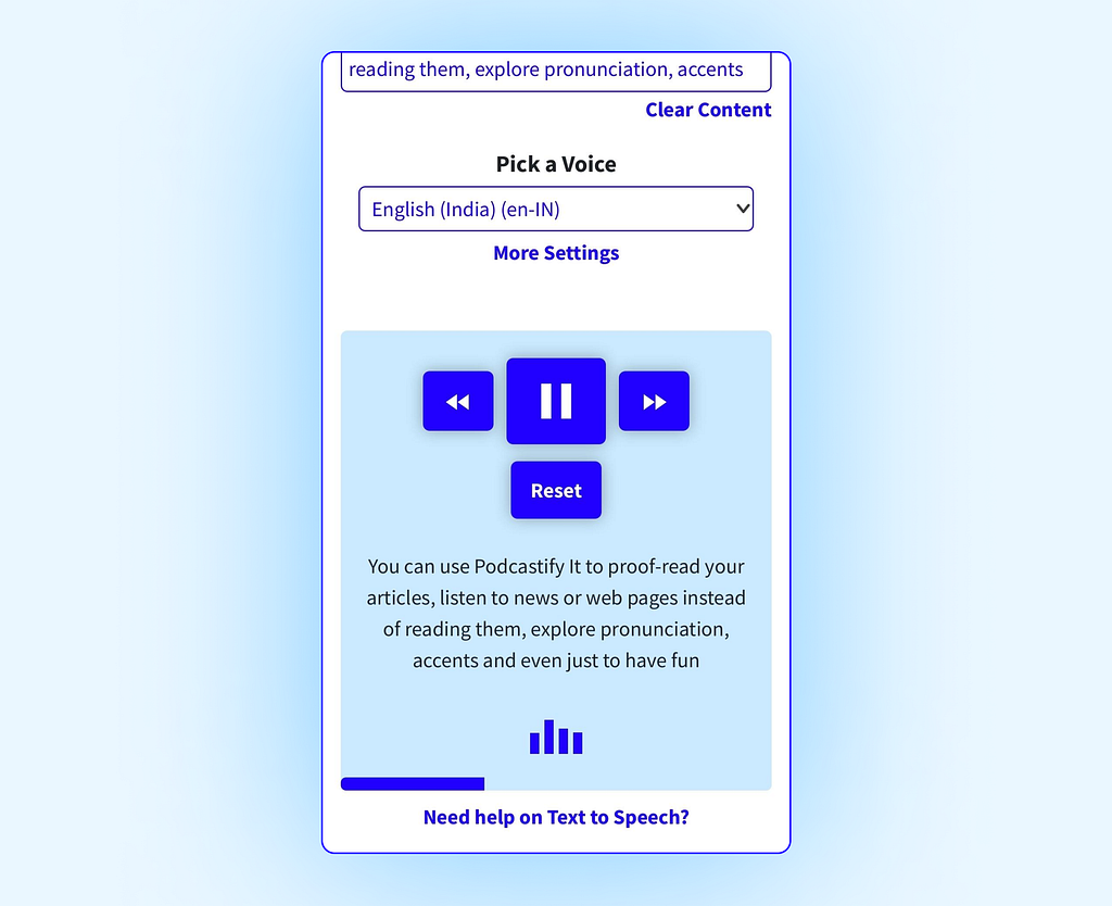
v2 named Podcastify (2020)
High effort required by the user to see value, buggy on Safari.
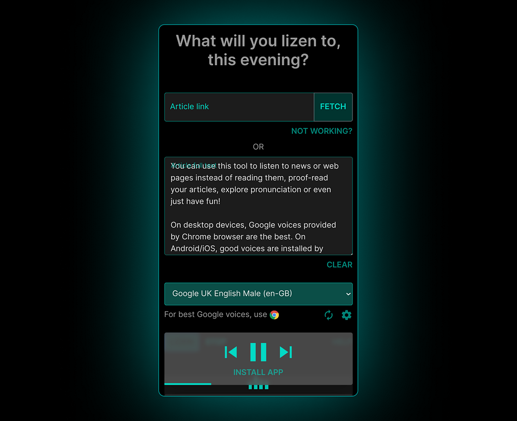
v3 named Lizen (2021)
Still clunky controls, weird name.
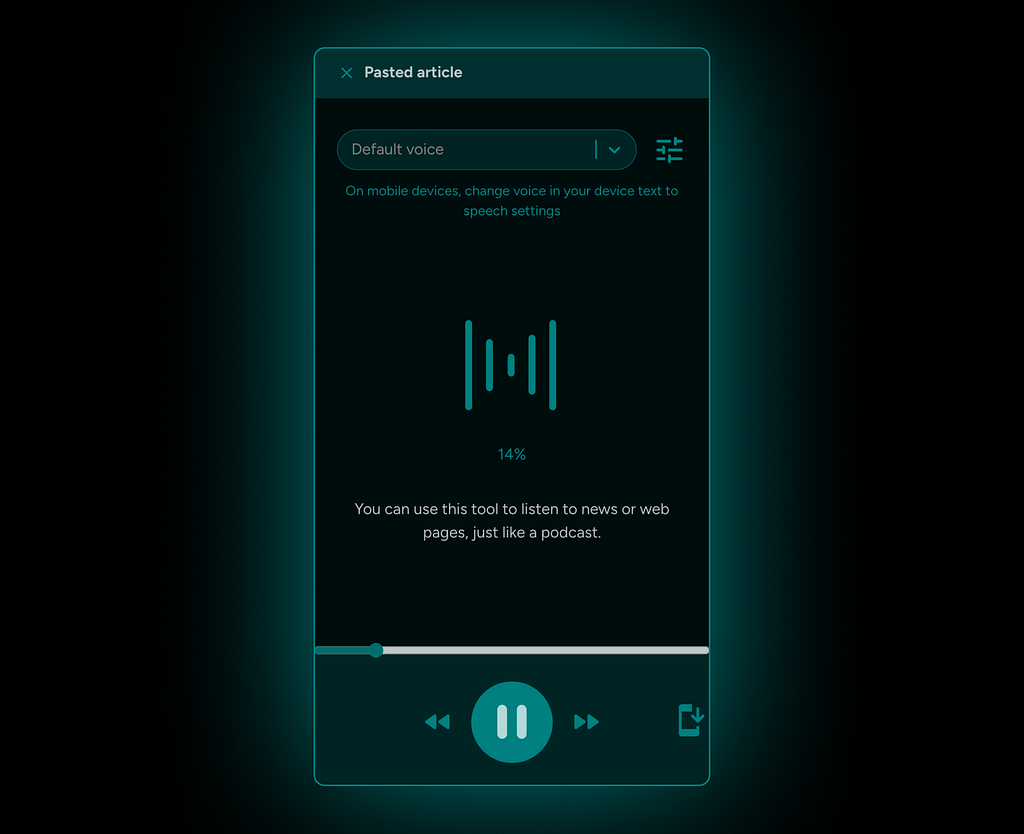
v4 named Listen (2023)
Largely good experience. However, some interaction design friction, minor bugs in player controls exist.
Tech research before building this version
In all the previous versions, I was flying blind, especially from a tech and compatibility point of view. At best, I would test on my own devices or get feedback from few people.
So this time, I gathered data from employing anonymous analytics over a brief period of time, in the previous versions of the app. The data helped me identify edge cases and guided my design decisions on error handling. Of course, I kept in mind that the data can be skewed and used it with a pinch of salt.
State of WebSpeech API across devices and browsers
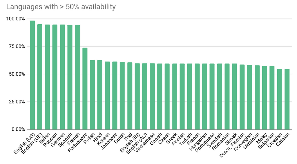
Voice availability for each language, across devices and browsers
This is the wide variety that the app should handle!
- Google Chrome browser provides additional 19 natural sounding voices.
- Microsoft Edge browser provides up to additional 423 natural sounding voices.
- Android has 79 voice families, provided by Google’s pre-installed Speech Synthesis app.
- iOS has 55 voices pre-installed.
Uncovering user expectations
- Ability to use on any device, easily.
- Ability to listen to articles of different languages.
- Ability to download the spoken audio.
- Fluidly pause/resume/forward/rewind speech when listening to the article.
- Get an estimate of how long it will take to listen.
Feedback from previous versions
- Unclear on what can I do with this app.
- Too many voices to choose from.
- Not sure how to choose the best voice, for the article’s language.
- Need proper guidance on how to make the text to speech engine work.
- Speech dies if screen turns off, on mobile.
Now let’s get to designing and building!
Progressive disclosure to help users ease-in to the app
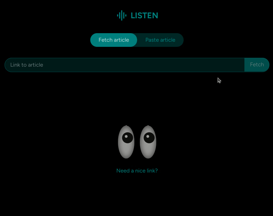
There are two main parts for the app:
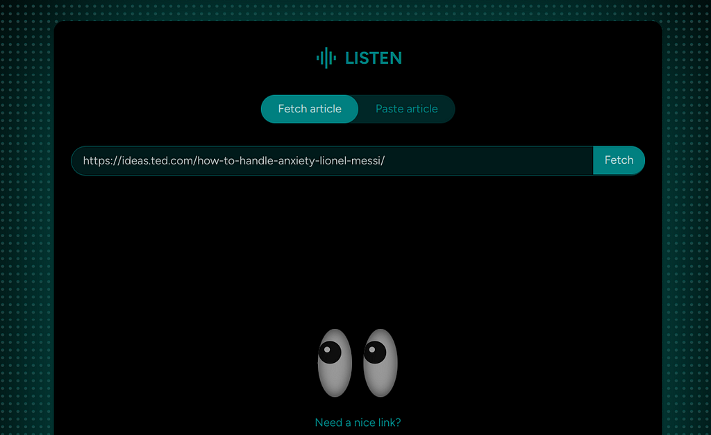
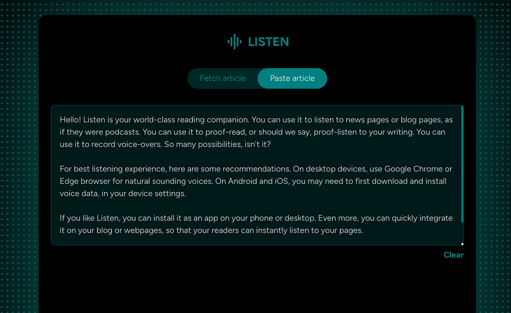
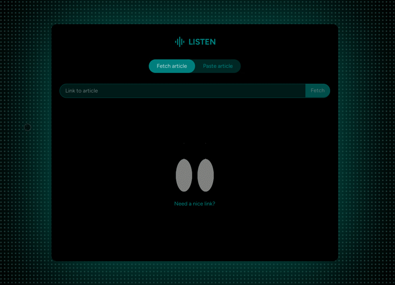
- Input stage: User provides the article they want to read, as a link or a pasted article.
- Output stage: The app reads out the article.
Versions up to v3 had both of these stages shown upfront together, which caused too much cognitive load.
In v4 and v5, these stages have been split up, which makes the app look very simple and easy to start using.
Reduce time to value
1. Provide pre-filled values
The app provides a link or a pasted article by default, so that users can immediately start listening.
The pre-filled text was also used to educate users on how to use the app.
2. Auto-detect language
Though a complex engineering problem, this was made possible by a project that provided JavaScript binding for Google Compact Language Detector 3 (CLD3) library.
CLD3 is a neural network model for language identification and detects more than 100 languages.
This becomes a crucial prerequisite to the next point.
3. Intelligent voice pre-selection
Based on the language detected, the app automatically selects a voice using this smart algorithm:
- If the user has chosen a specific voice for the article’s detected language when they used Listen previously, then honour that and use it.
- If not 1, then check if there are any remote voices are available for the auto-detected language and use it. Remote voices are more natural sounding and provide a great listening experience.
- If neither 1 nor 2, then use the first available local voice for the auto-detected language.
- If there are 0 voices available for the auto-detected language, promptly let the user know before using the default voice.
Auto detected language voices were also grouped in the drop down to reduce choice overload.
Automatic language detection and intelligent voice pre-selection, together, address one of the weakest link of the app’s user experience — choice overload.
UI design
For UI patterns, I drew a lot of inspiration from podcast apps and music player apps.
Dark theme
I intentionally picked dark theme to give the feeling of a calm listening experience. Opacity of the primary colour(and not solid colours) is used to convey elevation.

Responsive design
Even though desktop screens have a lot of space horizontally, it usually clutters the interface, if used to the last pixel. Hence, the trick is to think of the desktop interface as small mobile sized UI blocks, intelligently arranged. A central UI block where the action happens, supported by helper UI blocks.
With this principle, the UI essentially boiled down to:
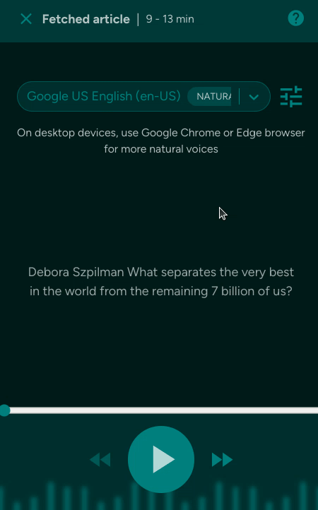
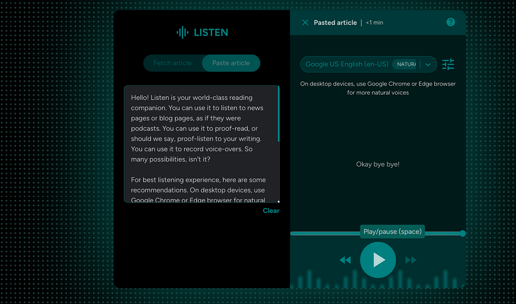
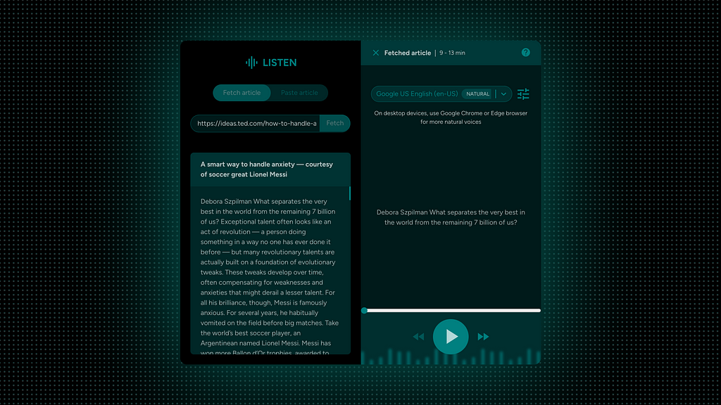
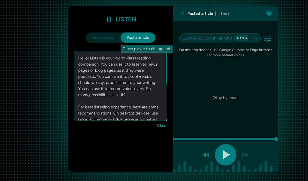
- Article UI block: This block has tabs to either fetch the article from a link or paste the article directly.
- Player UI block: This block has speech settings, player controls and other supporting UI elements.
Motion design as a core element, beyond just aesthetics
- Convey layout transitions (desktop) and elevation of surfaces (mobile).
- Communicate system state (animated sound bars when listening) and system readiness (when ready to listen, play button slides into view).
- Draw attention to system events (input field auto-fill animation, toast appearance animation).
- Convey app’s value on home page with strong, minimal and visually appealing metaphors.
- Reinforce calm listening experience with a fade sentence change animation.
Little big things
1. Blinking and stalking eyes, for a lively empty state
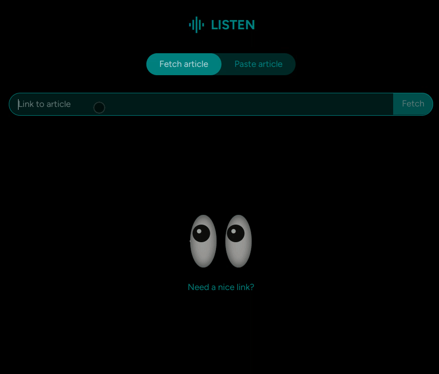
2. Eyes doubling up as a refreshing loader
3. Background music — Bug that became a feature
Mobile browsers prevent web pages from functioning in the background when screen goes off. Playing an audio file was the workaround to overcome this tech limitation.
Instead of thinking of this as a workaround, I repurposed it as soothing background music that adds to the listening experience.
4. Sticky group header in voice drop-down
5. Keyboard shortcuts
- Escape to close player.
- Space bar for play/pause.
- Arrow keys for forward/rewind.
6. Music studio vibe with background graphics and glow, on desktop
7. Better communication with tool-tips across the app
8. Suppress repetitive informational toasts, for frequent users
Repetitive toasts can be irritating and cause toast blindness, when shown every time for frequent users, because they already know it from their frequent usage of the app. So, the app intelligently suppresses these for frequent users:
- Changes will be applied for the next sentence
- Ensure that the selected voice is downloaded and installed on your device. Click help icon for instructions.
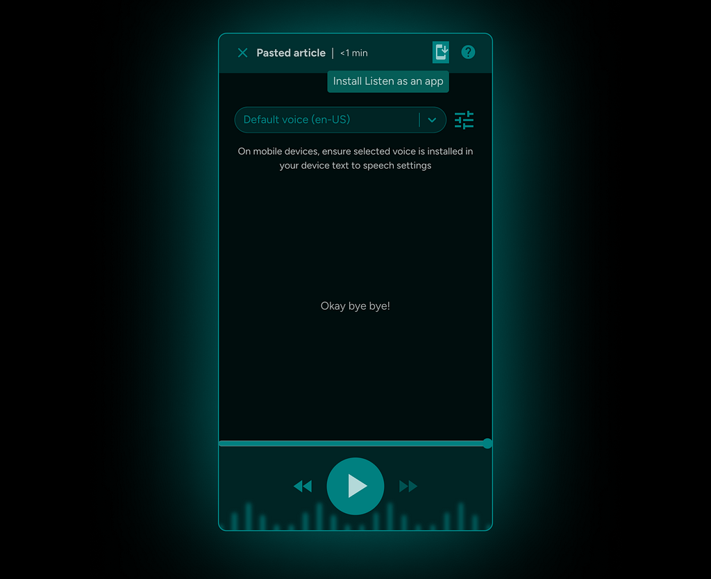
9. Install Listen as an app
For super fast access, Listen can be installed as a Progressive Web App (PWA) on mobile and desktop devices.
Closing thoughts
I hope you found something useful in reading this tech+design fusion story!
If you have made this far, please do try Listen nd share feedback!
If you have a blog or website of your own, you can also explore integrating Listen on your pages. Plug and play integration instructions available here: https://github.com/vivek-nexus/listen.
May be also checkout my website? 😛
![]()
Listen, a world-class reading companion was originally published in UX Planet on Medium, where people are continuing the conversation by highlighting and responding to this story.