
Mobile-first is a design approach in which we start the product design process from the mobile end. The mobile version of the website or app is designed first. The tablet or desktop versions are then adapted from the mobile version. In other words, we start designing for smartphone screen sizes (4.7 to 6.5 inches) before moving on to larger monitors and screens.
“Mobile-first” is not one of the countless mobile app design trends that pop up and fade away every year. For professional web and app designers, it is a fundamental design practice similar to mobile app design best practices like using clear and concise navigation. Why? Because this approach prioritizes the needs of mobile users.
In 2012, 10.88% of all global web traffic came through mobile phones. In 2023, that figure was a whopping 56.86%! Mobile searches have accounted for over 50% of all searches on Google for the past four years as well. Simply put, Internet users have indisputably adopted the mobile-first approach.
To keep up with them, web designers and UI UX design consulting experts must do the same: go mobile-first themselves. In this article, we will share our in-depth understanding of mobile-first design. We will review the fundamentals of this design approach and analyze their importance in today’s context.
Mobile-First Design Concepts
Here we will guide you on how to apply the best practices of the mobile-first design approach to your company’s website or app. But, before that, we need to clarify a few design concepts which aid in creating “mobile-first” digital platforms.
Responsive Web Design
Responsive web design (RWD) is a web design technique used to create flexible websites that can automatically adapt to different screen sizes across all devices.
A responsive web design will feature flexible layouts and fluid grids. It will also feature design elements that can automatically resize and rearrange proportionally to the device they are being viewed on.
No matter what device you use to access a responsive website or web app, it will always look good and feel easy to use on all devices.
Adaptive Web Design
RWD is a modern version of adaptive web design (AWD). AWD is an older design approach that uses separate, non-flexible layouts for different devices. By “non-flexible” we mean that the design layouts, grids, and elements do not automatically adjust to different devices.
In this approach, designers have to manually create different design layouts for the desktop, tablet, and smartphone versions of the website. This extra work makes adaptive websites difficult to maintain. Hence, this approach to web design has been usurped by RWD.
Progressive Advancement
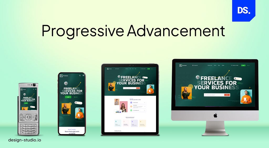
A progressive advancement is a design approach where the most basic version of a product is designed first. Progressively, new layers of complexity may be added to the design. Over time the app/web design becomes sophisticated and multi-layered. But, things always start simple.
Progressive enhancement is widely considered to be one of the mobile app design best practices. App designers create simple, yet viable product designs with basic features. These simple designs are usable on multiple platforms. The designers then perform usability testing and collect feedback to enhance the design.
The progressive enhancement design approach is also taking over the world of web design. That is because brands prefer creating simple, yet usable web designs that work on all browsers and screen sizes at the start. Their designers future-proof the websites by strategically adding layers of design complexity in accordance with evolving user needs.
Graceful Degradation
Graceful degradation is the opposite of progressive enhancement. In this design approach, web or app designs with complicated and well-rounded features are stripped of their functions or content. Instead of building a design from the ground up, you are taking apart a fully-functional design and stripping it of its feature to make it compatible with other devices or platforms.

Let us say you are designing a web app that works great with the latest Chrome browser. But, you need it to work well on an old-school Opera browser. So, you will gracefully degrade and de-sophisticate the existing design.
But, why do these four design concepts matter in the world of mobile-first design? Because the mobile-first design approach is built upon the shoulders of progressive enhancement and responsive web design.
In “mobile-first design,” we always start designing the product from the mobile end. Progressively, new features may be added to the design. Plus, most mobile-first designs are created with HTML. HTML websites and apps work on all browsers.
Brands can easily launch simple HTML-based apps or web designs and then make them more complex over time. Hence, designing a mobile-first web or app design from scratch, designers always think in terms of progressive enhancement.
But, mobile-first designers don’t always think in terms of responsive web design (RWD). In RWD, designers use flexible grids, layouts, and media queries. These flexible elements detect the user’s screen size and automatically modify the website’s layout accordingly.
In mobile-first design, the focus is solely on designing the website or app for mobile devices. At the start of the design process, the design will solely be optimized for small screens. Yes, the design may feature some RWD elements. And yes, it may get adapted for larger screens later.
But, the primary focus is to create a user-friendly design for mobile users. Here is why this design approach is extremely important in modern-day product design.
Why “Mobile-First” Is Essential in Modern Product Design
The increasing use of mobile devices for Internet access is the main driver of the “mobile-first” design approach. Mobile internet usage topped desktop usage in 2016. Since then, there has been no looking back for mobile. According to some estimates, by 2025, 73% of all web traffic will come exclusively from mobile devices.
Website and app designs that are not “mobile-first” by then will either need to be updated or scrapped. On the other hand, a mobile-first design approach can help your website or app reach significantly more users right from its launch. In addition to the potential of added exposure, the mobile-first approach has its own inherent merits.
For designers, starting really little and then gradually scaling upwards is so much less complicated than starting on a huge canvas and then shrinking things down. Here are some other inherent merits of adopting the mobile-first approach:
Giving Users Access to Key Information
When designing for small screens, designers do not have the luxury to include as much information as they can. They have to create a hierarchy of information and showcase only the most important content to users.
In other words, designing mobile-first helps business leaders highlight what information is most important to their business. More critically, it helps businesses launch simple yet informative digital products that give people the information they need to become potential customers.
Fewer Bugs
Less code means fewer complications and fewer bugs. As mentioned before, progressive enhancement is a central aspect of mobile-first design and when you start things small and simple, detecting and preventing bugs becomes very easy.
Deliver Simple Yet Effective UX
Mobile-first design is all about making websites and apps as easy to use as possible. Seamless, friction-free interactions are key aspects of this design approach.
Google Ranking
Google uses special mobile bots to crawl for search results. These bots give higher rankings to mobile-friendly websites. A 2021 page experience update made the mobile-friendly design even more critical for ranking higher in search results. By adopting the mobile-first approach, designers and brands can make their apps and websites Google-friendly.
Cost Efficiency
Brands love the mobile-first design approach because of its cost-effectiveness. Designing complex desktop websites requires a lot of resources. Every mistake is costly and there is always the risk of clients not liking the final designs. In mobile-first design, everything starts off small so there are no major risks or downsides.
Designers do not need a ton of money or time to create design prototypes for mobile websites and apps. If their creations fail, they can easily re-create new designs. If they succeed, they can progressively add more layers of complexity to their designs.
Are There Any Cons of Mobile-First?
Mobile-first design is not a flawless concept. Old-school designers who are experienced in creating desktop-sized designs often claim that designing for mobile is a restrictive practice with little to no room for creativity. Plus, many brands do not like the idea of hiring more resources to undertake the challenge of going mobile-first.
However, the pros of mobile-first design far outweigh the cons, especially when you are designing a product that you know will be used primarily by mobile users. If you are designing such a product, here is how you can implement the mobile-first approach in your design process.
How to Implement Mobile-First Approach in Product Design?

Now that we know the fundamentals of mobile-first design, let us understand how designers put this approach into practice.
- Let us assume a team of web and UI designers is asked to design a website (or a web app) for a restaurant. The team adopts a mobile-first approach.
- The first thing they do is review what their target audience (mobile users) may expect from a restaurant-based website.
- Given that we are designing for mobile users, there is little room for content. So, they only include key restaurant-related details in their original design.
- Operating hours, location, contact details, and menu: these are the main details that target users need to get in touch with the restaurant.
Based on these assumptions, the basic design for the mobile website may look something like this:

Notice how simple this mobile web design draft is? In this spirit of simplicity, let’s break down the simple steps that designers must take to implement the mobile-first approach into their designs.
Content Prioritization
In the world of web and app design, the term “mobile-first” loosely translates to “content-first.” As you saw in the restaurant example above, identifying which content is most important for the website/app is the first step mobile-first designers need to take.
This is the primary content that will be placed on the chief pages of the mobile website or app and it needs to be identified right away. The best way to do this is to rank, sort, and list all of your available app or website content on a spreadsheet. Here is an example:
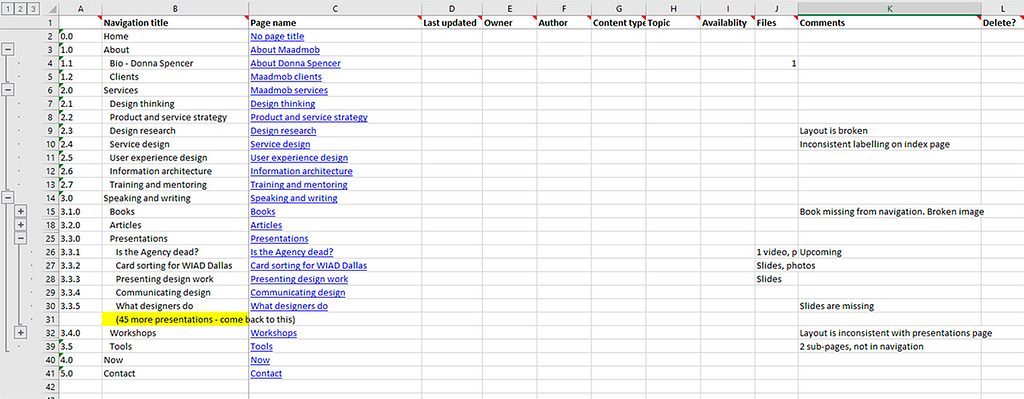
Professional mobile-first designers use spreadsheets like this to assign value to different types of content (headings, calls to action, imagery, etc.). Then, they determine which content should take precedence and be placed at the top of the main app or website pages.
Why the top? Well, according to a study by the Nielson Norman Group showing mobile users spend 74% of their viewing time on mobile apps/websites staring at the top sections of the primary pages.
If you want your mobile-first design to make a strong first impression, placing relevant and eye-catching content at the top of the primary pages is crucial.
Identifying A Visual Hierarchy
Once you have sorted and ranked your content in terms of the user value they offer, create a visual hierarchy. What is that? A pecking order of visual design elements based on how relevant, eye-catching, and attention-grabbing they are.
For example, let us say you are designing a mobile website for a college. The most important objectives for such a product design are:
- Informing users about the college and its brand
- Asking students to sign-up for the college mailing list
- Giving users easy access to important links and pages
Based on this information, we can create the following visual hierarchy:

Here are the key characteristics of this mobile-first website’s visual hierarchy:
- The logo of the college is at the top.
- The main brand message is placed in the center of the screen.
- A simple sign-up process is on the home page.
- Content information is available at the bottom of the screen.
- One simple widget gives users instant access to all relevant links.
Of course, there is no one specific way to create a visual hierarchy. But, this example shows how most competitive designers map out their designs by arranging the elements they feel are most relevant for their target users.
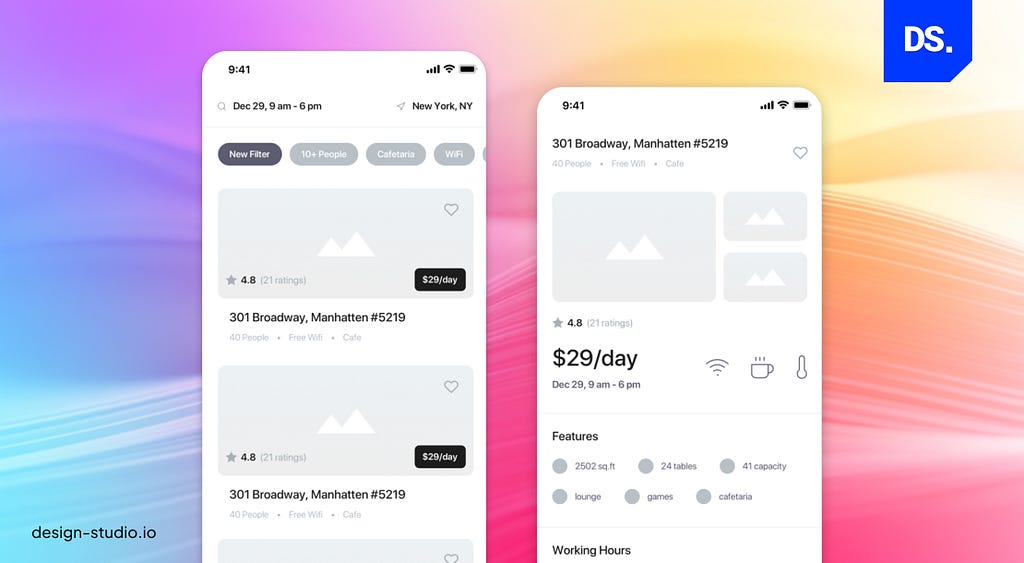
Build the Wireframe, Then Scale Up
Build the mobile wireframe and structure your mobile app or website layout. Then, use that as the model for expansion. The initial wireframe should represent the initial product concept and:
- Provide a concise overview of how the main pages of the app or website will be structured
- Provide a concise overview of the information architecture on the main pages
- Define user flow
- No need to focus on styling, color, graphics, and other non-functional features
Here is an example of a wireframe for an educational mobile website and web app:
Design for Touch
Human fingers are not as “pixel precise” as mouse cursors. Mobile-first designers must keep this in mind and use larger buttons, give hyperlinks enough space, and ensure that there is sufficient whitespace around all the interactive design elements. Each “touch target” in the screen should be at least 45–57 pixels wide so that the users’ fingers can fit snugly inside them.
Design for Mobile Intuition
Mobile users are accustomed to certain behaviors and practices. For example, when they use apps or websites, they expect to see compact hamburger menus (three-line menu icon) on the top-right or left section of the screen. This is their “mobile intuition”.
Mobile-first designers must leverage this innate user intuition by giving them what they want. Use tried-and-tested design elements, tab bars, navigation features, and content layouts.
Avoid Large Media Files
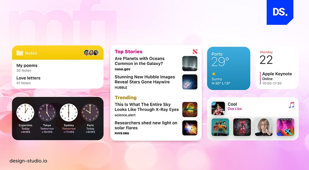
All content in a mobile-first web or app design should be optimized for small, handheld screens. High-definition photos, complex graphics, and HD videos do not display well on such screens. Plus, they can make websites and apps slow-loading. So, stick to simpler images and logos instead.
Test the Prototype on Real Devices
It does not take much time for designers to progress from the wireframing stage to the prototype creation stage. Once a prototype has been designed, it must be tested on mobile phones. Tap through the app/web pages and ensure that they load fast and are easy to navigate.
Test other functionalities of the design and create a list of corrections. Members of the target audience must be involved in the testing process. Their feedback should be used to make necessary refinements to the app/website design.
Mobile First Design Best Practices
Mobile-first design teams have identified many practices that help them streamline their work. We have already discussed a few of these practices above. Let us go through these mobile-first best practices once again:
- Prioritize content over other design elements
- Make all the page elements consistent
- Use intuitive navigation to ensure users get what they want
- Use clean code and light media files to ensure the app/website loads fast
- Use bold and eye-catching Calls-to-Action (CTAs) all across the website
- Test the prototypes on real devices and involve end-users in the tests
If you need more instructive blueprints, check out Google’s mobile-first design guidelines and Apple’s human interface design guidelines. Here are some other helpful resources on mobile-first design guidelines:
- Microsoft Fluent Design System
- Atlassian Design System
- Uber Design System
- Shopify Design System
- IBM Carbon Design System
- Salesforce Lightning Design System
Use these tools to learn more about the art of designing mobile-friendly digital products.
Final Thoughts
Mobile devices have taken over the internet. If your app or website is not designed for the mobile future, it will not fare well against competing products that are optimized for smartphones. Hopefully, this guide has served as a solid introduction to the budding world of mobile-first design. Use this guide to create mobile-friendly digital products that can drastically expand your brand’s reach!
Originally posted on design-studio.io.
Mobile-First Design Guide 2023 was originally published in UX Planet on Medium, where people are continuing the conversation by highlighting and responding to this story.