In today’s fast-paced digital world of instant gratification, users expect to find what they need quickly and efficiently. Poor navigation can cripple your website or app, driving users away and costing you valuable conversions. This is where navigation UX comes in, serving as a silent guide, enabling users to achieve their objectives quickly and intuitively.
It is a branch of user experience (UX) design that focuses on guiding users through an interface. It is the art and science of guiding users through your interface, creating a seamless path to their goals. This includes:
- Design Layouts: The arrangement of navigation elements like menus, search bars, tabs, etc.
- Interactions: How users interact with these elements (clicks, swipes, etc.)
- User Flows and Journeys: The overall user journey that ensures smooth transitions between all sections and interactions
Users have goals and expectations when they interact with your website or app. Navigation-focused user experience design helps designers create the clearest path to achieving those goals. That is why it is crucial to make positive user experiences.
The best navigation feels natural and intuitive, and does not distract from the content. Users do not even notice that specific design decisions are influencing their actions and guiding them toward specific goals. How do user experience designers achieve this? In this article, we’ll see how to master navigation UX. Let us dive into the specifics, including:
- What Is Navigation UX?
- The Relationships Between Navigation Design and UX
- Different Types of Navigation UX
- Common Patterns of Navigation UX
- Navigation UX Best Practices
Let us ensure that our users find what they need, when they need it, with navigation systems that empower, not hinder, their experiences!
What Is Navigation UX?
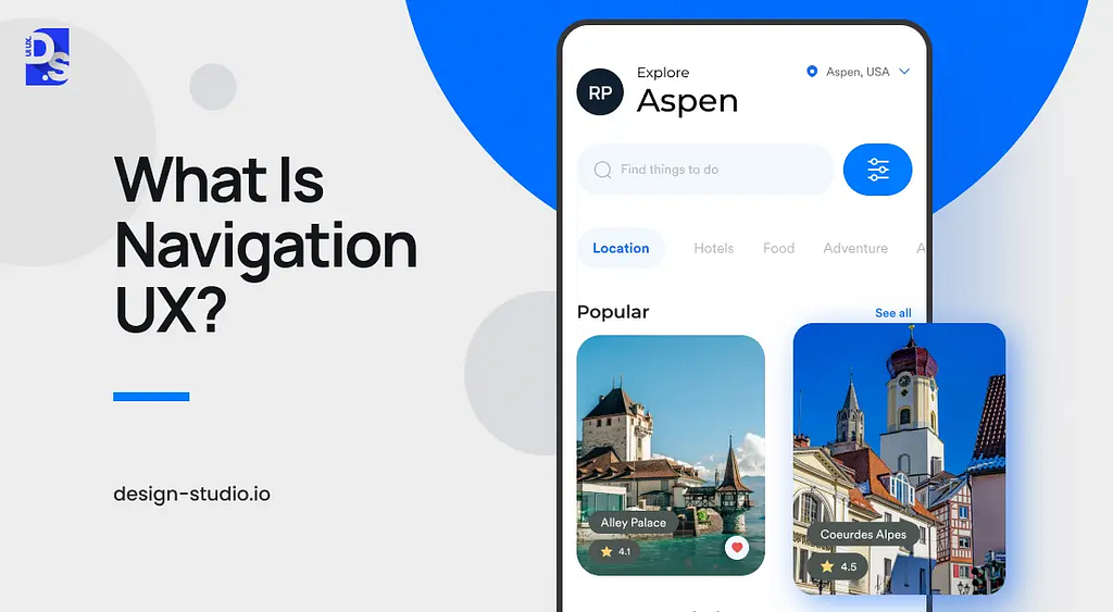
Navigation UX dictates how users interact and move within your interface, impacting everything from task completion to overall satisfaction. It goes beyond menus and buttons. It’s the art of strategically arranging all navigational user experience elements — menus, links, buttons, etc. — in a way that guides users seamlessly through your app or website.
With good navigation design, users can move through an app/website intuitively and time-effectively. It keeps users aware of where they are and exactly how they can achieve their goals within the digital interface. That is why without “good UX navigation,” there is no “good UX.”
The Relationship Between UX and Navigation
The connection between UX and navigation is direct and inter-reliant. Effective navigation empowers users to find what they need quickly and efficiently. This translates directly to the usability of your product:
- Effortless Exploration: Optimized navigation lets users find features and complete tasks quickly. This boosts productivity and satisfaction as seen in platforms like Google Maps, where users can easily navigate through the app and access all of their desired destinations with intuitive gestures and clear visual cues.
- Faster Onboarding: Intuitive interfaces reduce the learning curve for new users. This leads to quicker adoption and reduced training costs, as demonstrated by the user-friendly onboarding process of popular apps like Canva.
- Fewer Errors: Clear navigation minimizes user mistakes, leading to more accurate interaction with your platform, as found in the seamless navigation of online banking platforms like Chase.
- Reduced Customer Support: Users can solve problems independently, lightening the load on customer support and improving overall efficiency. For example, Amazon’s self-service features are so easy to navigate that most customers can resolve issues quickly and easily on the app or website, without needing phone or chat support. This is despite the vast number of products and services offered by Amazon.
- Reduced Abandonment Risk: Smooth navigation keeps users engaged and satisfied, reducing frustration and the risk of them abandoning your platform. This is the reason why apps and websites with well-designed navigation like Netflix and Spotify have extremely low abandonment rates, as users can always find the content they need.
Frictionless navigation directly translates to lower frustration and higher user retention. But, what type of design will achieve these results for your app or website? Let’s find out.
The Main Types of Navigation UX Design
Navigation types define the overall approach to organizing content. Think of it as the blueprint for your website or app. The ‘right’ type of navigation UX design for your website or app will depend on its nature and user goals. Here’s a breakdown of the most common types to help you decide:
Hierarchical Navigation UX
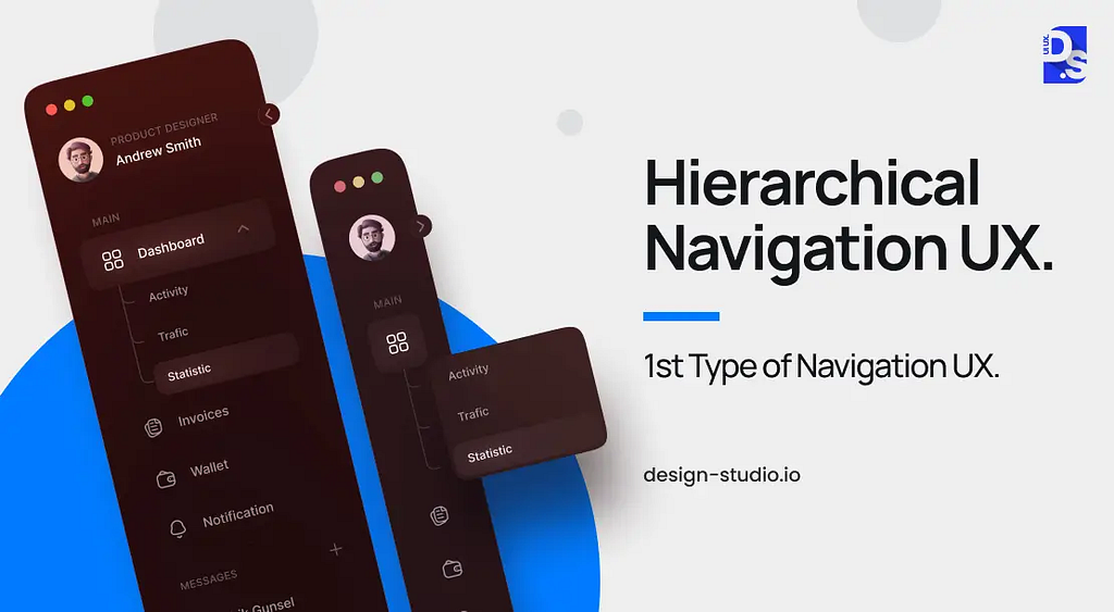
This tried-and-true method has been around since the early days of the Internet, and it continues to be a go-to solution for websites and apps that need to present a vast amount of information in a structured and user-friendly manner. Think of hierarchical navigation as a filing system for your digital content. It organizes information into a clear, tree-like hierarchy of categories and subcategories, much like the way a library organizes its books.
This logical structure empowers users to efficiently locate specific information or features by drilling down through relevant categories, making it an ideal choice for websites and apps that need to present a large amount of content in a digestible way.
Key Considerations for Implementation
The key to successful implementation lies in crafting a clear and logical information architecture. Labels for categories/subcategories should be concise and self-explanatory. Visual indicators can further enhance usability — arrows can subtly guide users through the hierarchy, while breadcrumbs can show their current location within the structure. This type of clarity ensures users never get lost in the maze of information.
Object-Oriented Navigation UX
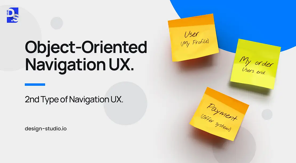
Object-oriented navigation breaks away from traditional website and app navigation structures. Here, each feature of your app or platform functions as a distinct unit. Imagine it like navigating between apps on your smartphone: users get to explore and interact with different features, design elements, and functionalities freely, unrestricted by a rigid hierarchy.
This approach is ideal for apps that thrive on user exploration and creativity. An example can be whiteboarding tools, where users can easily jump between features (like adding sticky notes, drawing shapes, or inserting images) within a single, free-flowing environment.
Key Considerations for Implementation
Self-Contained Features:
Each design feature inside the navigational structure should be complete in itself, allowing users to engage with it independently. For example, a feature for adding sticky notes should be fully functional and accessible without requiring users to navigate through other features.
Visual Differentiation:
Using distinct shapes, colors, or animations to set features apart and make the navigation intuitive is also important. This visual clarity is key to a smooth user experience. For example, a feature for adding notes within an onboarding app should be represented by a distinct color or animation, making it easily distinguishable from other features like adding a user profile or uploading files.
Task-Oriented Navigation UX
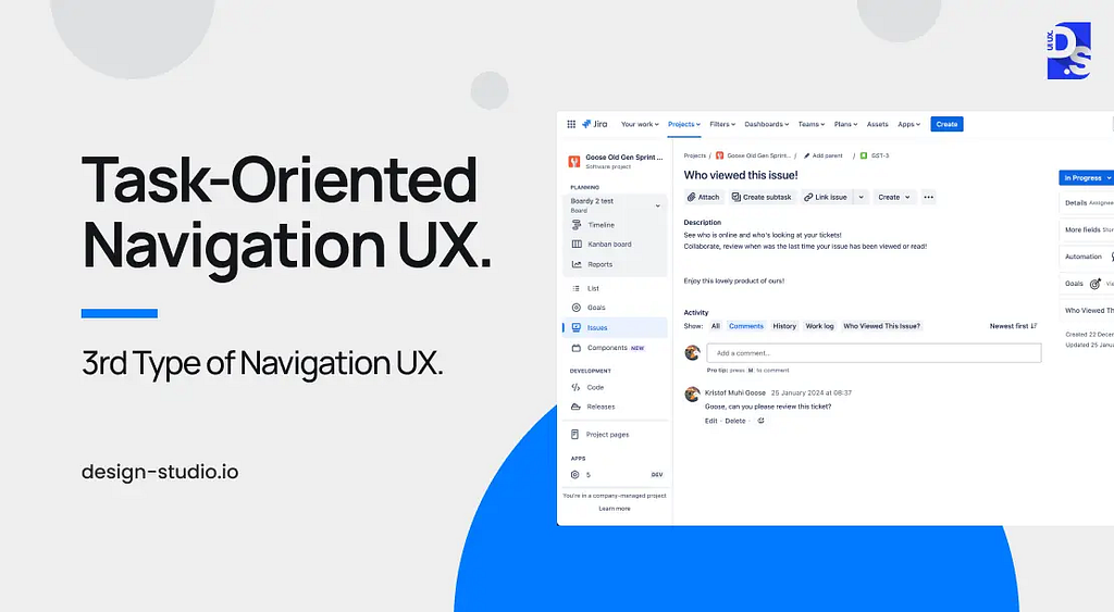
Task-oriented navigation takes the opposite approach to object-oriented. Here, the UX revolves around the specific tasks users need to accomplish, not individual features. This approach to navigation design shines in apps designed for helping users accomplish well-defined goals, like booking systems, payroll platforms, or project management tools.
For example, in a company-specific project management tool, presenting a laundry list of features to users is pointless. Instead, app designers should opt for task-oriented navigation and group functionalities based on common tasks. Key features for assigning tasks or tracking task progress should be gathered under one clear navigation label like “Project Coordination.”
By mapping out the most common tasks and grouping related features, the navigation can be optimized to be friction-free. With features logically grouped by task, users can quickly access the tools they need to get the work done. They won’t have to hunt through long feature lists. The navigation will only present the most relevant options for their current task.
Key Considerations for Implementation
To implement task-oriented navigation effectively, you need to understand how users approach their goals within your app. This includes in-depth user research, user testing, and observing users as they complete tasks. You need to group features logically by task and give these groups clear and concise navigation labels. Gather feedback and make adjustments accordingly.
Workflow-Based Navigation UX
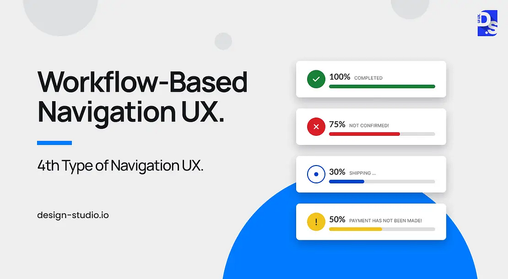
Workflow-based navigation steers users along a predetermined path, ideal for apps with standardized processes or where guiding users through specific steps is beneficial. Think of set-up wizards, form submissions, or even learning modules.
Key Considerations for Implementation
The key to successful implementation lies in meticulous planning. Map out the user journey from start to finish, then design the interface to usher users from one step to the next. This can involve:
Prioritizing Features:
De-emphasize or hide functionalities that are not crucial to the immediate workflow, minimizing distractions.
Visual Progress Indicators:
Incorporate clear visual cues like progress bars or numbered steps to keep users informed of their position within the process. This transparency fosters trust and a sense of accomplishment as they move forward.
Other Types of Navigation UX
While object-oriented, task-oriented, and hierarchical navigation form the core navigation UX toolbox, there are other valuable strategies to consider:
Faceted Navigation:
Ever browsed an e-commerce platform with endless filters? Faceted navigation empowers users with that level of control. Imagine sifting through shoes; faceted navigation allows users to filter by price, brand, color, and more, streamlining their search for the perfect pair. This approach is ideal for large datasets or complex search queries.
Contextual Navigation:
Imagine a mobile app that recommends restaurants based on your location or weather. Contextual navigation leverages user context (location, device, previous actions) to provide relevant and personalized navigation options. This enhances the user experience by anticipating their needs.
Regardless of what navigation approach you take, in today’s multi-device world, your digital product needs to be easy to explore across all devices.
Common Patterns of Navigation UX
As discussed above, navigation types define the overall approach to organizing content. They are the blueprint for your website or app. Navigation patterns are the specific design elements that translate that blueprint into reality. A well-chosen navigation type lays the foundation, while effective navigation patterns bring it to life. Here are the main patterns of navigation UX you need to know:
Vertical Navigation Menus
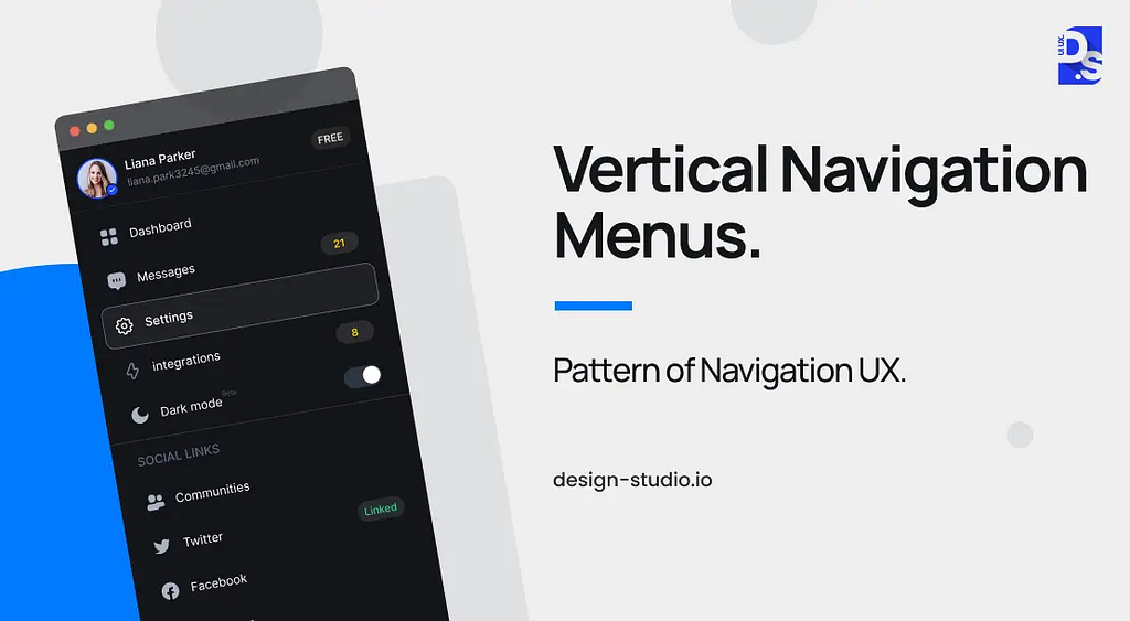
Picture a long list that expands and contracts. Vertical navigation menus are ideal for accommodating a large number of options, particularly on desktop screens where they can utilize the full-screen height. Ensure they remain accessible without obstructing the main content area, and design them to adapt to smaller screens with hamburger menus or similar patterns. Clarity is key — use typography and color cues to establish a clear visual hierarchy within the menu, making it easy for users to find what they need.
Breadcrumbs
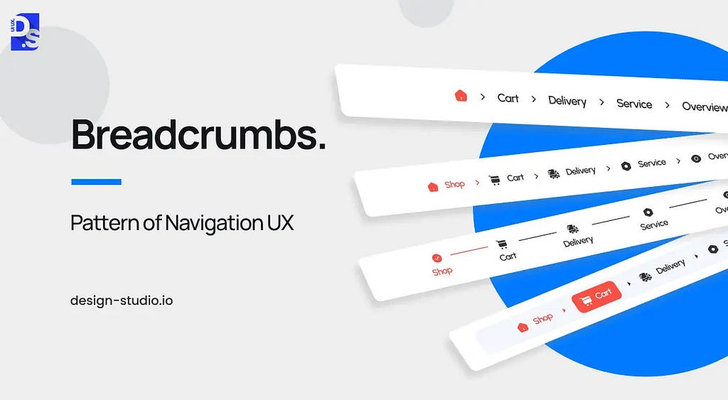
Imagine a digital breadcrumb trail. This navigation pattern displays the user’s current location within your application, similar to breadcrumbs leading back to Hansel and Gretel’s cottage. This not only provides clear orientation but also allows users to navigate back through the hierarchy without needing the browser’s back button.
Tabs
Think of tabs like folders in a filing cabinet. Tab navigation groups related features into distinct sections, keeping the interface clutter-free while allowing users to switch between them effortlessly. This is particularly useful for apps and websites with a wealth of features.
Dropdown Menus
These collapsible menus offer a way to organize a large number of options under a single category. They are space-saving and can simplify information hierarchies; but, be mindful of including too many sub-options — a cluttered dropdown can be confusing.
Dashboards
Imagine a personalized cockpit for your application. Dashboard navigation provides a central hub displaying key information and shortcuts to frequently used features. Users customize their dashboards to prioritize what matters most to them, keeping them informed and in control.
Sidebars
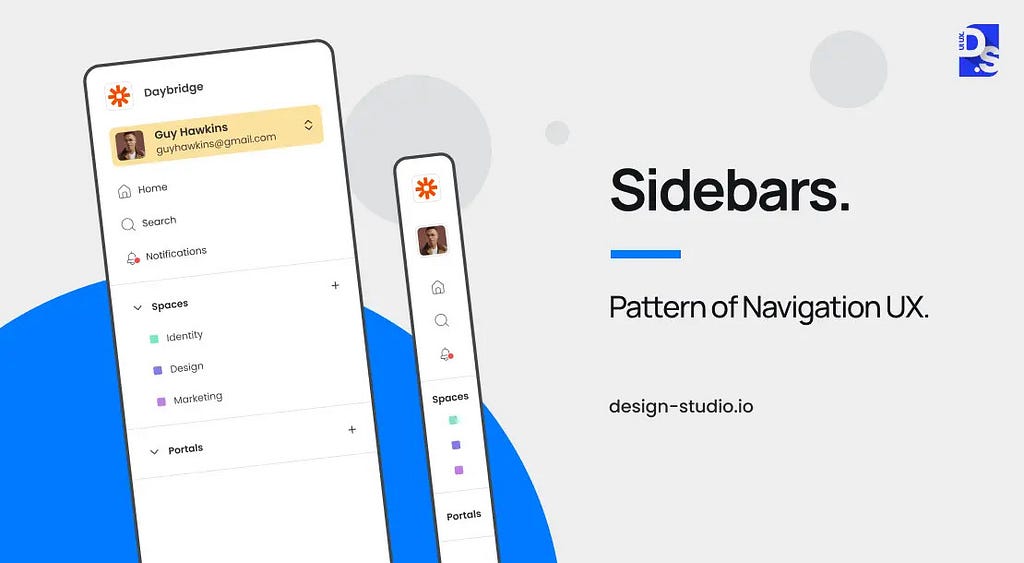
Ever notice the menus on the left-hand side of many websites? That is sidebar navigation in action. It offers constant visibility of key functionalities, allowing for quick access and easy navigation across various sections of your application. Sidebars can even be collapsible on smaller screens to save space.
Search
Search navigation provides a direct route for users who know exactly what they need. By entering keywords, they can bypass menus and find the specific information or features they are looking for. Advanced search functionalities can even offer real-time suggestions as the user types.
Tooltip Pattern
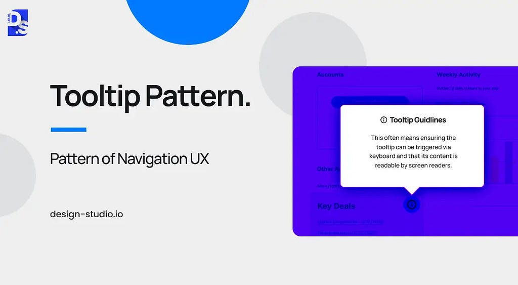
Think of a tiny pop-up hint. Tooltips offer bite-sized instructional messages that appear when users hover over specific features. These act like micro-tutorials, guiding users without disrupting their workflow but keeping everything concise and relevant to avoid annoyance.
Spotlight Pattern
Need to draw users’ attention to a specific element or specific section of the screen? The spotlight pattern shines a metaphorical light on a particular UI section, ideal for highlighting new features or guiding users during onboarding sequences.
Customization Menus
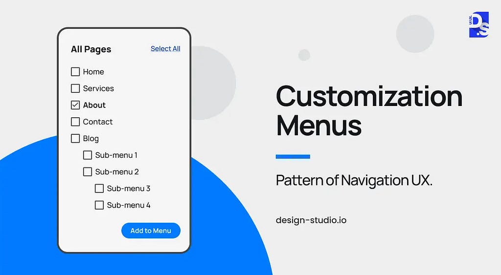
Customization menus allow users to tailor the navigation layout to suit their unique workflows. This can involve features like pinning frequently used options, reordering elements, or even hiding less-used functionalities.
Progressive Disclosure Navigation Menus
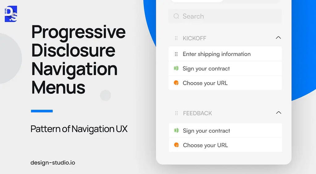
Not everything needs to be front and center. Progressive disclosure menus prioritize essential elements upfront, with additional features revealed as needed. This approach keeps the interface clean and reduces cognitive overload for users. Menus should be designed to intuitively expand and reveal deeper navigation levels when users need them.
Selecting the Right Navigation Type and Pattern
To select the right navigation type and pattern, you need to think like your target users. Understanding user intent at every step of the user journey will allow you to tailor navigation to their specific needs. For example, if speed and information retrieval are important user needs, search-based navigation can be the most effective option.
If users need to follow a specific workflow or process while operating at speed, adding breadcrumb navigation can further enhance their efficiency. On the other hand, if users need to access multiple parts of the app simultaneously, tab-based, task-oriented navigation will be the most effective choice. Here are some other factors you need to consider:
Content Structure:
How is your content organized? Understanding the content architecture helps determine the most suitable navigation type and pattern. A complex website with numerous categories might benefit from a hierarchical structure, while a simpler app with well-defined sections might thrive with tab-based navigation.
Intended User Experience (UX):
What kind of experience do you envision for your users? For a seamless and intuitive experience, consider tab-based navigation or clear breadcrumbs. If your goal is task completion efficiency, prioritize workflow-based navigation.
Device/Screen Size:
How will users access your platform? For mobile apps with limited screen space, a hamburger menu or vertical navigation might be the way to go. On desktops, a horizontal navigation bar with dropdown menus could be more effective.
Customization:
Do you want users to personalize their experience? If so, consider incorporating features like menu customization. This allows users to tailor the navigation layout to suit their unique workflows, enhancing their efficiency and satisfaction.
Navigation UX Best Practices
Navigation design deserves center stage throughout the product development process, especially during information architecture planning, wireframing, and prototyping. Here are key practices to keep in mind throughout the UX design process:
Understand User Interactions
The foundation of good navigation lies in knowing your users. Gather data on their behaviors, needs, and preferences through user research. This can be achieved via usage data, user feedback, and path analyses. By understanding your user base, you can tailor the interface to their expectations.
Information Architecture
Create a clear hierarchy. Organize features logically and intuitively so users can find what they need quickly. Select a navigation type (e.g., tabs, breadcrumbs, search) that facilitates access to different sections without overwhelming users. Conducting an information architecture audit and usability audits can help identify areas for improvement.
Familiarity and Clarity
Use common navigation patterns like menus, breadcrumbs, and search bars for user recognition and ease of use. Design icons that are visually distinct yet easily recognizable to avoid confusion about their functionality. For example, a magnifying glass icon is often associated with search functionality. This familiarity will help users quickly understand the purpose of each design element, making navigation feel more intuitive.
Similarly, use established industry standards for icons and descriptions. Users understand familiar elements, regardless of their physical existence. Labels, icons, and help text should all feel familiar, reinforce the same message, and avoid contradictions.
Optimizing the User Experience for All Users and Devices
Empower users to personalize their navigation layout based on individual preferences, fostering a sense of ownership. But, don’t go overboard with personalized messaging. Keep the language simple, direct, and easy to understand. Provide clear training programs, tutorials, and user guides to equip users with the knowledge to navigate the platform effectively.
Integrate intuitive keyboard shortcuts for advanced users seeking a faster navigation method. Ensure a consistent and enjoyable user experience on mobile devices through an adaptive and user-friendly interface. Consider native apps for Android and iOS if targeting a less professional audience or aiming for a more integrated everyday experience.
Continuous Improvement
Ideally, your navigation system will feel helpful and guide users without being condescending or dictatorial. But, what if it doesn’t work as planned? Implement a user feedback system to gather timely user insights and suggestions to avoid such risks. This direct feedback loop allows you to continuously refine your navigation and optimize it for user needs.
Final Take
A well-designed navigation system not only keeps users happy and engaged but also serves as a strong foundation for adding features and content without overwhelming users. It’s crucial to ensure your product thrives as it grows, providing a seamless user experience that adapts to changing user needs and preferences. And that is why at Design Studio, we prioritize navigation UX in every project.
Navigation UX Design: Types & Best Practices was originally published in UX Planet on Medium, where people are continuing the conversation by highlighting and responding to this story.