Creating a visually appealing user interface (UI) is essential for improving user experience and increasing engagement on websites and apps.
One of the most crucial aspects of UI design is spacing. Proper spacing can make a design look clean, organized, and easy to navigate.
In this article, we’ll explore the principles of spacing in UI design and provide a step-by-step guide on using the 4-point spacing system.

What is Spacing in UI Design?
Spacing in UI design refers to the empty areas between elements in a layout. This includes the space between text, images, buttons, and other UI components.
Proper spacing helps to create a visual hierarchy, making it easier for users to understand and interact with the content on a page.
Understanding the 4-Point Spacing System
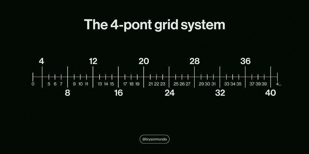
The 4-point spacing system is a simple and effective method for maintaining consistent spacing throughout your UI design.
It uses multiples of 4 to define the spacing between elements, ensuring uniformity and alignment.
Here’s how you can use the 4-point spacing system step by step:
Step 1: Define Your Base Unit
The base unit in the 4-point spacing system is 4 pixels (px).
All spacing values will be multiples of this base unit. For example, you can use 4px, 8px, 12px, 16px, and so on.
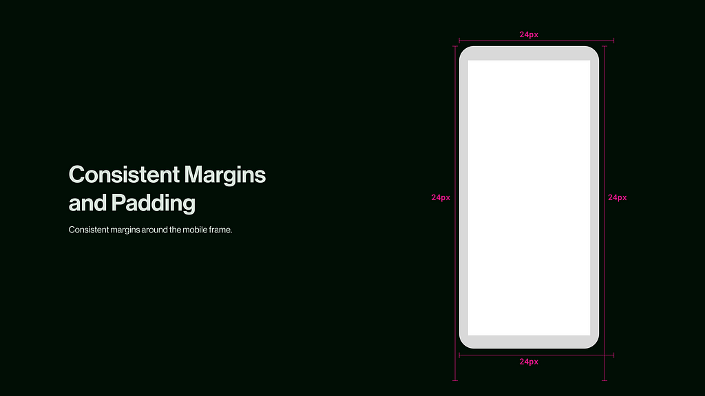
Step 2: Apply Consistent Margins and Padding
Margins and padding are essential for separating elements and creating breathing room.
Use the base unit to set consistent margins and padding around your elements.
Margin: Margin is the space outside an element. It creates a gap between the element and other elements around it, ensuring that everything isn’t too crowded together.
Padding: Padding is the space inside an element. It creates a gap between the element’s content (like text or images) and its border, giving the content some breathing room.
For instance, you can set a of 24px.
Step 3: Create a Visual Hierarchy
To create a clear visual hierarchy, use different spacing values for different levels of importance.
For example, you can use 16px spacing between major sections and 8px spacing between related elements within a section. This helps users easily distinguish between primary and secondary content.

Benefits of Proper Spacing in UI Design
1. Improved User Experience and Readability:
Adequate spacing between text lines and paragraphs makes content easier to read.
When users don’t have to strain their eyes to read or figure out where to click next, they have a much more pleasant experience.
Happy users will stay longer, engage more, and return to your site or app.
2. Consistency
Using a standard spacing system ensures that your design looks cohesive and well-organized, no matter how many elements you have.
Consistency in spacing helps create a unified look, which is crucial for maintaining a professional appearance.
It also makes it easier to maintain and update your designs over time.
3. Visual Hierarchy:
Proper spacing helps establish a clear visual hierarchy, guiding users’ attention to the most important elements.
By using different spacing values strategically, you can highlight key elements and create a clear path for users to follow.
This not only improves the user experience but also helps in achieving your design goals, whether it’s directing attention to a call-to-action button or making important information stand out.
4. Increased Engagement:
A well-spaced design is more inviting, encouraging users to stick around longer.
When your design looks clean and organized, it’s more appealing to users, which can lead to increased engagement and interaction.
Users are more likely to explore your content, click on links, and complete desired actions when they find your design visually pleasing and easy to use
5. Reduced Clutter:
Proper spacing keeps your design from looking like a hot mess.
It prevents elements from crowding each other and ensures that there’s enough breathing room around each component.
This reduction in clutter makes your design look more professional and helps users focus on the content without feeling overwhelmed.
6. Time-Saving Efficiency
Once you establish a consistent spacing system, you can easily apply it across your designs, saving time in the long run.
You won’t have to rethink the spacing for every new project or component, which streamlines your workflow and allows you to focus on other important design elements.
This efficiency can be a real game-changer, especially when working on tight deadlines.
7. Improved Collaboration with Developers
When you use consistent spacing, it’s easier for developers to bring your design to life without any hiccups.
Clear spacing guidelines reduce miscommunication and make the development process smoother.
Developers can implement your designs more accurately, which helps in maintaining the integrity of your design vision throughout the development process.
Practical Examples of the 4-Point Spacing System
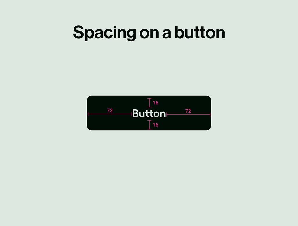
- Buttons and Text: Ensure buttons have enough padding (e.g., 12px or 16px) to make them easy to click. Space buttons apart by 8px or 16px to avoid clutter.
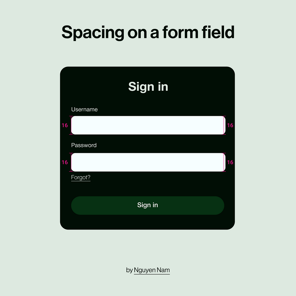
2. Form Fields: Use consistent spacing (e.g., 16px) between form fields to improve readability and usability.
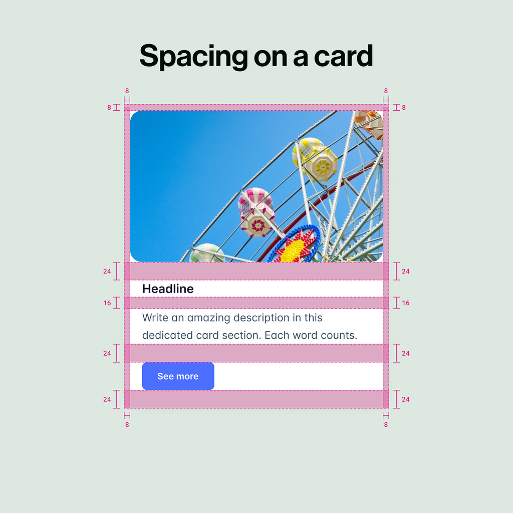
3. Spacing on a Card: Maintain a balance by adding spacing (like 24px) between different sections of a card, such as the meeting organizer details, attendee list, and ‘Join’ button, to create a clean and organized layout.
Conclusion
Proper spacing is a fundamental aspect of UI design that significantly impacts the overall user experience.
By using the 4-point spacing system, you can create visually appealing and functional designs that enhance readability, navigation, and engagement.
Remember to test your design and make adjustments as needed to achieve the best results.
Hey there 👋 I’m Bryson, your go-to UI designer here on Medium.
If you found this article useful, join my free newsletter! I write about UI design topics, freelancing and sharing tips and resources to help you improve your skills as a user interface designer.
You can find me on Instagram, Twitter and Dribbble or reach out directly by booking a call for freelance projects!
Check out my online store on Gumroad.
Thank you for reading;
Bye for now👋
Check out my other articles:
- Principles of color in UI Design
- Principles of Typography in UI Design
- Principles of visual hierarchy in UI Design
![]()
Principles of Spacing in UI Design: A Beginner’s Guide to the 4-Point Spacing System was originally published in UX Planet on Medium, where people are continuing the conversation by highlighting and responding to this story.