Typography is a core component of user interface (UI) design. It’s the art and technique of arranging text to be both visually appealing and easy to read.
Good typography isn’t just about choosing a fancy font — it’s about creating a visual hierarchy, ensuring readability, and setting the tone for your brand.
When done right, typography can enhance user experience and make your design stand out.
In this comprehensive guide, we’ll explore the key principles of typography in UI design, covering topics like font selection, line height, letter spacing, text alignment, and more.
Ready to dive in? Let’s get started with defining What is Typography.
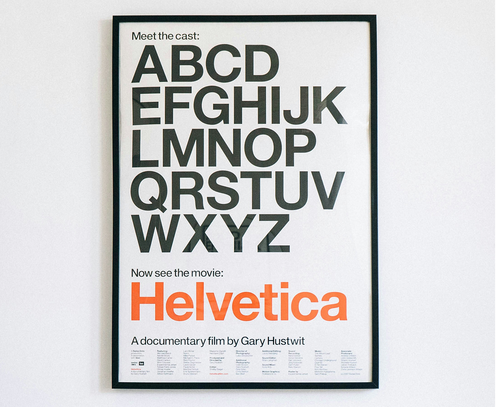
What is Typography?
Typography is the art of arranging letters and text in a way that makes the copy legible, clear, and visually appealing to the reader.
Why Typography Matters in UI Design
Typography is more than just choosing a font; it’s about creating a visual language that communicates information clearly and attractively.
Good typography can enhance readability, improve user engagement, and create a cohesive design aesthetic.
Poor typography, on the other hand, can lead to confusion, frustration, and even a loss of credibility for your digital product.
1. The Basics of Typography
Before we dive into the basics let’s understand some basic typography terms:
Typeface
A typeface is a collection of letters, numbers and other symbols of the same lettering.
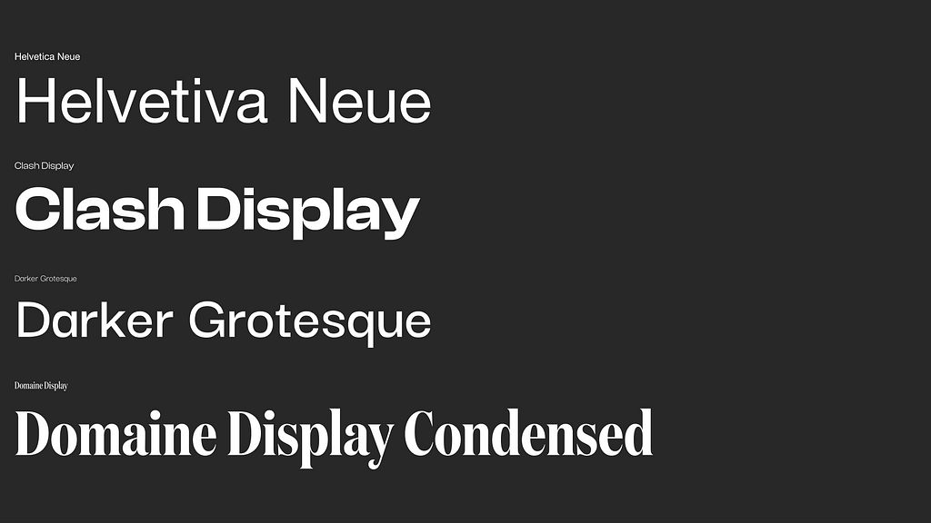
Typefaces have different styles. The most common are:
a) San Serif
Sans-serif fonts are cleaner and simpler (like Arial, Helvetica and Inter).
These fonts are known for their straightforward appearance, making them ideal for modern and minimalistic designs.
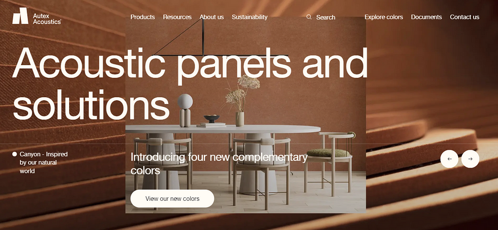
b) Serif
Serifs are small decorative strokes at the ends of characters (like Times New Roman, Editorial New, Garamond, and Domaine Display).
The decorative strokes add a touch of sophistication and classic style.

c) Decorative
Also known as novelty or ornamental typefaces stand out because of their unique shapes and personalities.
They are used in headlines or logos. They are not used for body copy because of their lack of readability.

d) Script
Also known as cursive or handwriting typefaces are designed to mimic traditional handwriting.

e) Monospace
Also known as fixed-pitch, fixed-width or non-proportional.
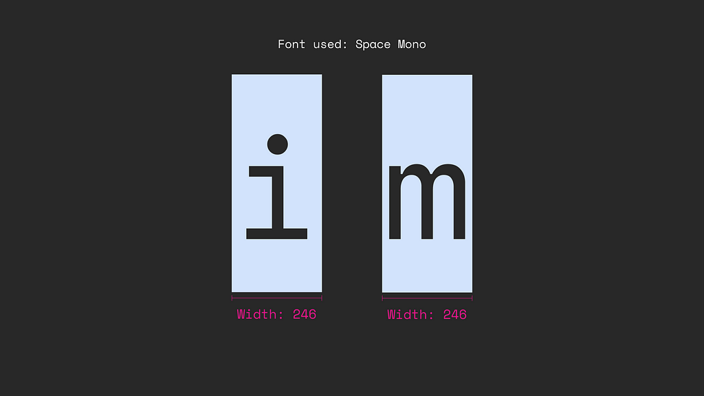
This a font whose letters and characters occupy the same amount of horizontal space.
The “i” takes up the same horizontal space as an “m.”
Font family
A font family is a group of related fonts.
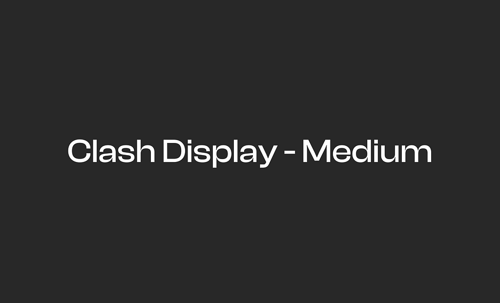
Clash Display Thin, Clash Display Light, Clash Display Regular, Clash Display Medium, Clash Display Semi-Bold, Clash Display Bold.
All of these are a collection. All this into one is a font family.
When people release a new font, they often call it a typeface, like ‘Humane Typeface,’ instead of just ‘Humane Font,’ because a typeface is the overall collection, while a font refers to the specific styles within that design.”

Font
A font is a specific style within a typeface which varies in weight and size.
For example, Clash Display is a typeface and Clash Display Medium is a font.
Key Principles of Typography in UI Design
1. Readability and Legibility
Readability and legibility are often used together, but they have different meanings in typography.
- Legibility refers to how easy it is to distinguish individual letters and characters.
- Readability is about how easy it is to read and understand a block of text.
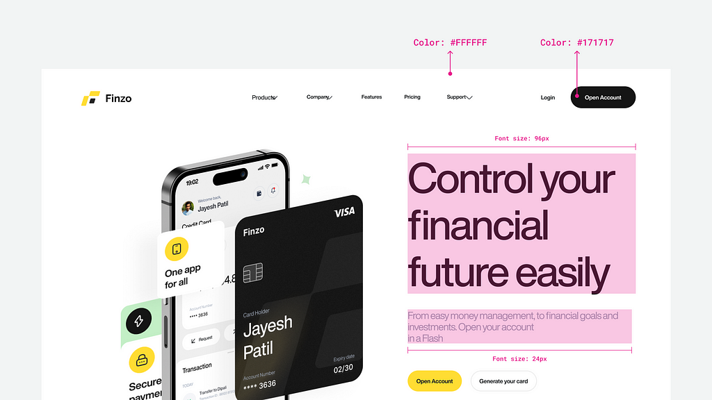
To ensure both, choose a font that’s clear and easy to read at various sizes, and ensure there’s enough contrast between text and background.
2. Font Selection
Choosing the right font is crucial for your designs. Consider these factors:
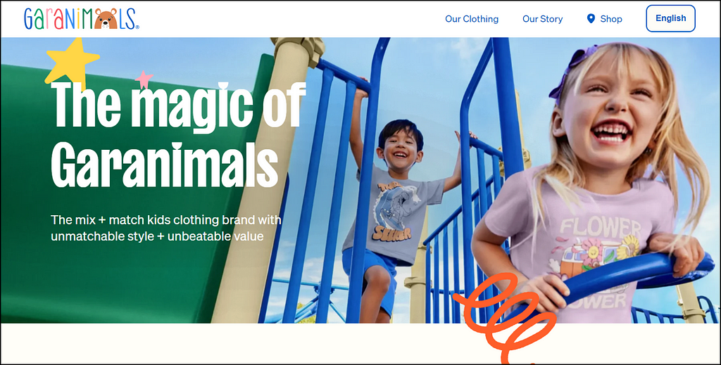
- Purpose: Is the font suitable for your design project? For example, a formal font for a financial app or a playful font for a children’s game.
- Consistency: Limit your font choices to one or two families to maintain a cohesive design.
Popular fonts for UI design include sans-serif fonts like Arial, Helvetica, and Roboto, known for their clean lines and simplicity.

3. Font Size and Hierarchy
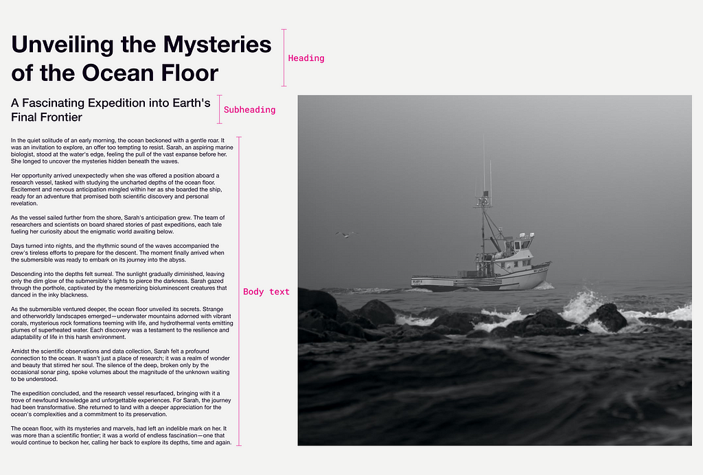
Hierarchy is arranging text based on the importance of information.
This can be achieved through font size, weight, and style. Here’s a simple definition:
- Headings: Typically the largest and boldest text, used for titles and key sections.
- Subheadings: Smaller than headings but larger than body text, used to separate content.
- Body Text: The standard size for regular content.
- Captions/Labels: Smaller than body text, used for annotations or additional information.
Also, use various title sizes (H1 to H6) to show their importance.
Using consistent font sizes helps users understand the relationship between different sections of your UI designs.
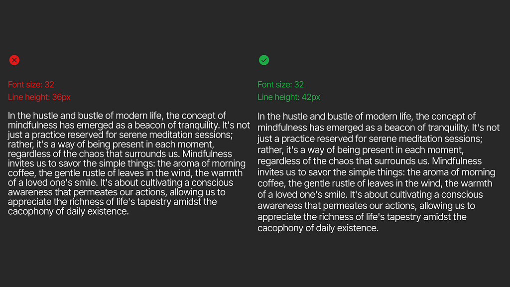
4. Line-Height
Also known as Leading, it is adjusting the space between all characters in a line, Vertically.
Proper line height ensures that text is easy to read and doesn’t feel crowded or overly spaced.
If the line height is too low, lines of text can overlap or feel compressed.
If it’s too high, the text can seem disjointed and hard to follow.
To achieve an appropriate line height, you may want to increase it using the golden ratio by multiplying your font size with the line height property.
For Example:
If I multiply 12px by 1.618, the line height will be 19.2.
So, we get 19.2 as the line height value; we will then round it off to get 19. When you have an even number as your font size and an odd number as the line height value of your font size, the vertical alignment of the text within its bounding box will be uneven.
Therefore, if your font size is an even number, the line height must also be an even number. Thus, we will set the line height value to 20.
5. Letter-Spacing
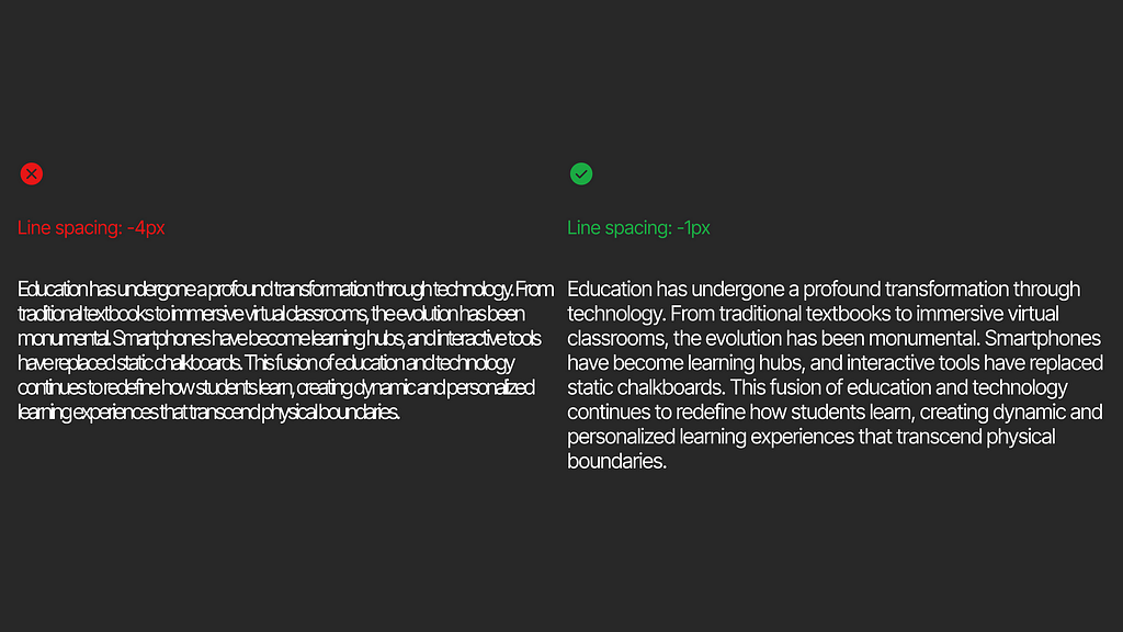
Also known as Tracking, it is adjusting the space between lines of text.
Adjusting letter spacing can make text easier to read and create a desired visual effect.
Tighter letter spacing can produce a compact, modern look, while wider spacing can give a more open and airy feel.
6. Kerning
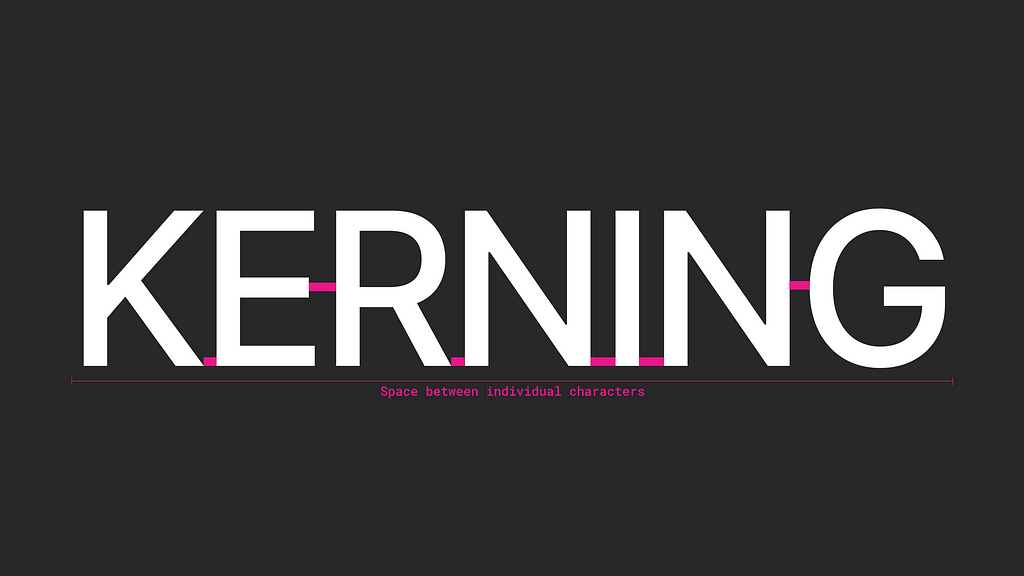
Kerning is adjusting the spacing between individual characters in a piece of text.
Unlike letter-spacing (tracking), which affects the spacing across an entire block of text, kerning is applied to individual character pairs to correct visual inconsistencies.
Common Scenarios for Kerning:
- Headlines and Titles: Kerning is often applied to large text like headings, titles, and logos. Proper kerning helps create a visually pleasing and impactful presentation.
- Special Character Combinations: Some letter pairs, like “TY,” “WA,” or “LY,” might need manual adjustment to avoid awkward gaps or collisions.
- Branding and Logos: For branding and logo design, kerning is crucial to ensure the text has a consistent and balanced appearance, reinforcing the brand’s professional image.
7. Text Alignment
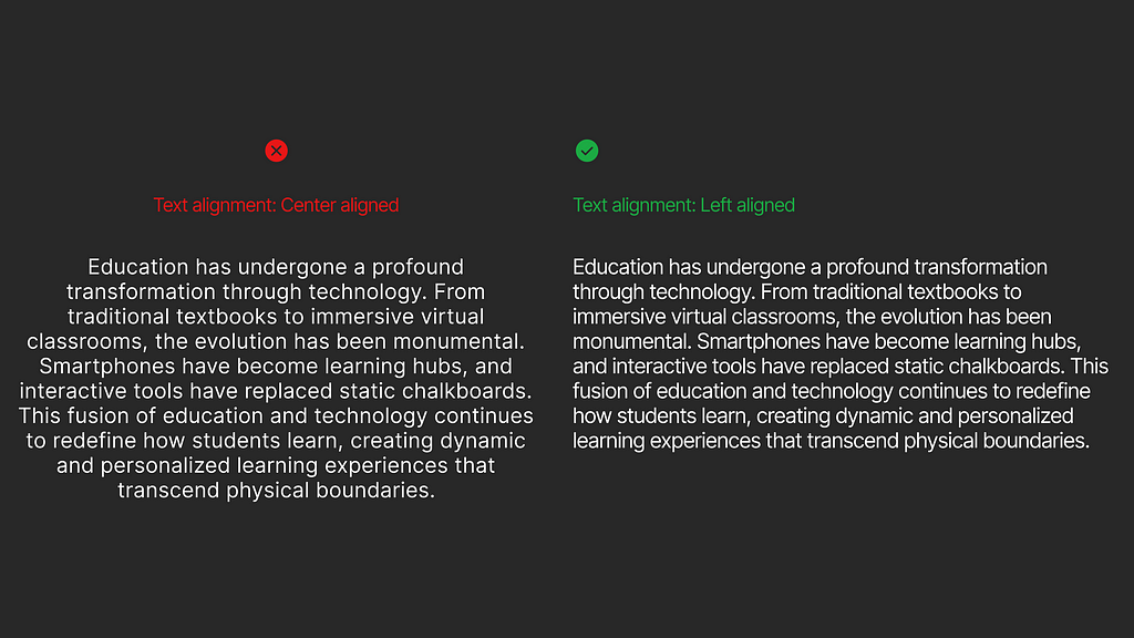
Aligning text properly contributes to a clean and organized UI. The common types of alignment are:
Left Alignment:
- This is the most common and suitable alignment for most interfaces and is typically used for body text, paragraphs, and lists.
Right Alignment:
- Right alignment is less often used for specialized cases like captions, sidebars, tables, columns or design elements where a unique alignment is required.
Centre Alignment:
- Centre alignment is often used for headings, titles, invitations, and design elements where symmetry and balance are desired.
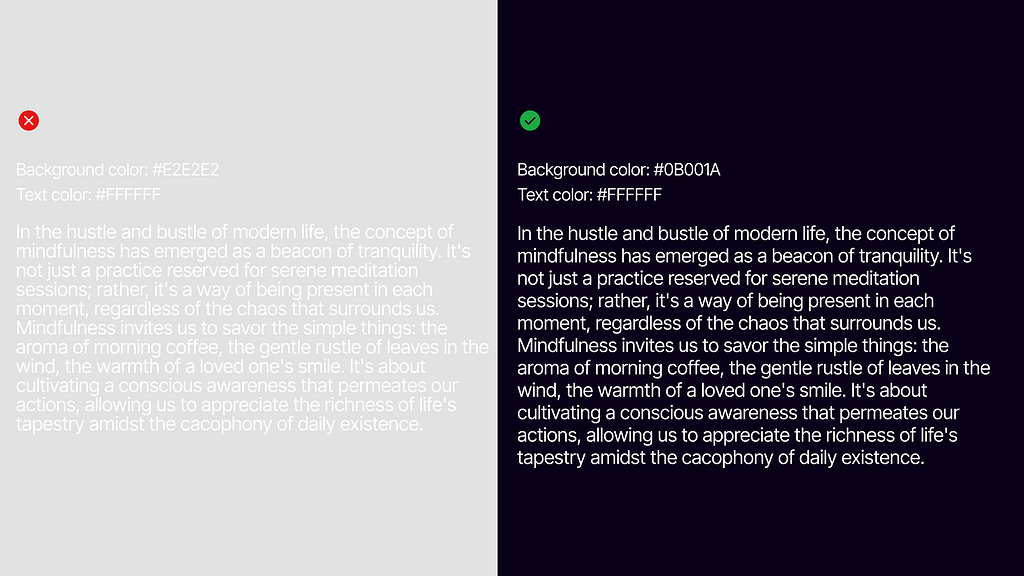
8. Contrast and Color
Contrast between text and background is essential for accessibility and readability.
Ensure your text stands out against the background, considering factors like color blindness.
High Contrast: Best for visibility and accessibility.
Low Contrast: Can be used sparingly for less critical text or decorative elements.
Use color primarily for emphasis or to create visual interest. Always test your color choices to ensure readability.
9. Consistency and Branding
Typography should be consistent across your UI to maintain a cohesive brand identity. Use the same font families, sizes, and styles throughout your product.
- Style Guides: Create a style guide to define your typography rules, ensuring consistency.
- Brand Identity: Typography should align with your brand’s tone and personality.
Consider the Screen
UI design is often on screens, and that makes it different from print design. Here’s what to keep in mind:
Responsive Design
Ensure your typography looks good on different devices and screen sizes.

Web Fonts
Use web-safe fonts to make sure your design doesn’t break on different browsers.
Web-safe fonts are fonts that don’t need to be downloaded because they are universally pre-installed across all devices. Fonts like Inter, Arial, Calibre, Century Gothic, Helvetica, Georgia, Garamond, Didot, Bodoni, Tacoma, Lucida, Grande, Impact, Segoe UI, and Times New Roman.
Conclusion
Typography is really important in making good user interface designs(UI).
By following the principles we’ve talked about, you can make your designs look great and work well for everyone. Let’s summarize what we’ve learned:
- Readability and Legibility: Make sure your text is clear and easy to read. Use enough contrast so it stands out against the background.
- Font Selection: Choose fonts that fit your design. Try to stick with one or two fonts to keep it consistent.
- Hierarchy: Use different font sizes to show which text is most important. This helps guide users through your design.
- Line Height: Ensure there’s enough space between lines of text to prevent crowding and make reading easy.
- Letter Spacing: Maintain a consistent space between characters. Avoid too much or too little spacing to keep text readable.
- Kerning: Adjust the space between specific character pairs to improve readability and visual appeal.
- Text Alignment: Choose an alignment that suits the content. Left alignment is common, while centre alignment works well for headings.
- Contrast and Color: Ensure high contrast for readability and accessibility. Use color sparingly and thoughtfully.
- Consistency and Branding: Keep typography consistent throughout your UI. It should reflect your brand’s identity and tone.
- Consider the Screen: Test your typography on different devices and screen sizes to ensure it looks good everywhere.
When you use these principles in your design, you’ll create user interfaces that are attractive and easy to use.
If you found this guide helpful, share it with others who are interested in UI design.
Keep learning about typography to improve your design skills. The more you practice, the better your designs will be.
Hey there 👋 I’m Bryson, your go-to UI designer here on Medium.
If you found this article useful, join my free newsletter! I write about UI design topics and share tips and resources to help you improve your skills as a user interface designer.
You can find me on Twitter and Dribbble.
Check out my online store on Gumroad.
Thank you for reading;
Bye for now👋
Check out my other articles:
Principles of Typography in UI Design was originally published in UX Planet on Medium, where people are continuing the conversation by highlighting and responding to this story.