
In the digital age, where information flows faster than ever and multitasking has become a way of life, the user experience of data entry has never been more critical. Whether we’re inputting personal details into an online form, searching for products on an online marketplace, or typing messages on our smartphones, the ease and efficiency of data entry profoundly affect our daily interactions with technology.
Autocompl…
Imagine a world where there was always someone who continuously finished your sentences. It would eventually become tedious, and you would want it to stop, right? Now, consider every time you enter a search term into Google or you start to type your email into a form field. You tend to be happy when you only need to enter three or four of the 15 to 20 characters. Or perhaps you have been in a situation where you weren’t 100% sure how to spell one of the words in your search and were relieved when, after a rough attempt at spelling the word, the search engine was able to correct it. This truly demonstrates the power of using autocomplete at the correct time in the user journey.
By providing the user with an autocomplete functionality, you save them two of their most important commodities: time and effort!
Below are three great examples of autocomplete functionality:
- The first while writing a text message on an Iphone the user is presented with up to three auto complete options for each word they type.
- The second from a sign in modal from webflow, which presents a previousley used email address to the user so they don’t have to type it out letter by letter.
- The third is an example of entering a search query into Google. The user is presented with relevant search queries from history or popular searches.
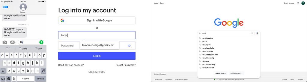
As you can see in each of the examples above, the autocomplete options are often placed below the text input field. This close proximity highlights to the user that these options are directly associated with the data the user is inputting.
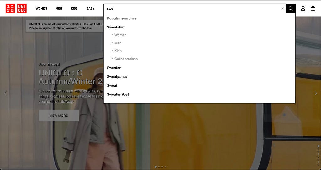
A good practice when adding autocorrect functionality to your software is to highlight the section of the word the user has inputted. You can see a great example of this when searching for a certain type of clothing on the UNIQLO website:
The autocorrect options are there to assist the user and speed up their data input journey. As a result, they should reflect relevant searches to the user’s input, and there shouldn’t be so many options that the user has to spend excessive amounts of time scanning through them.
You should use your best judgment to decide how many autocorrect options to include, taking screen size into account. From personal experience, I would recommend around five options as a rule of thumb; certainly no more than 10. As with all UX/UI designs, I would encourage testing various amounts of autocorrect options with your users to see what best fits their needs.
Refining the Search
As an extension of the above point, you should consider offering your user the chance to further refine their autocomplete options if there are a large number of potential search results. To better understand this concept, take a look at how Google Images uses search refining to allow the user to achieve a more specific search when entering data.

To implement refined search effectively, you should consider logical categories for the content and display the options in a common UI pattern. I would suggest a dropdown menu similar to the one utilised by Google. And remember, the user should be able to select and combine an option from each of the categories if there are multiple categories. For example, when searching for an image, they could be able to combine a time, size, and style of image all at once.
The Correct Style of Input Field
The next important consideration when creating simple data entry experiences is which type of input field to select. Consider what type of data your users will be inputting and select the input field accordingly. Will the input be purely text-based? If so, will they enter one or two words or maybe even a paragraph? Will they be selecting an option from a predetermined set of options or entering data with a set format such as a date? Each of these instances comes with its style of input field.
The image below, created by Taras Bakusevych, demonstrates each of the input field styles at your disposal. Notice how they have inbuilt formatting for ease of use. For example, the number-only input for cards allows the user to type four digits and automatically adds a space. This is great for two reasons: firstly, this is how the numbers are written on the bank card itself, and secondly, ordering the digits into four groups reduces cognitive load on the user. This allows them to scan back and forth between the card and the data they have inputted to ensure it is accurate.

Don’t Punish Mistakes
When creating experiences for our users, we must always remind ourselves that they are only human. Just like you and I, they are susceptible to making mistakes when inputting data. Rather than punishing the user for these grammatical and linguistic errors, you should instead build a flexible experience that anticipates errors and provides the user with potentially correct options.
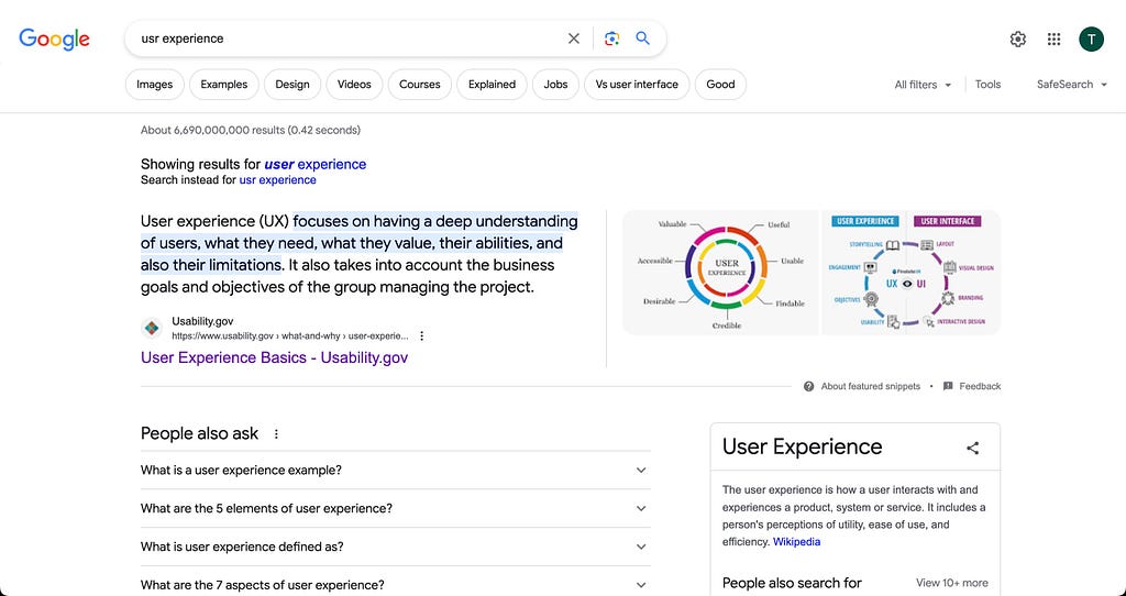
Take the example below, which shows how Google implements design flexibility by showing the user a correctly spelled search similar to the one the user has inputted.
Don’t Forget Colloquialisms
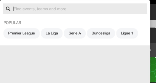
Another way to add flexibility to data input is offering a wider scope for what the user is able to search. Consider that different users from various parts of the world may have multiple ways of searching for the same thing. For example, if the user was searching for Manchester United, they may search for any of the following terms: Manchester United, Man United, United, Man Utd, Man U. And I am sure there are other variations I haven’t thought of! Rather than restricting the user, build an experience flexible enough to allow for these data input variations.
The Betway website has a great example of this on their top-level site search. Instead of restricting the user to searching solely for an event, e.g., Manchester United vs. Liverpool, the user is free to search for teams, players, events, leagues, and a whole lot more.
Offer Speedy Data Input
In order to help speed up the data input process when the user is inputting dates, consider using a date picker. This UI pattern is great for experiences such as purchasing flight tickets or selecting dates to stay in a hotel. Booking.com is a good example of how and when to successfully add a calendar input into a user journey.

Notice how the user is also afforded extra data input flexibility with the pills under the calendar. They allow the user to flexibly search for dates 1, 2, 3, or 7 days on either side of the selected dates.
Incorporating these principles into your design philosophy can transform data entry from a mundane task into a user-friendly, efficient, and painless experience. By simplifying the UX of data entry, you not only empower users but also elevate your digital products to new heights of usability and user satisfaction.
Simplify the UX of Your Data Entry was originally published in UX Planet on Medium, where people are continuing the conversation by highlighting and responding to this story.