Just as the physical world operates under predictable cause-and-effect relationships, so too does the world of User Experience (UX) design. Behind every interaction on every digital interface, lies a series of cause-and-effect relationships, dictating the predictable outcomes and human behaviors we encounter as users.
UX designers refer to these predictable cause-and-effect relationships as the “laws” of UX design. These “laws of UX” are not rigid rules set in stone; they represent tried-and-true cause-and-effect relationships that, over the years, have proven invaluable in aiding UX designers to craft outstanding user experiences.
- Created by scientists and pioneers in fields like human psychology, programming, product design, and UX design, these laws have been repeatedly refined through decades of diligent research and experimentation.
- They serve as guiding principles, providing a solid framework for understanding how modern-day users interact with digital products.
- By understanding these laws of UX design, young and aspiring UX designers can craft sophisticated digital experiences that go beyond mere functionality and resonate with users on a deeper level.
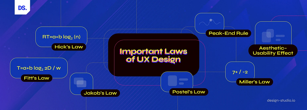
In this article, we aim to introduce you to seven such quintessential UX design laws. These tried-and-true principles have weathered the storms of time and consistently produced exceptional UX outcomes. So, without delay, let’s embark on our exploration of these seven classic laws of UX design:
The 7 Laws of UX Design
1. Jakob’s Law: Leveraging Familiarity

The human mind thrives on familiarity: this principle forms the bedrock of the UX design ‘law’ put forth by the legendary UX designer Jakob Nielsen. According to Nielsen, the human mind’s penchant for familiarity extends to our interactions in the digital sphere. His law, a.k.a. ‘Jakob’s law’ asserts that users inherently prefer website/app designs to appear and function in ways they’re already familiar with.
Key Takeaways
In a study published in 2000, Nielsen observed that users develop ‘design expectations’ based on their previous experiences with various websites/apps. Here are the key takeaways from that study:
- Mental models are the internal blueprints that guide our interactions with the world around us (including the digital world). Shaped by our accumulated experiences, these models serve as intuitive frameworks that enable us to navigate new situations with ease.
- ‘Design expectations’ refer to the mental models and assumptions that users create in their minds while interacting with digital products. Conforming to these expectations can help UX designers create interfaces that are intuitive, efficient, and easy to use.
- Not conforming to these expectations by presenting users with unique, unfamiliar design patterns can lead to frustration, confusion, and ultimately, abandonment.
By aligning website/app designs with these pre-existing mental models, UX designers can empower users to leverage their existing knowledge, interact freely with all features of digital products, and achieve their goals effortlessly. A prime example that epitomizes the efficient application of Jakob’s Law in UX design is the ubiquitous ‘Hamburger Menu’ icon:

This basic icon has become the de-facto symbol for hidden menus in digital products. Whenever users see this icon, they know to expect a hidden menu. They draw upon their mental models of previous experiences with the three-horizontal-line icon to anticipate its function, navigate the interface, and find what they need effortlessly.
By utilizing familiar design patterns/conventions, users can immediately understand how an interface works. Familiar interfaces create a sense of comfort and ease, eliminating the need for extensive exploration/instruction. This leads to higher user satisfaction as users can readily navigate the interface and access desired information or functionalities.
Here are some more practical examples of Jakob’s Law in action:
- Snapchat Redesign: In the infamous 2018 redesign of Snapchat, the company dramatically altered the app’s layout and navigation. These dramatic changes caused discordance with users’ mental models. Snapchat faced heavy criticism for disregarding established design conventions.
- Booking Services: Standardized maps are a familiar and widely-used tool users can easily understand/navigate. Most cab booking and delivery apps/websites feature these maps.
- E-commerce Websites: Most e-commerce websites like Etsy, eBay, etc. feature similar design patterns and styles. These design features match users’ mental models of how online shopping experiences should work (design expectations related to product selection, cart management, checkout, etc.). There’s no need for users to learn how to use different eCommerce sites as most of them are designed similarly.
While Jakob’s Law advocates for leveraging familiar design elements, it is not an explicit call for total uniformity. Innovation and refinement are still vital for creating great user experiences. But, UX designers must ensure they don’t make things harder for their users when they depart from established design conventions and practices.
2. Fitts’s Law: Optimizing Touch Interfaces for Easier Interactions
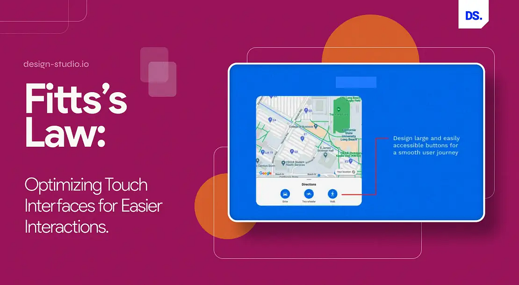
Fast and accurate interactions contribute to smoother and more enjoyable experiences for users. In other words, when users can quickly and precisely interact with all the key elements on a digital interface, it leads to a more effortless and satisfying user experience. Fitts’s Law provides a framework for understanding this relationship between the speed and accuracy of user interactions with the distance and size of targets on an interface.
This law was established in 1954 by psychologist Paul Fitts as a model for understanding human movement in the physical world, long before the first graphical user interface was invented. Since then, it has been applied extensively to study and enhance human-computer interactions (HCI). Now, we’re in the era of touchscreen interfaces and Fitts’s Law is a foundational principle in the field of usability & UX design.
Key Takeaways
According to Fitts’s Law, the larger and closer a design element is to a digital interface, the faster users can engage with it. There are three key takeaways that designers derive from this UX design law:
Touch targets (the interactive elements on app/web designs) created for touchscreen interfaces should be large for users to accurately discern them and easily select them:
Apple’s Human Interface Guidelines recommend a minimum touch target size of 44×44 points. If your app/web design’s interactive elements are more than that, it can lead to an inefficient user experience.
All interactive elements on app/web designs should have ample space between them:
Google’s Material Design guidelines propose a minimum space of 8dp between two touch targets for optimal usability.
All interactive elements on app/web designs should be placed in areas of the interface that are easily accessible:
On most eCommerce sites/apps, you’ll see the “Place Order” or “Submit” buttons positioned in areas of the interface that are easy to access. This strategic placement reduces the distance users need to travel with their cursor/finger to make key decisions on the interface.
By understanding and applying Fitts’s Law, designers can optimize their touch interfaces for fast, intuitive, and efficient interactions.
3. Hick’s Law: Minimizing Choices to Minimize Complexity

Hick’s Law was discovered by psychologists William Hick and Ray Hyman in 1952. It underscores the crucial need for UX designers to keep their designs simple and avoid giving users too many features or options. Hick’s Law asserts that the more choices people have, the longer it takes them to make a decision. In other words, when users are faced with too many choices, their ‘cognitive load’ increases.
Cognitive load refers to the amount of mental effort users exert to process information and make decisions. If a design fails to consider the users’ cognitive load and presents them with an excessive number of choices, it can lead to slower decision-making, frustration, and even abandonment.
Key Takeaways
By understanding and applying Hick’s Law, UX designers can create interfaces that help users achieve their goals quickly and effortlessly:
Minimize User Choices: To minimize the risk of decision fatigue, designers must promote faster interactions by reducing the number of options/choices users see on the screen:
Google’s homepage, one of the most-visited websites of all time, features a clean search bar that never overwhelms users, even first-timers.
Break Down Complexity: Break complex tasks into smaller steps. Then encourage users to focus on achieving individual sub-steps and sub-goals:
Slack employs an AI-powered bot to ease users into its interface. This bot guides new users through key features step-by-step to avoid overwhelming them with too much information.
Highlight Recommended Options: Guide users towards the most relevant choices by highlighting the most important design elements:
In e-commerce websites/apps, large-sized “Add to Cart” or “Buy Now” buttons help simplify the shopping experience and expedite the decision-making process for users.
While minimizing complexity is important in UX design, it’s also important not to oversimplify designs to the point of abstraction. Over-simplistic designs may fail to provide users with sufficient info/functionality. Designers must strike a balance between simplicity and complexity and progressive onboarding is the best way of achieving this balance.
Instead of overwhelming new users with too many design features/elements at the start of their journey, designers should implement a progressive onboarding process. By gradually introducing new design features and functionalities, they can avoid the risk of cognitively overloading their users.
4. Postel’s Law: The Robustness Principle

Jon Postel, an internet development pioneer, introduced the robustness principle in the context of network protocols. He championed the idea that data transmission and processing should be robust and adaptable enough to handle variations and errors. Over time, this principle has moved beyond its technical roots and gained substantial relevance in the field of UX design.
Key Takeaways
Postel’s Law is one of the most notable laws of UX design. It advocates a two-fold approach:
- On one hand, designers should be conservative in their outputs, ensuring accessibility across a wide range of users and devices. This means adhering to established design standards (like Google’s Material Design guidelines) and avoiding overly complex or device-specific elements.
- On the other hand, designers should be liberal in what they accept, embracing diverse input methods and user interactions. This means allowing users to engage with the interface in ways that are most natural and convenient for them, whether through touch, voice, or gestures.
By embracing Postel’s Law, UX designers can create resilient designs that are grounded in anticipation and adaptability, and inclusive interfaces that accommodate the ever-evolving needs of users and devices. For example, designers follow Postel’s Law while designing error handling and feedback mechanisms on interfaces.
Error messages are inclusive and informative. They don’t expect users to understand the date entry format. They don’t present users with cryptic error messages. They simply assists users in correcting their errors. Such adaptable, inclusive, and responsive design elements reduce friction and help deliver more satisfying user experiences.
5. Peak-End Rule: Leveraging User Psychology to Shape Memorable User Experiences

Have you ever wondered why certain experiences linger in our memories more vividly? It’s probably because of the Peak-End Rule, a cognitive bias discovered by Nobel laureate Daniel Kahneman. As per this psychological ‘rule,’ our judgment of an experience hinges heavily on its peak moments and conclusion, sidelining the average.
In other words, our recollection of an experience is chiefly influenced by the most emotionally charged moments (peaks) and the outcome (conclusion), while the overall average experience tends to fade into the background.
Key Takeaways
How does the Peak-End Rule apply to UX design? It suggests that UX designers shouldn’t try to optimize every aspect of the user journey. Instead, they should focus on creating designs that deliver memorable peaks and satisfying conclusions:
Pay close attention to the most emotionally charged points and the concluding moments of the user journey:
Journey mapping is a helpful tool for identifying and anticipating peak moments. Designers can create visual representations of the user journey to identify the moments when their designs are most helpful, valuable, or entertaining to the end user.
Users recall negative experiences more clearly than positive ones:
Designers must anticipate potential negative scenarios and create apt recovery strategies. For example, a humorous “404-error-page” can turn a frustrating experience into a fun one, fostering brand loyalty. Uber shows users interactive visuals of maps as they wait for the app to connect them with drivers. These visuals help reduce user frustration.
6. Aesthetic–Usability Effect: Merging Beauty and Brains in Design
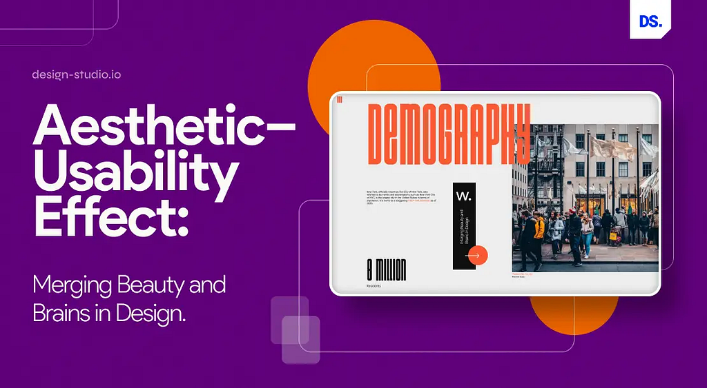
The aesthetic-usability effect describes the phenomenon where users think visually appealing designs work better, even if they offer the same functionalities as less beautiful designs. This concept emerged from a 1995 study by Japanese psychologists Kurosu and Kashimura. Their study demonstrated a strong correlation between the perceived aesthetic appeal and the perceived usability of ATM interfaces in Japan, proving that aesthetics plays a huge role in influencing users’ minds.
Key Takeaways
The aesthetic-usability effect highlights the undeniable power of aesthetics in shaping user experience. For designers, it underscores the importance of striking a healthy balance between aesthetics and usability.
- A good-looking design makes people intuitively feel positive. It leads them to believe that the design works well, even if it has small usability problems.
- Efficient application of color theory, readable text content, and the use of attractive visuals are essential for making users feel satisfied.
- Nice visuals can hide usability issues, making it hard to find them in testing. UX designers must consider this detail while testing their design prototypes.
Rdio and Spotify were two big music streaming platforms in the early 2010s, battling for users. While both platforms offered similar core functionalities, they differed significantly in their design approaches. Rdio opted for a more cluttered, unaesthetic, & visually busy design. The platform’s main interface was packed with design elements:

Spotify, on the other hand, applied the aesthetic-usability effect. The platform adopted a minimalist design philosophy, making its main interface visually stunning & easy to navigate:

Spotify’s commitment to following the aesthetic-usability effect has played a significant role in its success and the eventual demise of Rdio, its competitor.
7. The Von Restorff Effect
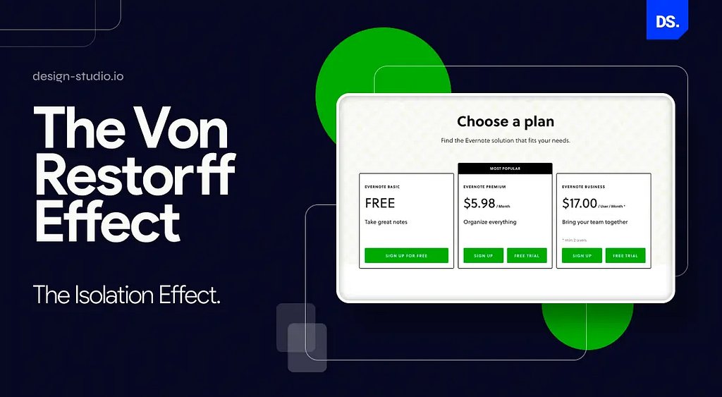
The Von Restorff effect, discovered by psychologist Hedwig von Restorff, claims that humans tend to remember items that stand out from their surroundings. This cognitive bias can be explained by the fact that human brains have limited attentional resources. They’ve evolved to filter out unimportant information. That’s why items that stand out visually capture our attention and become lodged in our memories. This phenomenon is called ‘visual salience.’
In 1933, von Restorff performed a memory test where participants were presented with word lists. The lists contained mostly similar words, but one word’s color, font, or size would be different. Every time, the distinctly designed word was remembered more vividly by participants. This finding has since been corroborated by various other studies on cognitive psychology.
Key Takeaways
The Von Restorff effect plays a crucial role in new-age UX design. It guides designers on how to employ visual contrast to capture user attention and influence user behavior.
By intentionally making design elements visually distinctive, designers can highlight important information:
Using contrasting sizes, colors, and shapes, designers can make CTA buttons appear more prominent and ‘click-worthy’ on digital interfaces.
Designers must use color and motion sparingly to avoid overwhelming users or making important elements appear like ads. In other words, design elements on digital interfaces shouldn’t be competing for attention:
On, LinkedIn bold colors are used only to highlight important sections of the site/app (menu, CTA buttons, etc.). This way, users focus only on what they need on the platform without any distractions.
Designers should consider offering users advanced features like animation or other moving design elements to emphasize specific visual elements:
When a user first opens an app, animated design elements (like Slack’s interactive chatbot) can be used to guide them through the app’s key features.
The Von Restorff effect is real and highly impactful in digital designs. But, it’s crucial to use it carefully. Using too much visual contrast can dilute its impact and even overwhelm users.
Final Take
Collectively observing and applying these essential laws of UX design can empower designers to create optimal user experiences for any digital product or service. That’s why the more of these laws a designer knows, the better. We would love to delve into more popular UX design laws. But, the vastness of this subject demands more time than we currently have. However, we can provide concise summaries of some of the laws we’ve not discussed in detail to further spark your interest in this topic and guide your future explorations:
- Tesler’s Law (the law of conservation of complexity) states that for any design there’s a certain amount of complexity that’s unreducible. Designers must avoid simplifying their designs to the point of abstraction.
- The Goal-gradient Effect claims that users are motivated by their proximity to a goal. UX designers must consider this effect and design user journeys that make users feel that they’re getting nearer to their goal every time they use the digital product/service.
- According to the Law of Common Region, when design elements are enclosed within a shared space, users perceive them as belonging together. This principle helps designers group related design elements, create clear visual hierarchies, and improve user perception.
- The Law of Uniform Connectedness claims that design elements with similar visual features (shape, font, size, etc.) are often perceived to be related. This law again helps designers group related elements and maintain visual consistency in their designs.
- According to the Law of Proximity, design elements that are placed closer together are perceived as more related to each other than those that are further apart. This principle influences how users scan/process information. UX designers can use it to guide user attention.
- When faced with complex information, humans strive for simplicity by grouping elements in the simplest way possible. This principle is known as the Law of Prägnanz. It emphasizes the need for designers to establish clear visual hierarchies, minimize clutter, and favor simpler design solutions in general.
To delve deeper into these laws, connect with Design Studio’s UX research experts now. We specialize in leveraging the laws of UX design to elevate ‘normal’ designs and deliver unforgettable user experiences.
The 7 Most Important Laws of UX Design in 2024 was originally published in UX Planet on Medium, where people are continuing the conversation by highlighting and responding to this story.