A deep dive into how two leading music apps turn listening into completely different experiences.
When you put Apple Music and Spotify side by side, you realize how two products serving the same purpose can feel completely different. Both are leaders in their space, both have years of design evolution behind them, yet their choices say a lot about design philosophy, brand personality, and user behavior.
Let’s break down how these two approach their core screens and interactions and what we can take away from them.
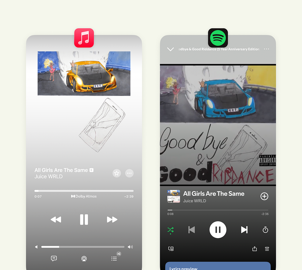
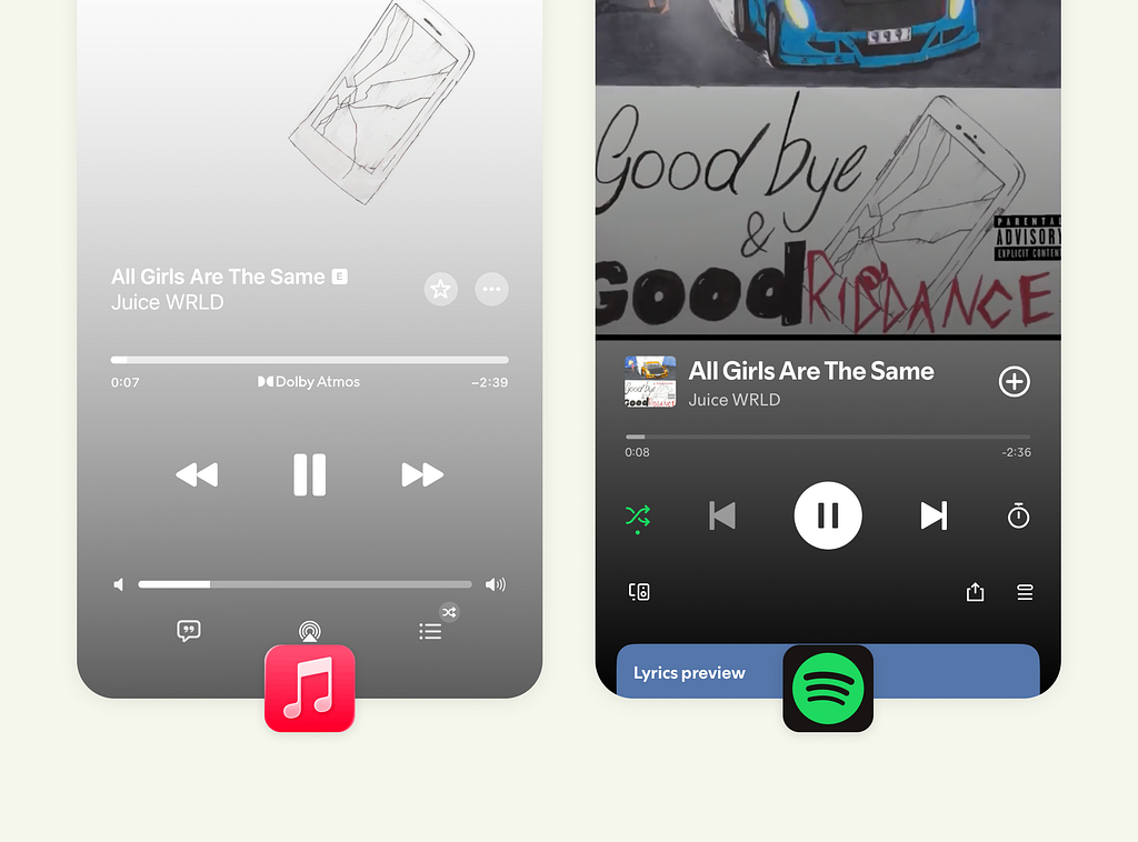
1. The Main Player Screen
Apple Music takes a calm, minimalist route. The interface feels almost meditative, spacious, centered, and distraction-free. But that visual stillness has trade-offs. The volume and track sliders look nearly identical, which could confuse new users. And given that most people adjust volume with physical buttons, that second slider arguably adds clutter.
Spotify, in contrast, embraces structure. You see controls, states, and feedback clearly. The higher contrast gives each element its own weight, especially in dark mode. It may not look as “clean” as Apple Music, but it feels more grounded in usability.
Apple optimizes for serenity. Spotify optimizes for control. Both are right, depending on what you value more in the listening moment.
2. The Lyrics (Song Caption) Screen
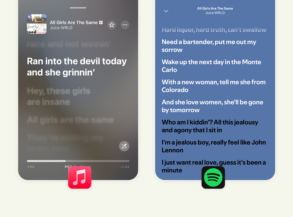
Apple’s lyric experience feels cinematic. Only the current line is highlighted, and the rest fades away softly. The typography is large and expressive, guiding attention exactly where it should be. It’s less about singing along and more about immersion.
Spotify’s lyric UI is more inclusive; it shows more lines at once so users can follow, anticipate, and join in. The trade-off? Slightly reduced focus. The smaller type and dense layout work for engagement but not necessarily for deep reading.
Apple makes lyrics feel emotional. Spotify makes them social. It’s a great example of designing for different listening intentions.
3. The Song Queue Experience
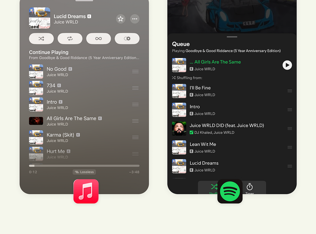
Apple keeps the queue directly on the same screen. You can view, reorder, or manage upcoming tracks without leaving the player. Controls for shuffle, repeat, and transitions are right where you expect them. It feels deliberate and stable.
Spotify moves the queue to a temporary bottom sheet, elegant in form, but fleeting in behavior. Once you close it, it’s gone, so managing the queue again means extra taps.
Apple favors persistence. Spotify favors flow. Apple gives control priority, while Spotify gives context priority.
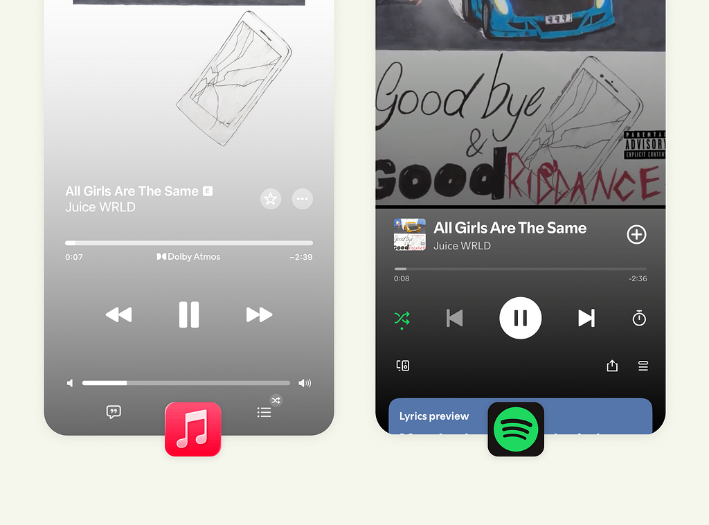
4. Song Info & Artist Context
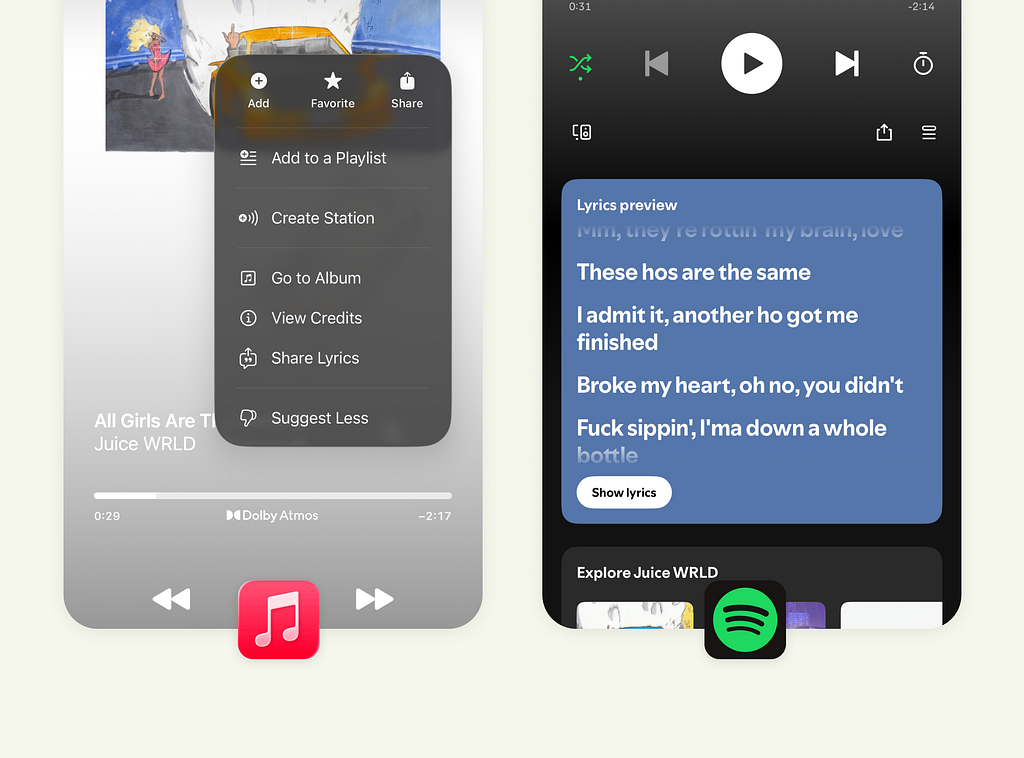
Apple hides song details behind the three-dot menu, which keeps the main screen spotless but hides discovery behind intent. It’s great for cleanliness, less so for curiosity.
Spotify does the opposite. Scroll down, and you instantly see lyrics, artist info, and related albums, everything connected to what you’re listening to. The scrolling feels natural, almost like an invitation to explore.
Apple designs for structure and hierarchy. Spotify designs for continuity and exploration.
5. The Overall Listening Experience
Apple Music is about calm focus. Every screen feels curated and controlled, ideal for those who want the app to disappear behind the music. But sometimes, it hides useful actions under menus or gestures that could have been surfaced more openly.
Spotify thrives on engagement. It feels more alive, sometimes a bit busy, but also more generous in how it shares information. You scroll, you tap, and the app keeps rewarding that curiosity.
Apple perfects stillness. Spotify perfects movement. Neither is wrong — they just reflect two different philosophies: refinement vs. rhythm.
Final Thought
As designers, this comparison reminds us that clarity and calm don’t always mean the same thing. Apple’s minimalism teaches restraint. Spotify’s density teaches responsiveness. Both are the result of intentional design trade-offs, not mistakes.
When designing products, it’s less about which path is “better” and more about which emotion or behavior you want to guide your users toward.
![]()
The Design Tug-of-War Between Apple Music and Spotify was originally published in UX Planet on Medium, where people are continuing the conversation by highlighting and responding to this story.