Introduction
Typography has come a long way since its inception, it’s an ever-evolving art form that has witnessed the creation of countless typefaces over the years, with designers and typographers continuously pushing the boundaries of creativity. Major typeface libraries such as Google Fonts, Adobe Fonts, and Monotype collectively host thousands of typefaces, which can be overwhelming, but amidst the vast sea of fonts available, these 8 typefaces have proven their mettle, standing tall as essential tools in every designer’s arsenal. From elegant classics that evoke the charm of classical literature to modern and versatile designs that embody progress and functionality, these fonts have captured the essence of typography’s rich history.
1. Garamond: The Reader’s Champion
Garamond, the creation of 16th-century French engraver Claude Garamond, was a game-changer in its time. This old-style serif font, designed to mimic handwritten calligraphy, revolutionized the printing process by being more legible and less space-consuming. Its low contrast and rounded shapes evoke a warm and inviting feeling, making it an evergreen choice for extended reading. It is the go-to choice for lengthy text that needs an elegant and warm touch.
![[Visual representation of Garamond, highlighting its elegance and warmth]](http://codetrait.com/wp-content/uploads/2024/06/12AyVIOwb_NMr1WvRhRLnUipg.png)
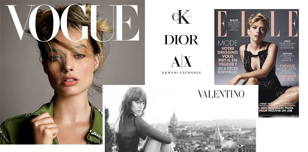
2. Bodoni: The Statement Maker
Next, let’s turn up the contrast with Bodoni. Giambattista Bodoni’s eponymous typeface, Bodoni, is a product of the late 18th century. This modern serif typeface isn’t shy, it was designed with a clear intention—to make a bold and luxurious statement. Its dramatic thick-thin contrast, sharp serifs, and captivating aesthetics set it apart and make it a perfect choice for high-end printing and striking logos.
Bodoni’s classic style has made it a popular choice in the world of advertising, lending its elegance to iconic logos such as Guerlain, Elizabeth Arden, Giorgio Armani, and the timeless “CK” for Calvin Klein. Renowned magazine publications, such as Harper’s Bazaar and the esteemed architecture magazine Metropolis, have embraced Bodoni as their go-to text font, adding a touch of sophistication to their pages. Notably, even Elle magazine has adopted Bodoni for its logos and titles, further exemplifying the font’s versatility and enduring appeal in the realm of design and typography.
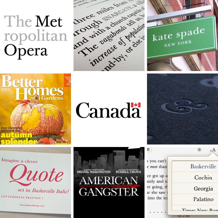
3. Baskerville: The Enlightened Serif
John Baskerville, an English businessman and type designer, crafted this typeface with the primary intention of improving upon the typography of his era. His focus was on refining every character for better readability and aesthetic beauty. The result was Baskerville, a transitional serif typeface known for its wide proportions, ample counters, and high contrast in strokes.
What makes Baskerville unique is its sharp, tapered edges, lending it an air of formality and sophistication. Its understated elegance, excellent readability, and old-world charm make it a preferred choice for classical literature and upscale brands. Whether you’re typesetting a classic novel or creating an identity for a luxury brand, Baskerville brings an undeniable touch of class and refinement.
Baskerville’s timeless appeal has been recognized by the digital age as well, with the creation of many modern revivals and variants, making it as relevant in 2023 as it was in the 1750s.
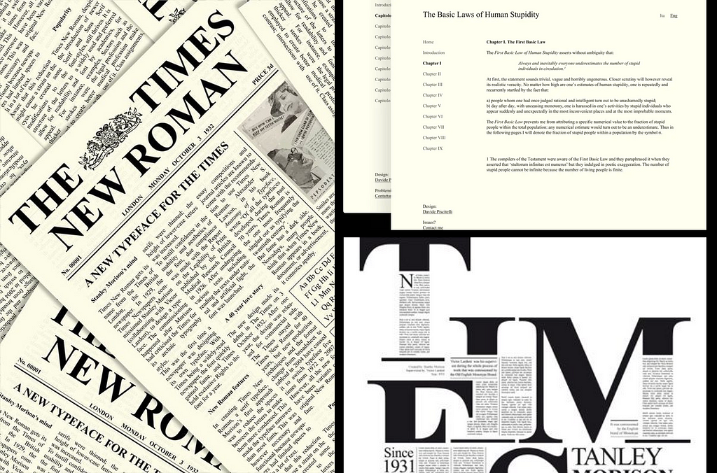
4. Times New Roman: The Global Citizen
Versatile and well-loved, Times New Roman is like the Swiss Army knife of fonts. Commissioned for The Times newspaper in 1931 by Stanley Morison, aiming for improved legibility within the constraints of narrow newspaper columns. This transition serif typeface is a perfect balance between classic design and practical readability, making it an ideal choice for a vast array of applications. Suitable for print and digital — Times New Roman has become synonymous with professionalism and tradition.
5. Century Expanded: The Reader’s Delight
Let’s widen our horizons with Century Expanded. Crafted by Morris Fuller Benton in the 20th century, this serif typeface, was purposefully designed to be more readable at small sizes in a dense text setting. Its expanded width and low stroke contrast, is a reader’s delight. Its legibility makes it a top choice for academic and editorial contexts.
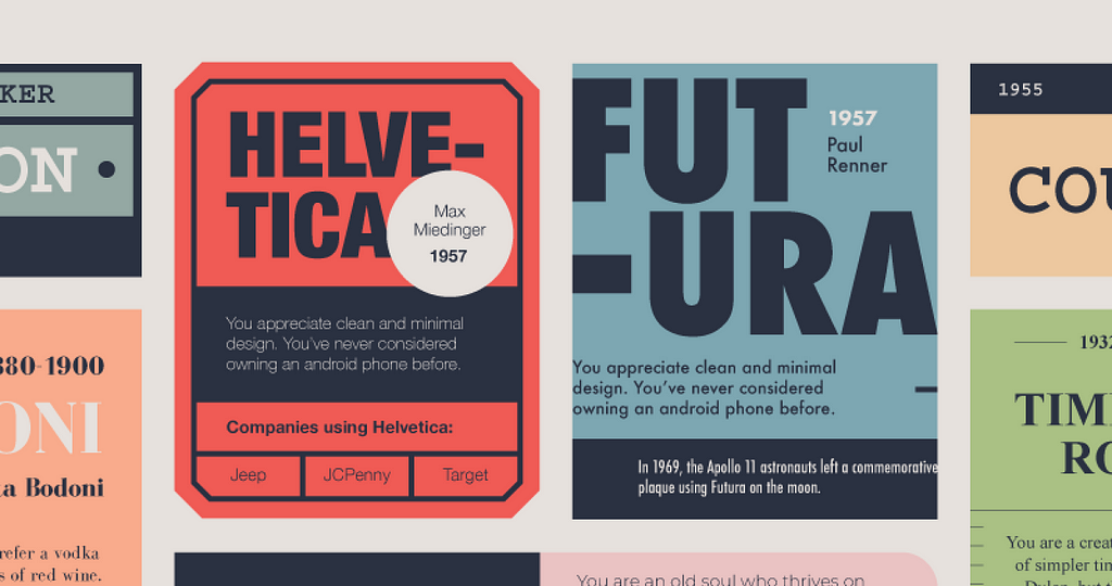
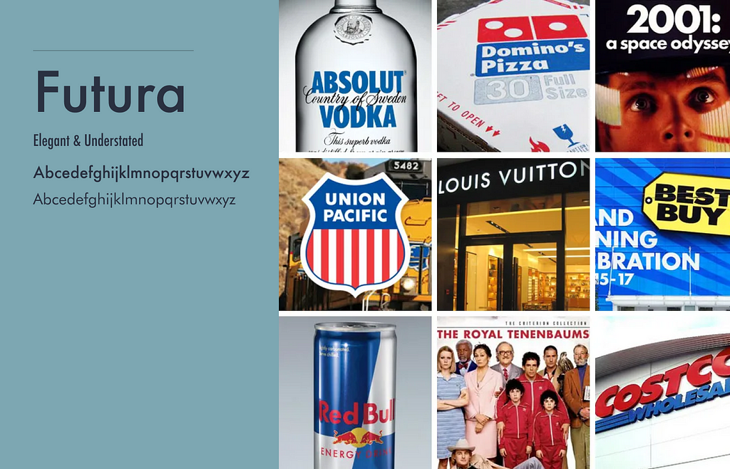
6. Futura: The Forward Thinker
Say hello to Futura, my personal favorite. Futura, Birthed by Paul Renner in the 1920s is a representative of the Bauhaus design movement’s ideologies, designed to celebrate the future. This geometric sans-serif typeface, with its even-weight strokes and round geometric shapes, radiates a sense of efficiency and modernity, perfect for brands with a forward-thinking ethos.
A fun fact for you: the Apollo 11 astronauts left a commemorative plaque on the moon in 1969. The text set in Futura
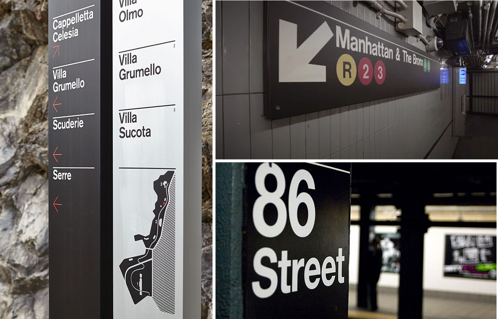
7. Helvetica: The Neutral Powerhouse
Up next is Helvetica, the typeface that loves to play it cool. Created by Max Miedinger in 1957, this neo-grotesque sans-serif is beloved for its neutrality and clarity. Its clean lines, minimal stroke contrast, and unassuming beauty allow it to convey a range of messages without stealing the spotlight, making it a universally applicable choice for signage and corporate communications.

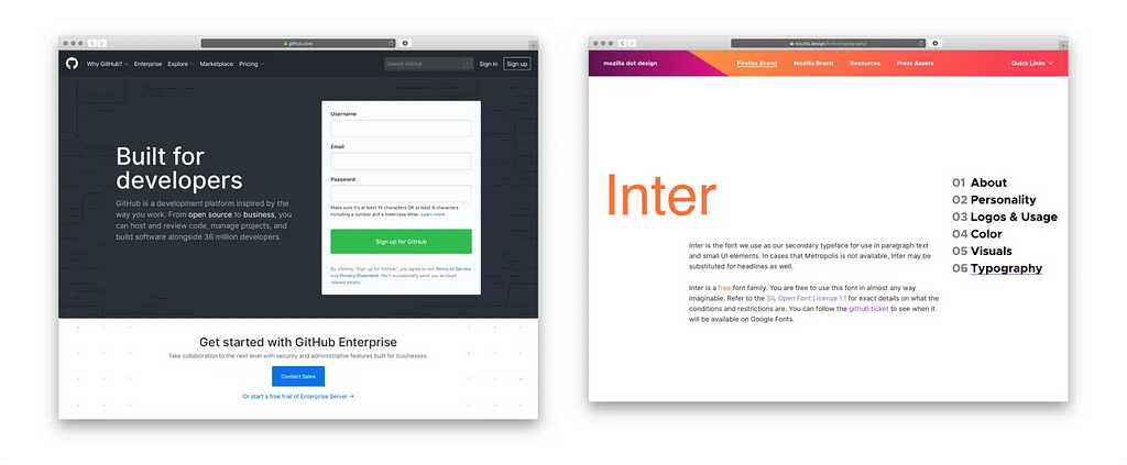
8. Inter: The Digital Prodigy
Moving into the realm of recent trends, Inter is making waves in the digital world. Created by Rasmus Andersson, a Swedish designer and software developer, Inter was initially designed for computer interfaces, hence the name. Intended to make small text legible, Inter focuses on improved readability in digital contexts. Its open apertures, tall x-height, and distinctive letterforms make it stand out, especially in UI design, where space is at a premium. Andersson’s meticulous consideration for digital legibility makes Inter an essential typeface for any digital designer in 2024.
Conclusion
So there you have it—the ‘Essential Eight’ typefaces of 2024. Each one is a product of its time, carrying its own historical significance, design ethos, and emotional resonance. From the time-honoured classics to the modern trendsetters, these typefaces are all you need to imbue life, depth, and character into your typographical projects. Dive in, start experimenting, and see the magic unfold!
![]()
The Only 8 Fonts You Will Ever Need was originally published in UX Planet on Medium, where people are continuing the conversation by highlighting and responding to this story.