A Blueprint for Developing a Bulletproof Cross-Organizational Language Alignment UI Manual
By Liran Elboym and Mollye Oze Halickman, on behalf of HP Indigo’s UX team
TL;DR
In order to create strong UX microcopy, it’s essential to fine tune your Tone and Voice. Keeping your own cohesive Tone and Voice manual will help keep track of all your rules as well as your Tone and Voice roadmap, so that every writer (and perhaps an AI assistant) knows how to maintain consistency and always sound user-centered and on-brand. That’s exactly what we did at HP Indigo for our recent flagship Series 6 printing presses. This article provides incredible detail into how every aspect of our Tone and Voice was established: Our Tone and Voice approach, a list of guidelines and unique categories that keep track of them, repeated textual patterns in a multitude of categories, capitalization rules, reserved words, terms and abbreviations, and units and measurements. We explain how we categorized our rules and built a manual that can actually be integrated into a company and become a go-to tool for consistent word and phrasing choice. This is not an easy read, but for those interested in diving deep into how to create a comprehensive Tone and Voice manual. Save this for the right mindset — it will be worth it.
Introduction
Before we start, Liran has a confession to make. Despite being in the design system field for the past fifteen years — intensively working on all aspects of design from creation, maintenance and implementation, to training, consulting and more — he’s never once written a chapter dedicated to Tone and Voice. He’s always known it was necessary, as he talked quite confidently about it whenever asked, but the truth is–he’s just never done it.
Until now. The UX team for Series 6, led by Liran, finally had the long-awaited opportunity. Even at HP, although it has its own writing style guide, it was never customized to accommodate UX writing specifically for Indigo’s presses. The Tone and Voice manual we will introduce in this article complements the general guidelines, and we’re proud to say that it’s probably one of the most detailed, comprehensive, and thorough Tone and Voice documents in the industry.
In the following post, we will share how to build a Tone and Voice manual to match your own brand voice, one that you can actually integrate into your own company and make your go-to tool for consistent word and phrasing choice. To do that, you would need to include the following chapters:
1. Tone and Voice approach
2. General guidelines
3. Sentence patterns
4. Capitalization
5. Reserved words
6. Terms and abbreviation
7. Units and measurements
Let’s dive in.
1. Tone and Voice Approach
The first part of writing such a document is setting a brand Tone and Voice that clearly defines you. The fun part about this is that there’s room to ask yourself, how do you want to be thought of? We asked ourselves lots of questions: Did we want to be more matter-of-fact or enthusiastic (more matter-of-fact), more serious or funny (more serious), more formal or casual (you can see where this is going). That doesn’t mean you really have to choose sides — we broke our own pattern on the spectrum of supportive vs. unsupportive and decided to go middle of the road. For us this means supplying more information to the user about how to solve issues, but not necessarily their causes if they aren’t specifically requested.
In case you were wondering, these axes were not selected by chance — these were the parameters we thought matched our product and our users, who are professionals operating large printing presses that require close attention in a complex work environment.
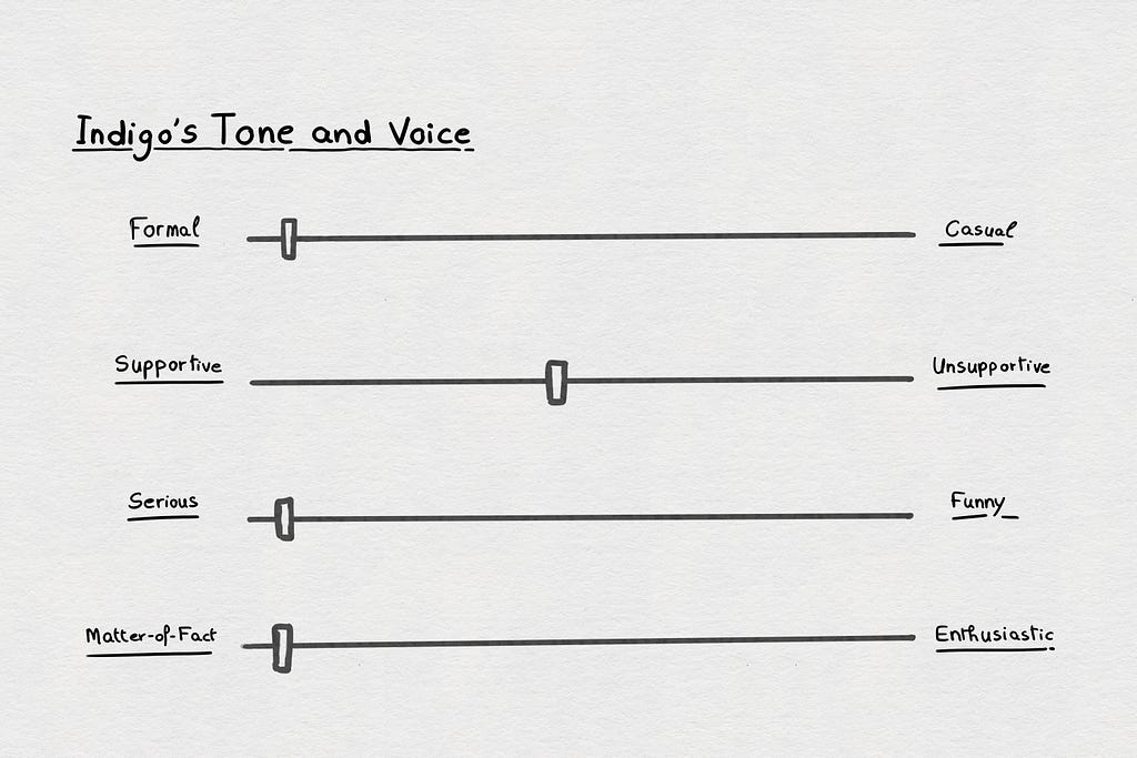
Choosing these four parameters helped really nail ourselves down on our Tone and Voice approach. Thanks to this, users can identify us as more impersonal and less emotional, which is where we now know we want to be.
Still, this might not be you. You may need your users to laugh when they go to your website. You may need your users to find respect and solemnity when glancing at your system. The important part is that your Tone and Voice should be consistent and convey the personality of your product.
If you have already started writing texts in your interface that you feel do represent your brand’s ideal voice well, as was the case with us, begin by reviewing them and identify where they are located on each of the above spectrums. It will likely give you a good idea of where you are, and where you want to be.
Sometimes it’s not that easy to land exactly where you want to be. We considered a voice that gave lots of support, and ultimately decided to avoid overloading information. We wouldn’t have found that balance if we hadn’t found our four axes and selected a comfortable place for us on each spectrum. Once you do that, your stylistic choices can fall into place much more easily than with only a general idea for reference.
2. General Guidelines
Rules. This may have been what you were expecting from the beginning; a list of generic rules for you to stick to throughout your writing. Guess what — that’s not what this is. Just like every brand has their own unique voice differentiating them from others, you’ll have to have your own guidelines to match that. However, what we can tell you is how we did it.
Our general guidelines are divided into a list of categories we wanted to explore. Follow along and examine the categories that stuck out to us as the UX writing essentials needing consistent guidelines throughout our UI.
2.1 Syntax and Punctuation
This section is devoted to listing grammatical rules we felt were important to remind those who write microcopy to follow. If your team includes designers/product experts contributing texts who are non-native English speakers, you can probably relate to that reasoning. But even if your team is in an English-speaking country, this section can still be of use to you. Although the rules of grammar are strict and unwavering, there are good reasons not to always follow them and even add some of your own. Therefore, this section can also be for tracking grammatical rules you choose not to take as gospel in your interface.
Take Lisa Simpson for example. In a famous episode of The Simpsons, Lisa built her own robot to correct her grammar. However, the experience quickly turned from insightful to exasperating as it nitpicked her every word. When she mumbled a sentence fragment to herself, the robot criticized her by saying “sentence fragment.” However, as Lisa frustratingly pointed out, “‘Sentence fragment’ is also a sentence fragment!” Lisa was onto something; sometimes fragments are essential to properly convey a message. Lisa’s conclusion can also apply to you; not only can you use sentence fragments, when it comes to your user interface, you’re even expected to deviate from grammatically correct language to convey a clear and concise message. If there are grammatical guidelines that you decide to take liberties with, this is the place to keep track and point out where you are flexible and where you are uncompromising.
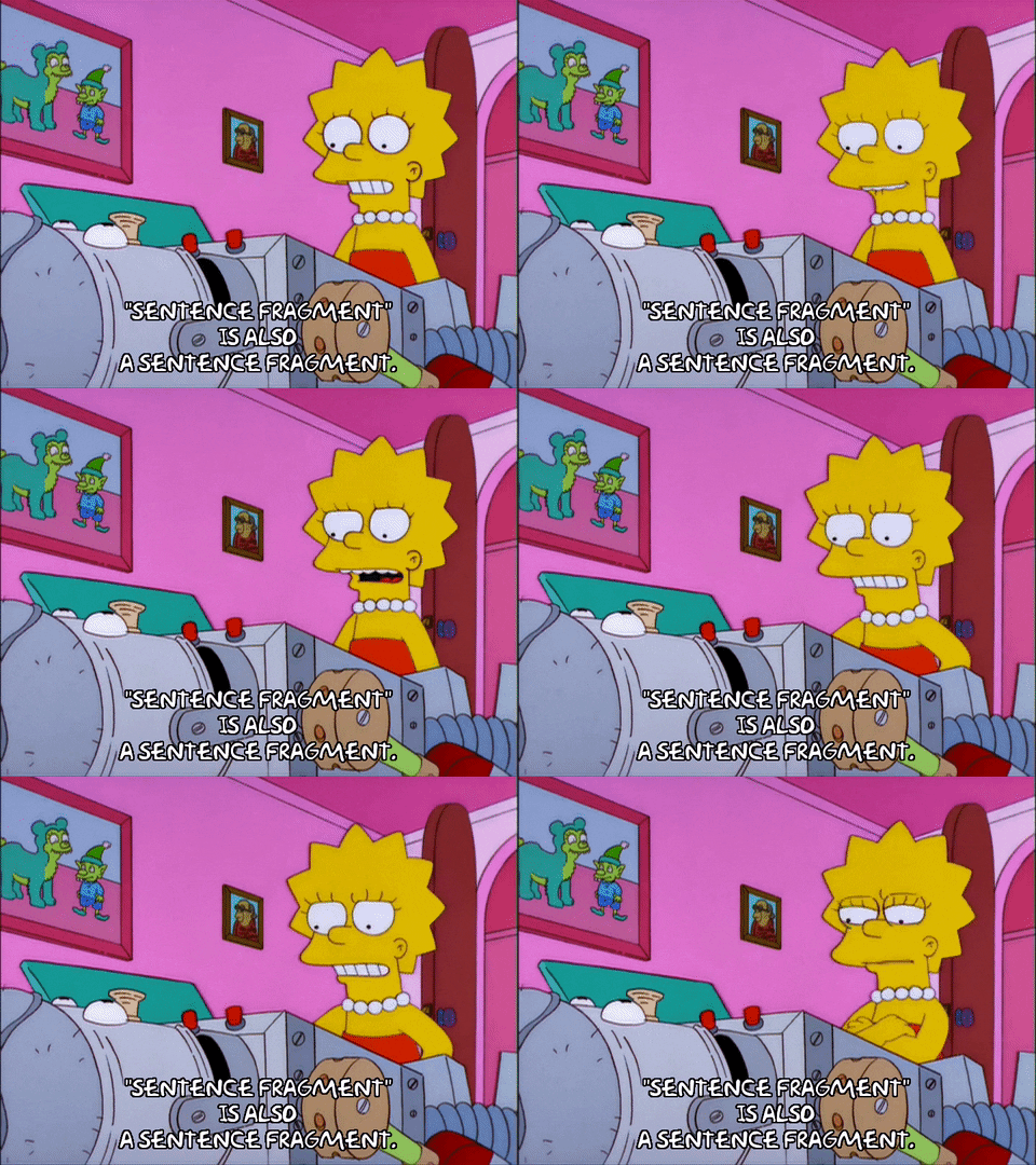
You would probably agree that, for instance, shortening unnecessarily long sentences with sentence fragments can get the job done just as well. For example, when instructing a user to “Insert S/N” or when there is an “Invalid password”. When it is better for the microcopy to be as short and concise as possible, that takes precedence over writing a full sentence.
This principle goes beyond fragments — we use it to bend other rules as well, like with the use of the word “the”. As we know, a more conventional text would use “the” whenever introducing proper nouns. However, we decided that since this would make our writing less concise, it should not be prioritized in our texts and be removed when seen fit. Therefore, we made a list of rules regarding “the”: In titles, we omit it completely, in full sentences we use it always, and for statements (such as our often-used sentence fragments) and instructions-we only use it when absolutely grammatically necessary for the context to make sense. For example, we would not have the title “Cancel the Blanket Replacement”, but we would have “Cancel Blanket Replacement”. As an instruction, the fragment “Load new roll and close the door” works, because “new roll” is easily understandable without “the,” while “close door” wouldn’t hit the mark.
We also wanted to point out our unique rules regarding punctuation, which we chose to construct despite their deviation from the correct sentencing guidelines of English grammar. Remember, we’re not writing books or dictionaries, we’re creating a UI–and with that comes the freedom to occasionally diverge from grammatical conventions. Despite the difficulties with navigating spellcheck as it flags correct sentences as wrong simply because we did not end our sentence with a period, it is so necessary for us to have our own unique style and always follow it. This is our rule:
When there is a period within notifications (two sentences or more), the last sentence ends with a period. Otherwise — no period (including when there is other punctuation).
For example:
“If ignored, job will be printed on substrate” — Correct
“Turn the power off. Restart after 10 seconds.” — Also correct
Now that we’re done with the free rein provided to us by Lisa Simpson, we actually do intend to follow many of the official rules of grammar and syntax. Here is an example of a guideline belonging in syntax that we want to ensure anyone writing texts, potentially including contributors that are non UX Writers or even native-English speakers:
Adjectives should appear in a specific order and always before nouns:
Opinion-size-age-shape-color-origin-material-purpose + Noun.
Did you know that the English language has an order of which words come first? As English speakers, this is something that has likely never occurred to you, but at the same time you would be baffled at the phrasing “glass clear” instead of “clear glass”. This is because there is indeed a correct order for the placement of adjectives in a proper, grammatically correct sentence.
To flesh out our examples, we noted the correct and incorrect statements as well. See how we showed this here:
“White wood table” — color before material (correct)
“Wood white table” — material before color (incorrect)
This rule is so important to follow, yet so easy to overlook. This is what’s important to include here; rules that are important for you and your brand but at the same time, are easily forgotten.
2.2 Style
This section doesn’t, and shouldn’t, have anything to do with correct grammar. This is the place where we made our stylistic choices, choosing from two completely acceptable options, but only one could be chosen to express our desired user experience through proper word choice and phrasing.
The questions you should be asking when writing this section are how do you want to address the user? Are you using higher or lower diction? Do you use a certain dialect? Your approach to your Tone and Voice will be significant in crafting your stylistic guidelines.

As you may remember, our approach is more formal than lighthearted, and our style had to reflect that. See the below example of how we address our users to see what we mean:
Active voice should be used when the focus is on the person performing the action (the user). Therefore, active voice should be used when giving the user instructions they need to perform.
For example: “Open the door”. These are the times we wanted to center the user as they are required to act. Otherwise, we opted for this approach:
When informing the user of actions being performed (with the focus not on the user), use passive voice.
We even wanted to take it a step further and be very specific in how we address the user, so we added:
When using passive voice, avoid speaking directly to the user with pronouns such as “you”/“yours”. Instead, refer to the user indirectly.
For example: “Process cannot be performed while press is printing”.
While this may make sense, it still could have gone completely different. We could have written the instruction as “the door needs to be opened”, or the notification as “as long as you are printing, the process can’t be performed”. It all works just fine — just not for us.
Another thing we paid stylistic attention to was our popup titles. Popups are a great way for our product to convey important messages to users, so we needed to ensure they have their own dominant and recognizable textual guidelines. We have three important parts to this:
- Popup titles are written in upper case letters
- Popup titles are written with a component name first and then an adverb — they are not phrased as instructions
- Popup titles are written in the singular form, even when there are multiple steps to the action that need to be done
An example of a popup title: “DOOR CLEANING”, not “CLEAN DOOR”, or “CLEAN DOORS”, even when there may be multiple doors needing cleaning as part of the task. We chose to put more of a focus on the stylistic sound of the title, making sure it sounds good, rather than aiming for 100% accuracy.
2.3 Numerals
Yes, even numbers deserve their own section. We have to admit, we almost skipped over this ourselves. What could be important about numerals? It turns out, there are lots of valid ways to write numerals. Without keeping track, each writer could end up writing numerals completely differently
There were a few rules in this category, but this is the most important one:
Numerals are written as digits, not in words.
That means we will write “7 cycles” instead of “seven cycles”. Sounds simple? You may be surprised by how passionate writers feel about this choice one way or another. This is a subject long debated in the world of English writing, and as such the perfect opportunity to make your own rules, even if they deviate from someone else’s.
2.4 Glossary, Special Words, and Characters
This is not where we tell you to use some words over others. Do you remember the questions we asked about style regarding diction and dialect? Unfortunately, those answers alone aren’t enough. There is a world of options within these choices, as we discovered when we tried to remain consistent with certain word choices. See some examples of how we did this.
HP Indigo’s products are large printing presses, and they constantly have processes that are under way. Having one word that we can use to define their progress gives the user familiarity every time a process begins. This is why these word choices matter to us. One thing we did is deliberate between using “in progress,” and “ongoing”.
You may be asking yourself, “don’t they mean the same thing”? When it comes to synonyms, the common assumption is that the numerous synonyms are all different ways of writing words with identical meanings, but when mulling over each one, you see the small nuances can make a difference. Therefore, choosing “in progress” over “ongoing” was more significant than meets the eye. While “in progress” refers to something currently happening, “ongoing” can be something that has been going, and will continue going, for a long time.
You obviously don’t have to do this with every synonym in the English language. Just like the above example worked for processes that occur constantly in our product, your choice of words will relate to describing situations that occur most often for you.
2.5 Dos and Don’ts
Unfortunately, in large companies such as ours, it’s almost impossible to give every piece of text to a UX Writer to review — but we still have to ensure texts that are not in our control (such as messages) will be written in the best way possible. Along with the various rules we’ve created for non UX Writers contributing texts, such as the correct grammatical rules we shared in the Syntax and Punctuation section, we made a list of dos and don’ts as general guidelines for these professionals.
Dos:
· Use active voice in messages
· If possible, connect clauses to one sentence
This is how the following sentence —
“The 1mm feeler gauge should be inserted between the sensor and its flag. Then the sensor and the limiter bracket should be released (P1 — pin A1, wiring — page 88)” —
Became this:
“Insert 1mm feeler gauge between the sensor and its flag and release the sensor/limiter bracket”.
Don’ts:
· Don’t use “please”
· Don’t pass blame to the user
· Don’t use “simply” and presume something is simple for the user
This is how the following sentence —
“The problem is simply that you have probably disconnected the P1 connector. Please verify that the P1 connector in the related BID HV board is actually connected.” —
Became this:
“Verify P1 connector in the related BID HV board is properly connected”.
This list as well as additional guidelines that describe elements in writing messages have helped us align pieces of text that may be overlooked. With this we’re able to slightly better control the content of error messages that are written by others.
3. Sentence Patterns
Now that we’ve presented our rules, it’s time to talk patterns. Like many of you, we’ve been writing UX texts for a long time before sitting down to make our Tone and Voice document, and therefore we already knew which text segments we wanted repeated throughout certain contexts in our interface. We wanted these text segments to always have the same structure, and the same phrasing. We called them “text patterns”.
This is an example of what a pattern template would look like:
Pattern name: Maximum characters in field
Pattern description: Maximum number of characters in fields that only include digits
Applies to: Number fields
Structure: Maximum [maximum number] characters allowed
Example: Maximum 46 characters allowed
We occasionally included variations as well, which are patterns similar enough but with slight changes due to distinct circumstances that require both patterns being present.
Variation structure: Maximum [maximum number value]
Variation example: Maximum 650ml
Let’s explore some of our categories with select pattern examples.
3.1 Buttons
Since buttons are repeated throughout interfaces, it is important to define how the button descriptions should be formatted in any use case. One example of how we did this is by defining the labels on confirmation buttons. There are multiple options that are possible here, “confirm”/”yes”/”no”/”cancel” and so many more. While a few variations are required to cover all the different scenarios, here is a default button label pattern:
Pattern name: Confirmation button label
Pattern description: Confirmation button for confirmation messages (when the question does not include “cancel”)
Applies to: System messages
Structure: [Action]/Cancel
Example: Restore/Cancel
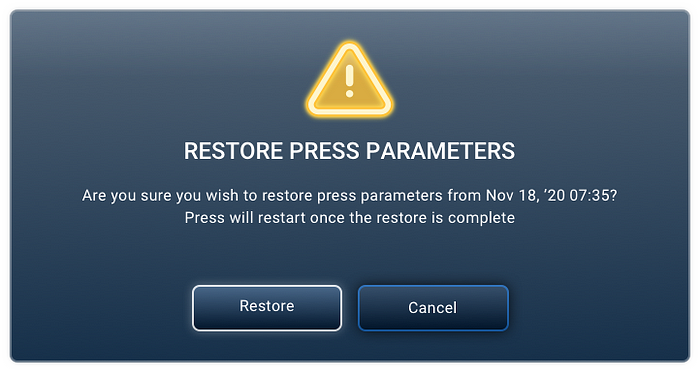
This way we ensure that button labeling in messages will always be consistent throughout the system.
3.2 Instructions
This is not a button description, but rather an instruction for the user to use a button to trigger an action.
Pattern name: Tap for action
Pattern description: When a button is needed to trigger an action
Applies to: Process instructions
Structure: Tap [Action] to [process verb] [(the) subject]
Example: Tap Run to rotate the tube
3.3 Statements
Like instructions, there are a variety of possible statements throughout our interface, making this an essential category as well.
Pattern name: Date label meaning
Pattern description: Describing the meaning of the date label
Applies to: Instances of the same component
Structure: Previous [process] date is noted under each [component]
Example: Previous calibration date is noted under each station
See the following example for another statement pattern:
Pattern name: Estimated time action takes
Pattern description: Informing the user when actions will not be immediate with specific estimation
Applies to: Action buttons
Structure: This takes about [number] [minute(s)/second(s)]
Example: This takes about 1 minute
There are many more examples for time related patterns — make sure you identify them and address them all.
4. Capitalization
Capitalization rules can affect so many things throughout your interface. How do you write titles? How do you reference menu items? How do you write button labels? What about column titles? Field labels? Values in fields? Maybe you don’t even want to use capitalization?
When we wrote our capitalization category, we wanted to stay close to grammatical conventions, so we focused on three types of common capitalization: Title case (the first letter of every word is capitalized — besides noted exceptions), sentence case (capitalize only the first word of the sentence and the proper nouns), and upper case (every letter is capitalized). Next, we defined which textual elements will be written each way:
Upper case: Popup titles
Title case: Buttons, labels, message titles, subtitles, column titles, terms
Sentence case: Instructions and statements, wizard steps, field validations, values in fields
We’ve of course found some exceptions. If you’re following the grammatical rules of the English language, then you’ll know that some words will not be capitalized even in title case. If your writers are prone to forget this, it might be helpful to attach a list of prepositions that are exceptions such as “in”, “on”, “at”, and “to”. We took this a step further by also adding a list of words many non-native speakers think are exceptions but are actually not, and in fact should be capitalized (such as “from”, “between”, “among”, “was”, and “is”). Whatever rules you’re following, make sure there’s no room for your writers to misunderstand.
5. Reserved Words
Since you’ve defined which words to use over others, why do you need reserved words? This really comes into play when you have two words that are completely valid, but not at the same time. One word is reserved for one circumstance, and the second for another.
Here’s an example from us:
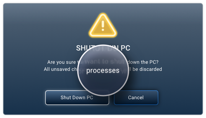
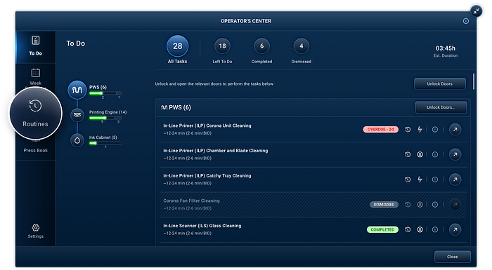
“Process” and “Routine” are both valid words in our system, but they should not be confused with one another. One could think that because these sound like they have identical functions they are truly interchangeable, but we wanted to define a unique purpose to each word (see the visual examples of how they are used above). “Process” is a structured (not necessarily linear) course of action that is presented inside a popup. However, a “Routine” is a type of process, but specifically one that is associated with scheduled or planned press triggers.
6. Terms and Abbreviations
We defined three categories within abbreviations: Terms that are always abbreviated, terms that are abbreviated except for their first appearance, and terms that are never abbreviated. This made us look back at the many different forms of abbreviations used by HP Indigo, determining which ones had more of an internal focus and which ones would always be recognizable for the user. It also meant defining words that we would never abbreviate as part of our interface, even though they were external to our organization and potentially familiar to the user.
For example, a term we always decided to abbreviate is “serial number,” which we’ve chosen to write as “S/N”. A term we write out in full initially is “High Voltage Board,” which we first write as “High Voltage (HV) Board,” and later will write as “HV Board.” A term which we decided not to abbreviate is “Cleaning Station,” which some thought to abbreviate as “CS”.
7. Units and Measurements
After all these guidelines, how can you still be missing more categories? Don’t worry, we reached the end.
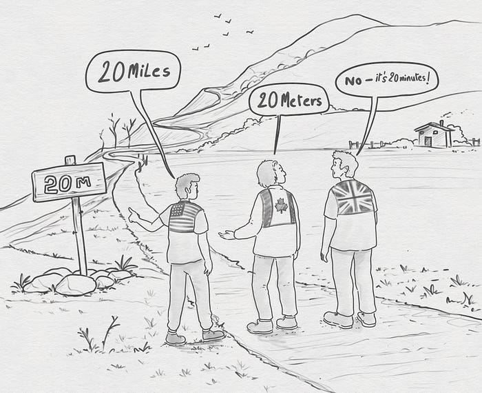
Determining the right way to write different types of units and measurements is a question of style as well as attention to the user’s knowledge and understanding. These questions range from writing “seconds” (“seconds”, “sec”, or both in different circumstances), to “meters” (“meters”, “m”, and how do you even keep that from getting confused with “m” for “minutes”?) Do you always write the full word? Are there instances where you shorten the word? Do you always shorten the word? We’ve chosen to shorten all our measurements, with “m” for “meter” and “L” for “liter”. This works with professional terms too, such as “Rounds Per Minute” becoming “rpm” and “Optical Density” becoming “OD”, as long as they don’t contradict industry standards.
Looking Ahead
In the section discussing Syntax and Grammar, we mentioned Lisa Simpson’s grammar correcting robot. This episode of The Simpsons aired in 2001, when such a thing was science fiction. However, this is no longer the case. With the rise of AI, writing is a whole different ball game, and technical tools now exist to correct a writer’s grammar. Today’s AI is even more sophisticated than Lisa’s robot. AI tools are now allowing you to implement your own Tone and Voice and will review and generate texts accordingly. For us this means that today, it’s even more important to document tone and voice decisions to achieve maximum consistency across our products, that will be inserted into our future textual AI assistant (don’t worry, it’s coming soon).

Linguo is real with the magic of AI
This is also our advice to you. Only by keeping track of important words, phrases, rules, patterns, and guidelines for your interface will you be able to achieve exceptional microcopy — especially in the era of AI. A Tone and Voice manual will assist writers, and their AI tools, to implement their brand voice, letting sentence fragments pass through even though they don’t match grammatical standards. It is important that both human writers and technology understand these rules, in order to have a full picture of your Tone and Voice when writing microcopy. With your own style guide, your Tone and Voice will never be left behind, and even AI will be left without words.
Liran is a UX Architect, manager and design systems thought leader. He’s managed UX groups for the past 20 years, and helps companies establish and maintain viable design systems. Contact him at liran.elboym@hp.com.
Mollye is a UX Writer. Holding a degree in English Literature and History, she is an avid reader and a self-proclaimed grammar nerd. Contact her at mollye.oze.halickman@hp.com.
Tone and Voice How-To Guide By HP Indigo was originally published in UX Planet on Medium, where people are continuing the conversation by highlighting and responding to this story.