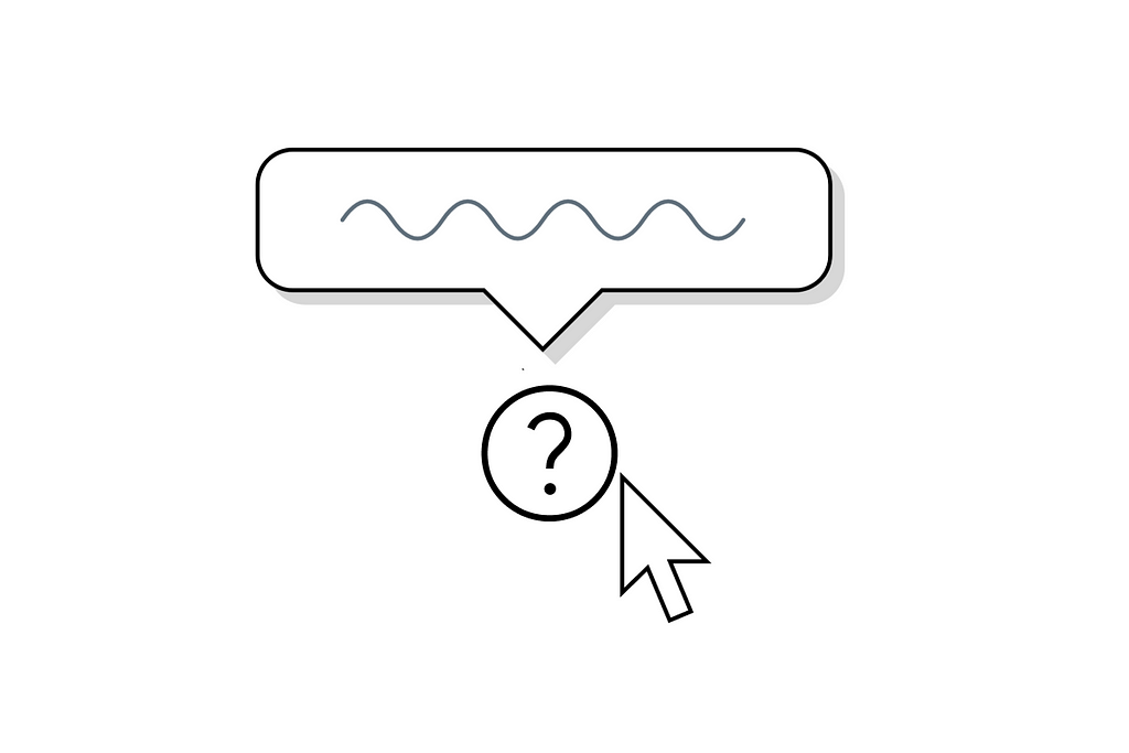
A tooltip is a small box of explanatory text that appears on the screen when a user hovers over an icon. Despite their small size, tooltips play an important role in creating great UX.
The purpose of tooltips
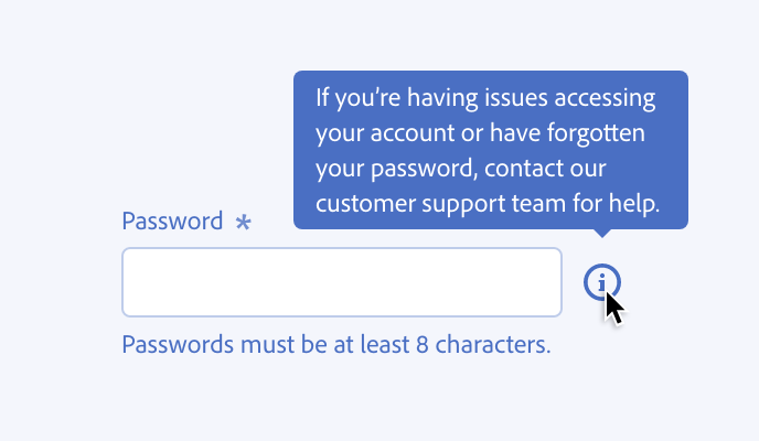
Tooltips exist to provide additional context and guidance to users as they navigate an interface. They can:
Explain an unfamiliar icon, field name, or function


Offer instructions on how to complete a task
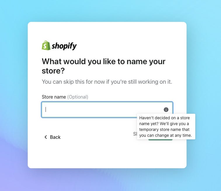
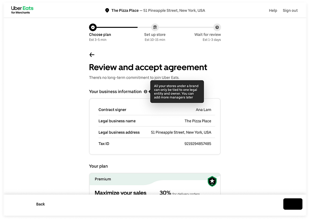
Provide additional helpful information

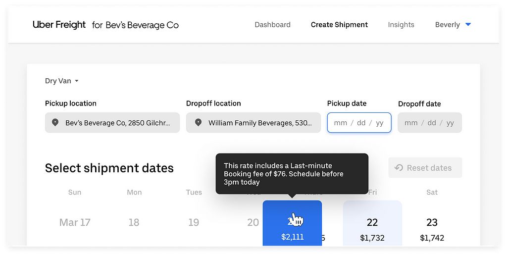
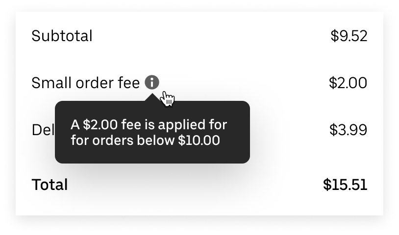
Educate users on how to use the product more effectively

Reassure users
How to design tooltip
Here is a quick tutorial on how to design interactive tooltip in Figma.
Interaction behavior
Tooltips should have a 300ms entry delay when hovering over an object with a mouse, and they should disappear after 1 second.
Placement
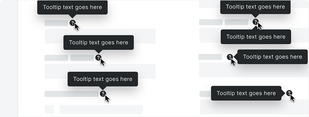
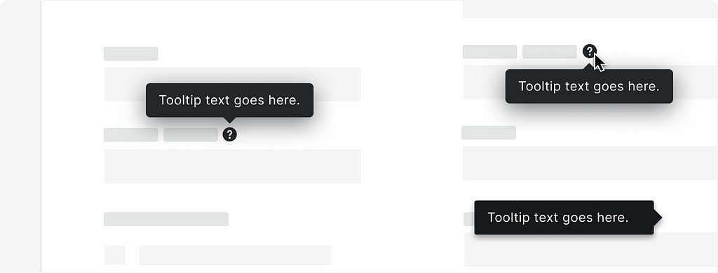
Tooltips can appear above, below, and to each side of the UI element depending on screen real estate and intent.
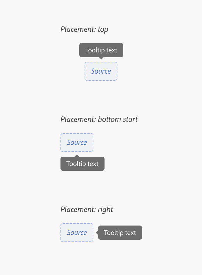
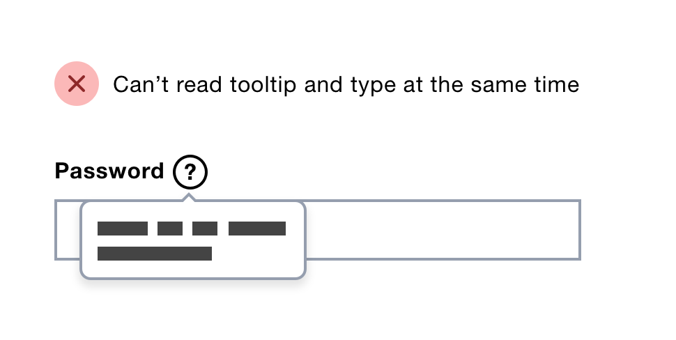
When placing a tooltip, ensure it doesn’t overlap the UI element that the user currently interacts with.
Design recommendations
Use tooltips sparingly
Too many tooltips can overwhelm users. If you’re building something that requires a lot of tooltips, work on clarifying the design and the language in the experience.
Prioritize explanations for complex, high-risk, or frequently misunderstood items.
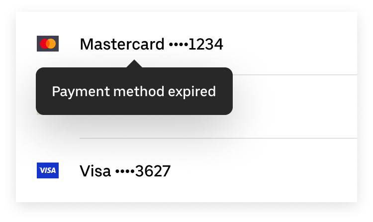
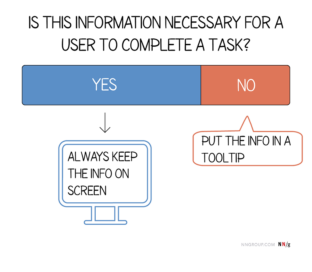
Don’t use tooltip to communicate critical information
Don’t use a tooltip to convey critical information (like your “payment method expired”).
Use tooltips to provide useful additional information or clarification.
Succinctly describe or expand on the element they point to
Tooltip text should be clear, succinct, and scannable. Use plain language and get straight to the point (explain what the user needs to know in as few words as possible). Aim for a character count limit of 20, which is between 2 and 5 words with spaces included.

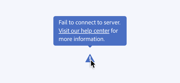
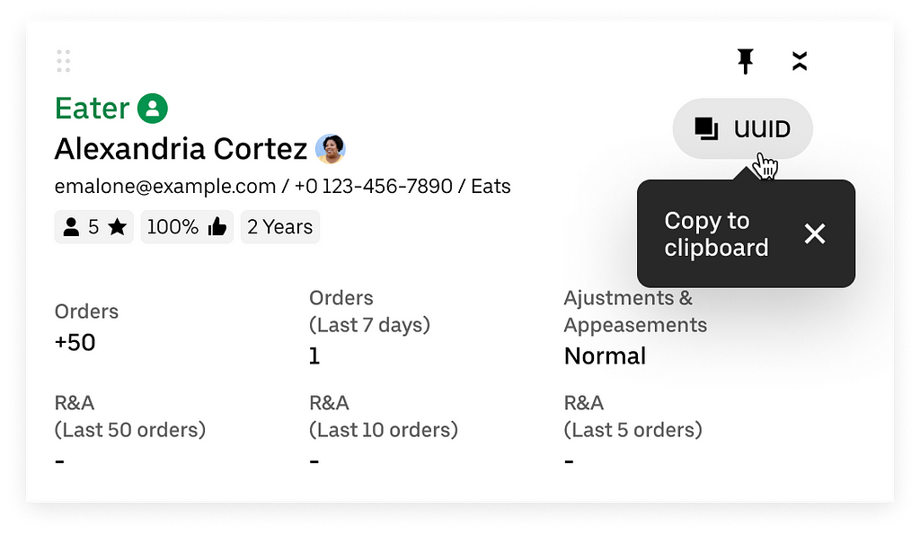
Don’t add any interactive elements in a tooltip
Tooltips appear only on hover or when in keyboard focus; when the focus switches to the other element, the tooltip disappears. For that reason, they shouldn’t contain any links or buttons.
Keyboard accessible tooltips
Tooltips must be accessible via keyboard navigation and screen readers.
Keyboard interaction
- Tab: Move focus on the trigger and open the tooltip.
- Esc: Close the tooltip
Want To Master Product Design?
Try Interaction Design Foundation. It offers online design courses that cover the entire spectrum of product design, from foundational to advanced level.
This post contains affiliate link(s)
Tooltip: A small design element with a big UX impact was originally published in UX Planet on Medium, where people are continuing the conversation by highlighting and responding to this story.