When it comes to design systems, opinions vary widely. Some perspectives are controversial, while others are staunchly in favor of these systems. You’ll often see job postings that demand knowledge of maintaining or creating a design system from scratch, even if you’re applying as a junior designer… While I won’t dig into the sometimes unrealistic expectations of hiring managers, it’s clear that if you consider yourself a UX designer, familiarity with design systems is expected to some degree. Chances are, you’ve at least heard of major players in the field like Material Design, Atlassian, Microsoft Fluent, Carbon, and Adobe Spectrum, among others.
Quickly, what’s a design system?
A design system is a comprehensive set of guidelines, principles, and standards for design and code, along with a collection of reusable components and patterns. It encompasses a wide range of elements, including UI components, design principles, typography, color schemes, icons, and even voice and tone for written content. A design system is not just a collection of assets but also includes
The rules and rationale behind their use, ensuring consistency and efficiency across a product or brand.
It’s like the overarching blueprint for a brand’s or product’s design and development.
So, what’s a UI Kit then?
Imagine you have a big box of Lego blocks. Your design system is like the instruction manual that tells you how to build different things with those blocks. It shows you what colors to use, how to make things look nice together, and even how to make sure your buildings are strong.
Now, think of your UI kit as a smaller box of Lego blocks that are already put together into small parts, like a door, a window, or a wheel. You can use these parts to build things faster because you don’t have to start from scratch.
So, it’s a subset of a design system —
A collection of reusable UI elements, such as buttons, input fields, checkboxes, and sliders, that are designed to be consistent with the overall design language of the product or brand.
A UI kit typically includes visual assets and sometimes code snippets that can be used to quickly build interfaces. It focuses more on the visual and interactive components of the design and is often used by designers and developers as a toolkit to create consistent UIs.
This article introduces several UI kits in Figma that I’ve found incredibly useful. Whether you’re looking to audit and update your existing design system based on new guidelines or aiming to build your own from scratch, these kits can serve as excellent examples. They provide insights into the essential components that might be necessary for your brand, offering a practical framework to guide your design process. By exploring these UI kits, you can gain a better understanding of how to construct a cohesive and effective design system tailored to your brand’s needs.
❖ Untitled UI — FREE Figma UI kit and design system v2.0
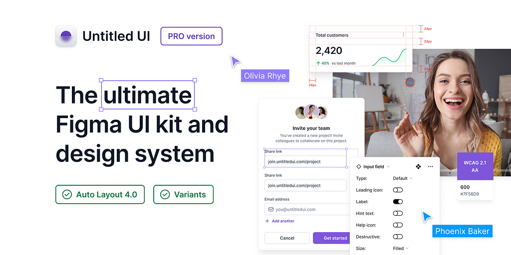
I can honestly say that this system has taught me a lot about how to create various components, more effectively than any other tool. It’s a great resource for learning how to use different UI components, how to start from scratch, and what you might need. If you’re studying and need it for personal use, you can simply edit your own brand, duplicate the design, and start not from scratch, but by just changing variables for your personal projects. If you’re planning to buy it exclusively, even better, you won’t need to worry about starting everything from scratch but can use it as your foundation and modify it accordingly.
As the authors mentioned: This project was born out of necessity after experiencing shortcomings with existing Figma UI kits, which often lacked in size, flexibility, or quality. Our goal was to create an “ultimate starter” kit for new freelance projects and design systems, eliminating the need to start from scratch each time and the repetitive task of rebuilding common components.
What you can do:
- Duplicate your copy of Untitled UI.
- Swap out your branding elements such as logo, color styles, and typeface.
- Utilize pre-built sections and page examples for design and iteration.
- Delete any unnecessary parts or components once finished.
The Untitled UI team continuously updates the kit, incorporating Figma’s latest features like color variables and Auto Layout 5.0. They’ve also released Untitled UI PRO LITE, a lighter, faster version ideal for smaller projects, included for free. For a quick overview, check out the 60-second summary.
Disy Design System
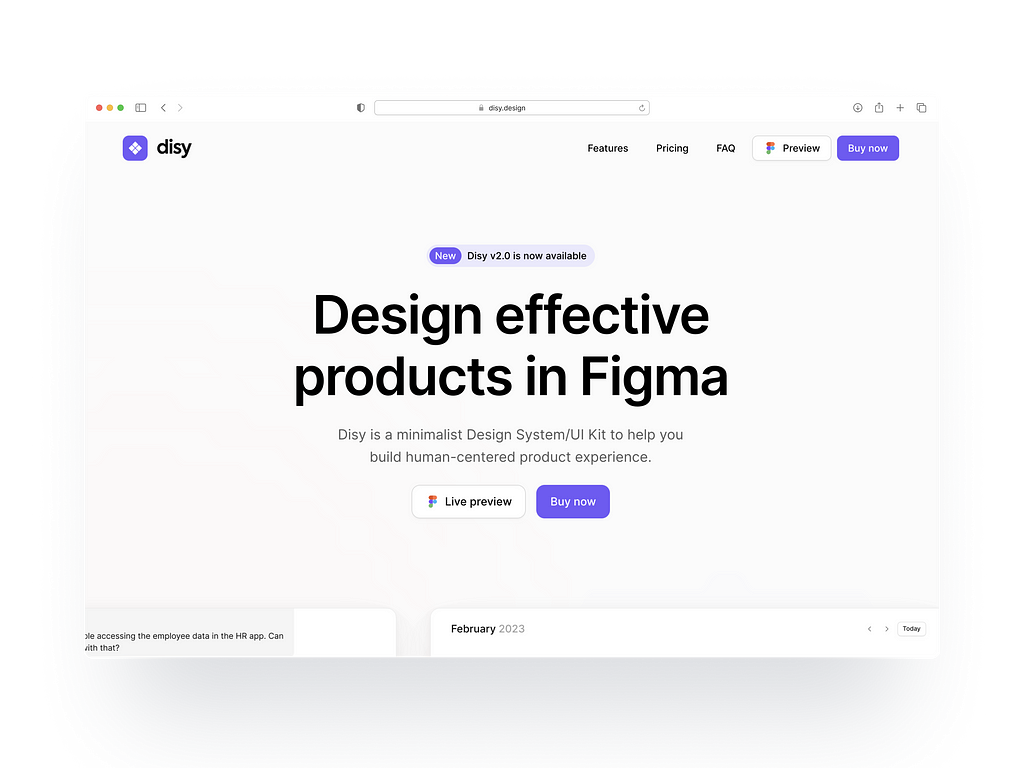
If Untitled UI seems a bit pricey for you, another good alternative is Disy Design, which is quite similar to the Untitled UI kit but more simplistic and modern. Launched in January 2022 by French designer Yoan Almeida, the one-time purchase for Disy Design will cost you a modest 48 euros, making it a worthwhile investment in your UI career. Here’s what you’ll get:
- Access to over 3,000 elements
- A large library of styles
- Single user access
- One-time price
- Product samples
- Lifetime updates
You can access a preview here.
Even though the kit itself is relatively small, it has everything you may need for large projects. It’s great for dashboards and custom informational pages and even includes some samples to give you an idea of how to use the components.
Microsoft Fluent 2 Web & Microsoft Fluent 2 iOS

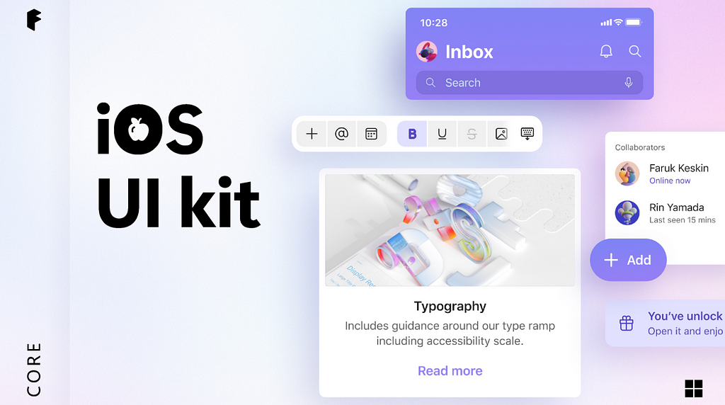
Discover Fluent 2, the latest evolution of Microsoft’s design system. Built in Figma, the Fluent 2 UI kits offer seamless integration with code libraries, ensuring smooth transitions from design to development.
What you’re getting from the newest update:
Key features of Fluent 2 Web UI Kit:
- Incorporates variable libraries, using variables instead of color styles.
- Simplified theme switching with variables, eliminating dark theme components.
- Refactored library, reducing memory usage by 50%.
Updates include improved file management and organization for intuitive navigation.
You can also preview the upcoming Fluent iOS design system, which is still in development, with new components being added regularly.
While I haven’t used Fluent 2 extensively, it’s a valuable addition to my material kit, offering occasional insightful discoveries.
Design System Kit — White
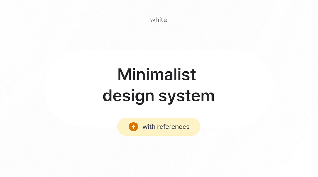
If you find the aforementioned kits overwhelming with lots of variables and limited room for improvement, you might want to check out the Design System Kit — White by Redefy. This kit is relatively minimalist and small, yet it has as many components as possible to start a new project (e.g. perfect for quick Saas projects or showcases) . Here’s what they offer:
- Minimalist design system to bootstrap your project and create your own design system easily.
- No bloated components, addressing the issue of unused components often found in other design systems.
- UI references to help you build your own components.
- Very light and easy to use.
Best of all, it comes for free, so there’s no commitment required. You can use it to streamline your project or as a learning reference while building your own design system.
The Sigma Design Kit
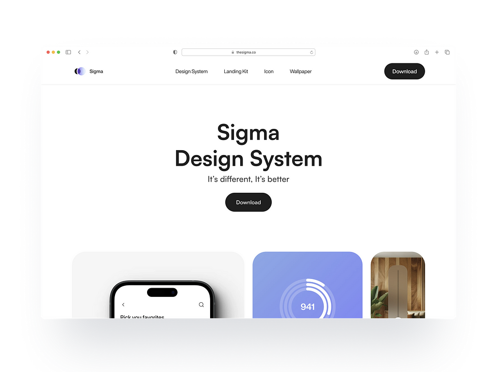
Ameer Omidvar’s The Sigma Design Kit delivers on its promise of simplicity and ease of use. It’s available for both Figma and Framer, so if you’ve already switched to Framer, you’re a step ahead with this kit. It’s quite capable, though it has a minimalistic and clean design, the file organization could be improved. Priced at an affordable $59, it’s still under development, so you might want to wait for the official release. In the meantime, you can preview and download the Figma file from here: The Sigma Design Kit. The Sigma Design Kit stands out from others because of its focus on spatial design, which is expected to become increasingly important in the near future.
Notable Mentions: Material 3 Design Kit & Apple Design Resources — iOS 17 and iPadOS 17
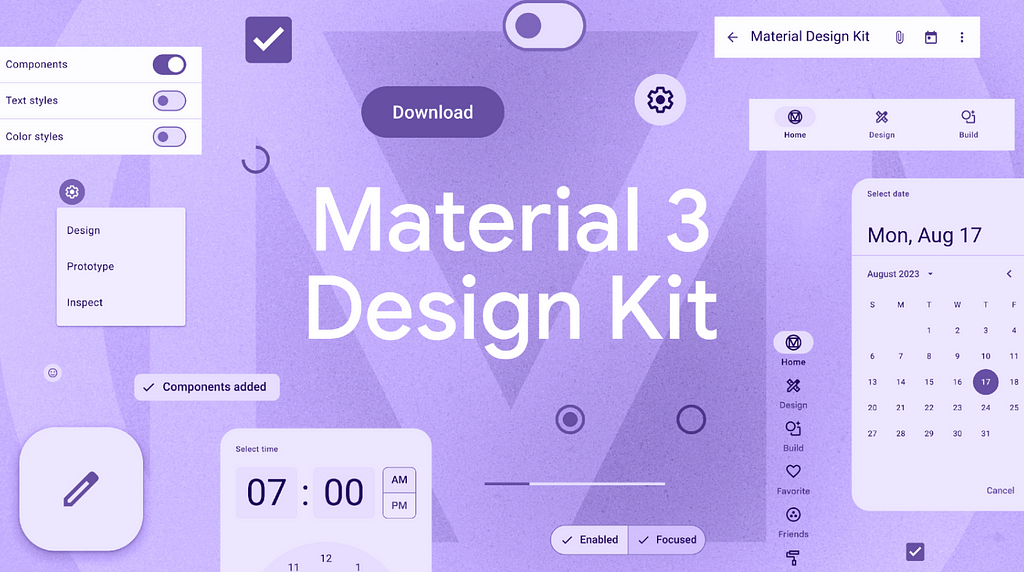
Material Design is a system for creating beautiful projects. The M3 Figma design kit helps you start with Material Design, offering guidance and tools. You can use the kit as a foundation, customize it, or just use the components you need.
The Material Theme Builder (MTB) works with the design kit to help you design and build products efficiently.
You can manage your Figma styles, swap components, and customize the design kit.
For inspiration, check out projects like Now in Android or Pesto. The Android UI Kit helps you craft your app’s journey.
I have to say, it has become my major source for creating dark themes on android apps
The Dark themes in Material Design are characterized by these properties:
- Contrast: Dark surfaces with pure white body text achieve a contrast ratio of at least 15.8:1.
- Depth: Components at higher elevations show depth by adopting lighter surface shades.
- Desaturation: Primary colors are toned down to meet the Web Content Accessibility Guidelines (WCAG) AA standard of a minimum 4.5:1 contrast ratio (when combined with body text) across all elevation levels.
- Color Usage: Large areas feature a dark surface color, accented with restrained use of colors (light, muted, and bright, vivid colors). [1]
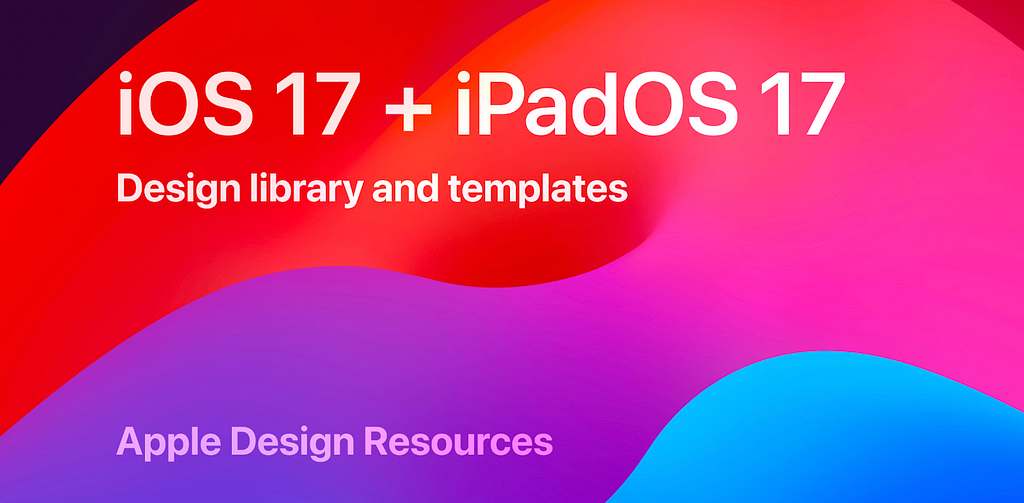
If you’re aiming to enhance your iOS design and experience, this kit is a must-have. While it might not be a daily necessity, it serves as an excellent resource or reference for your designs.
At WWDC23 in June, Apple made a surprising announcement. Traditionally aligned with Sketch, this year they introduced their first official design kit for Figma. Until this time it was Joey Banks, (now offering premium and personalized training in creating design systems for Figma under baseline design) who did a colossal work providing unofficial yet totally important resources.
This Figma Community file is brimming with resources for iOS 17 and iPadOS 17.
Highlights of the kit include:
- An all-encompassing selection of components ranging from Alerts to Widgets.
- Templates for Home Screen and Lock Screen widgets.
- Design templates for notifications.
- Templates for various app structures like tabbed apps, parent/child apps, split views, and sheets.
- A full dynamic type chart with accessibility sizes.
- Integrated iOS system colors, materials, text styles, and vibrancy effects.
UI kits and design systems are more than just aesthetic tools. A Figma UI kit can provide a strong foundation, helping you create visually appealing, consistent, and user-friendly designs, all while keeping within your project constraints. For larger projects, UI kits are an excellent starting point for building a design system and a team library filled with reusable components. In my experience, these resources are a game-changer, making the design process smoother and more efficient.
Besides, designing user interfaces within a tight budget and schedule can be challenging. That’s why I’m sharing my go-to Figma kits, which have been invaluable in refining my design systems and UI kits. Trust me, a good UI kit is essential for speeding up your or your team’s workflow and maintaining consistency.
TUNE: 5 UI Kits You Need To Have In Figma was originally published in UX Planet on Medium, where people are continuing the conversation by highlighting and responding to this story.